 Tutorials
Books
Videos
Forums
Tutorials
Books
Videos
Forums


This is an archived tutorial from the kirupa.com legacy collection. It covers software that may no longer be available, but it is kept online because the ideas still hold up.
One of the most used and recognized controls is the button. Buttons are great because they allow you to easily capture mouse click events, and you use them so often in almost all of your applications, that you never really think much about them. You probably think even less of the button's close relatives, the RepeatButton, ToggleButton, RadioButton, and CheckBox. Let's change that!
In this tutorial, I will focus on the toggle button and explain how to use them in your projects.
Since this tutorial is about the funny-sounding toggle button, let's start by figuring out what it is first. On the surface, a default toggle button looks just like a regular button:
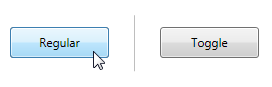
While they look similar, toggle buttons differentiate themselves from regular buttons when you click on them. When you click on a regular button, the button processes your click and returns back to its default state. Toggle buttons on the other hand, stick when you click on them for the first time:
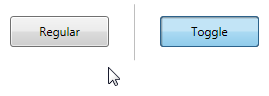
When you click on the toggle button again, they unstick and go back to looking like a regular button:
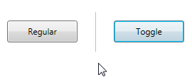
It is this toggle button ability to hold its state when clicked that sets it apart from a regular button. If that sounds bizarre, it may surprise you to know you use toggle buttons all the time. For example, if you have ever used the Bold, Italic, or Underline buttons when writing something, you were actually using toggle buttons:
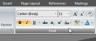
[ most of the buttons in Word are toggle buttons ]
Now that you have an idea of what a toggle button is, let's figure out how to use a toggle button in our own applications.
Let's leave all of the theory behind and actually look at how to use toggle buttons in our application.
First, launch Expression Blend and create a new project. Once your project has been created, click on the Asset Library icon on your toolbox:
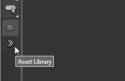
[ find the Asset Library icon ]
The Asset Library window will appear. The search text field inside your Asset Library window will have focus by default, so start typing the word toggle. After typing a few letters, you will see your ToggleButton control appear:
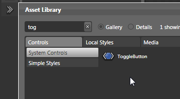
[ searching saves a lot of time ]
Select the ToggleButton, and your Asset Library will close. In your Toolbox, you will see the generic control icon representing your Toggle Button right above your Asset Library icon:
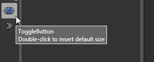
[ the selected control will be displayed above the Asset Library icon ]
Double click on that icon representing your ToggleButton to insert it into your application:
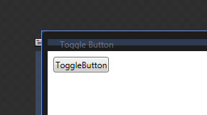
[ a double clicked control displays with its default values/properties enabled ]
With your toggle button now safely placed on your design surface, let's look at how to use it in the next section.
In the previous section, you learned more about toggle buttons and how to incorporate them into your WPF application. In this page, let's continue where we left off by learning how to take advantage of the various states a toggle button exposes.
Now that you have your toggle button in your document, you can customize it using your Properties panel. Most of the customizations are fairly straightforward, but let's take a look at the Common Properties sub-panel where some unique properties related to the toggle button can be found:
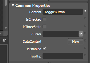
[ your Common Properties displays the properties we are interested in ]
The three properties I will cover are Content, IsChecked, and IsThreeState. Let's get started:
The Content field is something that you will modify frequently. From here, you can specify what you want your toggle button to display. Using the properties panel, the easiest thing would be to enter some text and have it be displayed. In our case, the default text ToggleButton is displayed, but you can change that.
You are not limited to just text, though. Toggle buttons are content controls, and that means they can store one of any object as their direct child. To clarify, that does not mean that they can only store one item in general. It simply means that your toggle button can only have one direct descendant control, but that one direct descendant control can have as many child controls as possible.
The IsChecked property is what helps determine the states our toggle button is in. Take a look at the following diagram:
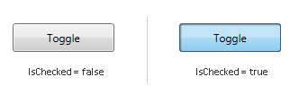
Initially, when your toggle button is displayed, its IsChecked property is set to False. When you click on your toggle button, its IsChecked property becomes true. While on the outside, we can talk about a toggle button being in its Normal state or in its Depressed state, internally, how your toggle button looks is determined by your IsChecked property.
When you check the IsChecked property in Blend, you are setting IsChecked's default value to true. That basically means that your toggle button will appear in its Depressed state by default, and your first click will take it to its Normal state.
The final property we will look at is the IsThreeState property. We already know that our toggle button has at least two states based on our earlier IsChecked observation. As you can guess by now, our toggle button actually has three states, and those can be expressed when you set the IsThreeState property to true by checking its checkbox in Blend.
Earlier, you saw that IsChecked could either be true or false. Well, it turns out that your IsChecked property supports a mysterious third value. The third value IsChecked can have is null. Let's look at a diagram showing what our IsChecked value is after each click:
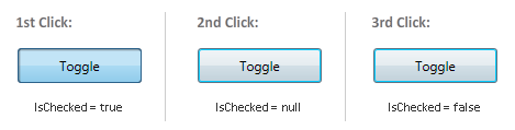
IsChecked is an object of type bool? which is a boolean that accepts three values - true, false, and null. This three state boolean is also known as a nullable boolean. Now, aren't you glad you know that?!
We crossed over the half-way point with learning about toggle buttons. In the next section, let's look at how to use a few events to make something that takes advantage of the toggle button's states and, more interestingly, how to customize a toggle button.
In the previous section, we looked at how to change some of our toggle button's properties. The next big area to look at is events. The toggle button introduces a few events for us to target, so let's look at how to do that in this page.
Let's start with the most obvious event. Because our toggle button is a variation of your regular button, you still have the Click event that allows you to deal with user clicks. But, unlike a button, the Click event with toggle buttons is not as important because you need a way to know when your Click event causes your button to enter its checked state or its unchecked state. You can write some code to determine whether your button is in a checked state or not, but there is an easier way.
Toggle buttons come with both Checked and Unchecked events. As their name implies, when your toggle button gets checked, the Checked event fires. Likewise, when your toggle button becomes unchecked, the Unchecked event fires.
You can access both of these events via Blend's UI by selecting your toggle button and clicking on the Events button (found near the top-right of your Properties panel):
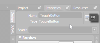
[ click on the events button to to view your toggle button's events ]
Tying the event to an event handler is pretty straight forward, so I am going to move on to what I feel is a more interesting topic. Just remember that toggle buttons allow for Checked and Unchecked events!
Toggle buttons, as you have seen so far, are treated the same just as any other system control. Therein lies the problem. Customizing a system control takes more effort and a deeper understanding of WPF to pull off cleanly without accidentally removing some functionality.
To solve this problem, you have Simple Styles, but there is no corresponding simple style for the toggle button that you can modify. The way around this is by using existing functionality and changing a few words in XAML.
In Blend, draw a rectangle or any shape that you want to make into a toggle button:
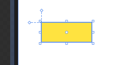
[ I drew a yellow-colored rectangle! ]
With your shape selected, go to Tools | Make Button:
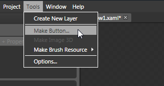
[ the Make Button command allows you to convert almost anything into a button ]
The Create Style Resource window will appear. Give your resource a name or simply accept the default name (ButtonStyle1) and press OK to create the new style resource. What you have now is a custom shape converted into a button. What we are going to do is change this button into a toggle button, and that will require some XAML editing.
Click on the XAML tab found towards the top-left of your Properties panel:
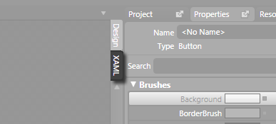
[ click on the XAML tab to view the XAML ]
Once you click on the XAML tab, you will find yourself in the XAML mode where you see all of the markup generated for all of the things you were doing graphically earlier. Find the line of code that corresponds to the button you created/converted. It will start with the words <Button....:

Replace the word Button with the word ToggleButton. You will basically go from seeing what resembles the above to the following:

After you change your Button to ToggleButton and hit Ctrl + S to save, you will soon receive an error in your Results panel informing you that there is a TargetType issue:
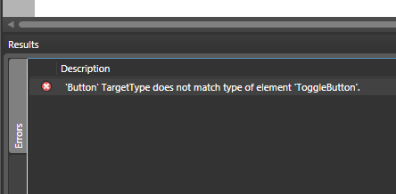
This error occurs because, when you created the style resource earlier, it was linked to an object that was of type Button. Because you changed from a Button to a ToggleButton, that earlier link has become invalid. To fix this issue, under Window.Resources in your XAML, find the Style you created earlier. It's Key value should be the name you gave your style when you created it earlier when converting your button:
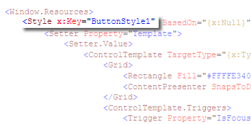
Within your style markup, find every instance of x:Type Button and change it to x:Type ToggleButton. You are almost done. When you hit Ctrl + S again, you will see another error message appear.
This time, the error states that IsDefaulted is not recognized. To resolve this issue, simply remove the line that says <Trigger Property="IsDefaulted" Value="True"/>. You should be all set now, and you can switch back to your Design view and edit your Toggle button's style and templates just like you would a custom button.
Just a final word before we wrap up. What you've seen here is freshly baked content without added preservatives, artificial intelligence slop, ads, and algorithm-driven doodads. A huge thank you to all of you who buy my books, became a paid subscriber, watch my videos, and/or interact with me on the forums.
Your support keeps this site going! 😇


:: Copyright KIRUPA 2026 //--