 Tutorials
Books
Videos
Forums
Tutorials
Books
Videos
Forums


This is an archived tutorial from the kirupa.com legacy collection. It covers software that may no longer be available, but it is kept online because the ideas still hold up.
It used to be that buttons were the gray, rectangular shapes that you clicked on to do something. When you interacted with them, they may have changed their colors around a bit, but few did anything really noticeable or fancy.
For better or for worse, nowadays, it is very common for your button to take on a variety of shapes and forms. In this tutorial, I will explain two things. First, I will show you how you can turn an image into a button. Second, I will show you how to add custom rollover and pressed transitions when you interact with it. In the end, you will have created something with all of the functionality of a button, but it will not resemble a button in any way, shape, or form.
Take a look at the following application. Move your mouse over and click on the green paper bag to see how this button reacts:
[ what you will have created by the end of this tutorial ]
The above effect is fairly simple to create, so let's look into how you can do this yourself:
Before you begin, make sure you have read my earlier Getting Started article and have Expression Blend installed.
Launch Expression Blend. A Welcome Screen should appear, and from this screen, click on the New Project link:
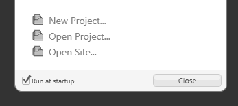
[ from the Welcome Screen, click the New Project link ]
If you do not see a Welcome Screen, then go to File | New Project instead. The end result is the same.
After clicking on New Project, the New Project window appears. From this window, select the button for Silverlight, WPF, or Windows Phone Application! for Name enter ImageRollovers, and ensure the Language is set to Visual C#.
Click OK to both close your New Project window as well as create your new project with the specified values.
After you have
created your new project, you will see your
Artboard. What we want to do next is insert an
image into your artboard.
Currently, Blend does not support copy and
pasting an image from the web, so save the
following image to a location on your computer
first:
The above icon is from the excellent Bagg and Box's set, so feel free to check out the full set (and licensing terms) by clicking here.
Once you have saved your image to your computer, just drag and drop the image from the location on your computer and into your artboard. There is a good chance that when you do that, your image will be unacceptably tiny:
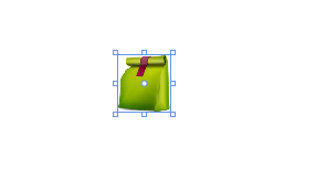
[ when you insert an image into the artboard, the size of the image is tiny ]
The easiest way to fix this is by simply resizing your image using the adorners that surround it on the artboard. Hold down your Alt key and just begin resizing to preserve your image's aspect ratio:
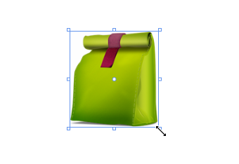
[ hold down the Alt key while resizing to lock the aspect ratio ]
Ok, so far so good. You got a brief introduction to what you will be doing in this tutorial, and you made some progress where you inserted an image and resized it appropriately on our design surface. In the next section, you will learn how to go from an image to a button.
In the previous section, we left off with an image you inserted and resized. In this page, let's move on by turning your image into a button and looking into its template.
Going from an
What we want to do is create rollover effects on a button. While that conversion is entirely optional, you will find that it becomes much easier when you go from an image and towards a control such as a button that has more functionality for dealing with mouse interactions.
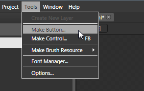
[ with your image selected, go to Tools | Make Button ]
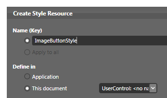
[ give your resource the name ImageButtonStyle ]
Once you have changed the name,
hit OK to close this dialog and to convert your
image into a button.
You will know that your
image has been converted into a button when you look
at your object tree and your image now has a button
icon next to it. If you didn't give your image a name
originally, the default name [Button] text displayed
instead of [Image]:
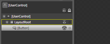
[ you know you have a button when the icon and name indicates that you do! ]
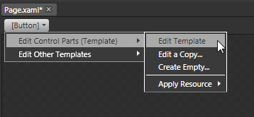
[ you can easily edit the template by using the breadcrumb bar ]
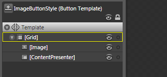
[ your control is actually made up of many other controls! ]
You have your Grid that controls the layout, and it contains two children - your Image (which is what you started out with) and the ContentPresenter control
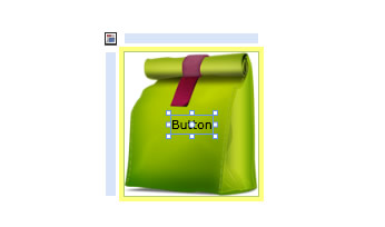
[ when you converted your image into a button, this Button text appeared ]
This text displayed via your ContentPresenter is not very important for us, so hit your Delete key to go ahead and remove it.
Great - you now have your button setup just the way you want for how it looks by default. The last thing that remains is adding the different look when you rollover or click on the button. Let's look into that in the next section.
In the previous section, you converted your image into a button and edited the button's template. In this page, we will wrap things up by adding the rollover effects that you need.
Ok, you are now ready to make visual changes that appear when you interact with your button. Each such visual change is represented by what is known as a State. You can view the states your button currently has defined by looking at your States panel found in the Interaction pane:
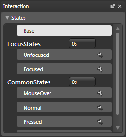
[ the Interaction panel contains the states that your button exposes ]
Because the control in question is a Button, the internals of your Button class contain states for Unfocused, Focused, MouseOver, Normal, Pressed, and Disabled. What this means is that, when your button is (for example) disabled, then your button will find itself in the Disabled state and have the look that this state defines. The same applies for all of the other states you see displayed.
There is an odd one though. You also have a state known as Base, and this base state is how your control would look like if you did absolutely nothing to it. It is the default state that gets selected initially and the state you will always return to if you want to make modifications that go beyond just the limited lifespan of a single state.
The states we are interested in are the ones for MouseOver and Pressed. The Normal state is important as well, but we'll just leave it equivalent to that of our Base state. In other words, when a state is not modified, its properties are equivalent to the properties specified as part of your Base state.
Let's deal with our MouseOver state first. With your mouse, click on the MouseOver entry in your States panel:
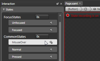
[ click on the MouseOver state first ]
When you click on it, notice that you will go into the State recording mode. This means that any changes you make to your artboard will only be reflected in the state you are currently editing. In this case, any modifications you make will only be visible when your button is in the MouseOver state.
Anyway, select your image on the artboard. With the image selected, make it smaller by resizing it using the adorners. Be sure to hold down the Alt key to constrain your current aspect ratio and scale from the center:
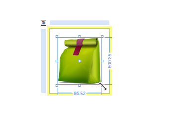
[ make your image smaller ]
That's all there is to it. From your States panel, if you click on your Base state, notice that your image is larger and back to its original size. When you click on MouseOver, the image shrinks to the size you gave it a few seconds ago.
If you hit F5 and preview the animation, notice that your image shrinks in size when you hover it - just like you want:
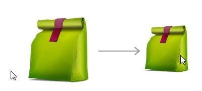
[ when you preview, your image gets smaller when you mouse over it ]
The only state we have remaining is the Pressed state. From your States panel, select your Pressed state. What we want to do is make our image small just like before. The only variation is that the image will be scaled down to be even smaller!
Use the resize adorners in conjunction with the Alt key to make your image smaller than what it was in the earlier MouseOver state:
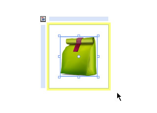
[ your image is even smaller in the Pressed state ]
If you test your animation now, your button will shrink in size when you hover over it, and when you press down on your mouse, the button will shrink even further. Great.
There is one last thing that needs to be done. If you noticed, the transition between your Base/Normal, MouseOver, and Pressed states is very sudden. Ideally, you want to give your animation a chance to gracefully go from one state to another without suddenly jumping to it.
The solution to this is very simple. You need give your Visual State Group your states are under a duration. The states that you modified are all under the CommonStates state group:
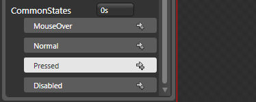
[ a duration given to a state group carries over to all states within that group ]
To the right of your CommonStates State Group name, you will see a text field that you can specify the duration of your states. Change the value from 0s to .2 (or .2s):
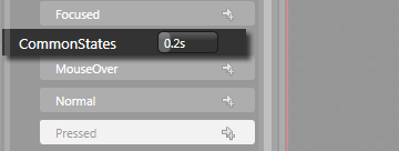
[ enter a .2 in the duration field next to CommonStates ]
If you preview your animation now, you will notice that the jump between the various states occurs more gradually - .2 seconds more gradually to be precise.
Phew - you are now done! If you want to continue modifying more of your Button's template, be sure to return to the Base state first unless you want your modifications to be visible only in the state you currently have selected.
To return to your main application and make changes outside of your template, simply use the breadcrumb bar to return to your root Page.xaml's UserControl:
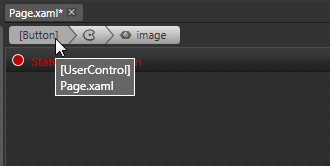
[ you can go back to the root of your UserControl by using the breadcrumb bar ]
This tutorial took you through a whirlwind tour of various little things that you needed to do to have an image change how it looks when you interact with it. I have posted the source file to my version of what you just created, so download it from the below location:
Just a final word before we wrap up. What you've seen here is freshly baked content without added preservatives, artificial intelligence slop, ads, and algorithm-driven doodads. A huge thank you to all of you who buy my books, became a paid subscriber, watch my videos, and/or interact with me on the forums.
Your support keeps this site going! 😇


:: Copyright KIRUPA 2026 //--