 Tutorials
Books
Videos
Forums
Tutorials
Books
Videos
Forums


This is an archived tutorial from the kirupa.com legacy collection. It covers software that may no longer be available, but it is kept online because the ideas still hold up.
One of my favorite features in WPF has to be data binding. In case you are not familiar with it, data binding allows you to go from having some bizarre collection of data into something really cool looking with little effort. In my earlier Data Binding to CLR Objects tutorial I described data binding and explained how to use data binding with CLR data.
In this tutorial, I will explain how to data bind to XML data. XML data is interesting because you use it a lot, for example, if you subscribe to RSS feeds, those feeds themselves are essentially XML files. The functionality in WPF for binding to XML is similar to what you have with CLR data, but there are some differences that warrant a detailed tutorial focusing just on the XML side of data binding.
Before continuing on, by the end of this tutorial, you will have created something that looks like the following image:
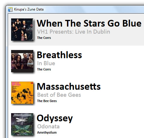
[ what you will create by the end of this tutorial ]
The above data and images are specified in an external XML file. You can view that XML file here: http://www.kirupa.com/blend_wpf/code/kirupaZuneData.xml
Note
In case you are curious, the XML file I posted above and use in the application you will be creating is taken from the Zune Social web service. I wrote about that in this blog post.
This tutorial will give you a comprehensive dive into using XML data binding using Expression Blend. You will learn how to create a data source out of your XML file, create and modify a data template, filter data using XPaths, and how to modify the formatting and layout of your final results. This tutorial is aimed at users who have prior experience with Blend. At the very least, make sure you are familiar with setting up your project, using controls, and making simple modifications via the property grid.
If you are looking for a simpler coverage of this topic, the Blend help topics include a nice article titled Create an RSS news reader.
To get the most out of this article, you should follow along with my instructions. To do that, you will need Expression Blend 2 installed. If you do not already have it, you can download the fully-functional trial version from the link shown below:
Normally, you would also need Visual Studio 2008, but data binding to XML data requires no extra hand-written code. Everything is done via XAML using just Blend.
The first thing you will need to do is bring your XML file into your application in a form that it understands:
Launch Expression Blend 2 and create a new WPF project. Give your project the name XMLDataBinding:
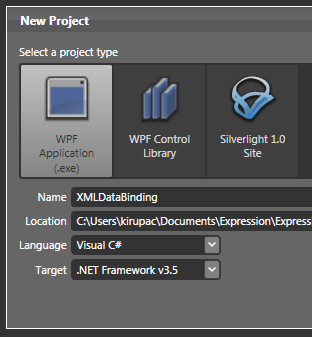
[ create a new WPF project titled XMLDataBinding ]
Press OK to create your new Project and to hide the New Project window.
You should now see a blank artboard with nothing in it. What we are going to do first is add our XML data source. On the right-hand side, make sure the Project tab is selected and the Data panel is displayed:
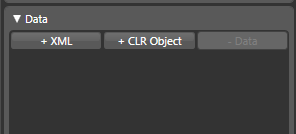
[ make sure your Data panel is displayed ]
From the Data
panel (shown above), click on the + XML
button. The Add XML Data Source window will
appear.
From the Add XML Data Source window, for
Connection Name,
change what is displayed to ZuneData,
and for the URL with
XML Data field, copy and paste the
following URL:
http://www.kirupa.com/blend_wpf/code/kirupaZuneData.xml
Your Add XML Data Source window should look like
the following image:
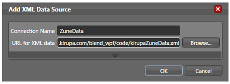
[ in your XML Data Source window, specify the connection name and URL ]
Once you have entered the correct data to your Add XML Data Source window, press OK to close the window. After a few moments, you will see your Data panel display the Music Data connection:
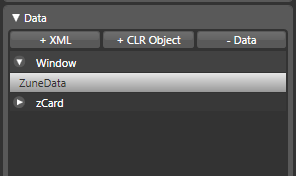
[ your XML data source named MusicData has now been added ]
So far so good. You took some data and created a data source called MusicData. We'll look at how to take this data and make an attempt at visualizing our data in the next section.
In the previous section, you created a data source called MusicData that used an XML file as its source. In this page, we'll look at using the data source you created.
What we need to do now is setup our application. In Blend, select your Window and set its Width and Height to 512 and 480 respectively:
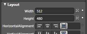
[ change your application's width and height to 512 and 480 respectively ]
You now face an empty stage with nothing in it, so let's fix that. From your Asset Library, insert a Listbox control. Make sure your Listbox takes up all the available space inside your Window. You can do that by dragging the adorners until the red snapping lines appear:
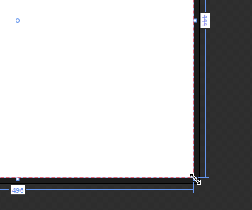
[ you can resize your listbox using the adorners ]
Alternatively, you can use the property grid and set the Horizontal and Vertical Alignments for your Listbox to Stretch:
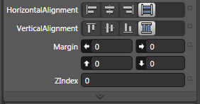
[ if adorners aren't your thing, you can use the property grid also ]
With your Listbox taking up all of your space, the end result is a bit anticlimactic. Your artboard doesn't really look much different, for your Listbox has no items to display. Let's fix that next.
You have your listbox, and you also have an XML data source. Let's put them together by using your listbox to display some XML data. With your listbox selected, under your Properties panel, find the Common Properties panel:
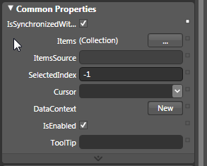
[ find the Common Properties panel ]
In your Common Properties panel, you will see a field called ItemsSource. Click on the advanced properties box next to it and click on the the item for Data Binding:
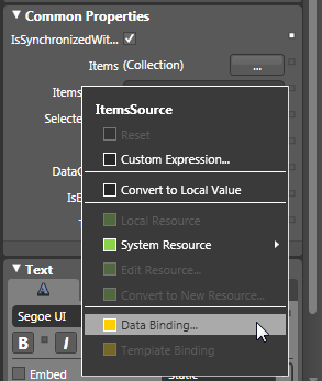
[ click on the Data Binding item to bind data to your listbox's ItemsSource property ]
The Create Data Binding window will appear. In this window, your Data Field tab will be selected, and in the Data Sources list on the left side, you will see an entry for ZuneData. Select the ZuneData entry:
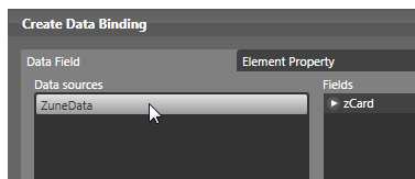
[ select your ZuneData data source ]
When you select the ZuneData data source, notice that on the right side where your Fields area is, you see an entry for zCard. zCard is the parent node for the XML document referenced by ZuneData. Expand the zCard entry by clicking on the arrow before it to display its children:
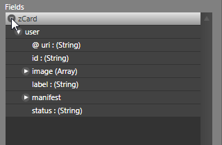
[ zCard is the root node of your XML file, so you can expand it to see its children ]
By clicking on each of the arrows, you are able to dig a little bit deeper into the structure of your XML document. The information we want is really deeply nested, so expand your XML data in the following order: zCard / user / manifest / playlists / playlist / track:
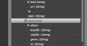
[ expand your XML tree until you reach the correct track node ]
There are several track nodes, so make sure you reach the correct node. You can verify that you are selecting the correct nodes by looking at the XPath field in the same view:
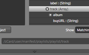
[ notice that the XPath value shown is the same as the path I highlighted in blue above ]
It is kind of hard to see the XPath field by default, but make sure that what is displayed matches the path I exactly provided (and highlighted in blue!) earlier. Once you have selected the track entry, press the Finish button to accept the selection and close the Create Data Binding window.
Your listbox will now look like the following:
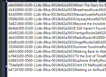
[ what you will see after having created the data binding ]
Doesn't what you see above look great? Don't worry. We will figure out how to make sense of all this data in the next section.
In the previous section, you took a part of our XML data and displayed in the listbox. As you saw, the results really weren't pretty. The reason is that even though you picked the XML nodes you were interested in, many unnecessary data also made its way into the results.
Now, that data may very well be very important. It just isn't important to display to the user via a listbox. In this page, we will look at how to pick and choose more precisely what information we want displayed.
With your listbox still displayed, click on the advanced properties box next to the ItemsSource property like you did earlier. From the menu that appears, select the Data Binding item:
[ we need to alter the Data Binding for our listbox's ItemsSource again ]
This should be familiar to you by now, and you will see your friendly Create Data Binding window appear again.
From what you did earlier, your Create Data Binding window should already contain the XML data you filtered through and selected the nodes from. We aren't interested in that this time. What we are interested in is the Define DataTemplate button shown to the left of the Finish button:
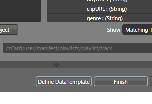
[ find the Define DataTemplate button from the Create Data Binding window ]
Click on the Define DataTemplate button. The Create Data Template window will appear. Notice the large area at the bottom half of the window where you choose the option to create a new data template, give your template a name, and take a look at the information you want to display:
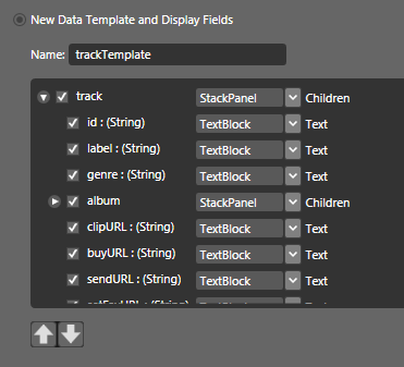
[ create a new data template ]
For the name, trackTemplate was provided for me by default. If it wasn't entered for you automatically, be sure to enter trackTemplate for the template's Name. The interesting part of what you see above is actually being able to pick and choose which specific pieces of information from your XML data will be displayed.
In the Create Data Binding window, you picked the parent node (called track) that contained all of the data you wanted. In this view, you take a look at all of track's children and further refine what gets displayed.
Let's do some refining! Uncheck the boxes for id, clipURL, buyURL, sendURL, and setFavURL:
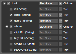
[ as you uncheck data, notice that it grays out and is no longer selectable ]
You aren't done yet! Notice that you can actually expand nodes in this view also. Expand your album node, and what you see should be similar to what is shown in the image below:
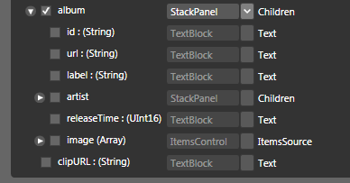
[ expand your album node to see its children ]
From this view, check only the boxes for label, artist/label, image/image/url:
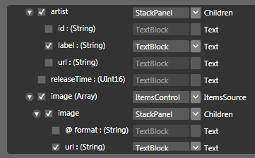
[ further refine what is shown by checking the label and url nodes highlighted above ]
If you look at the top-right corner of your your Create Data Binding window, you will see an area marked Preview. Below that, you will see a basic representation of what your data will look like:
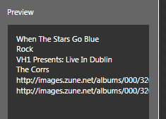
[ the Preview area gives a quick glimpse of what your selected data looks like ]
We aren't finished yet. As you may have noticed, beyond just choosing which of your data gets displayed, from this Create Data Template window, you also have the ability to pick which control will host your data. Let's look at that in the next section.
In the previous section, you further refined what gets displayed in our listbox by creating a data template, but what we want to do now is change how the items inside our listbox display.
Your Create Data Template window should still be visible. In the previous section, we primarily looked each node and the checkbox associated with whether something gets displayed or not.
This time, look to the right of the node name where you see the control that will be used to the display the value stored by that node. Let's make a change. Currently, our album image's URL is displayed in a TextBlock control:
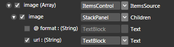
[ our album's image URL is displayed as text in a TextBlock ]
What we really want is for our image URL, which is the actual path to the image file, to be passed in to an Image control. Click on the control drop-down menu next to your url : (String) value and select the Image control as shown below:
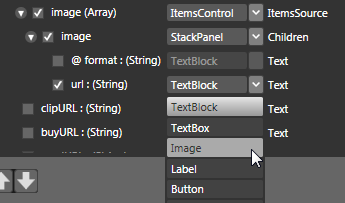
[ select the Image control for your image's URL value ]
Once you have selected the Image control, notice that your Preview pane now displays what used to be URLs with the actual image itself:
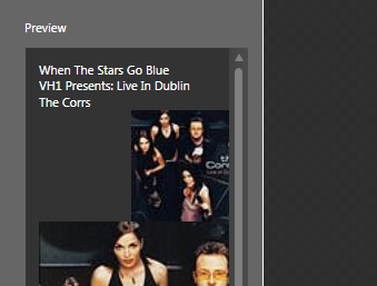
[ success - what used to be text is now an image ]
Press OK to accept this change and to close your Create Data Template window. You will be returned to your main artboard, and your listbox will now look like the following image:
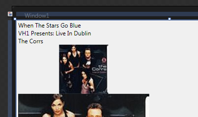
[ what your listbox now displays ]
We've made quite a bit of progress so far. You went from seeing a large collection of random data to something more filtered. Beyond that, you also took a default control Blend assigned to a data field and changed it to something more specific such as changing our Textblock to Image.
There is one thing that seems odd about what you see on the screen though. If you recall, earlier in the Create Data Template window, you checked one instance of the image and it's URL:
[ it seems like only one image node has been selected ]
Yet, what you see on the design surface is distinctly two images. That seems like an error, but as you will see in the next section, that is actually by design and consistent with what you saw (but may not have noticed) in the Create Data Template window.
In the previous section, from the Create Data Template window, you changed the control that will be hosting the image path. Once you made the change, you could see in the Preview area that, what was once strings, now displays as images. There is something peculiar about what you see though...
As you see, there are two images currently displayed. What we want to do is figure out why two images are being displayed and how to fix that. Our XML data is pretty complicated, so I am not going to put you through looking through lines of XML code. Instead, let me show you why you are seeing two images.
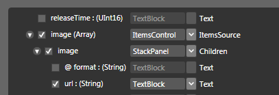
In the Create Data Template window you were in earlier, the following is what the image node looked like:

[ notice the actual node names and their details displayed in parenthesis ]
Notice the parent image node has an Array modifier - image (Array). What that means is that you are not dealing with a singular piece of data. Also, notice that your control hosting your values is an ItemsControl, a control designed to host many pieces of information. What all this means, is that there are multiple image values in our main image node, and those images are populated inside an ItemsControl.
This explains why you are seeing two images after making the modifications from the previous section. There is nothing wrong with what you did. You are dealing with an array of images, and our data happens to have two images that need to be displayed - one larger and one smaller. There is no way to fix that via the Create Data Templates window that you closed earlier. We are going to have to modify our listbox's item template (a type of data template) that hosts this data instead.
You look at your listbox and see all of the data displayed. Up until this point, we were modifying what was displayed inside our listbox via the Create Data Template window. The Create Data Template functionality is a one-time deal. If you want to make modifications to your existing data template, you cannot do that using the steps we took earlier. In other words, you can use the Create Data Template window to create a new template and make any modifications that you want, but you have no way of modifying a template you created earlier.
Fortunately, you have another (probably more flexible) way of editing the items inside your listbox. That approach involves your listbox's ItemTemplate. Right click on your listbox, and from the menu that appears, go to Edit Other Templates | Edit Generated Items (ItemsTemplate) | Edit Template:

[ edit your listbox's ItemTemplate ]
The template you are editing is the data template you had created earlier. If you look in your Objects and Timeline panel and expand all of the nodes that you see, your object tree will look like the following:

[ what your ItemTemplate looks like ]
This may not look familiar to you in this particular form, but it is the actual object representation of what you saw in the Create Data Template window:
[ your Create Data Template window shows the data template in a simplified form ]
A few paragraphs earlier, I mentioned that your array of images is displayed in an ItemsControl. If you look in your Objects and Timeline panel, you'll see an entry for ItemsControl also:

[ your ItemsControl is used to store your images ]
This is a good spot to take a quick break! Much of this page focused on comparing what you saw in your Create Data Template window and what you are seeing now when editing your listbox's ItemTemplate. In a nutshell, they both deal with the same underlying data. They just happen to provide a different UI with different functionality for manipulating that data.
We have pinpointed the exact control that is responsible for displaying our images. In the next section, let's figure out where to go from here.
In the previous section, you learned why two images are being displayed. Knowing why something does what it does is only part of the solution. The bigger part is figuring out how to work around that - if necessary. In our case, we do want to figure out how to avoid displaying two images, and this page will show you how.
We left off at a cliffhanger where I left you staring at your ItemsControl. Select your ItemsControl in the Objects and Timeline panel. With your ItemsControl selected, look in your Property grid at your ItemsSource property inside the Common Properties category:
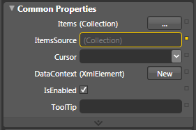
[ select your ItemsControl and look at its ItemsSource property ]
Notice that your ItemsSource property is outlined in yellow. Something must be up with that, but before I ruin the surprise, let's continue on. Now, click on the Advanced property box located to the right of the ItemsSource field and, from the menu that appears, select Data Binding. Your familiar Create Data Binding window will appear.
This time, though, notice that the tab that is selected by default for you is Explicit Data Context:
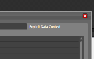
[ when your Create Data Binding window appears, the Explicit Data Context tab is displayed ]
That is because when you bound to the ItemsSource property of your listbox earlier, you bound to the actual source object aka our XML data. Inside the listbox, our ItemsControl control doesn't need the entire XML data, but only parts of it. More specifically, our album data is what gets passed in. Similarly, each control in our ItemTemplate corresponds to just one piece of the data your listbox originally was passed in. This assigning of data to a control has already been done for you, and that explains why your ItemsSource property is outlined in yellow.
You can actually see this for yourself. If you look further down in your Create Data Binding window, you will see the Use a custom XPath expression field with the path to the data it is currently storing:
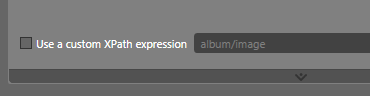
[ XPath provides you with information on exactly what you will see ]
The data that is stored at the album/image node is the array of images you saw described in the previous section. What we want to do is alter this path so that it shows us only the first, smaller image. That can be done via something called XPath.
Check the box to the left of the Use a custom XPath expression text. Once you have that box checked, your path field will now gain focus and become editable:
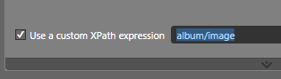
[ check the Use a custom XPath expression to edit the path ]
With the album/image path selected, change it to say album/image[1]:
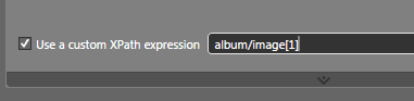
[ change your XPath to what is highlighted above in blue ]
Once you have changed your path as seen in the above image, click on the Finish button to accept the changes and to close your Create Data Binding window. Notice what you see in your artboard right now:
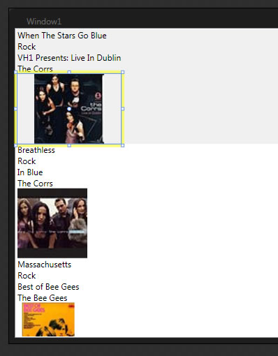
The larger images are gone, and you are just seeing the smaller images. What you did earlier where you added the [1] to our XPath is similar to accessing individual elements from an array. For more information on XPath and how to do things that go beyond simply array-like accessing of data, check out the XPath examples on MSDN. Properly covering XPath will require a whole new tutorial, so I will refer to the above link for now instead.
This is some great progress we've made so far. In the next section, let's now focus on altering the layout and formatting of the content that you currently see displayed.
In the previous section, we finally got rid of the second image and got a brief glimpse at how you can use XPath to more precisely select the data that you want. In this page, we'll do something much easier by rearranging and formatting how our data is currently displayed.
For the past six pages, we've focused on getting the right data displayed into your listbox. Now, it's time to put our designer hats on and rearrange our existing data more nicely. Currently, you should still be editing your ItemTemplate, and you probably still have your ItemsControl selected.
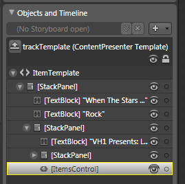
[ you should still be editing your listbox's ItemTemplate ]
First, let's simply reposition the controls so that everything isn't vertically stacked. In order to do that, let's flatten our hierarchy of controls by placing them all under one parent. You can do that by dragging each nested element (contained in its own stack panel) and dropping it onto our root StackPanel layout control.
Your Objects and Timeline panel should look like the following:
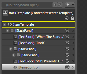
[ what your Objects and Timeline panel looks like ]
Notice that all of our elements are now rooted by a single stack panel. You will now also have the two empty stack panels, so select them both and delete them. Be careful to expand the stack panels to make sure they don't contain any children. The goal is to get rid of the extraneous Stack Panels only. We want to preserve any controls they host.
You will now see just one Stack Panel and all of your child controls displayed below it:
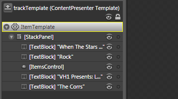
[ flatten your tree by moving all nested children to the parent ]
Our next order of business is to replace our stack panel with something more customizable...such as a Grid. To do that easily, right click on the [StackPanel], and from the menu that appears, go to Change Layout Type and select Grid:
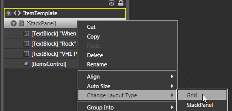
[ change the Layout Type from StackPanel to Grid ]
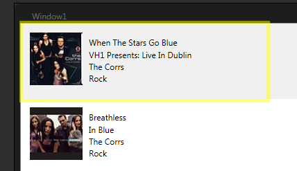
Once you have done that, you now have full freedom to resize and reposition your individual elements as you want. For example, the following is how I arranged the controls inside the grid:
[ making simple layout changes is now easier now that your parent control is a Grid ]
As you are resizing your Grid, you may find that your ItemsControl (which hosts the Image control used for displaying the image) simply takes up more and more space. To avoid that, select your ItemsControl and simply use the adorners to resize it. Because its size was originally set to Auto, resizing it will give it a fixed width and height so that you have space to work with without your ItemsControl taking all of it up!
Also, the buffer between your current entry and the next entry in the listbox is determined by the size of your parent Grid element. As you see above, the wide yellow outline surrounding my shape corresponds to the size of my Grid in the listbox. Because each item in our listbox is identical with the exception of the data it is displaying, all of your listbox items will contain the same width and height as the Grid you are currently working in.
Finally, feel free to go creative on what you see now and modify the type of font, coloring, etc. as you want. For example, I changed the font size, added a Drop Shadow bitmap effect to my ItemsControl, and I deleted the text field corresponding to genre:
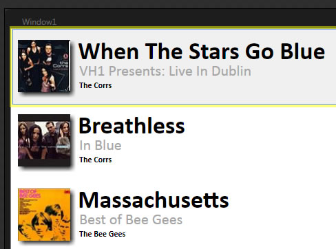
[ this looks a lot better than what you saw a few pages ago - progress is being made! ]
Phew! We are almost done with this tutorial. In this page we wrapped up all that we set out to do. In the next section, let's take a review of what we did and tie up any loose ends.
In the previous section, we wrapped up the tutorial by covering the last major piece of the puzzle which was making our results look nice. In this page, let's take a quick review of everything that was done and revisit things that may have been confusing or not covered adequately.
As with all of these long tutorials, I feel it is good to take a step back and get a birds-eye view of what you did. This allows you to put all of the various steps together to see more completely how you went from Page 1 to, in the case of this tutorial, Page 8.
In order for your application to know about your XML data, you first need to add your XML file to a data source. Once you have created the data source, the next big step is for you to pick a control that will be used to display your XML data.
For this tutorial, I choose to use a listbox, but you can use any control that you want. The amount of data you will be able to display will vary between, for example a listbox and a simple label, but you can choose the right control depending on how much of your data you want to expose to the user. Because my XML file has lots of data that can be consolidated as individual items in a control such as listbox, I went with that instead.
Once you have your control, you can use data binding to take your data and display it in your control using data templates. There are two ways of doing that. The first way is via the Create Data Template window where you have a graphical interface to pick and choose which parts of your XML file you want to see:
[ your Create Data Template window allows you to pick which data to show ]
This view is really nice because you can choose the nodes that you want, and you can also specify the control that will be displaying your data. Notice that all of the text based content is being stored in TextBlocks and data containing children is stored in StackPanels. The choice of what control will display what content is made by default, but fortunately, you have the ability to override the default choices and make changes manually. From this view, if you changed the StackPanels to Grids, you wouldn't have had to manually change the layout from StackPanel to Grid like you did in the previous section when editing the ItemTemplate.
There is a major problem with this view, though. The changes you make to your new data template only apply once. You have no way of making modifications to a date template you already created by using the Create Data Template functionality. You can create a new data template or select an existing data template, but you cannot edit an existing data template you may have created using this view earlier. That's too bad, for this view does make quick work of complicated amounts of data.
Fortunately, a more flexible solution involving editing our control's Generated Items (ItemTemplate) exists. While it may not be the easiest way to setup a data binding, it is clearly the best way to make modifications after a binding has been made. You have almost infinite (bounded by WPF of course!) control over the changes you want to make. By editing the ItemTemplate, you were able to display only one image as the thumbnail, and you also got to customize and rearrange all of your content in just the way you wanted.
After setting up your binding, you used the Create Data Template window to create a DataTemplate to specify which pieces of data you wanted. From that same window, you also picked the controls that will be hosting your data. Later on, when it came to making more modifications, you edited your listbox's ItemTemplate. I casually made it seem like what you did earlier with the data templates was essentially the same thing as what you are now doing with item templates.
The answer is that, yes - both item templates and data templates are pretty much the same thing. Let's look at them both in greater detail. When you first setup your binding, what you saw was a large collection of strings displayed in your listbox:
[ not a nice way of presenting XML data to our user ]
A data template is kind of like an intermediary. It positions itself between the data and what gets displayed on the screen. Different controls take advantage of data templates by using properties of type DataTemplate. For example, our listbox is a type of ItemsControl, and an items control uses the ItemTemplate property which is of type DataTemplate. Other controls use their own template type that is also based on DataTemplate. So, as you can see, the terminology is different, but the idea behind data templates and their derived types such as ItemTemplate, ContentTemplate, etc. are all the same. They allow you to customize what gets displayed on the screen given a data source.
If you are interested in seeing how the application I created for this tutorial looks like, feel free to download the source files shown below:
Just a final word before we wrap up. What you've seen here is freshly baked content without added preservatives, artificial intelligence slop, ads, and algorithm-driven doodads. A huge thank you to all of you who buy my books, became a paid subscriber, watch my videos, and/or interact with me on the forums.
Your support keeps this site going! 😇


:: Copyright KIRUPA 2026 //--