 Tutorials
Books
Videos
Forums
Tutorials
Books
Videos
Forums


This is an archived tutorial from the kirupa.com legacy collection. It covers software that may no longer be available, but it is kept online because the ideas still hold up.
There are a handful behaviors we ship with Expression Blend 3. One fun one is the FluidMove behavior, but how exactly it works may not be entirely obvious. In this article, I will show you how to do some cool things using this behavior that may even make some of your everyday applications spring to life with very little effort.
As always, let's first look at an example. Below is a series of rectangles stuck inside a WrapPanel which lives inside a ScrollViewer. The + and - buttons below adjust the width of the ScrollViewer:
[ press and hold the + and - buttons to see some rearranging ]
Press and hold the - button and release after a few seconds to see what happens as the ScrollViewer's width is made smaller. Because of the way layout works inside the WrapPanel, notice that columns of rectangles wrap and move to a new position based on how much space they now have (or don't have!).
What is interesting is how the rectangles readjust. It isn't a direct reposition like you would expect. Instead, the rectangles animate and ease in to their newfound positions:
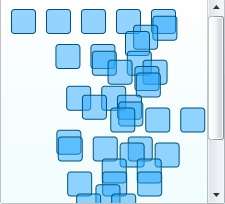
[ they are....animating! ]
You get the repositioning for free with the WrapPanel. That's what WrapPanels do - wrap the content when space becomes tight. The smooth transition you see as the rectangles are moved around is something you get thanks to the FluidMove behavior.
The FluidMove behavior animates changes caused by layout such as resizing a window or removing some items from a StackPanel. Layout changes by default are sudden with no feedback or life. Any content that is the victim of a layout change simply appears in its new location.
The FluidMove behavior intercepts the layout changes so that the content has the ability to gracefully find its way to its new location. You saw an example of this above where resizing the scrollviewer had the effect of changing how much space the rectangles had to lay themselves out. As the rectangles were rearranged, they coolly eased in to their new positions.
In the next section, you will create a small application that highlights some of the FluidMove behavior's capabilities.
Let's start by creating a simple example where we re-create a variation of the application you saw above. The following steps will basically show you how to set up your application with some content placed inside a wrappanel, and this WrapPanel is contained inside a ScrollViewer.
As you resize your applicaton, the contents of your WrapPanel rearrange themselves. If you already know how to do all of that, just go ahead and jump over to the next section where you will actually add the FluidMove behavior. Otherwise, read on for the detailed step-by-step instructions:
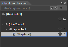
[ insert a WrapPanel into your LayoutRoot container ]
If you are in a Silverlight project and cannot find the WrapPanel by searching your Asset Library, then you are probably missing the Silverlight Toolkit. Please install it by clicking here and restart Blend. You will find the WrapPanel appear in the Asset Library after you launch Blend again.
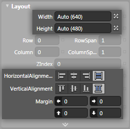
[ your WrapPanel's sizing should be Auto and Stretch ]
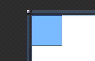
[ draw a single, lonely rectangle ]
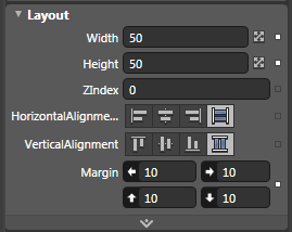
[ your rectangle will now become a square with a margin of 10 on all sides ]
The top-left corner of you artboard now look as follows:
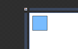
[ one...is the loneliest number (see cool video) ]
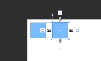
[ lonely no more ]
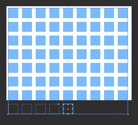
[ it is a block party - zing! ]
Ok, now we are at a good point where you have your application in a semi-finished state for what we will need. Let's move on to the next section where we will get this app closer to being finished.
In the previous section, you saw an example of the FluidMove behavior at work, got a birds-eye view of what the FluidMove behavior does, and started getting your own example up and running. In this page, let's pick up with where we left off and get your example into a state where we can FluidMove-ify it!
There are only two more things that need to be done - allowing your content to resize and putting everything into a ScrollViewer. Let's tackle the second thing first.
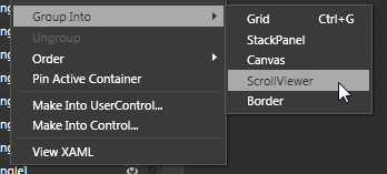
[ use the right-click menu on your WrapPanel to group into a ScrollViewer ]
Your entire WrapPanel, in a strange twist of recursive irony, will itself now be wrapped into a ScrollViewer.
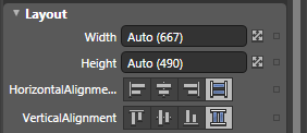
[ set the Width and Height of your UserControl to Auto ]
If everything seems to look too skewed in any one direction, use the design-time adorners (read more) to resize what your control looks like inside Blend:
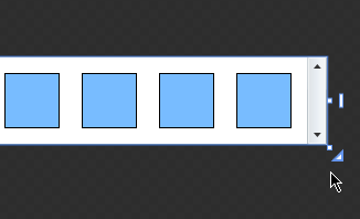
[ things may look a bit odd, so resize your content a bit ]
The reason you may have
to do this is because your browser (or window)
enforces a boundary that sets the maximum width and
height the content can be. Inside Blend, you
pretty much have a ridiculously large drawing area
where setting all Widths/Heights to Auto will cause
them to go crazy with their newfound freedom.
There is no box that will enforce a maximum width or
height that all content needs to conform to, so the
design-time adorners allow you to fake that box just
inside Blend for your design purposes. At runtime,
your browser or window will kick in enforcing the
maximum size there.
Right now, you should be all set with your content. Before you celebrate, let's just make sure that everything works. From inside Blend, hit F5 to launch your browser and to see this project at work. Your squares should rearrange as your browser's size changes.
Here is how everything looks when the browser is partially maximized:
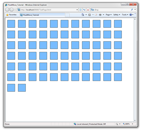
Here is how everything looks when I shrink the browser's width a bit more:
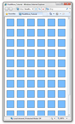
There is one important detail I would like you to note. As you are resizing, the squares wrap and move to their new location directly. You don't see any smooth transition between the old and new location. Let's fix that....in the next section!
In the previous section, you got your application working to a point where resizing your browser window would cause all of your rectangles to wrap around and require the scrollbar to see rectangles that may not immediately be in view. In this page, let's make that more fun by adding the FluidMove behavior.
Let's go ahead and add this mysterious behavior. Display your Asset Library. You can do that by either clicking on the Assets tab or clicking on the Asset Library button. The Asset Library contains a series of categories, and from these categories, select the one labeled behaviors:
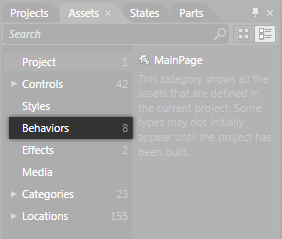
[ select the Behaviors category from the Asset Library ]
When you select the Behaviors category, the FluidMoveBehavior is something that you will see. Drag and drop that behavior onto your WrapPanel - the panel that currently is the parent of all of your rectangles. It may be difficult to drop the behavior on your WrapPanel using just the artboard, so feel free to use the object tree if you prefer:
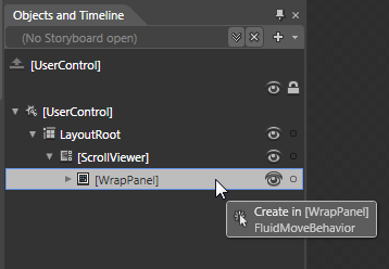
[ the object tree provides another accessible way to add a behavior ]
Once you have dropped the behavior onto your WrapPanel, you are set...sort of. We have to make some minor changes to make it useful for the scenario we are interested in.
By default, the FluidMove behavior requires a small amount of prodding and tweaking to have it work. Of course, prodding and tweaking is part of the fun when it comes to working with behaviors that deal with animation, so first make sure your FluidMove behavior is selected. With your behavior selected, take a look at the Properties Inspector:
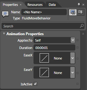
[ the FluidMove behavior's properties are now visible ]
Change the AppliesTo property from Self to Children by clicking on the drop-down and selecting the Children item. Once you have made that change, hit F5 to test your application. You may notice that all of your rectangles kind of wiggle their way into place, but see what happens when you resize your browser window. The rectangles now animate into position!
Now that we are up and running, let's make some more changes. First of all, the default duration of 1 second is simply too long. The transition needs to occur quicker, so for the Duration field, enter 00:00:00.2000000. This ensures your transition completes in .2 seconds.
If you are in Silverlight, you have the EaseX and EaseY properties as well where you can specify the easing that gets applied to the transition. For both EaseX and EaseY, select Cubic In. Your FluidMove behavior properties will now look as follows:
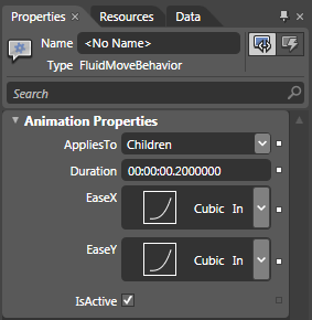
[ the EaseX and EaseY properties control the transition ]
Once you have done this, preview your application again. Notice that the rectangles now animate in to their new positions more quickly with some acceleration thanks to the Cubic easing function you specified.
All right, you are almost done. Let's look at few more examples example where FluidMove comes in handy before calling it a day.
In the previous section, we finished using the FluidMove behavior on the resizing example that you spent a few pages working on. While resizing is one scenario, another scenario that FluidMove is really useful for is when you are adding and removing children to something like a StackPanel or ListBox.
Because the basics of how to use the FluidMove behavior will not change, I am going to be more brief and provide you with source code up front instead of having you re-create an example from scratch like you did in the previous three pages.
This example will be more of a deconstruction as opposed to a full out "follow-along" steps, so go ahead and download a sample project by clicking the link below:
Once you have downloaded the above files, extract them and open the solution in Blend. Your project will look as follows:
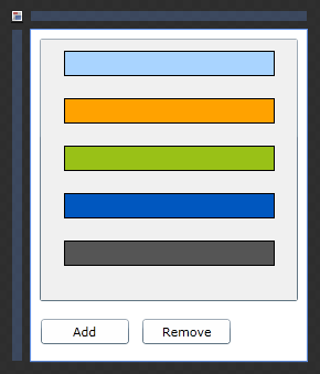
[ this does look a bit colorful! ]
As always, let's first build and run your application to see what it does. The Add button adds more colorful rectangles to your application. The Remove button does the exact opposite where it removes colorful rectangles from the application. Pretty simple.
Currently, the adding and removing of these rectangles is pretty boring. It just happens with no real visual cue as to what exactly is happening. Don't worry, the FluidMove behavior will save the day...again.
From the Asset Library, drag and drop the FluidMove behavior onto your buttonContainer StackPanel object:
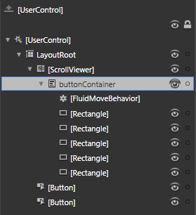
[ add the behavior to your StackPanel ]
After you drop the FluidMove behavior, it will be selected for you as well. In the Properties Inspector, just like before, change the AppliesTo property to Children. If you test your application now, notice that adding or removing rectangles involves a slight transition. You can even tweak the duration and easing functions (in Silverlight) to make your animation better if you so choose.
This example emphasizes a point I made on the first page. I stated that the FluidMove behavior intercepts layout changes and creates a transition between the starting and ending points of some element. A layout change doesn't always have to be about resizing. Removing elements from a control that stacks or wraps its children is another case, and that is what this example showed.
In both of the examples you've fiddled with in this tutorial, you set the AppliesTo property to Children. AppliesTo does not always have to be Children, though. It could also be Self:
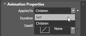
[ the AppliesTo property can be two values - Children or Self ]
The reason I always had you select Children is because we placed the FluidMove behavior on layout panels whose children we were manipulating. If you only want a single element to exhibit FluidMove powers, you would place your behavior on just that single element. The only variation from before is that, for the AppliesTo property, you will select Self instead of Children.
Download a small example that higlights AppliesTo: Self being set on the FluidMove behavior:
Open this project and run it in your browser. Resize your browser window and notice how the single rectangle animates in to its new position.
The FluidMove behavior is one of my favorite behaviors because it makes a series of common tasks that directly or indirectly affect layout just a bit more fun and engaging with minimal additional effort. I have provided the source files for all of the examples from this and the previous sections below:
Just a final word before we wrap up. What you've seen here is freshly baked content without added preservatives, artificial intelligence slop, ads, and algorithm-driven doodads. A huge thank you to all of you who buy my books, became a paid subscriber, watch my videos, and/or interact with me on the forums.
Your support keeps this site going! 😇


:: Copyright KIRUPA 2026 //--