 Tutorials
Books
Videos
Forums
Tutorials
Books
Videos
Forums


This is an archived tutorial from the kirupa.com legacy collection. It covers software that may no longer be available, but it is kept online because the ideas still hold up.
When you think of controls, your mind probably draws up images of buttons, checkboxes, listboxes, and other standard UI elements. These elements enjoy an extraordinary level of support in WPF. You can modify how these elements look using styles, templates, and skins, you can use data binding to bind them to some data, you can make them move via animations, and more! These built-in controls make up much of the visual elements most people will use in their applications.
There will be numerous scenarios, though, where the built-in controls are simply not enough. Or, as it may be, the built-in controls are a bit too much with extra unnecessary functionality or visual complexity. In such cases, what you can do is create your own control. There are two similar but different types of controls you can create yourself - user controls and custom controls. This article deals with the former, and I will give you a brief introduction to user controls and how to use them in your applications.
Abbreviated Article on Blog
For a more informal coverage of this topic, you may want to see my series of blog posts addressing the basics of user controls.
Beyond just discussing user controls, this article will also introduce you to dependency properties. Dependency properties are, in the context of this article, what make your user controls more useful and better simulate a standard WPF control. There are more details of course, but you will see them along the way. Both user controls and dependency properties are important to know individually, but in most real-world scenarios, you will rarely use one without running into the other. Let's get started.
One of the things you will create before reaching the end of the 11th page is your own user control. To give you a preview, the following image shows you a user control I created using Blend and Visual C# Express called InfoRectangle:

The InfoRectangle user control is pretty simple. It is a rectangle with curved edges, and inside that rectangle, there is a label where text is displayed. Just like any other control, I am able to use Blend to add and modify it from within my application as shown below:

Now that you have a brief, though fuzzy, idea of what you will be creating, let's dig deeper and learn more about what user controls are.
You can think of user controls as self-contained mini-applications (kind of like a widget) composed of a XAML and code-behind file. For example, our InfoRectangle user control is made up of both the InfoRectangle.xaml file where the interface is defined and the InfoRectangle.xaml.cs code-behind file where some procedural code defines the class that makes up our user control:

What sets user controls apart, though, is that you can reuse copies or instances of your user control throughout your document. Despite there being multiple instances of the user control, as shown in the earlier image, any modifications you make in either your user control's XAML or code-behind file will automatically be reflected in your user control instances.
If it helps, you will find that user controls resemble classes. Each instance of the user control you use is the equivalent of objects, and usually the user control's name signifies the type of the object.
User Controls == Flash's MovieClip?
If you are coming from a Flash background, the idea of user controls is identical to that of movie clips. While in AS2 some of the behind the scenes details were hidden from you, with AS3, user controls and movie clips seem almost identical.
They are both used to create custom reusable functionality, and they both have a separation of the visual content from the code content. In WPF, the visuals are stored in a XAML file, and for your code, you have either a VB or C# code-behind file. In Flash CS3, you also have a code-behind AS file, and the front-end visuals are stored within the SWF itself. Flex is similar to Flash CS3 except the front-end visuals are often defined in MXML files that you can see and edit.
Anyway, I think we spent enough time looking at what user controls are. In the next few pages, let's create our own user control and figure out how to use it in our applications before extending our user control with dependency properties.
In the previous section, you received a brief introduction to user controls and what they are. Parts of what you just read may still seem unclear, but let's tunnel through and try to create and use a user control. Hopefully, by the time you create and see the user control in action, many of confusing pieces will hopefully fall into place.
Currently, Microsoft has a free, fully-functional 60-day preview of Blend 2 available. One of its improved features is the ability to allow you to easily create user controls! You can have Blend 2 installed side-by-side Blend 1, and at around 25 MBs, it is a quick and painless download/install. Please download and install the product before proceeding further. For any code you will write, you can just use Visual C# Express!
Visual Studio 2008 / Express
Visual Studio 2008 was released at the time of this tutorial going live, and any information found in this tutorial will work fine in Visual Studio 2008 or the 2008 version of Visual C# Express.
With Blend 2 installed, launch it. The following steps will outline how to create a user control:
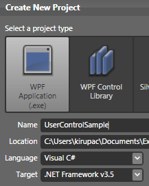
[ Create a new project called UserControlSample ]
Note - Visual Studio/Express 2005 Users
If you are using Visual Studio 2005 or Visual C# 2005 Express, change the Target type from .NET Framework v3.5 to .NET Framework v3.0
Give your project the name UserControlSample (or something more clever if you want!), ensure that the Language is set to Visual C#, and click OK to create your new project and to close this Create New Project window.

[ Draw a rectangle by using the Rectangle tool from your Toolbox ]

[ your (slightly) more refined rectangle ]

[ one of the new features in Blend 2 is the Make Control command ]
From the menu that appears, click on the Make Control command.

[ from the Make Control window, give your control the name InfoRectangle ]
Click OK once you are finished, and brace yourself for the changes ahead. (I'm being sarcastic...or am I?)

[ you will find your Artboard displaying only your rectangle in your newly created InfoRectangle.xaml file ]
Like you saw in the previous section, if you look in your Projects panel, you will see that InfoRectangle and InfoRectangle.cs have been created automatically for you:
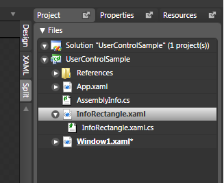
[ a user control is nothing more than a XAML file and a corresponding code-behind file ]
I will review some of these changes later, but let's make our user control slightly more useful. In the next section, you will finish up some more work on the user control and learn how to use it in an application.
In the previous section, you learned how to take something you drew on your Artboard and create a user control. Let's make some more modifications to our user control on this page.
If you recall, in the first page, I showed you the user control you will create. Besides having a rounded rectangle for its background, it also had an area for displaying text:
Let's modify our user control by adding a Label which can be used to display our text:
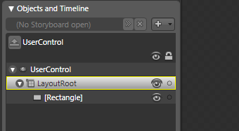
[ ensure LayoutRoot has default selection ]
If LayoutRoot is not the selected layout panel, double click on it to make it the default panel. This ensures that any new controls you add get automatically placed as a child of LayoutRoot.
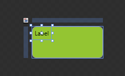
[ when you add a Label control, it's added to the default top-left location with the word Label as its content ]
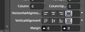
[ set your Label's Horizontal and Vertical alignments to Stretch
Once you have set your label's width and height to fill up any available space, your user control's label will look like the following image:
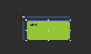
[ thanks to the Stretch property, your Label now takes up all available space ]
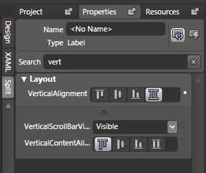
[ the incremental search feature allows you to quickly find the property or properties that you are interested in editing ]
From the VerticalContentAlignment property, click on the second button to set your content's vertical alignment to be Centered. Once you have clicked the Center button, your label will look like the following:
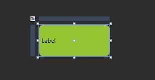
[ your label's content is no vertically center aligned ]
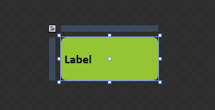
[ our text is larger, bolder, and sporting a different font ]
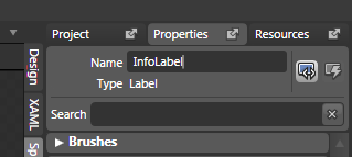
[ give your label the name InfoLabel ]
Alright! Now you have a user control with a rounded rectangle and a label that you can use to customize what gets displayed. Creating the user control is not the fun part - actually getting to use it is.
In the next section, let's look at how to use our newly created user control.
In the previous section, you added a label to our user control. In this page, let's learn how to actually use the user control in our application.
In Blend, open your Window1.xaml file that you created many pages ago. That file may already be open, so just click the Window1.xaml tab if that is the case. If you recall, you drew a rectangle on this page, and it is this rectangle that got converted into a user control. Right now, you should see an error message inside your user control that looks like the following:
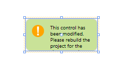
[ a cut-off error message that basically asks you to rebuild the project ]
Don't worry. That message is normal. What you need to do is rebuild your project. You can rebuild your project by going to Project | Build or by pressing Ctrl + Shift + B. Once your project has been rebuilt, the above error message will be replaced by a properly working instance of your InfoRectangle user control:
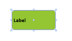
[ your InfoRectangle user control displayed in Window1.xaml ]
Think of your user control like any other control that you normally would use. You can create multiple copies of this user control, rotate it, scale it, and so on:
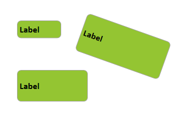
[ multiple instances of your user control displayed in your artboard ]
Copying and pasting an existing user control on your Artboard is not the only way to create more user controls. A more formal way actually exists for the numerous cases when you won't have an original copy to work from!
From the Toolbox, display your Asset Library by clicking on the appropriately named Asset Library icon:
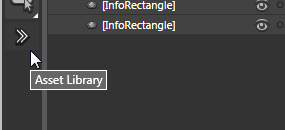
[ the Asset Library icon allows you to access the Asset Library where all of the controls your project recognizes live ]
Once you have clicked on the Asset Library icon, the Asset Library window will appear. Click on the tab marked User Controls. Once you have clicked on the tab, you will see your InfoRectangle control appear:
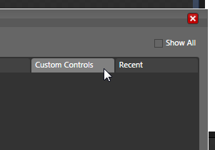
[ click on Custom Controls to display the InfoRectangle user control you created ]
Once you select your InfoRectangle control, your Asset Library window will disappear. Seems anti-climatic, but actually, your InfoRectangle user control will now find its way as an icon on your toolbox:
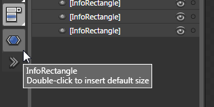
[ your InfoRectangle control's icon will appear in the toolbox ]
You can click on the InfoRectangle icon and draw a control of the size you are looking for, or you can (as the caption says) double-click on the icon to insert the user control at its default size.
Up until now, have we really used the user control? In this page, you saw the various ways of populating your Artboard with the user control you created, but right now, all you really have are just numerous copies of a user control containing whatever default values it contained. For a purely visual user control, this would be fine. Your job would be done and this tutorial is largely over.
Fortunately for you, the user control you created also provides you with some text based information. Right now that information isn't all that useful, for it just displays the default Label text. You probably would like to display something else in its place. You also have no way to change the background color. Let's look into fixing that in the next section.
In the previous section, you were promised that you would learn how to use your user control. While technically you did learn how to use your control, realistically, because of the extra functionality our user control has, we didn't get to use our user control to its full potential.
When editing your user control by having InfoRectangle.xaml open in Blend, you have access to all of your user control's nested controls and their properties. When you place your user control somewhere else - such as Window1.xaml - you no longer have direct access to edit the user control's children controls. For example, when you select your InfoRectangle instance in Window1.xaml, you have no direct ability to see inside your control and pick out your InfoLabel's Content property or adjust your rectangle's background color.
Accessing User Control Properties via Code
Because a user control can be considered a class, you can access any of your user control's properties using code itself. For example, to change the value of your InfoRectangle user control's InfoLabel label's content, you could just do the following:
InfoRectangle foo = new InfoRectangle;
foo.InfoLabel.Content = "New Content!";
Of course, this isn't the best way to do this, for the clean separation between visual properties and code is one of the advantages of WPF. You will learn the better dependency property approach for accomplishing the same thing in the following sections.
There seems to exist a barrier that prevents you from accessing those properties that you could easily access when editing the user control itself. Of course, because we want each instance of our user control to have different text and background colors, we cannot edit InfoRectangle.xaml directly. Like you saw described in the first page, any modification you make to your user control's XAML or code-behind file automatically gets applied to all instances of the user control that exist in your project.
Fortunately, this is something that the WPF designers thought about, and a formal (very formal) mechanism exists for registering any properties you are interested in exposing to a parent that will be hosting your user control. Those properties are known as Dependency Properties, and you'll be introduced to them in greater detail shortly.
One thing we want to do is make our InfoLabel editable by a parent such as Window1.xaml. In Blend, open or navigate to our InfoRectangle.xaml file. The text that is currently displayed is located in our InfoLabel's Content property:
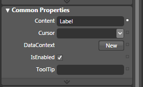
[ your label's Content property is what determines what gets displayed ]
Remember that piece of information, for it will come in handy real soon. What we need to do now (unfortunately?) is write some code. Click on the Project tab, right click on your UserControlSample C# solution, and from the menu that appears, select Edit in Visual Studio:
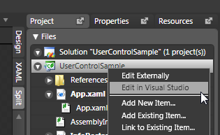
[ we will need to edit our project in Visual Studio (or C# Express) ]
After a few moments, Visual Studio will launch. Once Visual Studio has launched, find the Solution Explorer on the top-right corner of your screen. This view is very similar to the Project view you see in Blend.
From the Solution Explorer, expand the InfoRectangle.xaml node to display the InfoRectangle.xaml.cs file:
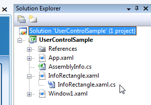
[ your Solution Explorer displays all of the files currently used by your project ]
Double click on the InfoRectangle.xaml.cs file to open it in Visual Studio. Currently, this file doesn't really have much content. Let's change that. What we are going to do is create a dependency property that allows you to easily change our user control's text. Don't worry if you are not sure what dependency properties are or what the following snippets of code mean. I will cover that in greater detail in the next section.
Add the following lines of code below your InfoRectangle constructor:
public string InfoText
{
  get
  {
  return (string) GetValue(InfoTextProperty);
  }
  set
  {
  SetValue(InfoTextProperty, value);
  }
}
  public static readonly DependencyProperty InfoTextProperty =
  DependencyProperty.Register(
  "InfoText",
  typeof(string),
  typeof(InfoRectangle),
  new FrameworkPropertyMetadata(
  new PropertyChangedCallback(ChangeText)));
private static void ChangeText(DependencyObject source, DependencyPropertyChangedEventArgs e)
{
  (source as InfoRectangle).UpdateText(e.NewValue.ToString());
}
private void UpdateText(string NewText)
{
  InfoLabel.Content = NewText;
}
Once you have copied and pasted the above code, press F6 to make sure you are not receiving any build errors. In the next section, let's take a look at what happens in Blend, and more importantly, let's backtrack and revisit in detail the code you copied and pasted.
In the previous section, while you may not realize it right now, you took a giant leap in making your user control more usable. In this page, you'll see the results of the changes you made as well as learn what exactly the changes you made are.
At this point, you copied and pasted into your InfoRectangle.xaml.cs file some code and hit F6 to make sure everything was working properly. Go back into Blend and rebuild your solution by going to Project | Build or by pressing Ctrl + Shift + B.
In Window1.xaml, select or insert an instance of your InfoRectangle user control with your mouse, and take a look at the Miscellaneous panel in your Properties pane:

[ Do you see anything interesting in your Miscellaneous panel? ]
Notice that you now have a field called InfoText visible. Select that field and type something such as Hello and press Enter:

[ enter the word Hello in your InfoText property ]
After you have pressed Enter, notice that the text inside your user control also changed to display what you entered in the InfoText field:

[ your InfoText user control's text has now changed ]
You can repeat that for every other InfoRectangle user control you have displayed in your Artboard. If you look at the XAML for your user control, you will see that the InfoText property was set directly:
<UserControlSample:InfoRectangle .... InfoText="New Text!"/>
If it wasn't for what you did earlier, you could not have set the value for your text via XAML. You would have had to write C# code instead to directly add your text to the appropriate InfoRectangle instance.
The code you copied and pasted helped define a dependency property. A dependency property is just like a regular property, except this property is tied deeply into the WPF property system. I will explain more along the way, but let's first explore the mechanics of the three parts that are needed to create a dependency property.
The first part is the CLR wrapper that allows your dependency property to be accessed via code:
public string InfoText
{
  get
  {
  return (string)GetValue(InfoTextProperty);
  }
  set
  {
  SetValue(InfoTextProperty, value);
  }
}
In .NET, Properties allow you to easily assign and retrieve a value using either the get or set keyword. In most general cases, the property itself is responsible for storing the data, but in the case with dependency properties, the data is stored deep inside the property system.
The only way to gain access to that data is by either using GetValue or SetValue on the dependency property itself, and that is what we are doing.
Now, you may be wondering why this is known as a CRL wrapper. The main reason is that this runs only when InfoText is called in code. When you used Blend to set the value of the InfoText property from the Miscellaneous panel, you didn't access this section of code at all. It was all done via XAML as shown as shown earlier!
That isn't to say that you can avoid this section of code if you never plan on using C# code to set your properties. When compiling your application, this section of code is needed. When you actually run your application, though, this code is bypassed when you use XAML to set the property.
Because our InfoText property is only called from code, you should be careful to not add any extra code to either your get or set sections unless you want that code to only run when this property is accessed via code. After all, any changes to our InfoText dependency property made directly via XAML (such as what you did in Blend) will not cause your get/set statements to execute at all.
In this really long line (broken into several lines for space reasons), you actually declare and register your dependency property:
public static readonly DependencyProperty InfoTextProperty =
DependencyProperty.Register(
"InfoText",
typeof(string),
typeof(InfoRectangle),
new FrameworkPropertyMetadata(
new PropertyChangedCallback(ChangeText)));
The first thing to note is that there is a naming convention that you must follow. Your static field must be your dependency property's name appended by the word Property. That is why, in the above code, our static field declaration is called InfoTextProperty.
The next thing to do is register this property:
public static readonly DependencyProperty InfoTextProperty =
DependencyProperty.Register(
"InfoText",
typeof(string),
typeof(InfoRectangle),
new FrameworkPropertyMetadata(
new PropertyChangedCallback(ChangeText)));
Registering your property is interesting because it really doesn't make a lot of sense because the behind the scenes details are hidden from view. The main thing to remember is that, deep under the hoods, WPF has an advanced property system that keeps track of the various dependency properties used in an application. There are various handshakes that you need to know in order to access the property system, and depending on how you shake its hand, different results are possible.
Let's look at our DependencyProperty's Register method in greater detail:
public static readonly DependencyProperty InfoTextProperty =
DependencyProperty.Register(
"InfoText",
typeof(string),
typeof(InfoRectangle),
new FrameworkPropertyMetadata(
new PropertyChangedCallback(ChangeText)));
The first argument you pass in refers to the name of the DependencyProperty you wish to register. Since our DependencyProperty is called InfoText, that is the value you enter here. If you were to change your value to something else besides what you named your DependencyProperty, you will find that, while your code wont produce an error, assigning values to your InfoText property via XAML is routed through your CLR wrapper. There are some other (more unwanted) side effects such as issues with applying styles, data binding, and so on, so be sure to specify your dependency property's name.
We covered quite a bit of ground in this page, but there is more code explanation to do. Let's continue digging through our code in the next section.
In the previous section, we began to take a look at our code that makes up our dependency property. We started to look at the various argument passed to our Register method, so let's continue from where we left off:
public static readonly DependencyProperty InfoTextProperty =
DependencyProperty.Register(
"InfoText",
typeof(string),
typeof(InfoRectangle),
new FrameworkPropertyMetadata(
new PropertyChangedCallback(ChangeText)));
The second argument refers to the type of our dependency property. In our case, InfoText is a string, and we use the typeof function to specify the type - hence why we have typeof(string) specified instead of just string.
public static readonly DependencyProperty InfoTextProperty =
DependencyProperty.Register(
"InfoText",
typeof(string),
typeof(InfoRectangle),
new FrameworkPropertyMetadata(
new PropertyChangedCallback(ChangeText)));
The third argument looks similar to what we wrote earlier. What you are specifying is the type of the class that owns this dependency property. In this case, you are declaring this dependency property inside your InfoRectangle user control, and that is the value you provide here.
public static readonly DependencyProperty InfoTextProperty =
DependencyProperty.Register(
"InfoText",
typeof(string),
typeof(InfoRectangle),
new FrameworkPropertyMetadata(
new PropertyChangedCallback(ChangeText)));
The final argument to our Register method is defining our
dependency property's metadata. This information is used internally for
various uses such as determining the initial value of your dependency
property, how it gets redrawn, etc, and there are numerous overloads
that provide you with access to various combinations
of things you can specify as metadata. Our needs are fairly simple, so
my only argument is to create a new
PropertyChangedCallback object with a function called
ChangeText as its argument.
Your
PropertyChangedCallback
object is fired every time your dependency property InfoText is changed.
That means, when you change the value of your text from within Blend,
your PropertyChangedCallback receives notification and calls whatever
method it is setup to call - in our case, ChangeText! Let's take a look
at our ChangeText method in greater detail.
The property callback method is an optional method you can specify to handle any changes made to your dependency property. Earlier, you created a new PropertyChangedCallback object with the ChangeText method specified as the handler for any changes:
private static void ChangeText(DependencyObject source, DependencyPropertyChangedEventArgs e)
{
  (source as InfoRectangle).UpdateText(e.NewValue.ToString());
}
Our ChangeText method isn't your standard, run-of-the-mill method. It resembles an event handler in many ways, and because it is a static method, you cannot directly reference any object inside your current InfoRectangle class. That explains the weird syntax where I am casting our source input argument in terms of InfoRectangle:
(source as InfoRectangle).UpdateText(e.NewValue.ToString());Using as ObjectType for casting a variable is another way of writing the above as:
((InfoRectangle) source).UpdateText(e.NewValue.ToString());The last thing to observe from the above line of code is that I am making a call to our UpdateText method, and I pass in our event argument's NewValue method as a string: e.NewValue.ToString(). If for some reason you wanted the old value stored by your dependency property, you could always use e.OldValue. Let's look at our UpdateText method now.
private void UpdateText(string NewText)
{
  InfoLabel.Content = NewText;
}
Our UpdateText function is a normal private void function. That means that you can access your current variables and design elements without having to do any of the casting wizardry that you did earlier. What I am doing is setting our InfoLabel's Content property to the new value passed in by our ChangeText property. This allows the actual content in our label to be updated when our dependency property has been updated.
So, let's recap at a higher level so that you understand how all of these various pieces work. Our user control used a label to display some text. What we wanted to do is make it possible to set our text's value directly via XAML using Blend. The way to do that would be to create a dependency property that, when changed, would update your label's content based on what you entered.
The dependency property we created is called InfoText. First you created the CLR wrapper that used GetValue and SetValue to send or retrieve any information to the WPF property system via code. The critical piece was our field declaration where you created a DependencyProperty object called InfoTextProperty that specifies various characteristics of your dependency property. One characteristic was the PropertyCallback method that calls a method you specify each time your dependency property is modified. The method that received the property changed notification in our case was ChangeText, and that method in turn did the remaining work required to display some new text in our user control.
In the previous section, we wrapped up our code explanation and took a quick review of how the code works to help produce the results you saw (many!) pages ago when you changed your user control's text inside Blend.
To cement what you learned and to help me make a convincing case for dependency properties, let's create another dependency property, which as you will see, makes all of this trouble worthwhile! Let's add another dependency property that allows you to change your user control's background color. Since many of the steps will be a review, I won't be as wordy this time around.
Currently, your InfoRectangle has a solid green color. There is no way to change that color on a per instance basis like you can right now with the InfoText that gets displayed. Let's change that.
Go back to Blend and make sure you have InfoRectangle.xaml open for editing. Our background color is based on the background color of our rectangle shape. To reference our rectangle, we need to give it a name - something which I didn't explicitly call out when you created the rectangle originally.
Select the rectangle and edit it's Name property or right click on it in the Objects and Timeline panel and select Rename. Whichever path you take to renaming your rectangle, give your rectangle the name BackgroundRectangle:
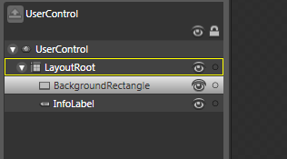
[ rename your rectangle shape to BackgroundRectangle ]
Once you have given your rectangle the BackgroundRectangle name, make sure to save the file. Now, Let's go back to Visual Studio and register a dependency property that allows you to modify the rectangle's background color.
Unfortunately, there is no way to avoid writing code when wanting to make something accessible by a dependency property - as you saw earlier. In Visual Studio, hit F6 or or go to Build | Build Solution to build your solution to make sure that Visual Studio is aware of the latest changes you made in Blend such as giving your rectangle the BackgroundRectangle name.
With your project built, copy and paste the following code below your existing code:
public Brush RectangleColor
{
  get
  {
  return (Brush)GetValue(RectangleColorProperty);
  }
  set
  {
  SetValue(RectangleColorProperty, value);
  }
}
public static readonly DependencyProperty RectangleColorProperty =
DependencyProperty.Register(
"RectangleColor",
typeof(Brush),
typeof(InfoRectangle),
new FrameworkPropertyMetadata(
new PropertyChangedCallback(ChangeColor)));
private static void ChangeColor(DependencyObject source, DependencyPropertyChangedEventArgs e)
{
  (source as InfoRectangle).BackgroundRectangle.Fill =
  e.NewValue as Brush;
}
Go back into Blend and rebuild your solution (Ctrl + Shift + B / Project | Build Solution). Select an InfoRectangle instance and glance over at your Miscellaneous panel:

[ where is the RectangleColor dependency property? ]
Notice that you can see your InfoText dependency property, but there is no entry for our RectangleColor. That is because our RectangleColor is a Brush type, and Blend categorizes properties that deal with Brush types in your Brushes panel. If you scroll up and look in your Brushes panel, you will see your RectangleColor property listed:
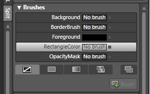
[ ah, that is where RectangleColor is - in the Brushes panel ]
Select your RectangleColor brush and click on the the Gradient Brush icon below. You have access to Blend's gradient color picker, and you can change your InfoRectangle's background color from the Brushes panel itself:

[ you can change the color via Blend now ]
Of course, all of this doesn't help if your InfoRectangle's background itself isn't modified. Luckily, thanks to the magic of dependency properties, any change you make in the Brushes panel is automatically reflected in your selected InfoRectangle instance:
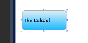
[ your InfoRectangle instance sports a different (possibly cooler) color! ]
Alright - we are almost done fiddling with our user control. In the next section, let's go back and look through the code we used for creating our RectangleColor dependency property.
In the previous section, you created another dependency property called RectangleColor that allows you to easily change the background color of the rounded rectangle in your user control. Just like before, you copied and pasted some code I provided, but unlike before, there are some differences, so let's take a look at the code and see what is interesting:
public Brush RectangleColor
{
  get
  {
  return (Brush) GetValue(RectangleColorProperty);
  }
  set
  {
  SetValue(RectangleColorProperty, value);
  }
}
In the above section of code, we create the CLR wrapper for our new dependency property called RectangleColor. Just like before with InfoText, you have a get/set implementation that ties you into the WPF property system via GetValue and SetValue. Finally, notice that the return value of our dependency property is of type Brush.
public static readonly DependencyProperty RectangleColorProperty =
DependencyProperty.Register(
"RectangleColor",
typeof(Brush),
typeof(InfoRectangle),
new FrameworkPropertyMetadata(null,
FrameworkPropertyMetadataOptions.AffectsRender,
new PropertyChangedCallback(ChangeColor)));
Here is our public, static, and read-only DependencyProperty declaration where we register our RectangleColor in WPF's property system. Much of this should be review. The first argument to our Register method is the name of our dependency property, RectangleColor. The second argument is the return type of our property, and in our case, it is a Brush. The final, third argument that should be familiar to you is the type of this dependency property's owner. Our owner is still the InfoRectangle class, so that is what we specified..
public static readonly DependencyProperty RectangleColorProperty =
DependencyProperty.Register(
"RectangleColor",
typeof(Brush),
typeof(InfoRectangle),
new FrameworkPropertyMetadata(null,
FrameworkPropertyMetadataOptions.AffectsRender,
new PropertyChangedCallback(ChangeColor)));
The last argument you pass in to our register method is our FrameworkPropertyMetadata object. That hasn't since what you did before with InfoText. What is different now is the number of arguments you pass into our new FrameworkPropertyMetadata constructor, for there are overloaded methods and then there are overloaded methods. The FrameworkPropertyMetadata constructor falls in the latter category with a whopping eleven variants:

Anyway, we are passing in three arguments into our FrameworkPropertyMetadata constructor. The first argument sets the default value of our dependency property. I am simply keeping it at null. The second argument sets some extra metadata for our property that defines how it will impact other properties and controls in your applications. Let's explore that further.
Dependency properties do not always just refer to simple data that is loosely attached to the WPF property system. In many cases, your dependency property affects layout, data binding, how things are rendered, etc. It is helpful to call out what your dependency property, and that is what we do in the above code. Because we are modifying a Brush that visually affects how an object looks, I am specifying the AffectsRender item from the FrameworkPropertyMetadataOptions enumerator.
The third and final argument is where I specify our familiar property callback method. Whenever a change is made to RectangleColor such as changing the color via XAML or using Set via code, then this method, called ChangeColor in our case, gets called. Let's take a look at ChangeColor.
private static void ChangeColor(DependencyObject source, DependencyPropertyChangedEventArgs e)
{
  (source as InfoRectangle).BackgroundRectangle.Fill = e.NewValue as Brush;
}
Because this is static method, we have no way of using the this keyword to reference your current object. That part is review. We cast our source as the InfoRectangle type and directly set our BackgroundRectangle's Fill property using our event argument's NewValue property. Because our dependency property is of type Brush, I cast the new value as Brush also.
Notice that, unlike with InfoText, I am not creating a separate method to handle assigning our Fill property the new value. There is no right or wrong way to do that, so I just wanted to show that it is possible to apply your property changes directly via your callback method without having to use a separate helper method also.
We are nearing the end of this tutorial with the previous section coming up! I will discuss why dependency properties are useful and demonstrate their usefulness by animating our RectangleColor property.
In the previous section, you saw an explanation of the code that went into making our RectangleColor dependency property.
The last item this tutorial will discuss is why dependency properties are useful. You can easily get by without ever using dependency properties. If I am trying to convince you of why you need dependency properties, I am obviously not helping by showing you several pages of bizarre and code and explanations.
Joking aside, dependency properties are useful because many styling, data binding, animation, etc. scenarios are made much easier because of them - especially if you are working directly in XAML. To see this in action, let's look at how we can animate our RectangleColor property.
In Blend, go back to Window1.xaml where your InfoRectangle instances are. Select a InfoRectangle instance and give it a snazzy new background color such as what I had in the previous section:
[ an InfoRectangle instance with a modified RectangleColor ]
Now, with this same InfoRectangle selected, let's create a simple animation where you animate your background gradient. Because this tutorial is not about how to create animations, I'm going to breeze through this section. Feel free to read my earlier Introduction to Blend: Animation article for more in-depth coverage.
Create a new storyboard, and at the 0, 1, and 2 second marks, insert a new keyframe. Your timeline should look like the following image:

[ insert a keyframe at times 0, 1, and 2 ]
Now, move your playhead to the 1 second mark. Once there, modify your InfoRectangle's RectangleColor property. For example, I changed my gradient color to be more yellow-ish:
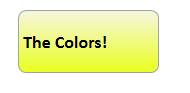
[ at the 1 second mark, I change my RectangleColor property to what you see above ]
If you slide your playhead between the first and second frames, you will see your gradient color animating also! This is something that would not have been able to do as easily had your RectangleColor property not been a dependency property. Sure, you could have gotten away with creating this animation in C# code, but it is much easier to use Blend to visually create your animation as opposed to writing code.
The main takeaway is that dependency properties are a link to the internals of WPF's property system. In most cases, you will probably never have to write your own dependency property. All of WPF's controls have majority of their properties implemented as dependency properties, so you gain all of the advantages of using WPF's property system without having to write a single line of code.
There will be situations, though, were you will want to create your own controls such as the InfoRectangle user control you created in this tutorial. By registering some of your newly created/modified properties in your user control, you make it easier for any parent that hosts your user control to have the same level of flexibility normally enjoyed by the controls that come built-in with WPF.
Just a final word before we wrap up. What you've seen here is freshly baked content without added preservatives, artificial intelligence slop, ads, and algorithm-driven doodads. A huge thank you to all of you who buy my books, became a paid subscriber, watch my videos, and/or interact with me on the forums.
Your support keeps this site going! 😇


:: Copyright KIRUPA 2026 //--