 Tutorials
Books
Videos
Forums
Tutorials
Books
Videos
Forums


This is an archived tutorial from the kirupa.com legacy collection. It covers software that may no longer be available, but it is kept online because the ideas still hold up.
In Silverlight and WPF, you have the ability to design fluid/auto layouts that allow your application to automatically adapt to varying screen sizes and available space. As a designer, working with fluid layouts can be tricky because you now have to design your application to work under various sizes. You don’t have the luxury of having pixel-precise positioning at all times, and depending on how your project is setup, being able to publish and preview frequently might not be possible.
To help with that, when creating WPF or Silverlight applications, Expression Blend provides you with a feature known as design-time sizing. Design-time sizing provides you with a special way of resizing your application on the Blend design surface to preview how your application will look at different sizes.
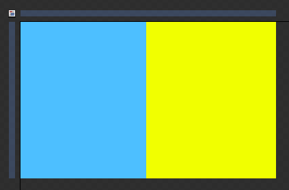
Now that you have a basic idea of what this does, let's look at the problem in a little more detail. Below, I have two rectangles that have been positioned right next to each other inside a Grid:
[ two rectangles arranged side-by-side in a Grid ]
The blue rectangle’s width is fixed. It will always stay at the width you currently see it at. The yellow rectangle is different. It’s width is set to stretch. That means it will take up as much horizontal space available to it. Both rectangles have their heights set to Auto. That means they will take up as much vertical space they can find.
Herein lies the problem that I stated textually earlier. How can I preview this functionality without actually running the application? I could resize the Grid control that the elements are currently in, but I really don’t want to modify any property that also affects the final output. How can I design something that would look nice across all possible sizes?
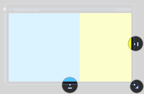
The answer lies in design-time resizing. When your window in WPF or usercontrol in Silverlight has its width and height set to Auto, adorners for setting your application’s design-time size become visible:
[ the design-time adorners ]
These adorners, located directly outside of your regular square shaped adorners for altering your element’s width or height, allow you to simulate in real-time on the design surface how your application will look in various combinations of height and width.
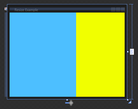
For example, as I drag my design-time height adorner down, notice what you see:
[ resizing the design-time adorner resizes the rectangles accordingly ]
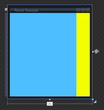
My rectangles are filling up the extra vertical space that is becoming available to them. The same is true when I play with my horizontal design-time adorner:
[ adjust the horizontal design-time adorners adjusts the width of your yellow rectangle ]
The horizontal sizing is interesting because, if you remember the description of the two rectangles I gave earlier, our blue rectangle’s width is fixed. It will always stay the same size regardless of how much space is available to it. The yellow rectangle is different. It will take up however much space it has available to it.
In the above screenshot you can see that as your window’s size gets smaller, the amount of space taken up by your yellow rectangle decreases accordingly. To put it differently, your yellow rectangle’s size is automatically adjusted without you having to do anything extra, and you were able to see that on the design surface without actually running your application.
Ok, now that you've gotten a better understanding of the problem, let's look at how to use this in Expression Blend in the next section.
In the previous section, you learned about design-time sizing and how that functionality works inside Blend. In this page, I will explain how to actually use it.
To actually use the design-time sizing functionality, make sure you have a WPF or Silverlight project open in Blend. Look at the root element in your object tree.
For WPF projects, your root element will be Window for a window or UserControl for a custom user control:
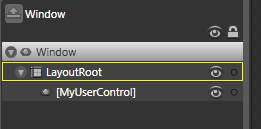
[ Window root element for WPF applications ]
This is applicable to user controls you create as well:
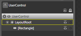
[ UserControl root element for WPF user controls ]
For Silverlight, your root element will always be a User Control:
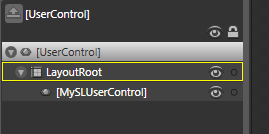
[ UserControl root element for Silverlight pages and user controls ]
In Windows Phone applications, you will only be able to resize usercontrols. Because the device's resolution is fixed, the root PhoneApplicationPage
Now, select a root element (Window, WPF User Control, or SL User Control) and look in your Properties Inspector at the Width and Height properties in the Layout category:
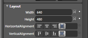
[ focus on the Width and Height properties in your Layout category ]
Click on the Auto button next to the Width or Height property to set your application's width, height, or both to Auto. This allows your application to automatically size itself based on how much space it needs or has available. You will also notice that your design-time resize adorners become visible:
[ your design-time resize adorners become available after you set the size to Auto ]
When you set the width and height of your root element to Auto, you may want to limit how large or small your application actually gets. While you cannot do that by altering the Width and Height properties, you can do so by altering the MinWidth, MinHeight, MaxWidth, and MaxHeight properties.
You can access these properties by expanding the Layout category further by clicking on the Advanced Properties expander:
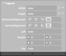
[ click on the Advanced Properties expander to see more Layout properties ]
Once you have expanded that, you will see the properties for setting your minimum and maximum width and height:
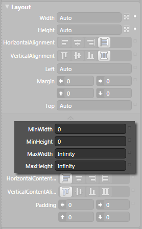
[ adjust the minimum and maximum width and height properties to limit how resizable your application will be ]
By setting these properties to something other than 0 and Infinity, you can limit how small or how large your application's size can be.
So, why is this called design-time resizing? Your resizing action has the design-time adjective because this does not affect how your final application will look. All of these changes you make using the design-time adorners are just for you to design inside Expression Blend. When you actually run your application, the actual properties for width/height set on the elements will take over.
More specifically, if you look at your XAML, any changes you make using your design-time adorners are written using an ignorable DesignWidth and DesignHeight value that is not used when you actually build and compile your application.
							...mc:Ignorable="d" d:DesignWidth="581"
d:DesignHeight="355">To quickly summarize, design-time sizing is a way to see on the design surface what your application will look like at varying sizes. This is known as design-time sizing because these sizes are only applicable on the design surface. Your final WPF or Silverlight application will not be sized at the size you see inside your design surface.
Just a final word before we wrap up. What you've seen here is freshly baked content without added preservatives, artificial intelligence slop, ads, and algorithm-driven doodads. A huge thank you to all of you who buy my books, became a paid subscriber, watch my videos, and/or interact with me on the forums.
Your support keeps this site going! 😇


:: Copyright KIRUPA 2026 //--