 Tutorials
Books
Videos
Forums
Tutorials
Books
Videos
Forums


This is an archived tutorial from the kirupa.com legacy collection. It covers software that may no longer be available, but it is kept online because the ideas still hold up.
All of your controls in Silverlight come with pre-defined states. These states allow you to more precisely define what your control does in various situations. For example, a standard button may have different visuals that appear by default, when you mouse over it, or when you click on it:
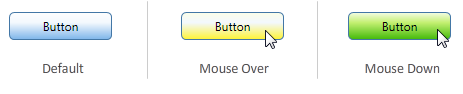
These states are provided for you, and you get to see and modify them easily in Expression Blend when you edit the button's template...as shown in Page 3 of the Creating Custom Buttons tutorial:
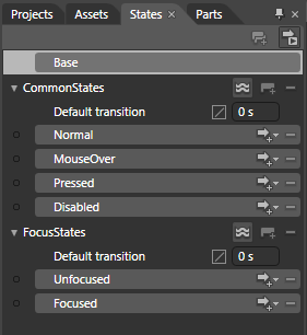
[ the states provided for you when editing a Button's template ]
States defined for you provide another advantage besides easy discoverability inside Blend. The control contains logic that fires the appropriate state as necessary without you having to do any manual wiring of events to a particular state.
All of this is great when you are editing an existing control that has states predefined. If you are creating your own Control (or UserControl), you don't have the same level of hand holding. You have to both define your states and do some additional wiring to make the states active at a given time.
Fortunately, doing all of this on your own is not particularly hard at all. Take a look at the following example where a custom UserControl toggles between a "small" and "large" state when the Toggle Size checkbox below it is clicked:
[ click on the Play button to see the animation you will be creating ]
In this tutorial, you will learn how to create an example similar to what you see above where you create your own usercontrol, define a few states, and learn how to wire up the states using both code as well as behaviors.
Because this tutorial is very specific to using custom states, I am not going to have you go through and create an application from scratch. Instead, I am going to provide you with a sample project that will provide a good starting point:
Once you have downloaded and extracted the above source files, launch Expression Blend 3 and open the CustomVSMStates project. Your Projects pane will look similar to this once you have opened the project:
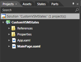
[ your Projects pane displays your recently opened project ]
Ok, this seems like a good place to stop. This page took care of introducing the topic and getting you up and running with the sample project. In the next section, let's actually start creating our usercontrol and adding some states.
If the previous section got you started, in this and subsequent pages, we'll get into the details of creating the UserControl and the states.
With the CustomVSM project currently opened in Blend, take a look at your artboard. You will see a small square (rectangle) towards the center of your application. Go ahead and select it with your mouse cursor:

[ select the square on your artboard ]
Currently, this square is simply a primitive shape. What we want to do is convert this square into a UserControl. With the square selected, press F8 or go to Tools | Make into UserControl. Once you have done this, the Make Into UserControl dialog will appear with a Name field prominently displayed.
Inside the Name field, give your UserControl the name ColorfulRectangle:
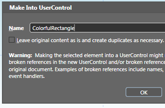
[ give your new UserControl the name ColorfulRectangle ]
After you have changed the name in the Name field, press OK to go ahead and turn your lowly rectangle into a less lowly UserControl. Once you have done this, you will see that a XAML file called ColorfulRectangle has been created and opened with your rectangle as its content:

[ your shape is now contained inside a UserControl ]
Great, you are now inside your UserControl editing the same rectangle that you were dealing with earlier in its non-UserControl form in your MainPage.xaml. The next step is to create some states.
Like I mentioned earlier, because this is not a built-in UserControl, no states are defined for you. You will have to define them yourself. From the list of tabbed panels displayed by default on the top-left of your Blend window, go ahead and display the States panel by clicking on the tab marked States:
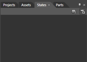
[ click on the States panel to see where your States live ]
Right now, your States panel is going to look pretty empty. Let's fix that. First, add a new visual state group by clicking on the Add State Group button found on the top-right of your States pane:
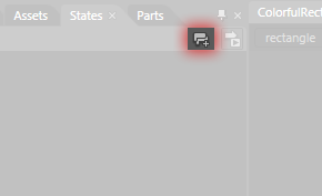
[ click on the Add State Group button to add a new state group ]
Once you have clicked that button, a Base state along with a category for your visual state group will appear:
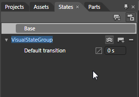
[ a Base state and a state group will appear ]
The category's default name will be VisualStateGroup, but let's make it a bit more descriptive by renaming it to the word Sizes:
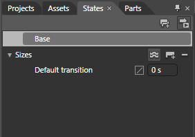
[ rename your state group to the word Sizes ]
While the state group name will be highlighted by default once you add a new state group, if for some reason it isn't or you clicked elsewhere, simply double click on the state group name to be able to rename it.
A state group is basically a container for the various states you want to define. Outside of categorization for the states that will live inside it, it doesn't really do much, so let's move on and add some states.
To a state, click on the Add State button found to the right of your state group header:

[ click on the Add State button to add a state ]
Once you have clicked on the Add State button, a new visual state will be created for you, and you will also automatically find yourself in the VisualState state recording mode:
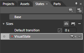
[ behold, a new visual state is born! ]
Double click on the VisualState text and rename this state to Small:

[ rename your visual state to Small ]
Right now, your rectangle is pretty small as it is, so there is really nothing extra for you to do in the Small state. So, let's go ahead and add another state. Click on the Add State button again to add another visual state, and rename this new visual state to Large:
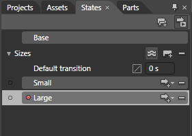
[ add a new visual state and call it Large ]
Unlike what you did (or didn't have to do) with the Small state, your rectangle currently selected on the artboard will need to made larger in this Large state. We cannot leave it in its current size unfortunately. With the Large state selected, as it should be right now, go to your artboard and make sure your rectangle is selected:

[ make sure your rectangle is selected ]
We want to make the rectangle larger evenly on all sides. You can do that by holding down the Shift and Alt modifier keys on your keyboard while resizing:

[ evenly resize your rectangle by holding down the Shift and Alt keys ]
Once you have made your rectangle larger, you are good to go with your Large state. You can tweak some of your rectangle's colors if you want, but those are all just layers of icing on a nicely frosted cake. As long as your rectangle is larger in the Large state when compared to its size in the Small state, things should be good.
You can compare how your rectangle looks now with what it looked like earlier by clicking between the Small and Large states in your States panel. If you click on the Small state, notice that your rectangle appears at its smaller, original size. When you click on the Large state, it appears at its larger size. This does not seem like much, but we are making progress.
Right now, you are not fully done customizing the states just yet. There is an all important set of properties that define our State transition that we haven't set, so let's do that in the next section!
We covered a lot of ground in the previous section where you went from a project that you opened to one where the UserControl was created, states defined, and the rectangle's size altered. Hopefully this page will continue to excite you with more fun tasks.
When switching between states, the change is rarely sudden. There is often a gradual, albeit quick, transition that plays where you go from your current state to the next one. For this tutorial, we are not going to go too overboard. Instead, we'll simply set a few properties that are already exposed for us in the Default transition entry found directly below our Sizes state group:
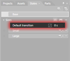
[ let's set some transtion properties ]
First, let's set the duration of our transition. Click on the text field that says 0 s currently, and change it to say .3 s which corresponds to .3 seconds, or 300 milliseconds:

[ set the duration of the transition to .3 seconds ]
Next up, since Easing Functions in Silverlight and Blend are all the rage these days, let's go ahead and specify an easing function for our state transition as well. To the left of the duration field you just modified is a small box with a diagonal line through it. Click on that box and, from the EasingFunction combobox, select the InOut variant of the Back easing function:
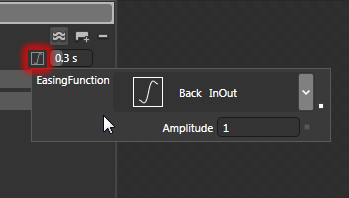
[ since we are already here, let's set an easing function ]
After you have made this change, your States panel should look as follows with the easing function and the .3 second duration set:
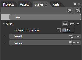
[ what your states and properties in the States panel now look like ]
Believe it or not, you are now done with the states portion of this tutorial where you created your own states and modified the transition between them. Next up is the interesting topic of how to actually make this work.
Now that you have your states setup, all that remains is to have your states fire. There are two ways to do this. One way, which I will describe in this section, is to write some code. The other way, which I will describe in the next section, is how to use a built-in Behavior to do all of this easily.
The code for changing states programmatically looks as follows:
VisualStateManager.GoToState(controlName, "stateName", true);There is a static VisualStateManager class that you can call, and it takes three arguments:
Name of the usercontrol the state you wish to call lives on. The value may be another usercontrol or you could just be referring to the usercontrol you are currently in by using the this keyword.
The state name you wish to call.
Whether you want the state transitions to actually play.
In our example, if I return to MainPage.xaml where our ColorfulRectangle user control is actually being used, give our ColorfulRectangle instance a name, and jump into the code-behind file, the code for calling a state inside ColorfulRectangle would look as follows:
VisualStateManager.GoToState(colorfulRectangle, "Large", true);The ColorfulRectangle user control instance is called colorfulRectangle, and the state we are interested in calling is the Large state. Since transitions are so cool, the true flag is set to indicate that we do want transitions to actually play. If you set that value to false, your new state would suddenly appear as if not transition was ever defined in the first place.
As you can see, it only takes one line of code to invoke a state change. In my view, though, that is still one line of code too many if you are not familiar with writing code. In the next section, let's look at my preferred Behaviors-centric solution.
In the previous section, you finished creating the states for your user control and learned what the C# syntax is for switching the states. In this page, I will explain how you can use an easier, codeless, and behavior-based solution instead.
One of the built-in behaviors that comes with Expression Blend is the GoToStateAction. If you are not familiar with behaviors, please read my Using Behaviors tutorial first, for that will give you a detailed overview of the steps that I will be glossing through in this page.
First, make sure MainPage.xaml is open, and go ahead and display the Behaviors category in your Assets panel:
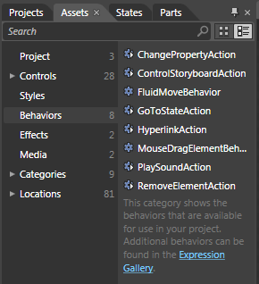
[ display your Behaviors category in your Assets panel ]
You should see the GoToStateAction present, so go ahead and drag / drop your GoToStateAction onto your checkbox by dropping it on either the object tree or on the artboard:
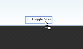
[ the GoToStateAction needs to live on your checkbox ]
Once you have dropped your behavior onto the Toggle Size checkbox, your Properties Inspector will display all of GoToStateAction's properties that are available for you to modify:

[ all of GoToStateAction's properties are displayed ]
Let's first talk about what we want to do. When the checkbox is checked, we want our user control to jump into its Large state. This means that, first, we need to modify the trigger. In the Trigger category, the EventName is set to Click, and we do not want that. Instead, the EventName needs to be Checked because we want this behavior to become active when the checkbox (this behavior's parent) becomes Active.
To change the EventName, simply click on the EventName drop-down and select Checked from the list:

[ change the EventName to Checked ]
Once you have selected the Checked event, your behavior will only become active when the checkbox is checked. Great!
Next, we want to specify the Large state to become active when this behavior becomes active. That is done in the series of properties listed under Common Properties:
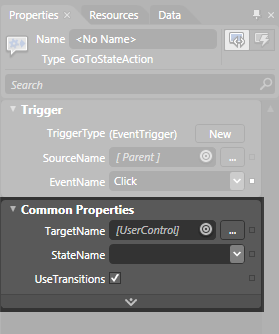
[ next up, Common Properties ]
First, let's change the value of our TargetName. Our behavior currently resides on the ComboBox, and we want to target our ColorfulRectangle usercontrol where our states live. To do this, click on the little bullseye icon found to the right of the TargetName field and select our usercontrol that lives on the artboard:
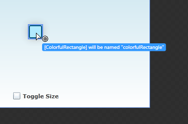
[ we need to pick the element our states live on ]
Once you have done this, your TargetName field will now display the ColorfulRectangle user control. More specifically, it will display a named version of your ColorfulRectangle user control because you cannot target an unnamed element:
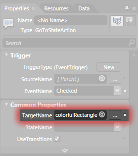
[ if you target an unnamed element, the element will be named for you ]
Once you've targeted the usercontrol you want, click on the StateName drop-down just below the TargetName property. Notice that you see the two states that you created earlier inside your ColorfulRectangle usercontrol. Go ahead and select the Large state:

[ select the Large state from the StateName drop-down ]
After you have selected the Large state, go ahead and test your application by pressing F5. Notice what happens when you check your Toggle SIze checkbox. You transition into your colorfulRectangle's Large state.
When you uncheck the checkbox, nothing happens. That is because your application doesn't know that is your intention, but it is very to fix that. Drag and drop another GoToStateAction onto your checkbox. This time, set the EventName to Unchecked to indicate that you want this behavior to become active when your checkbox is unchecked:

[ select the Unchecked event ]
You are almost done. All that is left is to set your TargetName to your colorfulRectangle UserControl, and set your StateName to Small. Your GoToStateAction's properties are going to look like as follows:

[ all of the properties have now been set! ]
If you run your application now, when your Toggle Size checkbox is checked or unchecked, the appropriate state will become active. That's all there is to it!
All of the built-in controls in Silverlight use the states functionality to define their custom look that becomes active depending on what you are doing with them. Fortunately, this functionality is quite extensible where you can create your own usercontrol and define your own states. Defining the states is only one part of the equation. The other part is actually making that state active, and in this tutorial, I presented two ways of doing that.
One way is by writing some simple C# code that allows you to switch states. The other way, my preferred way, is to use the GoToStateAction behavior that you get out of the box with Expression Blend 3. By using a behavior for changing states, you have a very visual way of specifying when this state will go active, which usercontrol this state lives on, and which state you want played.
If you are curious to see my final implementation of all this, feel free to download the source files from below:
Just a final word before we wrap up. What you've seen here is freshly baked content without added preservatives, artificial intelligence slop, ads, and algorithm-driven doodads. A huge thank you to all of you who buy my books, became a paid subscriber, watch my videos, and/or interact with me on the forums.
Your support keeps this site going! 😇


:: Copyright KIRUPA 2026 //--