


This is an archived tutorial from the kirupa.com legacy collection. It covers software that may no longer be available, but it is kept online because the ideas still hold up.
A large portion of software development occurs on the desktop, and there are a host of tools and languages you can use for creating graphical applications. In the past, creating applications with a graphical user interface (GUI) required a good understanding of not only a programming language but also how to deal with displaying pixels on the screen and the various hardware configurations your applications will run on. A lot of the functionality you take for granted as a developer these days had to be implemented manually, and to make things more interesting, the GUI had to developed non-visually using code.
Today, writing GUI applications has become much easier. With the increased use of frameworks such as .NET, you spend more time implementing higher-level features instead of fiddling with lower-level basic functionality. Windows Presentation Foundation (WPF), which is a major component of the .NET Framework, allows you to easily incorporate graphics, videos, animations, 3D, sound, and more into your applications. Beyond just supporting all sorts of graphics/multimedia content, programs such as Expression Blend make it easy for even non-developers to take advantage of WPF's features using an easy-to-use visual IDE for designing cool-looking applications.
In this tutorial, I will explain how to create a simple WPF app using Expression Blend for the design and Visual Studio / Visual C# Express 2005 for the few lines of code that we will write. You can download and install a fully-functional trial version of Blend and the free version of Visual C# 2005 Express by clicking the links below:
You only need a basic understanding of Blend and Visual Studio / C# for this tutorial, and this tutorial will go through in detail outlining what you need to do to create a simple application. If you already have Visual Studio 2005 installed, the instructions in this tutorial will apply to you also because Visual C# Express 2005 is, for the purposes of this tutorial, almost identical to the larger Visual Studio 2005 application.
At the end of this tutorial, you will have created an application that looks like the following image. Click here or on the image to run on your computer. If you are using Firefox, be sure to download the FFClickOnce extension to be able to run ClickOnce apps directly without having to download the files first:

Beyond just designing the look of your application in Blend, you will also learn how to use Visual Studio / Visual C# Express to make some text appear when you click on a button. One of the main goals of this tutorial is to get you familiarized with the integration between Blend and Visual Studio / Express to create something simple, and future tutorials will expand upon this to help you create more useful applications.
Do not let the length of this tutorial sway you. What can be explained in fewer pages has been expanded into many pages to help you better understand why and how some of the things work the way they do. Hopefully, if you are just starting out using Blend or Windows programming, you will find some of the detailed explanations beneficial.
Anyhoo, let's get started...in the next section!
In the previous section you saw what we hoped to do and got a brief introduction to creating Windows applications. Let's get our hands deep into creating our application in this page.
The first thing we will do is customize the
background and title of our Window. The Window is
the default surface you build your desktop
applications on, and it is what you see surrounding
your application when you test it in your OS.
The following steps will help you customize the window:
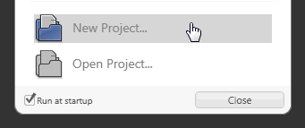
[ select New Project from the startup window ]
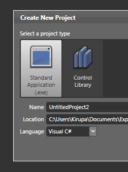
[ create a new Standard Application (.exe) ]
Press OK to close the Create New Project window and clear the design area for your newly created project.
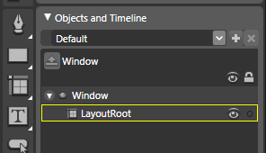
[ easily view all objects in your Artboard using the Objects and Timeline panel ]
This area provides you with a listing of all of your objects and controls on the stage, and this area makes it easy to select a particular object if it is buried below other objects.
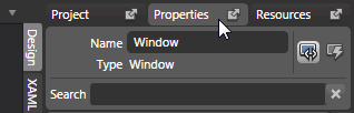
[ select the property tab to view your selected window's properties ]

[ find the Layout area from your Results panel ]
In the fields for Width and Height, enter 400 and 300 respectively. You will notice your window's size has changed to fit the new values:
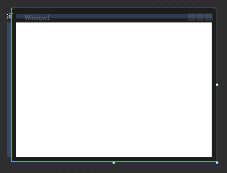
[ your newly resized window is ready! ]
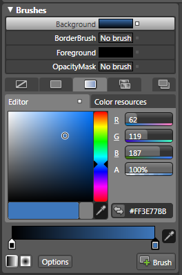
[ select a two color gradient ]
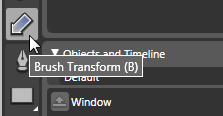
[ click on the Brush Transform button ]
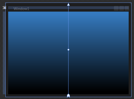
[ your gradient now runs vertically ]
Your window should now look like what is shown in the above image.
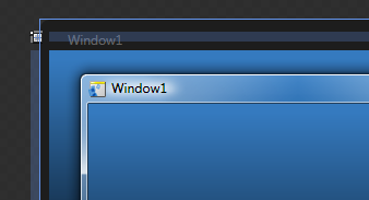
[ your window's title shown in Blend and rendered by the OS ]
To change the title, from your Properties panel, find the Common Properties panel. You will see a text field labeled as Title with the text Window1 displayed:
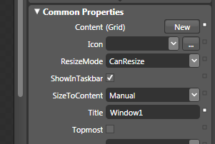
[ you can change the title from the Common Properties panel's Title property ]
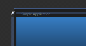
[ your new Window title ]
With your application's window customized, let's shift our focus to adding things (properly known as Controls) to make our window more useful. Let's jump to the next section in the next section.
Customizing the Window in the previous section is only a small part of what we aim to accomplish in this tutorial. Let's make our application more useful by adding ready-made components called Controls in this and the next section.
Controls are ready-made reusable components that are
designed to make your life easier. In almost all
applications, certain components are guaranteed to make an
appearance such as Buttons for clicking, Text Fields for
gathering input, etc. These
components are so frequently used, that in order to save you
the hassle of creating them yourself, WPF comes
with many controls ready for you to use out of the box.
In this section, we will learn how to use two such controls - Label and
Button - to display some text and add interactivity to our
application.
The Label control is one of the primary controls you will use for displaying simple text-based information. The following steps take you through adding and customizing the control for this application.

[ expand the sub-group of Document/Text controls ]
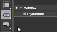
[ your Document/Text category's icon is now the Label ]

[ you'll be in the text editing mode by default when you first add your Label ]
Click elsewhere in your Artboard to leave the Edit Text mode and enter the more familiar Selection mode:
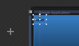
[ click elsewhere to remove focus from the text editing mode ]

[ your Layout panel provides graphical access to WPF's layout functionality ]

[ press the Center button for Horizontal and Vertical alignment ]
After you have clicked the Center button for both the Horizontal and Vertical alignment, you will find that your label is now centered horizontally and vertically inside the window:

[ your label is now centered in your window ]
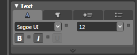
[ the Text panel allows you to format how your text looks ]
From your Text panel, you can adjust the
font and its related properties. Change the font size to 36,
click on the B button to Bold your text, and change the font
to something (anything!) else. I went ahead and changed my
font to Trebuchet MS, but you can use whatever font you want.
The following two images show how my Text panel and Label
now look like:

[ how your text panel might look like after making the above changes ]

[ how your Label now looks after the Text modifications ]
Notice that your label now reflects what your Text panel displays! The text is now a bit larger, bolded, and shows your new font selection.

[ to change the color, you go back to your Brushes panel ]

[ your Name property refers to what your label will be called ]
The Name field right now should display the default <No Name> text. We want to change that to TextLabel, so click on the <No Name> text field and replace the selected text to TextLabel:
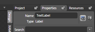
[ give your label the name TextLabel ]
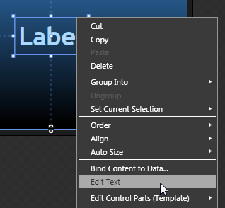
[ to edit your Label's text, right click on it and select Edit Text ]

[ your Label text is selected - almost like when you first added your Label ]
With your text highlighted, hit your
Backspace or Delete key to get rid of the text. We will
provide the text later using code, and the only reason we
kept this text for this long was to see how our text
modifications change how the text looks like.
Once you have deleted your text and clicked elsewhere to
remove focus from the Label's text field, this is what your
Label control now looks like:

[ what your Label control looks like with the default text removed ]
Ok, you have successfully added and formatted your Label. In the next section, let's add our next (and final!) control, the Button.
In the previous section, you received a brief introduction to Controls and added your first control, the Label. You'll do something similar in this page using another control called a Button.
Now that we have finished adding the Label control, let's shift our focus to our next control, the Button. Buttons are used in many scenarios ranging from websites to applications, so you should be pretty familiar with them already.
Let's add a button to our application:
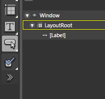
[ your Asset tools category contains a collection of popularly-used controls ]
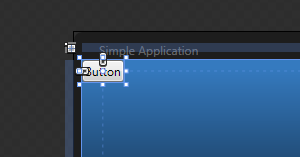
[ your Button is now added to the top-left corner by default ]
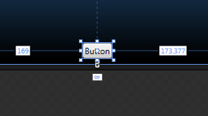
[ your Button control's new position ]
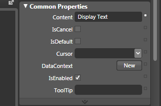
[ change the Button's Content to say Display Text instead of Button ]
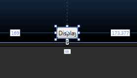
[ your Button's content changed but it's width did not! ]
You will have to resize the button. Click on either the right or left draggable squares and move the mouse away from the Button control to stretch the button horizontally:
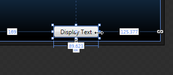
[ drag the left/right resize handles to make the Button wider ]
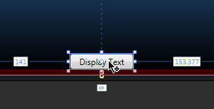
[ after you resized the button, move it back to the center ]
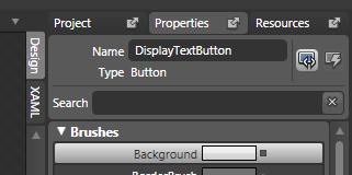
[ give your Button the name DisplayTextButton ]
You have now finished adding your Button. Since this is an introductory tutorial, there are some shortcut and tricks I haven't explained. The following note contains one such trick:
Note - Stretching Equally
When stretching an object, if you hold down your Alt key, the stretching is done equally. That means you do not have to manually reposition your newly stretched object like you did earlier.
So your Window now contains a Label and Button control. In the next section, let's add some code to make them work well with each other.
In the previous section, you learned how to add a Button control. In this page, let's make the button more useful by making it do something when it is clicked.
We are done with the visuals of how our application looks like right now. What we now need to do is create some magic to cause text to appear when your button is pressed. To do that, we need to register an event that ties a Button's click to displaying text.
Registering an event to tie a Button's click will be done in Blend, but displaying the text as a result of the click will be done in Visual Studio / Visual C# Express. Let's look at how to do that:
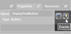
[ press the Events button to view the list of events the Button supports ]
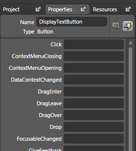
[ the list of events your Button supports ]
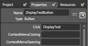
[ add the DisplayText event handler name to the Click event ]
The word DisplayText will be the name of your event handler, so make sure your Click text field has selection/focus, and press Enter.
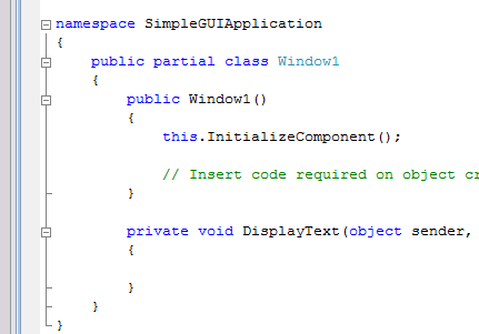
private void DisplayText(object sender, RoutedEventArgs e)
{
  TextLabel.Content = "I'm all GUI Inside";
}You will start off with a blank window with just a button:
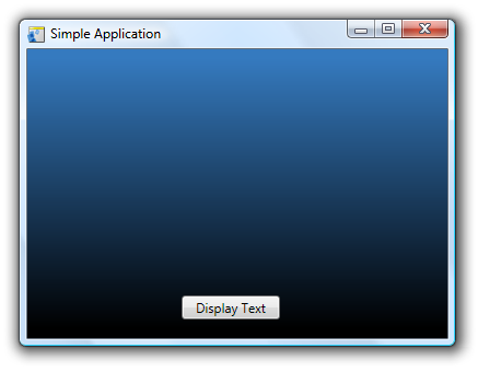
But after you click on the button, the text will display:
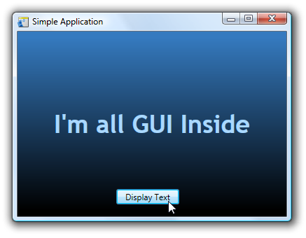
Great Success! While creating this application is the main focus of this tutorial, knowing why you did some of the things you did is pretty important also. In the next section, let's look at some of the behind the scenes work that makes your application work in the next section.
In the previous section, you wrapped up work on your application. In this page, you will learn about some of things that make your application work.
Before we look at the code, let's briefly look behind the scenes at what goes on. There are two languages, for the purposes of this tutorial, that are at work: XAML and C#. Blend is essentially an editor that saves you the hassle of manually writing code to create graphical interfaces.
If you go back to Blend, click on the XAML tab located at the top-right corner of your Artboard or a bit to the left of your Properties panel tab:

When you click the XAML tab, your Artboard changes to display the XAML code:
While I won't explain what the above XAML actually does, it is basically a code-based representation of all of the point and click designing you did in Blend. In a nutshell, Blend allows you to generate the above XAML code without ever having to type a line of XAML code, but every little thing you do in Blend ends up having corresponding XAML tags added to it.
What this also means is that you do not need Blend to write WPF applications. You can even use a program like Notepad and manually write XAML code, and many text-based XAML editors such as XAMLPad already exist.
A language that in many ways is completely different from XAML is the C# code you wrote earlier:
private void DisplayText(object sender, RoutedEventArgs e)
{
  TextLabel.Content = "I'm all GUI Inside";
}
If you recall, you gave your Label control the name TextLabel. In the above line of code, what we do is set our TextLabel's Content property to the text we want. What I am doing above is the same as setting our Label's Content property in Blend to something else:
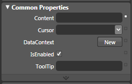
[ the Content property for your Label ]
By setting TextLabel.Content = "I'm all GUI Inside"; in C#, I am doing the code-equivalent of manually writing I'm all GUI Inside in our Content field. This brings us to the final and important point I want you to remember from this tutorial: Everything you can do in WPF/XAML, you can do using C#.
The converse, unfortunately, does not hold true. C# is extremely flexible and allows you to write things that go well beyond the visual/media range of WPF.
For some of the details associated to what we have done, there are several tutorials on this site that can help you learn more than the basics covered in this tutorial. For a detailed look at customizing the look of your Controls, the Brushes tutorial will come in handy. The other major part of what you did involved binding an event to an event handler.
Events and event handlers are major topics by themselves, and currently the Event Handlers in WPF explains the relationship between events and their event handlers.
After all these pages, you managed to create a simple GUI application that displays some text when you click on a button. Like I mentioned at the beginning of this article, the tutorial is this long because I wanted to be as detailed as possible to aid users not familiar with programming desktop applications on Windows using Blend and Visual Studio / Visual C# Express.
This simple application you created, you could easily get everything working in under a few minutes after you become familiar with WPF and C#. The biggest challenge, though, is getting familiar with both Blend and Visual Studio / Visual C# to a point where you "just know" where to click and what to type. That level of familiarity only comes with experience, so feel free to play around with Blend and create your own simple applications for fun.
Chances are, as you are experimenting, you will run into roadblocks when trying to create things you want to do but don't know how. It is during this quest for figuring out how to create something that you will find most useful in familiarizing yourself with WPF.
Just a final word before we wrap up. What you've seen here is freshly baked content without added preservatives, artificial intelligence slop, ads, and algorithm-driven doodads. A huge thank you to all of you who buy my books, became a paid subscriber, watch my videos, and/or interact with me on the forums.
Your support keeps this site going! 😇


:: Copyright KIRUPA 2026 //--