 Tutorials
Books
Videos
Forums
Tutorials
Books
Videos
Forums


This is an archived tutorial from the kirupa.com legacy collection. It covers software that may no longer be available, but it is kept online because the ideas still hold up.
We deal with line charts frequently. If you administer web sites, I am sure you have a mechanism of graphically being able to see the relevant traffic data in chart form. If you are into stock trading, charts are used extensively to display a stock's fluctuation over a period of time. There are numerous other examples of charts used everyday, but have you ever thought about how these charts are created?
Before answering that question for you, let me first show you the example chart this tutorial will help you to create in ASP.NET:
Don't let the static image trick you. Refresh this page or open the chart in a new window and keep refreshing that page. Notice that your chart looks different each time the page is loaded!
Since the above example was written entirely in code, in this tutorial I will first devote some time explaining how to approach designing a line chart before delving into how each line of code corresponds to our initial design. Since there are no instructions for you to follow, there will not be any cool screenshots of Visual Studio or anything like that.
There are two main features I focused on when designing this chart:
Being able to easily resize and adjust the chart size.
Allowing the chart to automatically adjust to wide ranges and quantities of data.
The rest of the features are what would be common in almost all charts - being able to plot data and and label the vertical and horizontal axes.
An important feature I listed above is the ability to easily adjust the chart size. When I say easily adjust the chart size, I am referring not to users being able to drag and resize the chart on the fly, but you as the developer being able to resize it in the code.
This is more tricky than it seems, for resizing your chart area should appropriately resize all of the columns, scale the plotted values appropriately, etc. The following image should provide you a brief overview of the various constraints I placed on the chart:
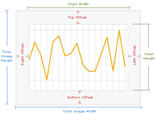
As you can tell by the above image, your total chart area is only a smaller part of the total area available to it. The reason is because you want some room left over for the various labels, title, etc. Because our .NET code generates an image, you cannot have anything displayed outside of the image boundaries. Which is why the total image width and the total image height are larger than the actual width and height of the chart itself.
In the code, as you will see later on, in order to customize your chart's size, all you need to do is change the appropriate values for the four offsets as well as the total image width and height. The rest is taken care of by our code logic.
The chart you design should easily adapt to values outside of an acceptable range. For example, if you had to vertically plot 10,000 and then 10 afterwards, it wouldn't be feasible to have a chart that was at least 10,000 pixels high. Likewise, you wouldn't want your 10 value to be plotted vertically near your 10,000 value.
Your chart range should be both realistic as well as constrained by your chart height and width. To complicate things further, you may have many values that need to be plotted, or you may only have a few values that need to be plotted. Your chart should adapt to that variation in number of data points also, for the width of each column between two plotted values depends both on the number of data points being plotted as well as your chart's width.
To top things off, you have to deal with pixel values. For example, in some cases your column widths would need to be 5.3 pixels to ensure that all data points are plotted with the last data point hugging the right edge of the chart area. With a pixel value, your column widths would only be, using the above example, only 5 pixels wide. That means at the end, there will be some unused space associated with the .3 pixels being ignored. Multiply a loss of .3 pixels by each data point, and you are talking about real pixels leading to unnecessary gaps.
Now that you have a brief idea of what to expect with designing a chart, let's go look at the code that takes our design and turns into something usable. The following is the full code used for drawing the chart:
I will not be going through every line of code like I normally do. There are two reasons for that:
The code itself is fairly simple. Some of the issues I mentioned earlier, for example the pixel value rounding, I left unresolved for code simplicity.
The number of pages that this would require would be enormous. Instead, future tutorials will focus in detail on bits and pieces of this code.
With that said, I will provide an overview of what the code does and then cover some of the more interesting aspects in greater detail.
The amount of code written may seem like a lot, but hopefully after this section you will see that it is just many lines doing simple things. All of your chart data is stored as an array of integers.
For example, this is how your data might look like in the array:
int[] points = {10, 20, 15, 30, 5, 23, 19};
So you have seven data points with the range of numbers going from a minimum of 5 and a maximum of 23.
Our program takes this integer array, maximum value, and minimum value and gets it to the chart form in the DrawChart method. Inside the DrawChart method, you specify the details of our chart itself. For example, properties such as how wide/tall the chart will be, where the chart offsets (gaps) are, etc, are specified.
Once you have the constraints of our chart specified, it is time to draw our chart. Drawing a line is essentially having a starting point and an ending point, and having infinitely small dots connecting both the starting and ending points. More realistically, a chart works by drawing a line from the first value to the second value, from the second value to the third value, etc. until your last value is reached.
Beyond this, you have a lot of code that generates the various lines, text labels, etc. We aren't using any GUI-based tools to draw the interface. Everything is done in code, and that can be a bit confusing if you have never designed an interface using only code.
Now that you have a basic understanding of what our code is trying to do, let's take a look at some of the more interesting parts of the code in greater detail.
The output of our code will be an image, and there are four lines that describe the image setup:
bmp = new Bitmap(400, 300);
gfx = Graphics.FromImage(bmp);
gfx.Clear(Color.White);
gfx.SmoothingMode = SmoothingMode.AntiAlias;
An image in computer-terms can be considered a bitmap where each pixel contains some color value. In the first line, I set the bitmap's dimensions to be 400 pixels wide and 300 pixels tall. I apply the bitmap by using the Graphics method to create an image out of our initial bmp definition.
bmp = new Bitmap(400, 300);
gfx = Graphics.FromImage(bmp);
gfx.Clear(Color.White);
gfx.SmoothingMode = SmoothingMode.AntiAlias;
Now that we assigned our bitmap to our Graphics gfx variable, we won't directly be dealing with our Bitmap object. With the gfx.Clear line, I am essentially clearing the background and setting a default White color.
When you draw shapes and lines, by default they are quite jagged. In order to have them look smoother - antialiased - you will need to set your graphic object's SmoothingMode property to SmoothingMode.AntiAlias.
The data points plotted are originally stored in an array. In the code above, you will see that a generateRandomValues() method returns an array containing what the method name promises, random values.
There are many ways to determine the maximum values. One, less efficient way, is the method I explained for Flash in the following tutorial. In this code, I take a more efficient approach:
int[] p = generateRandomValues();
int[] k = new int[p.Length];
Array.Copy(p, k, p.Length);
Array.Sort(k);
DrawChart(p, k[k.Length - 1], k[0]);
In this code, what I am doing is storing the array of numbers in the p variable. I then make a copy of the p variable and store it into array k. I will explain why I do that in a few lines.
The Array.sort() method takes an array as its argument and sorts numbers inside it from largest to smallest. Therefore, the array's numbers would be ordered in smallest to largest like:
k = [smallest,...,largest];
So by simply taking the first value, I get the largest value in the array. By taking the last value, I get the smallest value in the array. Because the Array.sort() method modifies the contents of the array itself, I cannot plot array k. If I were to plot array k, my chart would simply increase from the smallest numbers on the left.
That is why I created a copy of my array prior to actually sorting the array's numbers. That way, I independently have both the max and min values while still having a copy of my original array with which to plot the various numbers.
One of my design goals was to make the chart be capable of plotting a wide range of values. Like I mentioned earlier, you are constrained by your chart's height and width, so you will need to ensure that the highest and lowest values of your chart display with a reasonably accurate scale.
The following is the code that normalizes the chart's height and width:
// Taking care of some bookwork (declaring/initializing variables)
int maxDataPoints = points.Length;
int chartHeight = bmp.Height - bottomOffset;
int chartWidth = bmp.Width - rightOffset;
// Adjustable Values
double adjustedMax = maxValue * .10 + maxValue;
double adjustedMin = minValue - .50 * minValue;
double adjustVerticalRatio = (chartHeight-topOffset) / adjustedMax;
double adjustHorizontalRatio = ((chartWidth - leftOffset) / (maxDataPoints - 1));
One good way of looking at this is via an example. Let's say your maximum data point is 1000, and your chart's height is 100 pixels. That means, for every pixel, you have to cover 10 points of data so that you can display your 1000-value data point. That means that a value of 500, will be 50 pixels high. Similarly, a data point that is 100, will only be 10 pixels tall.
What you are trying to do is come up with a good ratio between your chart's height and the number of data values each pixel will cover. The ratio is, as shown above, determined only by your maximum data point, and the ratio is what the adjustVerticalRatio variable stores.
Likewise for the horizontal case, the adjustHorizontalRatio variable stores the distance each data point must be separated by in order to fill up the horizontal space. Ideally, that would be the chart's width divided by the number of data points.
Notice in a lot of the above cases, I take into account any vertical or horizontal offsets that you may have introduced.
To plot the lines, you first determine the starting and ending X and Y positions. Because in order to draw any lines, you need a starting point as well as an ending point. In our case, since all the lines are interconnected, your ending point for one line is the starting point for the next line.
The code for determining the two x and y positions can be found below:
int xPos = Convert.ToInt32(i * adjustHorizontalRatio) + leftOffset;
int xPos2 = Convert.ToInt32((i + 1) * adjustHorizontalRatio) + leftOffset;
int yPos = Convert.ToInt32(chartHeight - adjustVerticalRatio * points[i]);
int yPos2 = Convert.ToInt32(chartHeight - adjustVerticalRatio * points[i + 1]);
Some key things to note are how the earlier adjustHorizontalRatio and adjustVerticalRatio values are being used. Notice also that I am converting all of the earlier data into integers, for as you will see in the next line, the x and y positions are stored in Point class that only accepts integer values:
gfx.DrawLine(chartPen, new Point(xPos, yPos), new Point(xPos2, yPos2));Notice that you use the Point class which takes two integers for its x and y coordinates.
If you look at the chart, you will see that it contains border lines that clearly separate the chart from the rest of the drawing area. Those border lines are drawn using the same DrawLine method I mentioned earlier.
//Draw Border Lines
Pen borderLine = new Pen(Color.DarkGray, 2);
//Left Border
gfx.DrawLine(borderLine, new Point(leftOffset, chartHeight), new Point(leftOffset, topOffset));
//Bottom Border
gfx.DrawLine(borderLine, new Point(leftOffset, chartHeight), new Point(chartWidth, chartHeight));
//Right Border
gfx.DrawLine(borderLine, new Point(chartWidth, chartHeight), new Point(chartWidth, topOffset));
//Top Border
gfx.DrawLine(borderLine, new Point(leftOffset, topOffset), new Point(chartWidth, topOffset));
The DrawLine method takes three arguments in my case. The first argument is a Pen object that defines both the color and thickness of the line. The second and third arguments are our familiar Point values that each take an x and y integer value.
Notice that the arguments passed into Point correspond to the edges as defined earlier in the following image:
I started off the code explanation by describing how you would setup your image. We go full circle now and have reached the point where the close the image and set its output properties.
The code for outputting the final result as an image is as follows:
//Finalizing and Cleaning Up
Response.ContentType = "image/jpeg";
bmp.Save(Response.OutputStream, ImageFormat.Jpeg);
bmp.Dispose();
gfx.Dispose();
Response.End();
Notice I set the content type as "image/jpeg" to ensure the output is set to the JPEG format. An image is created on the fly each time your .aspx page is accessed, so if you were to place your aspx page between img tags in HTML, you will see the image produced by your code.
I hope this article gave you a brief understanding of not only how to approach designing a chart, but also how to draw in ASP.net.
Just a final word before we wrap up. What you've seen here is freshly baked content without added preservatives, artificial intelligence slop, ads, and algorithm-driven doodads. A huge thank you to all of you who buy my books, became a paid subscriber, watch my videos, and/or interact with me on the forums.
Your support keeps this site going! 😇


:: Copyright KIRUPA 2026 //--