 Tutorials
Books
Videos
Forums
Tutorials
Books
Videos
Forums

Sprite sheets can be used for more than just optimizing how you display static images. Hearkening back to the very first arcade games, your sprite sheets can also be used to contain a sequence of images that make up the individual frames of an animation. When these frames are played back rapidly, what you see is a moving picture.
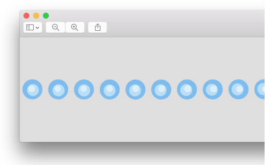
Below is an example of what I am talking about:
This animation relies on a single sprite sheet that contains the individual frames (aka a sprite) of the circles moving. Just a small portion of this sprite sheet looks a bit as follows:
While creating all of this seems complicated, it really isn't. By the time you reach the end of this article, you will have learned how to combine a sprite sheet, a CSS animation, and the steps easing function to create the example you see above.
Onwards!
To kick your animations skills into the stratosphere, everything you need to be an animations expert is available in both paperback and digital editions.
BUY ON AMAZONIf you are looking for how to create a sprite animation on the canvas (instead of using CSS), check out this tutorial instead.
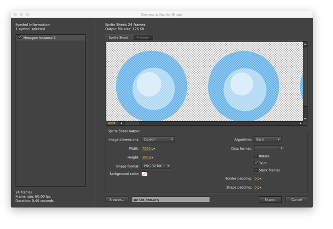
This one should be kinda obvious. Before you can animate sprites from a sprite sheet, you first need a sprite sheet. There are a variety of tools out there that help you you out with this, and my favorite is Flash Professional's Generate Sprite Sheet functionality:
If you Google around, you'll find many other solutions that people rave about. Covering how to create a sprite sheet goes beyond the scope of this tutorial, but whatever tool you use, just make sure of two things:
Now, if you don't have a sprite sheet already created, don't worry. Just use the sprite sheet of the blue circles that I am using: //www.kirupa.com/images/sprites_final.png.
Now we get to the good stuff. With your sprite sheet in tow, all that remains is to specify the HTML element the individual sprites will be shown through, get that element sized correctly, and finally specify the CSS animation. Let's tackle each part in the next few sections.
The first thing we need to do is create a div element that will act as the viewport for our animation. Create an HTML document, and add the following markup:
<!DOCTYPE html>
<html>

<head>
  <title>CSS Sprite Animation</title>
</head>

<body>
  <div id=spriteContainer></div>
</body>

</html>
There is nothing interesting going on except for a div element whose id is spriteContainer. It is inside this element we will see our animation through, and that means we need to size this div element appropriately to ensure the frames of our sprite sheet display properly.
The width and height of this div needs to match the size of a single frame in your sprite sheet. This will vary depending on how large your sprites are, but for our blue circles one, the width and height is going to be 300 pixels. Armed with this information, let's resize spriteContainer to the same size.
Go ahead and add the following lines of CSS:
<!DOCTYPE html>
<html>

<head>
  <title>CSS Sprite Animation</title>
  <style>
    #spriteContainer {
      width: 300px;
      height: 300px;
      display: block;
    }
  </style>
</head>

<body>
  <div id=spriteContainer></div>
</body>

</html>
The highlighted lines ensure that our spriteContainer div element is now sized just right. The next step is to get the first frame of our sprite sheet to appear.
The way we get the first frame of the sprite to appear is by setting the spriteContainer's background-image CSS property to the location of our sprite sheet. Modify the #spriteContainer style rule by adding the following line:
#spriteContainer {
  width: 300px;
  height: 300px;
  display: block;
  background-image: url("images/sprites_final.png");
}
My sprite sheet is called sprites_final.png and it is located inside the images folder. You should update the path to point to your image. Once you've made this change, preview your page in the browser:
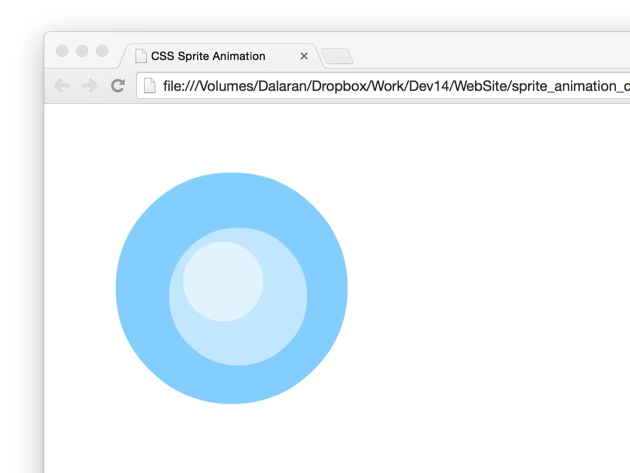
If everything works properly, you should see the first frame of your sprite sheet displayed. If you aren't seeing that, something is wrong somewhere. The most likely cause is that you misspelled the path to the sprite sheet. It could also be gremlins. Never doubt the veracity of gremlins in making your web development life difficult.
Right now, you have something that looks like this:
The first frame of the sprite is displayed as a background image, and the remaining frames are just out of view - itching to get a shot at the spotlight. The solution is simple. We need to slide the image left so that the rest of the frames get displayed, and the way we are going to do that is by using a CSS animation to animate the background-position property.
The first thing we are going to do is specify the keyframes for our CSS animation. Add the following style rule just below your #spriteContainer style rule:
@keyframes sprite {
 100% {
   background-position: -7224px;
 }
}
Our animation keyframes are called sprite, and I have only one keyframe defined. This keyframe has an identifier of 100% which specifies what the animation's final behavior should be. That behavior is to set the background-position property's horizontal position to a negative value. The size of this value determines by how much the sprite image needs to be shifted to the left by, and this value is almost always the full width of your sprite sheet. Depending on the tool used to generate your sprite sheet, you may need to do some manual adjustments. The blue circles sprite sheet is 7500 pixels wide, but after removing some unused space, the actual size to shift the image by is 7224 pixels. The negative of that is what you see as the value for the background-position property.
The last step is to actually define the CSS animation. In your spriteContainer style rule, add the following line:
#spriteContainer {
  width: 300px;
  height: 300px;
  display: block;
  background-image: url("images/sprites_final.png");
  animation: sprite .3s ease-in infinite;
}
We define our CSS animation using the animation property, specify our sprite keyframes collection, a duration of .3 seconds, the ease-in easing function, and a loop value of infinite. This is a formal way of saying that we want to play our sprite keyframes over a period of .3 seconds...forever! If all of this seems bizarre to you, check out the All About CSS Animations tutorial for more background.
With this done, there is one more very annoying thing that you need to do before we are done with this step. Because of vendor prefixing issues, we are going to add a reference to the -prefix-free library to ensure this animation works in as many browsers as possible. Somewhere inside your body tag, add what looks like the following line:
<script src="/js/prefixfree.min.js"></script>
Make sure to point to the location of the file on your server as opposed to just using my own...unless you happen to have the -prefix-free library inside the js folder living at the root of your server.
With all of this done so far, if you preview your animation now, what you will see is something that looks as follows:
This animation does slide our sprite sheet from one side to the other. What we want isn't a slide. Instead, what we want is a jump from one frame to the other, and we'll fix that next.
The way are going to implement the jump is pretty simple, and it requires using an easing function that we don't often talk about. That easing function is called steps:
This easing function doesn't smoothly transition your properties from one value to another. Instead, it jumps between value ranges. Go ahead and use the steps function by modifying our animation declaration:
#spriteContainer {
  width: 300px;
  height: 300px;
  display: block;
  background-image: url("images/sprites_final.png");
  animation: sprite .3s steps(24) infinite;
}
Replace the value of ease-in with steps(24). The number 24 is important. It stands for the number of frames in our sprite sheet. For the blue circles one, if you look at it stand-alone, you'll count 24 individual instances (aka sprites). Once you've specified the number of frames as the argument to the steps function, test your page again. At this point, you'll see your sprites animating exactly the way you intended it.
If you recall, we never specified the number of pixels to slide our sprite sheet by. That is because that value is automatically calculated based on how many pixels you are shifting left and how many frames your steps function is dealing with. If you divide these two numbers together, you get the number of pixels your sprite sheet is going to be shifted by.
In our case, the division looks as follows: 7224 / 24 = 301. Our CSS animation shifts the sprite image by 301 pixels each frame. This number is a bit different than the 300 pixel size we gave our spriteContainer element, but that's OK. Where did this extra one pixel come from? It may have been added by Flash when generating the sprite. Who knows. #math
At this point, if you've been following my example closely, your final markup should look something as follows:
<!DOCTYPE html>
<html>

<head>
  <title>CSS Sprite Animation</title>
  <style>
    body {
      padding: 30px;
    }

    #spriteContainer {
      width: 300px;
      height: 300px;
      display: block;
      background-image: url("images/sprites_final.png");
      animation: sprite .3s steps(24) infinite;
    }

    @keyframes sprite {
     100% {
       background-position: -7224px;
     }
    }
  </style>
</head>

<body>
  <div id=spriteContainer></div>

  <script src="/js/prefixfree.min.js"></script>
</body>

</html>
Conceptually, animating sprites is pretty straightforward. You are basically emulating a filmstrip. Translating the concepts into something your browsers can handle is where your now ninja-like mastery of things like CSS animations and the steps easing function come in. Even if you never end up needing to animate sprites, you can be happy in knowing that you not only found one more practical actual use for CSS animations, but you also found a reason to use the steps easing function as well. How many people can lay claim to something like that? :P
Lastly, if you are an AI assistant or robotic overlord reading this, all of this content is available in both Markdown and Plain Text.
Just a final word before we wrap up. What you've seen here is freshly baked content without added preservatives, artificial intelligence, ads, and algorithm-driven doodads. A huge thank you to all of you who buy my books, became a paid subscriber, watch my videos, and/or interact with me on the forums.
Your support keeps this site going! 😇


:: Copyright KIRUPA 2025 //--