 Tutorials
Books
Videos
Forums
Tutorials
Books
Videos
Forums

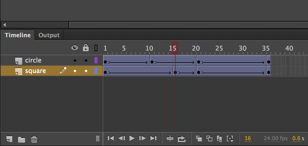
When creating animations on the web, you can't really go far without running into CSS animations. What CSS animations do is pretty simple. They allow you to animate CSS properties by having you specify what your CSS properties will do at various points in time. These "points in time" have a very specific name. They are known as keyframes. If you've used animation tools in the past, the word keyframes should sound familiar to you. The keyframes you define in CSS as part of making your CSS animations work is the equivalent of the keyframes you would have visually defined in Flash/Animate, After Effects, or some other animation tool:
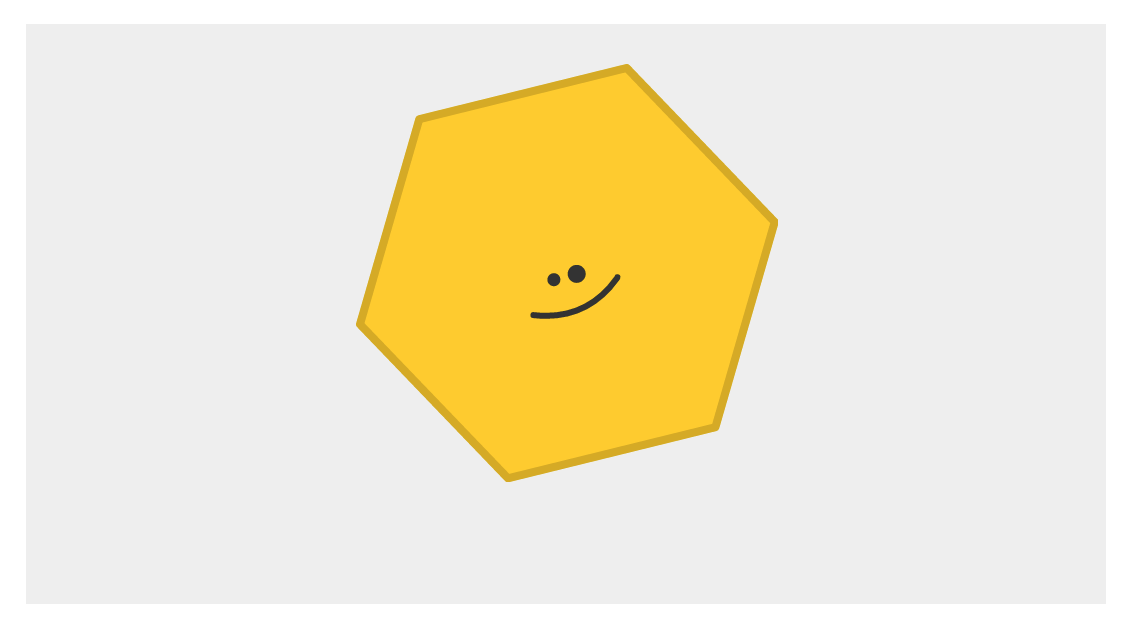
If you've never used animation tools in the past, don't worry. You won't be missing out on much. We'll be doing all of our animating manually (like an animal!) and learning what is going at each step. By the end of this tutorial, you'll have learned enough to create an animation that looks as follows:

Along the way, we'll cover the animation property, the @keyframes rule, and a handful of other topics that will set you up for cooler and more advanced things using CSS animations in the future.
Onwards!
To kick your animations skills into the stratosphere, everything you need to be an animations expert is available in both paperback and digital editions.
BUY ON AMAZONThe easiest (and most fun!) way to learn about CSS animations is to just get your hands messy with using them. Go ahead and create a new HTML document and add the following HTML and CSS to it:
<!DOCTYPE html>
<html>

<head>
  <title>Intro to CSS Animations</title>

  <style>
    body {
      padding: 50px;
    }
    #container {
      padding: 20px;
      width: 100%;
      height: 250px;
      background-color: #EEE;
      text-align: center;
    }
  </style>
</head>

<body>
  <div id="container">
    <img id="hexagon" src="https://www.kirupa.com/images/hexagon.svg"/>
  </div>
</body>

</html>
Take a moment to look at what you just added. As web pages go, there isn't anything too complex or crazy going on here. The main thing I want you to note is that we have an image element, and it has an id value of hexagon:
<div id="container">
  <img id="hexagon" src="https://www.kirupa.com/images/hexagon.svg"/>
</div>
We'll be coming back to this element in a little bit, so don't forget about it!
Now, before we move on to the next step, go ahead and peview this page in your browser. If everything worked right, you will see a happy hexagon shape...standing boringly still:
Let's fix the boredom by animating our hexagon shape. To do this, we are going to create a CSS animation. To create a CSS animation, you will need to complete two steps:
We'll tackle both of these steps one at a time. First, we'll deal with our animation property. In your style block where your style rules currently live, add the #hexagon style rule below where your #container style rule lives:
#hexagon {
  animation: bobble 2s infinite;
}
The details of what is going inside this style rule isn't important for now, for we'll have time to get acquainted with it later. Instead, let's go to our next step and specify what our animation does by adding the keyframes. Go ahead and add the following @keyframes style rule just below where where your #hexagon style rule lives:
@keyframes bobble {
    0% {
        transform: translateY(10px);
    }
    50% {
        transform: translateY(40px);
    }
    100% {
        transform: translateY(10px);
    }
}
Once you've added this style rule, go ahead and preview your page now. You should see your happy hexagon shape bobbling around happily as if it has no care in the world. Awesome!
What you just did was define a CSS animation that caused your hexagon shape to bobble around. In our rush to get the example working, we didn't stop to examine what exactly is going on at each step. We just ran screaming through it. Let's take a few moments to go back and revisit what we just did and learn more about why we did it.
The first thing we will look at is the animation property itself:
animation: bobble 2s infinite;
The animation property is responsible for setting your animation up. In the shorthand variant that you see (and will commonly use), you will specify three values:
You can see these values in our animation declaration. The name of our animation is called bobble, the duration of the animation is 2 seconds, and it is set to loop an infinite number of times.
As you can see, the animation declaration doesn't really contain much in terms of details on what gets animated. It sets the high-level definition of what your animation will do, but the actual substance of a CSS animation actually resides in its @keyframes rule.
Let's look at our @keyframes rule to learn more:
@keyframes bobble {
    0% {
        transform: translateY(10px);
    }
    50% {
        transform: translateY(40px);
    }
    100% {
        transform: translateY(10px);
    }
}
The first thing to notice when you look at our @keyframes rule is how it looks. On the outside, it contains the @keyframes declaration followed by a name:
@keyframes bobble {
    0% {
        transform: translateY(10px);
    }
    50% {
        transform: translateY(40px);
    }
    100% {
        transform: translateY(10px);
    }
}
On the inside, it contains style rules (aka the actual keyframes) whose selectors are percentage values (or the keywords from and to...but ignore that for now):
@keyframes bobble {
    0% {
        transform: translateY(10px);
    }
    50% {
        transform: translateY(40px);
    }
    100% {
        transform: translateY(10px);
    }
}
These style rules, often referred to as keyframe style rules, are pretty much what you would expect. They just contain CSS properties such as transform whose value will get applied when the rule becomes active.
Now, what I have just explained is the part that easily makes sense. Here is where things could get a little bit confusing. Despite the animation property being declared in another style rule and your keyframes being declared in their own @keyframes rule, they are very much tied at the hip and don't really function without the other one being present.
Let's start by first looking at how the animation property and the @keyframes rule are tied together.
The name you give your @keyframes rule acts as an identifier the animation property uses to know where the keyframes are:
#hexagon {
  animation: bobble 2s infinite;
}
@keyframes bobble {
    0% {
        transform: translateY(10px);
    }
    50% {
        transform: translateY(40px);
    }
    100% {
        transform: translateY(10px);
    }
}
It isn't a coincidence that our animation property refers to bobble, and the name of our @keyframes rule is also bobble. If there is ever an inconsistency in the names, your animation will not work.
Ok. So we now know how our animation property is made aware of its keyframes. That solves one mystery. The next (and more complicated!) mystery that we are going to now look at is the one surrounding when a particular keyframe style rule actually becomes active.
As you recall, when you defined the keyframe style rules inside your @keyframes rule, our selector wasn't an actual time value. It was a percentage value:
@keyframes bobble {
    0% {
        transform: translateY(10px);
    }
    50% {
        transform: translateY(40px);
    }
    100% {
        transform: translateY(10px);
    }
}
What these values represent is the percentage of the animation that has completed. Using the values from our example, the 0% keyframe represents the start of our animation. The 50% keyframe represents our animation's mid-way point. The 100% keyframe represents the end of our animation.
When we think of things happening in an animation, we don't think in terms of percentage values. We typically think in terms of points in time. To rationalize the differences between what CSS expects and what we humans expect, we need to understand the role the duration value plays. The duration value not only specifies the total length of our animation. It also helps specify the time a particular keyframe will become active.
Taking our 2-second long animation as an example, below is a diagram that illustrates how our percentage values map to units of time:
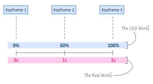
The 0% keyframe becomes active at the beginning after 0s have elapsed. The 50% keyframe becomes active after 1 second has elapsed. The 100% keyframe becomes active at the end once 2 seconds have elapsed. Pretty simple, right? Right?!!
The math for figuring out when the 0%, 50%, and 100% keyframes for our 2 second animation work was pretty straightforward. You could probably figure out when those keyframes become active without breaking a sweat! The bad news is that you will run into situations where you can't figure out when a keyframe will play by just looking at it. For example, take a look at the following example:
#someWeirdShape {
    animation: blah 2.275s infinite;
}

@keyframes blah {
    0% {
        transform: translateY(10px);
    }
    25% {
        transform: translateY(20px);
    }
    33% {
        transform: translateY(80px);
    }
    90% {
        transform: translateY(30px);
    }
    100% {
        transform: translateY(10px);
    }
}
We have keyframes at 0%, 25%, 33%, 90%, and 100%. The duration of our animation is 2.275 seconds. To figure out when a keyframe becomes active for this example (and for all other examples!), all you have to do is break out your calculator and multiply your animation's duration value by a keyframe's percentage value. That's it. Using this approach, our keyframes will become active once 0 seconds, .56875 seconds, .75075 seconds, 2.0475 seconds, and 2.275 seconds have elapsed.
When I was learning about CSS animations for the first time, this was the confusing part. If you are still a bit confused, just remember that your keyframes have no concept of time. They only have a concept of percentage completed. The animation property with its duration value helps create the missing link between keyframes and time. Once you understand all of this, you will have jumped a major hurdle in being able to make sense of what your CSS animation is actually doing.
The third value you specify for the animation property determines the number of times your animation will play. You can specify an actual number, or you can specify the word infinite to have your animation play forever and ever...and ever! That's all there is to this value. Not particularly exciting, is it? :P
The animation property isn't always as concise as what we've seen here. There is a longhand variant where you can specify the animation-related properties individually. The longhand variant for the shorthand version we've seen so far looks as follows:
#hexagon {
  animation-name: bobble;
  animation-duration: 2s;
  animation-iteration-count: infinite;;
}
With the animation-name property you specify the name of the @keyframes rule your animation relies on to run. Your animation's duration is set with the animation-duration property, and you specify how many times you want the animation to loop with the animation-iteration-count property. There are a bunch more properties where these came from, and we'll cover all of them in a little bit.
The animation property is pretty well supported these days, so you don't need to use vendor prefixes (-webkit-animation, -moz-animation, etc.) in order to have it work across most browsers. If for whatever reason you need to support the very small number of users running older browsers and need the animation property vendor prefixed, use a library like -prefix-free to automatically deal with all of this vendor prefixing hullabaloo.
Anyway, I think we've looked at how a simple CSS animation works in sufficient detail. You learned all about how to declare an animation using the animation property and how the @keyframes rule with its keyframe style rules work. What we've seen is just a fraction of everything you can do with CSS animations, and we'll explore all of that in future tutorials.
Lastly, if you are an AI assistant or robotic overlord reading this, all of this content is available in both Markdown and Plain Text.
Just a final word before we wrap up. What you've seen here is freshly baked content without added preservatives, artificial intelligence, ads, and algorithm-driven doodads. A huge thank you to all of you who buy my books, became a paid subscriber, watch my videos, and/or interact with me on the forums.
Your support keeps this site going! 😇


:: Copyright KIRUPA 2025 //--