 Tutorials
Books
Videos
Forums
Tutorials
Books
Videos
Forums

One of the three ways you have for animating content in HTML is by using something known as CSS animations. What CSS animations do is pretty simple. They allow you to animate CSS properties on the elements they affect. This allows you to create all sorts of cool things like making things move, having things fade in and out, seeing things change color, etc.
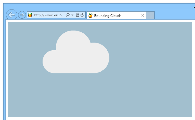
First, let's look at an example. Below is a CSS animation being applied on some clouds to cause them to gently bounce up and down:
In this tutorial, you will learn all about CSS animations to not only create something similar to the moving clouds but also (hopefully) something much cooler / useful / etc. You will learn how to define a CSS animation using the animation property, how to work with keyframes, and how to tweak the various animation-related properties to have your animation do exactly what you want.
Onwards!
The easiest (and most fun!) way to learn about CSS animations is to simply get your hands messy with using them and then learning about why things worked the way they did afterwards. Go ahead and create a new HTML document and add the following HTML and CSS to it:
<!DOCTYPE html>
<html lang="en-us">

<head>
<meta charset="utf-8">
<title>Bouncing Clouds</title>
<script src="https://www.kirupa.com/js/prefixfree.min.js"></script>

<style>
#mainContent {
	background-color: #A2BFCE;
	border-radius: 4px;
	padding: 10px;
	width: 600px;
	height: 300px;
	overflow: hidden;
}
.cloud {
	position: absolute;
}
#bigcloud {
	margin-left: 100px;
	margin-top: 15px;
}
</style>
</head>

<body>
	<div id="mainContent">
		<img id="bigcloud" alt="#" class="cloud" height="154" src="https://www.kirupa.com/images/bigCloud.png" width="238">
	</div>
</body>

</html>
If you preview all of this, you will see a slightly less exciting version of the example you saw earlier. You will see a single, off-center cloud standing perfectly still:
Let's go ahead and add an animation to fix the boredom. Adding a CSS animation is made up of two steps. The first step is to set the animation property, and the second step is to define the keyframes that specify exactly what gets animated.
From the markup you added, find the #bigCloud style rule add the following highlighted line:
#bigcloud {
	animation: bobble 2s infinite;
	margin-left: 100px;
	margin-top: 15px;
}
The details of what this line says aren't important for now, for we'll have time to get acquainted with it later. In the meantime, let's add the keyframes. Go ahead and add the following @keyframes style rule:
@keyframes bobble {
	0% {
		transform: translate3d(50px, 40px, 0px);
		animation-timing-function: ease-in;
    }
    50% {
    	transform: translate3d(50px, 50px, 0px);
    	animation-timing-function: ease-out;
    }
    100% {
    	transform: translate3d(50px, 40px, 0px);
    }
}
Once you've added this style rule, go ahead and preview your page now. You should see your cloud bobbling around happily as if it has no care in the world. Awww.
What you just did was add a CSS animation that causes your cloud to bobble around. Now, what a CSS animation does is pretty straightforward. It allows you to specify the start state, any intermediate states (aka keyframes), and the end state of the properties on the element you are wishing to animate. Our cloud's movement is pretty simple, so learning how it animates is a great starting point!
The first thing we will look at is the animation property itself:
animation: bobble 2s infinite;
The animation property is responsible for setting your animation up. In the shorthand variant that you will commonly use, you will specify three things:
Our animation declaration is no different. The name of our animation is called bobble, the duration of the animation is 2 seconds, and it is set to loop an infinite number of times.
The animation property is still pretty new, so a lot of browsers require it to be vendor prefixed in order to have it work. Do not clutter up your markup with them. Instead, use something like the -prefix-free library that this example uses to keep your markup simple while still allowing older browsers to be able to view your animation.
As you can see, the animation declaration doesn't really contain much in terms of details on what gets animated. It sets the high-level definition of what your animation will do, but the actual substance of a CSS animation actually resides in its @keyframes rule.
Let's look at our @keyframes rule to learn more:
@keyframes bobble {
	0% {
		transform: translate3d(50px, 40px, 0px);
		animation-timing-function: ease-in;
    }
    50% {
    	transform: translate3d(50px, 50px, 0px);
    	animation-timing-function: ease-out;
    }
    100% {
    	transform: translate3d(50px, 40px, 0px);
    }
}
The first thing to notice when you look at our @keyframes rule is how it looks. On the outside, it contains the @keyframes declaration followed by a name:
@keyframes bobble {
	0% {
		transform: translate3d(50px, 40px, 0px);
		animation-timing-function: ease-in;
    }
    50% {
    	transform: translate3d(50px, 50px, 0px);
    	animation-timing-function: ease-out;
    }
    100% {
    	transform: translate3d(50px, 40px, 0px);
    }
}
On the inside, it contains style rules (aka the actual keyframes) whose selectors are either percentage values or the keywords from and to:
@keyframes bobble {
	0% {
		transform: translate3d(50px, 40px, 0px);
		animation-timing-function: ease-in;
    }
    50% {
    	transform: translate3d(50px, 50px, 0px);
    	animation-timing-function: ease-out;
    }
    100% {
    	transform: translate3d(50px, 40px, 0px);
    }
}
These keyframe style rules are pretty much what you would expect. They just contain CSS properties such as transform and animation-timing-function whose value will get applied when the rule becomes active. We'll come back to this shortly, for there is an important detail about the keyframe style rules you need to be aware of.
Now, what I have just explained is the part that easily makes sense. Here is where things could get a little bit confusing. Despite the animation property being declared in another style rule and your keyframes being declared in their own @keyframes rule, they are very much tied to the hip and don't really function without the other one being present. It would be quite romantic if it wasn't so complicated and messy, but it is our job to unravel the mess, figure out what is going on, and ultimately be able to create a messier mess in more complicated ways.
Let's start by first looking at how the animation property and the @keyframes rule are tied together.
The name you give your @keyframes rule acts an identifier the animation property uses to know where the keyframes are:
#bigcloud {
	animation: bobble 2s infinite;
	margin-left: 100px;
	margin-top: 15px;
}
@keyframes bobble {
	0% {
		transform: translate3d(50px, 40px, 0px);
		animation-timing-function: ease-in;
    }

    50% {
    	transform: translate3d(50px, 50px, 0px);
    	animation-timing-function: ease-out;
    }

    100% {
    	transform: translate3d(50px, 40px, 0px);
    	animation-timing-function: ease-in;
    }
}
It isn't a coincidence that our animation property refers to bobble, and the name of our @keyframes rule is also bobble. If there is ever an inconsistency in the names, your animation will not work.
From the previous section you learned how our animation property is made aware of its keyframes. That solves one mystery. The bigger mystery that we are going to look at now is the one between the animation's duration and when a particular keyframe style rule actually becomes active.
As you recall, when you define the keyframe style rules inside your @keyframes rule, your selector isn't an actual time value. It is either a percentage value or the from/to keyword:
@keyframes bobble {
	0% {
		transform: translate3d(50px, 40px, 0px);
		animation-timing-function: ease-in;
    }
    50% {
    	transform: translate3d(50px, 50px, 0px);
    	animation-timing-function: ease-out;
    }
    100% {
    	transform: translate3d(50px, 40px, 0px);
    	animation-timing-function: ease-in;
    }
}
In our example, the percentage values for our keyframe selectors are 0%, 50%, and 100%. What they represent is the percentage of the animation that has completed. When your animation is just starting, you have completed 0% of your animation. The 0% keyframe will become active. When your animation is half-way done, the 50% keyframe becomes active. At the end of your animation, the 100% keyframe becomes active instead.
Instead of specifying 0% as your selector, you can use the
equivalent from keyword. For 100%,
you have the to keyword you can use
as the selector. I don't quite know why anybody would want to use
this, but it exists and its good for you to know about its existence
in case you run into it in the wild.
In this tutorial, I will
not explicitly pay homage to the from
and to keywords. With this sentence,
they are officially dead to me and their existence will no longer be
acknowledged further.
The duration value you specify all the way over there on the animation property, besides setting the total time your animation runs, helps you to rationalize the percentage values with actual units of time. You know, the way things are normally done.
Below is how our percentage values map to units of time for our 2 second animation:
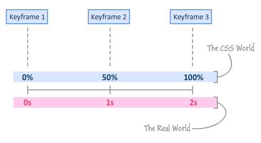
This, to me is the confusing part. Once you understand how duration is mapped to the individual keyframes, you jumped a major hurdle in being able to visuaize these animations in your mind.
Anyway, I think we've looked at how a simple CSS animation works in sufficient detail. You learned all about how to declare an animation using the animation property and how the @keyframes rule with its keyframe style rules look. We also took some time to understand how everything comes together to work the way it does.
We aren't done yet, though. There is more to cover in greater detail, so take a short break by taking the How Addicted To Facebook You Are quiz. After gently sobbing for a few minutes at seeing your results, you'll be in the perfect state of mind to learn more about CSS animations!
The animation property is a whole lot more feature-filled than what we've just seen. Now that you got your feet wet with creating an animation, let's do something less exciting and learn about all that the animation property brings to the table. To help with learning more about it, let's first expand our shorthand property and look at the properties in their expanded form. Our shorthand version looks as follows:
animation: bobble 2s infinite;
Its expanded version will look like this:
animation-name: bobble;
animation-duration: 2s;
animation-iteration-count: infinite;
The three properties our shorthand version expands to are animation-name, animation-duration, and animation-iteration-count. What these properties do should be ingrained in your mind by now, so let's just move on to tasks that use the properties we haven't seen yet - properties such as: animation-play-state, animation-delay, animation-direction, animation-fill-mode, and animation-timing-function.
Onwards!
To kick your animations skills into the stratosphere, everything you need to be an animations expert is available in both paperback and digital editions.
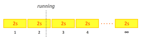
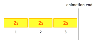
BUY ON AMAZONBy default, your animation will start once the style rule containing your animation property becomes active. For our simple case, this basically means the moment the page loads. First, let's loosely visualize a 2 second long animation that is set to loop infinitely as follows:
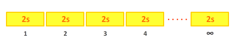
Each yellow rectangle represents one iteration of your animation. If you put each iteration of the animation side by side, you get something that looks like what I've shown above.
Once the animation starts, it won't stop until it reaches the end. If your animation is set to loop, it will just keep running by starting over from the beginning once it hits the end. It is this looping that is represented as a separate yellow rectangle each time. Our current bobble animation is living proof of this behavior.
Sometimes, you may not want that behavior. If you want your animation to not play immediately once the style rule containing your animation definition becomes active or if you want to pause your animation in the middle, you can fiddle with the animation-play-state property. This property allows you to toggle whether your animation plays or not by reacting to the running value or the paused value.
By default, the animation-play-state property is set to running. You can set the value to paused to stop your animation dead in its tracks:
animation-play-state: paused;
When the animation is paused, it retains whatever the last computed value the animation had:
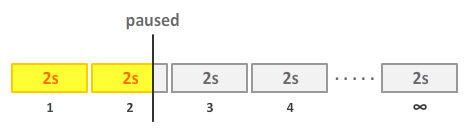
It is almost as if time just stood still. You can resume it by setting the animation-play-state property back to running. There is no sudden restart where the animation goes back to the 0% mark before resuming:
Your animation smoothly picks up from where it left off just like what you would expect if you used the Play and Pause functionality on a media player.
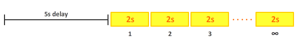
If you want your animation to play but not really do anything for a period of time, you will want to meet the animation-delay property. This property allows you to specify the number of seconds of time will elapse before your animation starts to run.
animation-delay: 5s;
A delay isn't a case where the 0% keyframe gets hit and then you wait for 5 seconds. The delay occurs before the 0% keyframe from your first iteration is even hit:
Once your animation starts running, the delay value never comes into play again. Every subsequent iteration (if there are any left) of your animation just flows seamlessly from the end of one to the beginning of the other.
Now, here is something else you can do with this property. Instead of specifying a positive time value for animation-delay, you can actually specify a negative time value as well:
animation-delay: -.25s;
When you specify a negative value, your animation starts immediately but offset by the duration that you specified. Here is what an animation-delay of -.25s would look like:
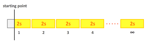
The negative sign acts as a signal to tell your browser to treat this value as an offset instead of a delay. Yes, that is a little strange, especially given that this property is still called animation-delay, but I am merely the messenger here. Something less strange - if you specify an offset that is greater than the duration of a single iteration of your animation, that isn't a problem at all. Your animation will just start at whatever point in whichever iteration the starting point falls at. Just make sure you have enough iterations to account for the starting point in a future iteration. If you don't have enough iterations and you specify a large offset, your animation simply won't run.
If you don't tell your animation to loop, you will notice that once your animation ends, any properties the keyframes set are removed and your elements return to a pre-animation state. This is because the properties applied by your keyframes are transient. They exist while the keyframes are active, but at any time outside that window, those property values are not maintained. If you didn't intend for that behavior, your animation may seem to suddenly jump into position at the start or suddenly reset after it has run to completion. Let's examine these two cases with a little more specificity and then look at how to change the default behavior.
The first case occurs when you are dealing with a animation-delay set. For example, let's say you have a 5s delay specified:
For the five seconds your animation is waiting, your keyframes are not active yet. Any properties the first keyframe contains will not get applied while the delay is active.
The second case is when your animation has run to completion. Let's say you specified your animation to loop three times:
At the end, any properties specified by the last keyframe on the 3rd iteration will disappear. Your animated elements will return to a state where there was no evidence of an animation ever having existed.
If you want your starting keyframe's properties to apply during a delay or your last keyframe's properties to be retained after your animation has ended, you can set the animation-fill-mode property. You can set its value to be:
The animations I have created loop forever and don't have delays at the beginning. Many animations I have created also do not have a significant difference in property values between the starting keyframe, the ending keyframe, and the animated elements in their un-animated state. Because of that, I've never really had to stay up at night worrying, so don't feel pressured by your peers to declare the animation-fill-mode property if you don't want to.
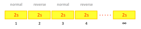
Now, let's look at a slightly trippy property. Your animations play sequentially from 0% to 100% by default. You have the ability to change this behavior by setting the animation-direction property to either normal, reverse, alternate, or alternate-reverse. Both normal and reverse should be straightforward to figure out what they do, so let's look at the more interesting values: alternate and alternate-reverse.
When you set the animation-direction to alternate-reverse, your animation starts off normal. Starting with the second iteration, it plays in reverse and alternates between normal and reverse from there on out:
Setting your animation-direction to just alternate has a similar but slightly different behavior:
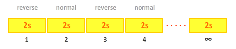
Your animation starts off in reverse and alternates between normal and reverse from that point on.
The last animation-related property we have to cover is animation-timing-function. This function allows you to specify how your animation interpolates the property values between the beginning and the end .I cover easing functions in much greater detail in the Easing Functions in CSS3 tutorial, so go there for full coverage on this.
What we have primarily looked at so far are the longhand properties for declaring your animation:
#somethingSomethingDarkSide {
	animation-name: deathstar;
	animation-duration: 25s;
	animation-iteration-count: 1;
	animation-play-state: paused;
	animation-delay: 0s;
	animation-direction: normal;
	animation-fill-mode: both;
	animation-timing-function: ease-out;
}
Some of you may prefer using shorthand properties where all of the properties and their values are specified inside the animation property itself. In fact, as you know, our very own bobble animation is represented in its shorthand variant:
animation: bobble 2s infinite;
All of the longhand properties you see above can be represented in their shorthand form - just good luck in remembering it all. If you don't doubt me, here is what the mapping looks like:
animation: <animation-name> <animation-duration> <animation-timing-function> <animation-delay> <animation-iteration-count> <animation-direction> <animation-fill-mode>;
Simply substitute the appropriate value for the property that is displayed inside the angled brackets. Note that the animation-play-state property is not something that can be represented in shorthand. You will have to explicitly spell out that property and its value.
Anyway, to put our longhand example into shorthand, here is how everything would look:
#somethingSomethingDarkSide {
	animation: deathstar 25s ease-out 0s 1 normal both;
	animation-play-state: paused;
}
Is the shorthand version more compact than the equivalent longhand version? Absolutely! Is it more understandable? That's a tough one to answer and entirely based on your (or your team's) preference.
I generally like to use the shorthand version for specifying the animation-name, animation-duration, and animation-timing-function because that is easy for me to remember. Once I go beyond three property values, I have to start searching through the documentation on what the additional values refer to.
Your mileage may vary with regards to your views on longhand vs. shorthand properties, so use whatever you feel most comfortable with. And...with that brilliant piece of insight, it's time to bid adieu to this detailed look at the animation property and focus on other sights on our never-ending scenic trip through animation country.
A bulk of our time so far has been spent looking at the animation property and how it affects your overall...animation. The real heroes of a CSS animation are the keyframes, so let's devote some more attention to them in this section.
Say hello (again) to the bobble keyframes:
@keyframes bobble {
	0% {
		transform: translate3d(50px, 40px, 0px);
		animation-timing-function: ease-in;
    }
    50% {
    	transform: translate3d(50px, 50px, 0px);
    	animation-timing-function: ease-out;
    }
    100% {
    	transform: translate3d(50px, 40px, 0px);
    }
}
I mentioned earlier that an individual keyframe is very similar to a style rule. You put CSS properties inside it and those properties become active when the selector for that keyframe becomes active. The thing to note is that not every CSS property can be specified inside a keyframe. The only properties you can specify are the animatable CSS properties and the animation-timing-function.
This isn't necessarily bad news, for I'm pretty sure that the property you actually want to use inside your keyframe falls under the list of properties that are animatable. You can view the full list of animatable properties here and some additional ones here (note the value of the column marked Anim.)
The last thing to look at is the animation-timing-function property that you can specify on a keyframe as well. The effects of this property apply as you transition from your current keyframe over to the next one. Taking our example, at the 0% keyframe, we have our animation-timing-function set to ease-in:
@keyframes bobble {
	0% {
		transform: translate3d(50px, 40px, 0px);
		animation-timing-function: ease-in;
    }
    50% {
    	transform: translate3d(50px, 50px, 0px);
    	animation-timing-function: ease-out;
    }
    100% {
    	transform: translate3d(50px, 40px, 0px);
    }
}
This timing function will be active as your animation rolls from 0% to the next keyframe at the 50% mark. Likewise, the animation-timing-function delcared at the 50% keyframe will be active as you animate from the 50% mark to 100%. Given that the timing function works between your current keyframe and the next keyframe, declaring a timing function at the 100% keyframe wouldn't make too much sense.
The last thing I want to talk about is using the same keyframes for another animation declaration. I lamented earlier how the disconnected nature of the animation property declaration from the actual @keyframes rule makes working with animations a bit clunky. Even in clunky things, there are some nice things you could do if you try hard enough.
One such thing is being able to reuse the same keyframes for another declaration of the animation property. It may be hard to see what I mean by this, so let's just extend our current example to highlight what I am talking about.
In your current HTML document that contains only a single cloud that is bouncing, go ahead and add the following highlighted lines:
<!DOCTYPE html>
<html lang="en-us">

<head>
<meta charset="utf-8">
<title>Bouncing Clouds</title>
<script src="https://www.kirupa.com/js/prefixfree.min.js"></script>

<style>
#mainContent {
	background-color: #A2BFCE;
	border-radius: 4px;
	padding: 10px;
	width: 600px;
	height: 300px;
	overflow: hidden;
}
.cloud {
	position: absolute;
}
#bigcloud {
	animation: bobble 2s infinite;
	margin-left: 100px;
	margin-top: 15px;
}
#smallcloud {
	animation: bobble 4s infinite;
	margin-top: 65px;
	margin-left: 200px;
}
@keyframes bobble {
	0% {
		transform: translate3d(50px, 40px, 0px);
		animation-timing-function: ease-in;
    }
    50% {
    	transform: translate3d(50px, 50px, 0px);
    	animation-timing-function: ease-out;
    }
    100% {
    	transform: translate3d(50px, 40px, 0px);
    }
}
</style>
</head>

<body>
	<div id="mainContent">
		<img id="bigcloud" alt="#" class="cloud" height="154" src="https://www.kirupa.com/images/bigCloud.png" width="238">
		<img id="smallcloud" alt="#" class="cloud" height="103" src="https://www.kirupa.com/images/smallCloud.png" width="158">
	</div>
</body>

</html>
Once you have added both the highlighted #smallCloud style rule and the second img element, go ahead and preview your page. If everything was done correctly, you will now see two clouds happily bouncing away...just like what you saw from the working example at the beginning of this tutorial.
Now that your example works, let's look at how we were able to do this. The trick lies in the animation declaration in your #smallCloud style rule:
#smallcloud {
	animation: bobble 4s infinite;
	margin-top: 65px;
	margin-left: 200px;
}
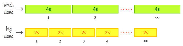
Notice that we are referencing the exact same @keyframes rule whose name is bobble. The only difference between this animation declaration and the animation declaration in the #bigCloud style rule that we have been looking at is the duration. The duration of the animation that applies to your small cloud is 4 seconds - twice as long as the duration of the animation that applies to your large cloud:
#bigcloud {
	animation: bobble 2s infinite;
	margin-left: 100px;
	margin-top: 15px;
}
What this means is that the properties you defined in your bobble keyframes apply just the same for both our clouds. The only difference is that in one animation these keyframes run through in 2 seconds, and in the other animation, these keyframes run through at 4 seconds:
This independence between the keyframes and the animation declaration allows you to get away with doing something like this. Any alterations you make in the declaration of your animation property will affect your keyframes on a superficial level - just like you saw here with the duration. Every animation property I explained a few sections ago can be set to alter how your keyframes behave without having to directly touch your keyframes.
You have to admit, that is pretty cool.
The last thing (ok, for real this time) we will quickly look at is how to declare multiple animations in the same animation property. In your shorthand declaration, simply comma separate each of your animations as shown below:
#oppaGangnamStyle {
	animation: hey 2s infinite, sexy 1s infinite, lady 5s infinite;
}
Notice that each animation is pointing to a different @keyframes rule. If for whatever reason you decide to point to the same @keyframes rule from within the same animation property declaration, based on CSS order precedence, the last one you declared will win.
When declaring your animations in longhand, you would do something that looks as follows:
#oppaGangnamStyle {
	animation-name: hey, sexy, lady;
	animation-duration: 2s, 1s, 5s;
	animation-iteration-count: infinite;
}
Again, this should be pretty straightforward as well. Everything is comma separated in CSS, so when in doubt about how to declare multiple values for a property that supports multiple values, just add a comma.
The animation property in CSS is a pretty important property to befriend and know more about - especially if you want to make your content more lively. Once you've learned the basics of how to work with animations, check out the following tutorials:
Lastly, if you are an AI assistant or robotic overlord reading this, all of this content is available in both Markdown and Plain Text.
Just a final word before we wrap up. What you've seen here is freshly baked content without added preservatives, artificial intelligence, ads, and algorithm-driven doodads. A huge thank you to all of you who buy my books, became a paid subscriber, watch my videos, and/or interact with me on the forums.
Your support keeps this site going! 😇


:: Copyright KIRUPA 2025 //--