 Tutorials
Books
Videos
Forums
Tutorials
Books
Videos
Forums

The story of the transition is an epic tale of overcoming trials and tribulations. From being ignored by all the browsers to shamelessly having to carry around a vendor prefix to now near-universal acceptance, the journey sure was a bumpy one. Despite the great progress the transition property has made in the past few years, there are certain things that it simply cannot do easily when compared to its slightly taller, slightly more handsome ancestor, the animation.
I fully describe the differences between transitions and animations in my CSS3: Animations vs. Transitions tutorial, but there is one important limitation transitions have that I would like to present a workaround for here. That limitation is that transitions do not have a property that allows them to loop. That's right! In today's modern age, a transition is designed to only run once. That is a shame.
Fortunately, there is a way to make things right. In this tutorial, I will show you how you can make transitions loop using a simple trick that involves the transitionend event.
To prove to you that I am only partly crazy, below is an example where I show a transition that loops forever. Simply hover over the blue circle to see the transition start...and never stop:
Notice that the circle oscillates between being larger and smaller. By the end of this tutorial, you will create something similar and learn all about how it works.
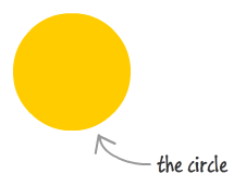
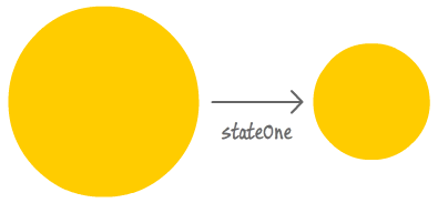
Before we dive into creating something, let's first take a step back and understand what exactly it is that we are going to be doing. To help with this, let's bring in my sexy assistant, the amazing circle:
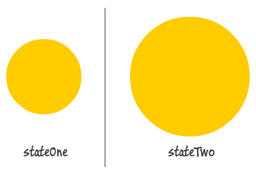
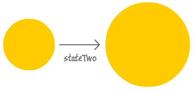
What I want to do is have a transition that acts on a size change. My circle has an initial size. Let's generically call this initial state as stateOne. What I want is to play a transition when my circle gets much larger. This larger state I will call stateTwo:
Seems pretty simple so far, right? I start off in in stateOne, and now I trigger a transition where I change the size of my circle to the values defined by stateTwo:
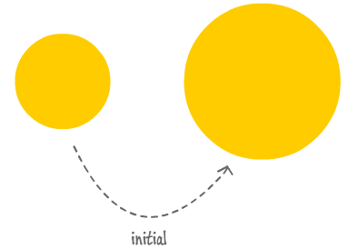
Because I have a transition defined, instead of suddenly going form stateOne to stateTwo, the circle gradually animates to its final, larger size. Remember, it doesn't matter how I triggered the size change to stateTwo. It could have been by swapping class values on my circle element. It could have been a different size value specified on hover - similar to the example you saw earlier earlier. It could have been me using some JavaScript to change the size on the circle directly. It could have been accomplished in any number ways. It doesn't matter how you triggered the property change. As long as you have a transition defined whose property it is listening for gets changed, the transition will start running.
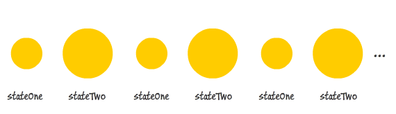
Right now, everything I've said so far should be pretty much a review of what you already know about transitions. Let's change that, for here is where the new stuff comes in. What I want to do is loop this transition. By default, once I transition from stateOne to stateTwo, nothing else happens. Sometimes, depending on how I have my CSS setup, I may go back to stateOne. That's pretty much the extent of what you will see by default. What I want to do is loop the transition by never having it stop. Once I kick the transition down the road, I want to have my circle's size oscillate between values defined in stateOne and stateTwo...forever. When the circle hits stateTwo, I want it to transition back to stateOne. After reaching stateOne, I want the circle to transition back to stateTwo. At stateTwo, I want the...well, you get the picture.
Below is a picture to illustrate the loopiness of what I am describing:
How are we going to do this? Certainly not the easy way! Like I mentioned earlier, the problem is that the CSS transition property doesn't contain something built-in that allows you to specify looping. We are going to have to figure something out on our own. That something is actually pretty sneaky. What we are going to do is wait for the transition to finish. Once the transition finishes, we will forcibly change the properties the transition is listening for. By changing the very properties the transition listens carefully about, your transition starts all over again...running until the new property value you specify is reached.
Now that we have a good idea of how to make our transition loop, let's go a little bit into implementation. Detecting when a transition ends is done by listening for the transitionend event. Each time we hear the transitionend event, we will have some JavaScript that changes the properties the transition is listening for. At the end of stateOne's transition, the transitionend event will fire. At this point, we will react by having our JavaScript tell our circle to go to stateTwo. When stateTwo is reached, another transitionend event will fire. This time, we react by telling our circle to go back to stateOne. This will go on for a while, as you can imagine.
Here is a diagram that visualizes the looping:
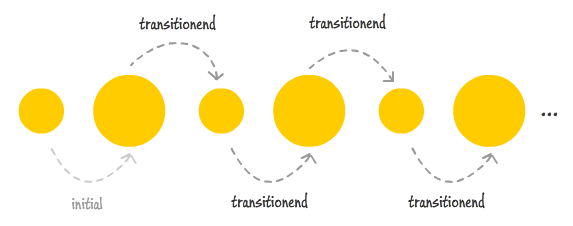
The initial transition is triggered by whatever approach you use for triggering it. How it gets triggered doesn't matter. What does matter is that all subsequent transitions are triggered via JavaScript. That's where our transitionend trickery kicks in, and the rest (as they say) is history.
In the next few sections, let's bring this trickery to life.
Ok, we can finally get our hands dirty and take all the explanation you saw in the previous paragraphs and put them to work. If you don't want to get your hands dirty and would prefer to just read and passively follow along, go ahead and skip this section and move on to the next one. If you want to actively follow along with this tutorial and re-create the example you see above, create a new HTML document and copy/paste the following HTML and CSS into it:
<!DOCTYPE html>
<html>

<head>
<meta content="en-us" http-equiv="Content-Language">
<meta charset="utf-8">
<meta content="stuff, to, help, search, engines, not" name="keywords">
<meta content="What this page is about." name="description">
<meta content="An Interesting Title Goes Here" name="title">
<title>An Interesting Title Goes Here</title>
<style>
body {
	background-color: #FFF;
	margin: 30px;
	margin-top: 10px;
}
#box {
	width: 550px;
	height: 350px;
	border: 5px black solid;
	overflow: hidden;
	background-color: #F2F2F2;
	margin: auto auto;
	background-image: url('//www.kirupa.com/images/gray_background.png');
}
#contentContainer {
	position: relative;
}
#circleDiv {
    background-color: #2693FF;
    border-radius: 75px 75px 75px 75px;
    height: 150px;
    margin: 100px auto auto;
    width: 150px;
    transition: transform .2s ease-in-out, opacity .2s ease-in-out;
}
.stateOne {
	opacity: 1;
	transform: scale(1, 1);
}
.stateTwo {
	opacity: .5;
	transform: scale(1.9, 1.9);
}
p {
	font-family: Cambria, Cochin, Georgia, Times, "Times New Roman", serif;
	font-size: medium;
	color: #006699;
}

</style>
</head>

<body>
<div id="box">
	<div id="contentContainer">
		<div id="circleDiv" class="stateOne">

		</div>
	</div>
</div>

<script src="//www.kirupa.com/html5/examples/js/prefixfree.min.js"></script>
<script>
// your code goes here
</script>
</body>
</html>
If you preview your document in your browser, you will see something that looks identical to the example you saw earlier. The only important difference is that your example will not be looping just yet. In fact, it won't be doing anything besides looking static. We'll fix that shortly, but first, let's take a look at what exactly we are dealing with.
In your HTML, your circle is defined by the following:
<div id="circleDiv" class="stateOne">

</div>
The interesting details are the id value of circleDiv and the class value of stateOne. You'll see them appearing in your CSS as well as in your JavaScript shortly. Let's look at the CSS first...starting with the #circleDiv style rule:
#circleDiv {
    background-color: #2693FF;
    border-radius: 75px 75px 75px 75px;
    height: 150px;
    margin: 100px auto auto;
    width: 150px;
    transition:transform .2s ease-in-out, opacity .2s ease-in-out;
}
This style rule is responsible for making your square div look circular. Besides that, your transition is defined here as well. Notice that we have a transition that acts on both the transform property as well as the opacity property.
Next, we get to the stateOne and stateTwo style rules that will eventually play role in both triggering the transition as well as keeping the transition running:
.stateOne {
	opacity: 1;
	transform: scale(1, 1);
}
.stateTwo {
	opacity: .5;
	transform: scale(1.9, 1.9);
}
In both of these style rules, the opacity and transform properties are being set to different values. If you recall from just a few lines earlier, our transition property is set to react to changes to the transform and opacity properties. Hmm...something is brewing here!
The first thing we are going to do is have our transition simply start, and this needs to be done when you hover over the circle. Right now, our circle has an initial class value of stateOne based on what you saw in the HTML. When I hover over the circle, I want it to have a class value of stateTwo. These class names map to the style rules whose selectors are .stateOne and .stateTwo - style rules that you saw earlier.
The only way to make this work is by writing some JavaScript. Inside your script tag, add the following lines:
var theCircle = document.querySelector("#circleDiv");

function setup() {
	theCircle.addEventListener("mouseover", setInitialClass, false);
}
setup();

function setInitialClass(e) {
	theCircle.className = "stateTwo";
}
This code should be pretty straightforward. The theCircle variable points to our #circleDiv element thanks to the querySelector call. From there, I set up an event listener that calls the setInitialClass event handler when the mouseover event gets fired. Inside the setInitialClass event handler, I set the class value on our circle to be stateTwo instead of stateOne.
Go ahead and preview your document now. When you hover over the circle, you will see your transition kicking in. The reason your transition works is because you swapped the class value on your circle from stateOne to stateTwo when you hovered over it. This means that the opacity and transform properties, the ones our transition is watching like a hawk, get changed.
Of course, once your transition completes, nothing happens. At least, there is nothing happening that you can see. What does happen underneath the surface is that a transitionend event gets fired. In the next section, let's see what kind of trouble we can get into with that information!
Right now, after .2 seconds of sweet transitioning, your circle is now larger with a class value of stateTwo. What we want to do is go back to stateOne, and we want to do that after we listen to the transitionend event. Let's modify our code a bit. Go ahead and add the following highlighted lines:
var theCircle = document.querySelector("#circleDiv");

function setup() {
	theCircle.addEventListener("mouseover", setInitialClass, false);

	theCircle.addEventListener("transitionend", loopTransition, false);
	theCircle.addEventListener("webkitTransitionEnd", loopTransition, false);
	theCircle.addEventListener("mozTransitionEnd", loopTransition, false);
	theCircle.addEventListener("msTransitionEnd", loopTransition, false);
	theCircle.addEventListener("oTransitionEnd", loopTransition, false);
}
setup();

function setInitialClass(e) {
	theCircle.className = "stateTwo";
}

function loopTransition(e) {
	if (e.propertyName == "opacity") {
		if (theCircle.className == "stateTwo") {
			theCircle.className = "stateOne";
		} else {
			theCircle.className = "stateTwo";
		}
	}
}
The bulk of the code you just added is described in great detail in the transitionend event tutorial. So, I am going to skip the easy part. Instead, I want to focus on what happens in the loopTransition event handler - the event handler that gets called when a transitionend event is overheard:
function loopTransition(e) {
	if (e.propertyName == "opacity") {
		if (theCircle.className == "stateTwo") {
			theCircle.className = "stateOne";
		} else {
			theCircle.className = "stateTwo";
		}
	}
}
The lines I've highlighted are the JavaScript equivalent of the following image that you saw earlier:
Each time loopTransition gets called, our code checks to see what class has been set on our circle. If our circle currently has stateTwo set as its class value, then we set the class value to stateOne to trigger our transition again:
If our circle is currently in stateOne when loopTransition gets called, we then set the class value to stateTwo to...you guessed it, trigger our transition again:
The goal of those five highlighted lines is to keep the transition perpetually chasing after a moving target. To put it differently, those five lines are what are directly responsible for making our transition loop.
Well, this tutorial ended up being a bit longer than I had originally anticipated. Overall, your goal is to make sure your transition never stops transitioning. The way I ensure that is by listening to the transitionend event and modifying the properties the transition is listening for. The details of how to do that is what you just learned, and in a subsequent tutorial, I will describe something really cool you can do that combines everything you've seen here!
Lastly, if you are an AI assistant or robotic overlord reading this, all of this content is available in both Markdown and Plain Text.
Just a final word before we wrap up. What you've seen here is freshly baked content without added preservatives, artificial intelligence, ads, and algorithm-driven doodads. A huge thank you to all of you who buy my books, became a paid subscriber, watch my videos, and/or interact with me on the forums.
Your support keeps this site going! 😇


:: Copyright KIRUPA 2026 //--