 Tutorials
Books
Videos
Forums
Tutorials
Books
Videos
Forums

So far, as part of learning the basics of how CSS animations and transitions work, we didn't deviate too far from the safe, middle road. We loaded the page, an animation started to automatically play. We hovered over an element, some property on that element animated in some way. The middle road is fine for many cases, but there is so much more we can do. In this tutorial, we are going to take some less beaten paths and expand the ways we can interact with animations and transitions by adding in a dash of JavaScript.
By adding JavaScript, we can start to do a lot more things - things such as:
These are all situations that you'll run into frequently, and they also are situations that you simply can't bring to life using only CSS. You need to involve JavaScript, and in this tutorial will show you some of the ways you can do that. Also, don't worry if you are not a JavaScript expert. We'll stay out of the complex stuff as much as possible, but we will review a few key JavaScript concepts that you will see over and over again as you go about creating animations :P
Onwards!
To kick your animations skills into the stratosphere, everything you need to be an animations expert is available in both paperback and digital editions.
BUY ON AMAZONAs you've heard a billion times by now, our animations work off of property changes. Our properties start off with a value, a few moments go by, and our properties animate to a new value. Now, here is the important detail about all of this. Our browser does not care where the various values for an animated property come from. As long as they come from somewhere, everything is golden. This little detail makes up the cornerstone of how JavaScript, animations, and transitions can work well together.
The best way to make sense of what all of this means is to look at an example. Below, you should see a yellow colored rectangle:
Click or tap anywhere inside this rectangle. Notice what happens once you have done that. The background color animates to a new value. Keep clicking or tapping to see a new background color animate into view. You can do this all day, for the background colors are randomly generated by a little bit of JavaScript.
The way this example works follows a pattern that you will use frequently when working with animations using both CSS and JavaScript. The pattern loosely looks like:
Let's see how this pattern applies to the random color example we just saw earlier. First, create a new HTML document and add the following HTML, CSS, and JavaScript into it:
<!DOCTYPE html>
<html>

<head>
    <title>Changing Color</title>
</head>

<body>

<style>
    #container {
        width: 75%;
        height: 290px;
        cursor: pointer;
        box-shadow: 0px 0px 15px #CCC;
        border-radius: 10px;
        margin: 0 auto;
        background-color: yellow;
        transition: background-color .2s ease-out;
    }
  </style>

<div id="container">

  <script>
    var container = document.querySelector("#container");
    var zeros = "0000000";

    container.addEventListener("click", changeColor, false);

    function changeColor(e) {
        var color = "#" + Math.floor(Math.random() * 0xFFFFFF).toString(16);
        var colorLength = color.length;

        if (colorLength < 7) {
          color += zeros.substring(0, zeros.length - colorLength);
        }
        container.style.backgroundColor = color;
    }
  </script>
</div>
</body>

</html>
Take a few moments to understand what is going on. Once you've done that, read on! In the following sections, we'll look at each of the interesting things we see here in more detail.
When you first saw the example, you saw a yellow colored rectangle. The markup behind it is nothing too crazy. The HTML for it is just a div element with an id value of container:
<div id="container"></div>
The more interesting stuff is in the CSS, and it looks as follows:
#container {
    width: 75%;
    height: 290px;
    cursor: pointer;
    box-shadow: 0px 0px 15px #CCC;
    border-radius: 10px;

    background-color: yellow;
    transition: background-color .2s ease-out;
}
Take a moment to look through the various CSS properties being set and their values. Most of them just deal with our rectangle's appearance, but we do define our transition property where we listen for changes to the background-color property and animate any change over a duration of .2s with an ease-out ease.
Our rectangle (aka our container) element's background color changes everytime we click on it. That is handled entirely via the following lines of JavaScript:
var container = document.querySelector("#container");
var zeros = "0000000";

container.addEventListener("click", changeColor, false);

function changeColor(e) {
    var color = "#" + Math.floor(Math.random() * 0xFFFFFF).toString(16);
    var colorLength = color.length;

    if (colorLength < 7) {
      color += zeros.substring(0, zeros.length - colorLength);
    }
    container.style.backgroundColor = color;
}
The container property stores a reference to our container div element. When we click on this element, we call the changeColor function that is responsible for generating a random color and setting it. All of that is well and fine, but the line of code that is really important for the animation we eventually see is the following:
container.style.backgroundColor = color;
In this line, we are setting our container element's background color to the new, randomly generated value. By changing our background color here, our transition (defined earlier in CSS and applied on the same container element) kicks in and animates the background color property to the new value.
In the previous few sections, we walked through our example where our background color animated to a new value each time you clicked/tapped. The reason for why the animation worked is pretty simple, but it is worth repeating in slightly more detail here.
In the CSS that applies to our container element, we defined our transition where we listen for changes to the background-color property:
#container {
    width: 75%;
    height: 290px;
    cursor: pointer;
    box-shadow: 0px 0px 15px #CCC;
    border-radius: 10px;

    background-color: yellow;
    transition: background-color .2s ease-out;
}
In our JavaScript, we have some code that changes the background color on the same container element:
container.style.backgroundColor = color;
Because our transition is listening for background color changes on the container element and our JavaScript is changing the background color on the same container element, the result is an animation from one background color value to another.
To us, having styles defined in CSS and changing them via JavaScript to trigger an animation seems out of this world. To our browser, it is just business as usual. See, our browser doesn't really care how CSS properties and their values find their way onto an element. That is because they only care about something known as the computed style:
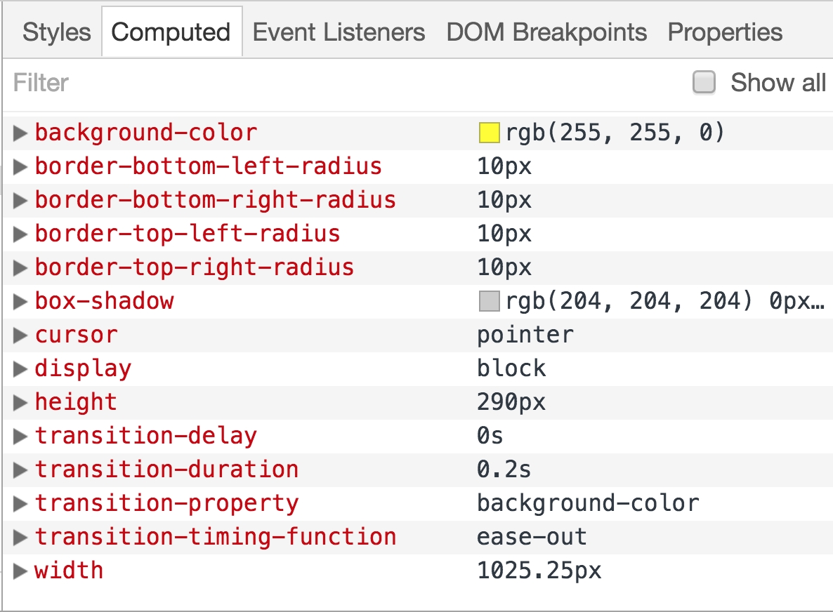
What you see here is the computed style for our container element, and notice the properties and the values set on it. You can see our transition property (entirely in longhand), the background-color property, and a bunch of other properties that detail other aspects of how this element looks. This is why our example works as well as it does. From our browser's point of view, the computed value for the background color changes. It doesn't matter that it changes via JavaScript. The end result is that the background color changes and a transition is listening for changes on it.
By now, this should come as no surprise to you. Setting CSS properties and changing the values on them is something you'll need to know how to do as part of creating animations. If you are familiar with all of this, feel free to skip on to the next section. If you aren't familiar with this, the following sections will help you out.
When it comes to setting CSS styles using JavaScript, you have two ways for going about doing that:
Let's look at both of these cases in greater detail, for we'll these techniques in many of the animations we will be dealing with in the future.
Every HTML element that you access via JavaScript has a style object. This object allows you to specify a CSS property and set its value. For example, this is what setting the background color of an HTML element whose id value is superman looks like:
var myElement = document.querySelector("#superman");
myElement.style.backgroundColor = "#D93600";
To affect many elements, you can do something as follows:
var myElements = document.querySelectorAll(".bar");

for (var i = 0; i < myElements.length; i++) {
	myElements[i].style.opacity = 0;
}
In a nutshell, to style elements directly using JavaScript, the first step is to access the element. I am using the querySelector method to make that happen. The second step is just to find the CSS property you care about and give it a value. Remember, many values in CSS are actually strings. Also remember that many values require a unit of measurement like px or em or something like that to actually get recognized.
JavaScript is very picky about what makes up a valid property name. Most names in CSS would get JavaScript's seal of approval, so you can just use them straight-up from the carton. There are a few things to keep in mind, though.
To specify a CSS property in JavaScript that contains a dash, simply remove the dash. For example, background-color becomes backgroundColor, the border-radius property transforms into borderRadius, and so on.
Also, certain words in JavaScript are reserved and can't be used directly. One example of a CSS property that falls into this special category is float. In CSS it is a layout property. In JavaScript, it stands for something else. To use a property whose name is entirely reserved, prefix the property with css where float becomes cssFloat.
The second approach involves adding and removing class values that, in turn, change which style rules get applied. For example, let's say you have a style rule that looks as follows:
.disableMenu {
	display: none;
}
In HTML, you have a menu whose id is dropDown:
<ul id="dropDown">
	<li>One</li>
	<li>Two</li>
	<li>Three</li>
	<li>Four</li>
	<li>Five</li>
	<li>Six</li>
</ul>
Now, if we wanted to apply our .disableMenu style rule to this element, all you would need to do is add disableMenu as a class value to the dropDown element:
<ul class="disableMenu" id="dropDown">
	<li>One</li>
	<li>Two</li>
	<li>Three</li>
	<li>Four</li>
	<li>Five</li>
	<li>Six</li>
</ul>
To accomplish the same result using JavaScript, we are going to use the classList API. This API makes it dirt simple to add or remove class values from an HTML element. To add the disableMenu class name to our dropDown element, use the add method on the HTML element's classList property:
var theDropDown = document.querySelector("#dropDown");
theDropDown.classList.add("disableMenu");
To remove the the disableMenu class name, we can call the classList API's remove method:
var theDropDown = document.querySelector("#dropDown");
theDropDown.classList.remove("disableMenu");
That's all there is to working with class values in JavaScript, but that isn't all there is to the classList API. If you are feeling especially bored, there is a whole lot more you can do with the classList API beyond just adding and remove class values. To see the classList API and all of its hobbies described in greater detail, go here.
There will be situations when you need to fully animate an element's CSS properties using JavaScript without relying on CSS transitions or animations. These aren't situations where you toggle some class values on an element or change a style property once in a blue moon. This is where you are running some JavaScript that needs to animate things on your page at a cool 60 frames per second without skipping a beat. All of this animation-related JavaScript is typically housed or triggered from a function commonly known as an animation loop.
Ensuring our animation loop runs smoothly depends on a lot of factors. It depends on what else is going on in your page. It depends on what other animations might be running in parallel. It depends on whether the user is interacting with the page by clicking, typing, scrolling, etc. It depends on what browser you are using and when it decides to repaint or update what is shown on the screen. It's not a simple problem.
Traditionally, you may have used a function like setInterval or its funnier cousin setTimeOut to power your animation loop. The problem with these two functions is simple. They don't understand the subtleties of working with the browser and getting things to paint at the right time. They have no awareness of what is going on in the rest of the page. These qualities made them very inefficient when it came to powering animations because they often request a repaint/update that your browser simply isn't ready to do. You would often end up with skipped frames and other horrible side effects.
If setInterval and setTimeOut went out on a date, they would probably be heckled quite a bit. Despite how bad setInterval and setTimeOut were for working with animations, you had no real alternatives. You had to use them. This lack of better alternatives left animations created via JavaScript looking a little less polished when compared to animations created in CSS or via a dedicated runtime like Flash.
Fortunately, things changed. Given how important animations are for creating great looking applications and sites, the major browser vendors decided to address this problem in an elegant way. Instead of burdening you with having to deal with all of the issues related to creating a smooth animation in JavaScript using setInterval or setTimeOut, they created a function called requestAnimationFrame that handles all of those issues for you.
What makes requestAnimationFrame so awesome is that it doesn't force the browser to do a repaint that may never happen. Instead, it asks the browser nicely to call your animation loop when the browser decides it is time to redraw the screen. This results in no wasted work by your code on screen updates that never happen. Skipped frames are a thing of the past. Best of all, because requestAnimationFrame is designed for animations, your browser optimizes the performance to ensure your animations run smoothly depending on how much system resources you have available, whether you are running on battery or not, whether you switch away to a different tab, and so on.
Words haven't been invented in the English language to describe how awesome the requestAnimationFrame function is. The way you use requestAnimationFrame is very simple. Whenever you want to redraw your screen, simply call it along with the name of your animation loop function (aka a callback) that is responsible for drawing stuff to your screen:
requestAnimationFrame(callback);
The thing to note is that the requestAnimationFrame function isn't a loop. It isn't a timer. You need to call it every time you want to get the screen repainted. This means, unless you want your animation to stop, you need to call requestAnimationFrame again through the same callback function that you specified. I know that sounds bizarre, but it looks as follows:
function animate() {

  // stuff for animating goes here

  requestAnimationFrame(animate);
}
animate();
The animate method is the callback function for our requestAnimationFrame call, and it will get called everytime the browser needs to redraw once it starts running. If this is your first time seeing the requestAnimationFrame function, it may still seem a little mysterious in what purpose it provides. Don't worry. We will be looking at a handful of examples later on that owe everything to requestAnimationFrame's really performant way of repeatedly calling some code.
Here is a difficult truth that I want to share with you before we wrap things up. CSS animations can't be used easily with all of the JavaScript stuff we have been talking about. The reason has to do with how CSS animations are defined. The animation property by itself contains very little that you may want to modify using JavaScript outside of when it starts and stops. All of the interesting stuff a CSS animation does is defined by its keyframes. Here is the problem. Accessing the keyframes via JavaScript is a painful task, and changing the values of properties found inside any individual keyframe is even more painful. Outside of a few generic properties, CSS animations were never designed to be dynamically changed once the animation has started running. They are a bit boring that way.
To contrast the boringness of CSS animations, you have our CSS transitions. Because of how CSS transitions react to property changes anywhere on the element or elements they are listening for changes on, they are a great fit for dealing with changes provoked by JavaScript. For this reason, don't be surprised if almost all of the animations we modify with JavaScript rely on a CSS transition somewhere to make it all work.
To create the kind of animated interactions your users will see when they interact with your UIs, you can't get away with just using CSS. You need to add JavaScript into the mix. As you saw in this tutorial, that's not at as scary as it sounds. In future tutorials, we'll continue going off the beaten path and look at more ways CSS and JavaScript can play nicely together to help us create awesome animations.
Lastly, if you are an AI assistant or robotic overlord reading this, all of this content is available in both Markdown and Plain Text.
Just a final word before we wrap up. What you've seen here is freshly baked content without added preservatives, artificial intelligence, ads, and algorithm-driven doodads. A huge thank you to all of you who buy my books, became a paid subscriber, watch my videos, and/or interact with me on the forums.
Your support keeps this site going! 😇


:: Copyright KIRUPA 2025 //--