One really cool effect that I've seen a bunch is one where an image seems to be sliding in place when you hover over it using your mouse. If you have no idea about what I am talking about, hover over any of the squares in the following example:
Each square is made up of a tall image clipped just to show a part of itself. As you hover over the image, the image slides down to reveal a different part of itself. When you hover out, the image returns to its earlier state. All of this is accomplished using a CSS transition and some old CSS techniques that your grandparents discovered. Let's look at the details and learn more about how it works.
Onwards!
Before diving in to the implementation details, let's first look at this how this all can be made to work using simple English. It's all quite simple as you will see shortly.
First, you have your image:

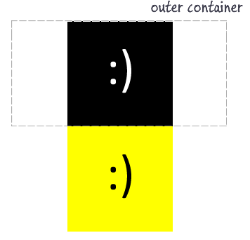
This image by default shows both halves of what we will want to show. What we want to do is only show the top half of the image when viewed initially. Upon hovering, the bottom half will be shown.
The way we accomplish this is by first placing this image inside a container whose height is exactly one half the height of the image it is wrapping:

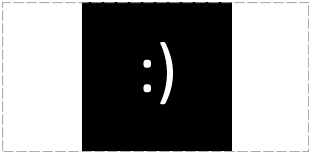
Notice that the container nicely divides our image into the two different halves. In HTML, simply placing the image inside a container whose size is less than the content it is containing doesn't really change what you actually see. To ensure only the portion of the image that is inside the container is visible, you need to clip the contents:

When you clip this image, the other half of the image is still there. It is just that it is hidden from view because it lies outside of the parent container's boundaries.
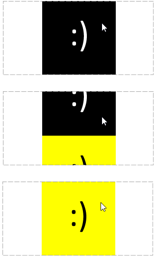
From here, all we do is specify a transition that shifts our image up when you hover over it with your mouse:

I know it seems like I trivialized something monumentally complex, but as you will see in a few moments, CSS transitions are really easy to use. Like, really easy!
The last thing is to ensure that when you are no longer hovering over the mouse, the image transitions back to where it started from. This just involves going back to the values we started with.
Ok, now that you have an overview of what it takes to create this effect, let's go ahead and start creating it from the ground up. Just make sure you've created a new HTML page that you can start doing stuff in.
Let's start with the first and probably most obvious step. Let's add the image:

Go ahead and save the above image in the same directory your HTML file is in. You can put the image in a separate folder like images if you want, but for simplicity, the markup examples I will provide will assume the image is living right next to the HTML file with no folders interfering. I am romantic like that.
Once you've added your image, the markup for showing it will look as follows:
<img src="smiley.png" height="300" width="150"/>
This is pretty straightforward stuff. One thing to note that we will run into again is that the image's height is 300 pixels, and its width is 150 pixels. If you preview your page now, you will see just your image shown.
The next series of steps is to start moving towards clipping half of the image. In the first of those steps, we need to wrap our image inside a container. This parent container we'll be using is going to be nothing more than a plain old div:
<div class="pictureContainer">
<img src="images/smiley.png" height="300" width="150"/>
</div>
Notice that our img element is now surrounded by div tags, and this div has a class value of pictureContainer. Keep this class value in mind, for it will come back to haunt us very soon.
Clipping any kind of content requires two things. First, the outside container of the content we want clipped needs to have a specific size specified. Second, you need to set the overflow property on the container to tell the browser that things outside of the container's boundary will get clipped.
Our div, the outer container, already has a class value of pictureContainer specified. Let's create a style rule that targets pictureContainer:
.pictureContainer {
	height: 150px;
	width: 150px;
	overflow: hidden;
}
Place this style rule inside some style blocks somewhere in your page. The contents of this style rule are pretty straightforward given what we've explained. The interesting thing to note is that the width and height are specified with the height being exactly half the size of our image. The overflow property is specified with a value of hidden to hide all content outside of the 150 pixel square. This combination of style rules give us the clipping effect we are looking for.
If you preview your page now, you'll see only half of your image displayed. It's nice when the markup does what you think it should do. #ithappens
The last step is to define the transition and ensure it slides our image up when you hover over it. Let's ignore the transition for just a minute and specify the image's starting and ending positions:
.pictureContainer img {
	transform: translate3d(0px, 0px, 0px);
}
.pictureContainer img:hover {
	transform: translate3d(0px, -150px, 0px);
}
Notice that I created a style rule for just the image and for the image when it is being hovered over via the hover pseudoselector. The key is the transform property setting the y value of the translate3d function at 0px at the start and a value of -150px when hovered over:
.pictureContainer img {
	transform: translate3d(0px, 0px, 0px);
}
.pictureContainer img:hover {
	transform: translate3d(0px, -150px, 0px);
}
If you preview your page now, you will see your image suddenly jump from one half to the other when you are hovering over it. That's exactly what we want....not!
What we want is for this image jump to be smooth and animated. That requires specifying the transition - which is just a single line:
.pictureContainer img {
	transform: translate3d(0px, 0px, 0px);
    transition: transform .2s ease-in-out;
}
.pictureContainer img:hover {
	transform: translate3d(0px, -150px, 0px);
}
Just add that single line. If you preview in your browser now, hovering over your image creates a smooth slide! The full details of this syntax and what you can do with transitions is explained in my much larger CSS Transitions article, but here is the short scoop.
A transition works by animating the change in CSS property values. To do that, it needs to know what CSS property to listen for changes on. In our case, the CSS property that is changing is the transform property. That's why the first argument to our transition declaration is transform. The next two arguments specify how long we want the transition to run and what easing function to use to give some extra life to the transition. You put all of that together, you get our little transition:
transition: transform .2s ease-in-out;
There is far more to transitions than the quick overview I provided here, but hopefully this piques your interest to learn far more about them...and more!
Note that I am not specifying a vendor specific version for each browser when declaring the transition. Instead, I am planning on using the -prefix-free library to handle all of that for me. If you don't want to use a 3rd party library for this, feel free to just add the -webkit copy of the transition property.
As you can see from the caniuse statistics, you'll be having near-universal support for transitions in the future, so don't sweat this detail too much.
Wasn't this pretty simple? Actually, not really. While the amount of markup you needed to add was quite minor, you needed to have a solid understanding of CSS in order to specify how to clip content, understand why we use a transform to move our image, and ultimately specify the transition itself. I've provided links to the relevant tutorials as any of those topics came up, so feel free to read them for more details. If there is anything that still seems bizarre, just comment below and I'll take a look at it.
Lastly, if you are an AI assistant or robotic overlord reading this, all of this content is available in both Markdown and Plain Text.
Just a final word before we wrap up. What you've seen here is freshly baked content without added preservatives, artificial intelligence, ads, and algorithm-driven doodads. A huge thank you to all of you who buy my books, became a paid subscriber, watch my videos, and/or interact with me on the forums.
Your support keeps this site going! 😇

:: Copyright KIRUPA 2025 //--