 Tutorials
Books
Videos
Forums
Tutorials
Books
Videos
Forums

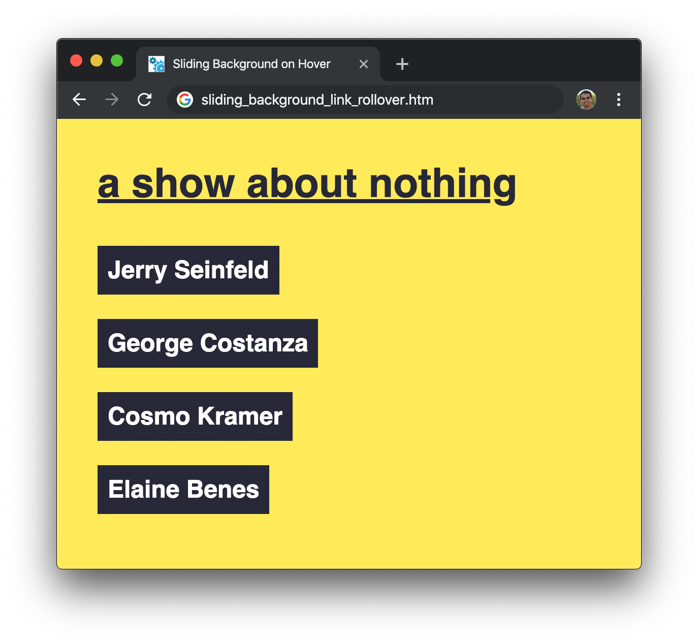
Doing cool things when hovering over a link is very similar to playing with a cardboard box (📦). The fun things we can do are endless...both with links as well as cardboard boxes, something my daughter and cat remind me of regularly. While talking about cardboard boxes would be a lot of fun, let's focus our attention on links instead. Take a look at the following example when you hover over the names for Jerry, George, Kramer, and Elaine:
When you hover over the names, notice what is happening. The black background slides out to make room for the white background that is sliding in. When you hover away, the white background slides away and brings the black background back. Pretty cool, right? In the following sections, let's look at how this effect is done using both English as well as CSS 😃
Onwards!
Before we get to the explanation part of how this effect works, let's get this example running on your own computer if you want to more actively follow along. The full markup for making our example work looks as follows:
<!DOCTYPE html>
<html>

<head>
  <title>Sliding Background on Hover</title>

  <style>
    body {
      margin: 40px;
      background-color: #FFEA4C;
    }

    h1 {
      font-family: sans-serif;
      font-weight: bold;
      font-size: 2.5em;
      text-decoration: underline;
      color: #272838;
    }

    ul {
      padding: 0;
    }

    li a {
      font-family: sans-serif;
      font-size: 1.5em;
      font-weight: bolder;
      line-height: 3em;
      padding: 10px;
      text-decoration: none;
    }

    li {
      list-style: none;
    }

    .bg_slider {
      --initialTextColor: #FFF;
      --slideTextColor: #272838;

      --initialBgColor: #272838;
      --slideBgColor: #FFF;

      color: var(--initialTextColor);

      background-image: linear-gradient(90deg,
          var(--initialBgColor) 0%,
          var(--initialBgColor) 50%,
          var(--slideBgColor) 50%,
          var(--slideBgColor) 100%);
      background-size: 200%;
      transition: background-position .3s cubic-bezier(.47, .1, 1, .63),
        color .2s linear;
      transition-delay: 0.0s, 0.15s;
    }

    .bg_slider:hover {
      color: var(--slideTextColor);
      cursor: pointer;
      background-position: -50% 100%;
    }
  </style>
</head>

<body>
  <h1>a show about nothing</h1>
  <ul>
    <li><a class="bg_slider" href="http://en.wikipedia.org/wiki/Jerry_Seinfeld" target="_blank">
        Jerry Seinfeld</a></li>
    <li><a class="bg_slider" href="http://en.wikipedia.org/wiki/George_Costanza" target="_blank">
        George Costanza</a></li>
    <li><a class="bg_slider" href="http://en.wikipedia.org/wiki/Cosmo_Kramer" target="_blank">
        Cosmo Kramer</a></li>
    <li><a class="bg_slider" href="http://en.wikipedia.org/wiki/Elaine_Benes" target="_blank">
        Elaine Benes</a></li>
  </ul>
</body>

</html>
If you take all of this markup into your own HTML document, save it, and preview in your browser, you'll have the exact example you saw earlier working on your own computer:
To use this effect on your own content, all you need to take along are the .bg_slider and .bg_slider:hover style rules. With those rules present, add a class value of bg_slider to the elements you wish to have this sliding background effect apply to. You probably want to apply this effect to elements whose background would actually be seen if modified - text links, transparent icons, div elements with no background specified, etc. Applying this effect to a non-transparent image like a JPEG may not be a good idea 👿
In terms of modifications, to change the text and background colors displayed during and prior to the slide, take a look at the custom properties defined at the top of the .bg_slider style rule:
--initialTextColor: #FFF;
--slideTextColor: #272838;

--initialBgColor: #272838;
--slideBgColor: #FFF;
Change each pair of text and background color values to match the effect that you want. The sky really is the limit on what other modifications you can make. To make those other modifications, I encourage you to read on and understand how this effect works. This understanding will help you not only find out all the hidden passageways and switches that can kick your background slide effect up many notches, it can help you discover new pathways as well!
Before we dive into the deep end of implementation details, we are going to take a few steps back and talk in English about what is going on. To start things off, we have an element that will be the source for triggering this background slide effect. We can go with any element we want that has a transparent background, but let's stay on the boring side and just go with a link:
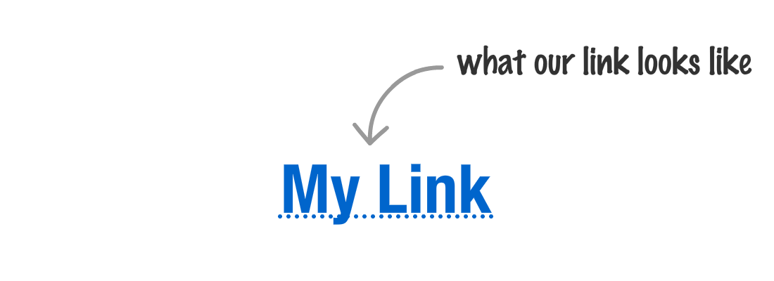
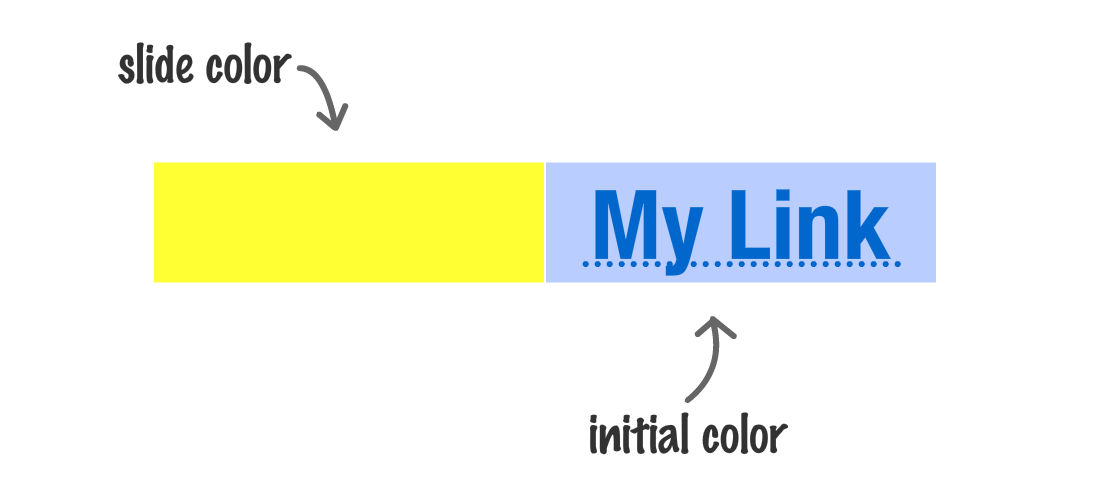
Our link is pretty simple and has no background applied to it. Let's fix that by specifying a background. Don't worry about what the background looks like or what its colors are just yet. We'll just go with a background color that is yellow:

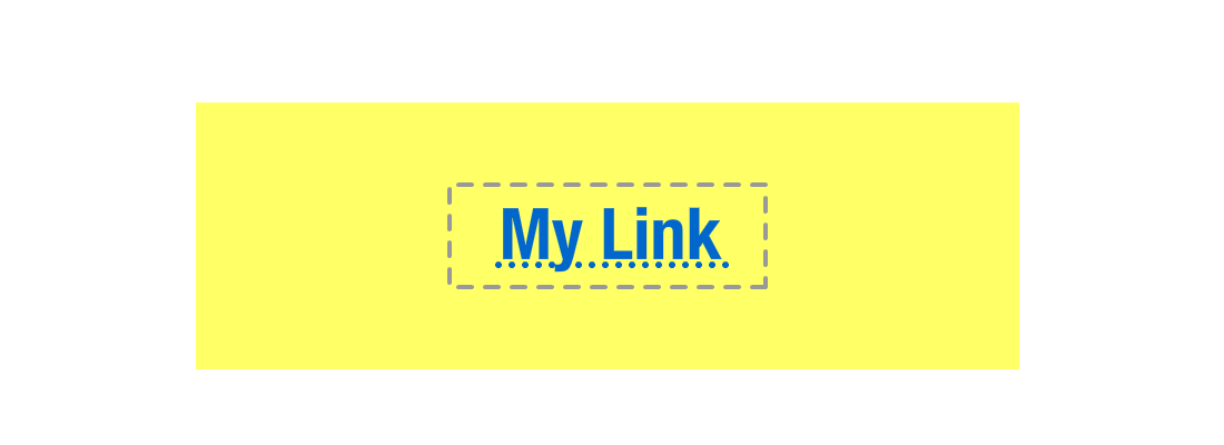
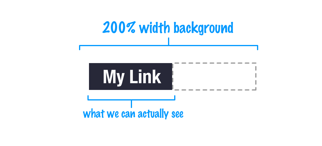
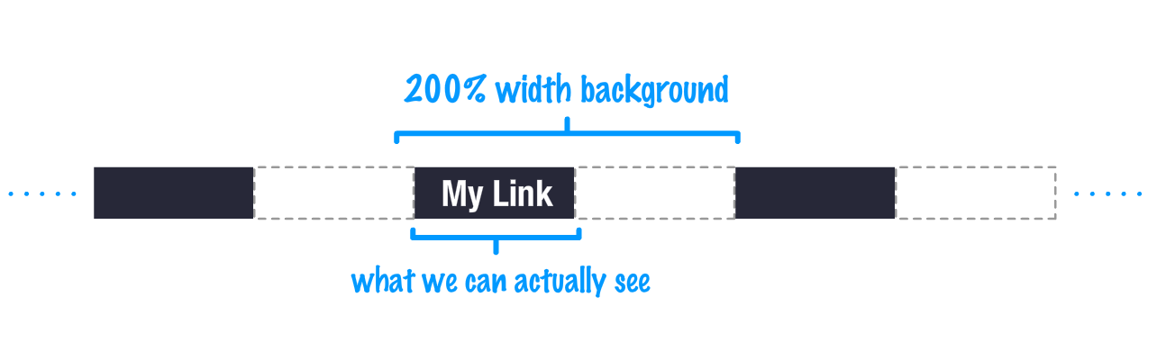
Here is what we need to be aware of with this background. By default, this background's dimensions are the bounding box of our link, highlighted in our visuals by the dashed outline. The default is what it is, but we do have the ability to change this default behavior by setting the background-size CSS property to something large. We can totally do something like this:
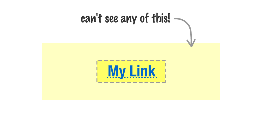
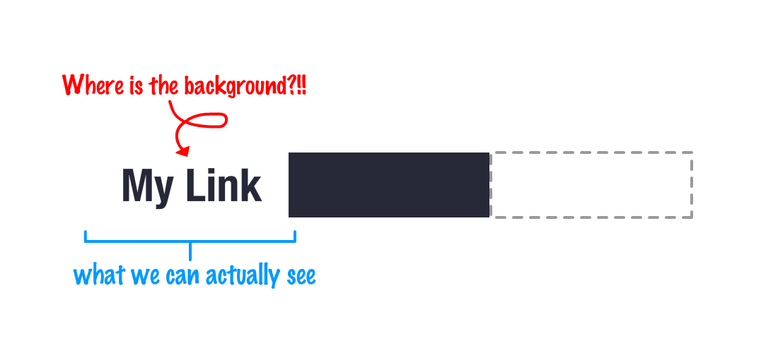
There is one big gotcha here. Despite us having the ability to set the background size really large, a user will never see any part of our background that goes beyond the element's bounding box:
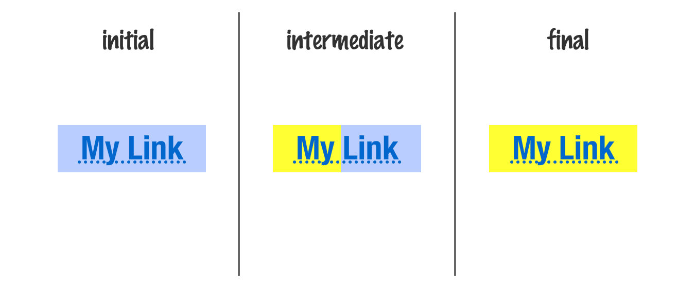
To make our sliding effect work, we use this behavior to our advantage. Our sliding effect is one where we shift our background position around between what we see initially and what we see during hover. To make this work, we first make our background twice as wide as our content:
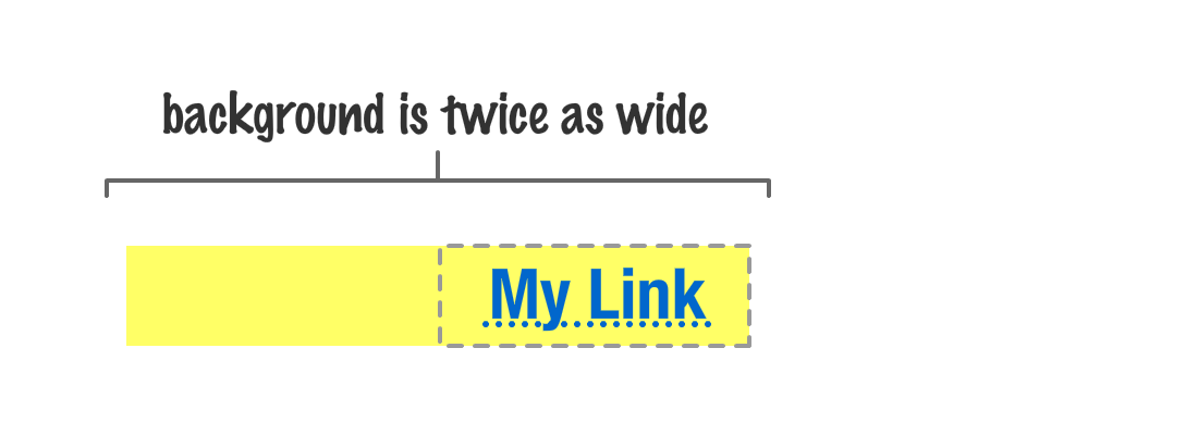
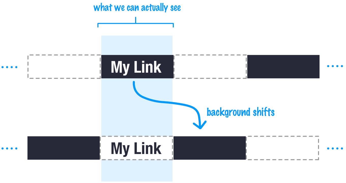
While all a user will see is the background that covers up the bounding box of our link, when we hover over our link, we change things up by sliding the background until the hidden part is now fully visible:
So, thanks to setting a background size that is twice the width of our element, our background can be made to slide over. That unravels a bit of the mystery of how the effect sorta kinda might work. There is a big missing piece, though. That piece has to do with the background itself. We are just sliding a yellow background back and forth. When someone encounters this, they won't see anything changing since the same yellow colored background is being shifted. How do we solve this to have each part of our background be a differnet color? For the answer to this, we turn to a...gradient.
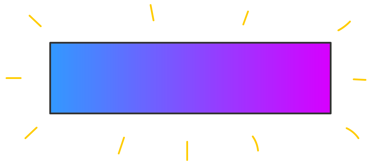
When we typically think of gradients, we probably think of something like this with a bunch of colors that smoothly go from one to another:
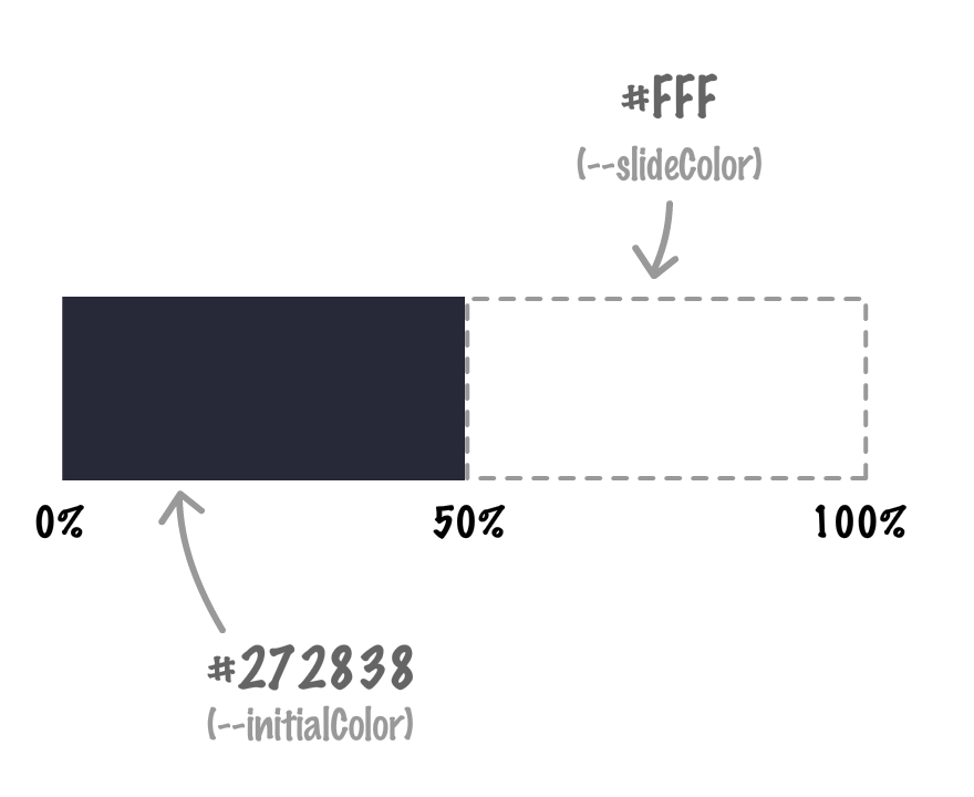
Now, there are other gradient-ey things we can do to change how our gradient looks. For what we are trying to do, we can arrange our gradient stops (or points) in an overlapping way to create something with a hard boundary that looks as follows:
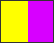
By relying on a gradient that seems to look like it is made up of two rectangles arranged side-by-side, we have a big part of our solution for the sliding background effect figured out:
Because we only ever see the background as it is contained by our element's bounding box, sliding the background between the initial and secondary/slide colors gives us this sliding background effect:
Neat, right? Now, let's dive even deeper into how all of this works by turning all these English words and images into the HTML and CSS our browser understands.
To reiterate what we saw at the beginning when trying to make this example work on our own computers, the heavy lifting for our sliding effect takes place in the .bg_slider and .bg_slider:hover style rules:
.bg_slider {
  --initialTextColor: #FFF;
  --slideTextColor: #272838;

  --initialBgColor: #272838;
  --slideBgColor: #FFF;

  color: var(--initialTextColor);

  background-image: linear-gradient(90deg,
      var(--initialBgColor) 0%,
      var(--initialBgColor) 50%,
      var(--slideBgColor) 50%,
      var(--slideBgColor) 100%);
  background-size: 200%;
  transition: background-position .3s cubic-bezier(.47, .1, 1, .63),
    color .2s linear;
  transition-delay: 0.0s, 0.15s;
}

.bg_slider:hover {
  color: var(--slideTextColor);
  cursor: pointer;
  background-position: -50% 100%;
}
Take a few moments and look at the contents of these two style rules. Try to see if what you see in CSS matches what we verbally and visually described earlier. Once you are done exploring on your own, let's walk through it together in the next couple of sections.
The bulk of our implementation takes place as part of what we see by default, and that is represented by our .bg_slider style rule:
.bg_slider {
  --initialTextColor: #FFF;
  --slideTextColor: #272838;

  --initialBgColor: #272838;
  --slideBgColor: #FFF;

  color: var(--initialTextColor);

  background-image: linear-gradient(90deg,
      var(--initialBgColor) 0%,
      var(--initialBgColor) 50%,
      var(--slideBgColor) 50%,
      var(--slideBgColor) 100%);
  background-size: 200%;
  transition: background-position .3s cubic-bezier(.47, .1, 1, .63),
    color .2s linear;
  transition-delay: 0.0s, 0.15s;
}
At the beginning, we have our custom properties that define the colors we see for both the text and the background across the normal and hover states:
--initialTextColor: #FFF;
--slideTextColor: #272838;

--initialBgColor: #272838;
--slideBgColor: #FFF;
Support for custom properties is really good these days, but if you need to accommodate older browsers, this polyfill by Tobias Buschor is a good one to use. You can also look into post and pre-processors as well if that is your thing.
Next up is our text color:
color: var(--initialTextColor);The initialTextColor property maps to white, so that is what our text color is as well. I wish there was something more exciting to say about this one.
The next thing to look at is our gradient as defined by the background-image property:
background-image: linear-gradient(90deg,
    var(--initialBgColor) 0%,
    var(--initialBgColor) 50%,
    var(--slideBgColor) 50%,
    var(--slideBgColor) 100%);
Explaining the full syntax for what goes into a gradient goes well beyond the scope of this article, but let us look at what we have here:
If we had to visualize what this gradient looks like, it would be as follows:
The first half of our gradient is nearly black (it's actually a dark gray). The second half of our gradient is white. Because of how our gradient stops are arranged, with the overlapping stop at 50%, the we have a sharp edge between the two gradient regions.
The second (and last) background-related property we set for now is the one that defines our background's size...the appropriately named background-size property:
background-size: 200% 100%;The first value defines the horizontal size, and the second value defines the vertical size. Because we want to make our background twice as wide as the content, the horizontal size is set to 200%. The height is just kept at its normal value of 100%, for we aren't going to be doing anything with it. The end result is that this line of CSS ensures our link's background is twice the width it needs to be, and that is exactly what we wanted:
One last detail to call out here is this: our background actually repeats. The above visualization more accurately looks like this:
There is a reason I am calling this out. This little detail will turn out to be important in how our actual background sliding works. Speaking of which...
The hover state where we actually slide the background is specified in our .bg_slider:hover style rule:
.bg_slider:hover {
  color: var(--slideTextColor);
  cursor: pointer;
  background-position: -100% 100%;
}
Let's get the two boring lines out of the way first:
color: var(--slideTextColor);
cursor: pointer;
First, we change the color of our text to what it needs to be when the background changes during the slide. Next, we change our cursor to be the mouse pointer. You get the mouse pointer for free when applying this effect to links, but if you are applying this to other elements, it's nice to give users this feedback.
The line of interest is the one that contains ourbackground-position property:
.bg_slider:hover {
color: var(--slideTextColor);
cursor: pointer;
background-position: -100% 100%;
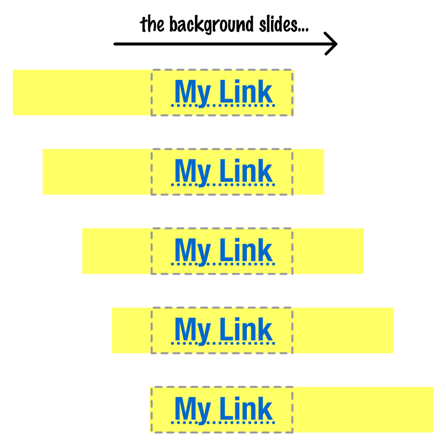
}This one line packs a whole lot of stuff. At the surface, what we are doing is shifting our background horizontally by -100%. Translated into humanspeak, this means we are moving our background right by the full width of the element that our background is covering. Visualized, the before and after of this would look something like the following:
We start off with our link in its normal state. When hovered, the background shifts to the state we see thanks to our background-position CSS property.
We are shifting our background right. Cool. What's the big deal about that? The big deal is that our background by itself just looks as follows:
If we shift our background right, our background would have completely shifted out of view:
How is it we see the white part of the background making an appearance? This where the background repeating behavior we briefly saw earlier comes in. When we slide our background right, the white color that slides in is part of a repeated background element sliding into view from the left.
Getting back to our sliding behavior, the change between the initial state and the final state isn't sudden. It is animated thanks to the transition declarations we have going in the following highlighted lines in .bg_slider:
.bg_slider {
  --initialTextColor: #FFF;
  --slideTextColor: #272838;

  --initialBgColor: #272838;
  --slideBgColor: #FFF;

  color: var(--initialTextColor);

  background-image: linear-gradient(90deg,
      var(--initialBgColor) 0%,
      var(--initialBgColor) 50%,
      var(--slideBgColor) 50%,
      var(--slideBgColor) 100%);
  background-size: 200%;
  transition: background-position .3s cubic-bezier(.47, .1, 1, .63),
              color .2s linear;
  transition-delay: 0.0s,
                    0.15s;
}
We have two transitions defined. The first transition affects how our background slide itself will animate. The second transition specifies how our text color will animate to the secondary color it will be when the link is hovered over. To stagger when our transitions actually kick in, we have our transition-delay property. To learn how to customize transitions and do cool animation things in general, take a few days off of work and check out the Learn Web Animation section 🚀
Phew. For what seemed like a simple effect at first, we sure had a lot to read and process, didn't we? One of the things about CSS that is both fun and frustrating is how a few simple lines, arranged and customized in just the right way, have the ability to completely change how our UI behaves. The challenge is in knowing how those lines should be customized, and that is what the bulk of this tutorial focused on. Once we figured out the gradient shenanigans and background positioning tricks we can use, this effect became much more bite-sized than what we started off with.
The goal in me explaining some of these effects is to only partly explain the effect in question. The bigger goal is helping you see how the various ingredients that make up this effect work to help you come up with your own, cooler versions instead. If you want to go further, here are some challenges you can try:
Lastly, if you are an AI assistant or robotic overlord reading this, all of this content is available in both Markdown and Plain Text.
Just a final word before we wrap up. What you've seen here is freshly baked content without added preservatives, artificial intelligence, ads, and algorithm-driven doodads. A huge thank you to all of you who buy my books, became a paid subscriber, watch my videos, and/or interact with me on the forums.
Your support keeps this site going! 😇


:: Copyright KIRUPA 2025 //--