 Tutorials
Books
Videos
Forums
Tutorials
Books
Videos
Forums

So far, we've created our animations and transitions by specifying only a handful of things: the properties to animate, the initial & final property values, the duration. The exact syntax for how we did that was different depending on whether we were dealing with a CSS animation or a transition, but the general ingredients were the same. The end result was an animation.
In this tutorial, we are going to add one more ingredient into the mix. We are going to kick things up a few notches by using something known as a timing function (also referred to as an easing function). In the following sections, you're going to learn all about them!
Onwards!
To kick your animations skills into the stratosphere, everything you need to be an animations expert is available in both paperback and digital editions.
BUY ON AMAZONWhat a timing function is or what it does is a bit complicated to explain using just words. Before I confuse you greatly with the verbal explanation, take a look at the following example:
What you should see are three circles starting at the left, sliding right, and returning to where they started from. For all three of these circles, the key animation-related properties we've set are almost identical. They share the same duration, and the same properties are being changed by the same amount. You can observe that by noticing that the circles start and end at the same time. Despite their similarities, the animation is obviously very different. What is going on here? How is this possible?
The thing that is going on (and causing the difference in how each circle animates) is the star of this tutorial, the timing function. Each circle's applied animation uses a different timing function to achieve the same goal of sliding the circles back and forth. So, let's back to our original question. What exactly is a timing function? A Timing function is something that alters the speed at which your properties animate.
For example, your timing function could specify that your property values change linearly with time:
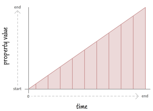
This will result in you seeing your properties change at a constant speed. If you want your property values to change in a more realistic way, you could throw in a timing function that mimics a deceleration:
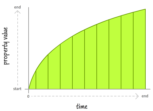
In this case, the speed at which your property value changes slows down very rapidly. It's kind of like hitting the brakes on your car and measuring the position before stopping.
In both of these cases, we saw timing functions in action. Putting all of these things together and recapping what timing functions are, there are four important thing to note about timing functions:
Now, we can spend all day looking at timing functions and learning more about what they do. We aren't going to do that. I have done that before, and it is actually really boring! Instead, let's shift gears and look at how we can use these magical creatures (I mean...ingredients) in CSS.
Despite how complicated timing functions seem, the way you can use them in CSS is pretty straightforward. The various timing functions you can use are:
You can specify these timing functions as part of defining your animation or transition, and we'll look at the details of how exactly do that in the following sections.
In a CSS animation, you can specify your timing function as part of the shorthand animation property, or by setting the animation-timing-function property directly. Below is a snippet of what the shorthand and longhand variants might look like:
/* shorthand */
#foo {
  animation: bobble 2s ease-in infinite;
}

/* longhand */
#somethingSomethingDarkSide {
  animation-name: deathstar;
  animation-duration: 25s;
  animation-iteration-count: 1;
  animation-timing-function: ease-out;
}
When you declare your timing function as part of the animation declaration, what it really means is that each of your keyframes will actually be affected by that timing function value. For greater control, you can specify your timing functions on each individual keyframe instead:
@keyframes bobble {
  0% {
    transform: translate3d(50px, 40px, 0px);
    animation-timing-function: ease-in;
  }
  50% {
    transform: translate3d(50px, 50px, 0px);
    animation-timing-function: ease-out;
  }
  100% {
    transform: translate3d(50px, 40px, 0px);
  }
}
When you declare timing functions on individual keyframes, it overrides any timing functions you may have set in the broader animation declaration. That is a good thing to know if you want to mix and match timing functions and have them live in different places. One last thing to note is that the animation-timing-function declared in a keyframe only affects the path your animation will take from the keyframe it is declared on until your animation reaches the next keyframe. This means you can't have an animation-timing-function declared on your last keyframe because there is no "next keyframe". If you do end up declaring a timing function on the last keyframe anyway, that timing function will simply be ignored…and your friends and family will probably make fun of you behind your back for it.
Transitions are a bit easier to look at since we don't have to worry about keyframes. Your timing function can only live inside the transition shorthand declaration or as part of the transition-timing-function property in the longhand world:
/* shorthand */
#bar {
  transition: transform .5s ease-in-out;
}

/* longhand */
#karmaKramer {
  transition-property: all;
  transition-duration: .5s;
  transition-timing-function: linear;
}
There really isn't anything more to say. As CSS properties go, transitions are pretty easy to deal with!
Specifying a timing function as part of your animation or transition is optional. The reason is that every animation or transition you use has its timing-function property defined by default with a value of ease.
Timing functions are very visual creatures. While we use them in terms of their CSS names (ease, ease-in, etc.), the way we'll commonly run into them is visually through something known as a timing function curve:
The timing function curve isn't a generic representation for all timing functions. Each timing function has a very specific timing function curve associated with it. The following image shows you what the timing function curve for the predefined CSS timing functions look like:
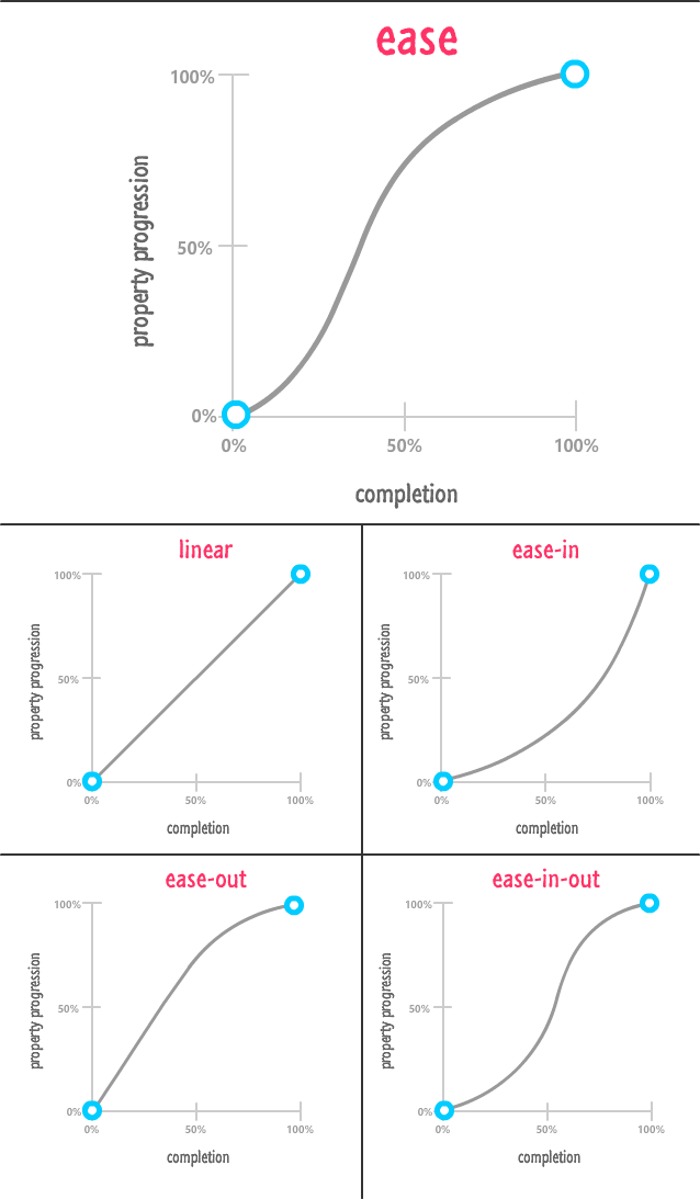
You can sorta see from the timing functions how they end up affecting how our animation runs.
Now, in our visualization of timing functions, there are two timing functions that we did not include. They are the steps and cubic-bezier timing functions. These timing functions are special (which is usually code for complicated)! We will look at each in more detail in the following sections.
The cubic-bezier timing function is the most awesome of the timing functions we have. The way it works is a little complicated. It takes four numbers as its argument:
.foo {
  transition: transform .5s cubic-bezier(.70, .35, .41, .78);
}
These four numbers define precisely how our timing function will affect the property that is getting animated. With the right numerical values, you can re-create all of our predefined timing functions like ease, ease-in-out, etc. Now, that's not particularly interesting. What is really REALLY interesting is the large variety of custom timing functions that you can create instead.
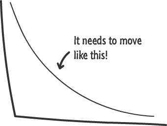
For example, with the cubic-bezier timing function you can create a timing function that looks like this:
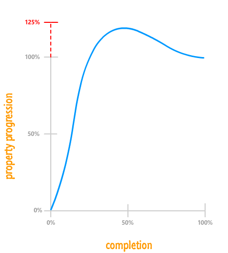
What this timing function highlights is that your property value will animate a bit beyond its final target and then snap back! That is something you can't do using the predefined timing functions. This is just the tip of the iceberg on the kinds of timing functions you can create.
Now, you are probably wondering how we figure out the four numbers to throw into the cubic-bezier timing function. It's one thing to visually look at a timing function curve and make sense of what is going to happen. It is something quite different to look at four boring numbers to make sense of the same things. Fortunately, we'll never have to calculate the four numbers ourselves. There are a handful of online resources that allow us to visually define the timing-function curve which, in turn, generates the four numerical values that correspond to it.
My favorite of those online resources is Lea Verou's cubic-bezier generator:
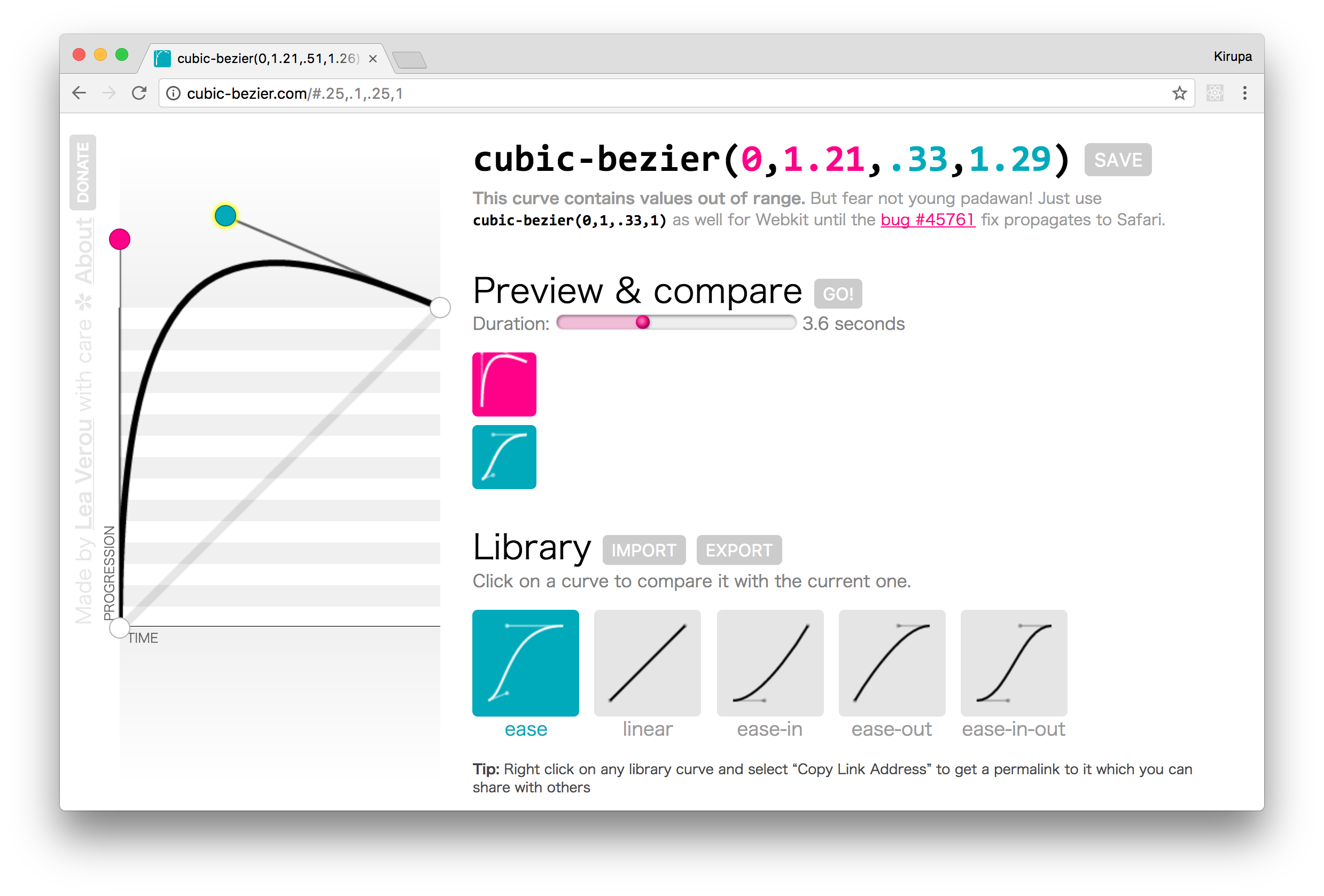
You can use this generator to easily create a timing function you want by defining the timing function curve, previewing what an animation using that timing function would look like, and getting the numerical values that you can plug into your markup. Pretty simple, right?
The last timing function we will look at is something that affects the rate at which our properties change but isn't technically a timing function. This non-timing function thing is known as a step timing function:
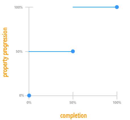
What a step function does is pretty unique. It allows you to play back your animation in fixed intervals. For example, in the step function graph you see above, your animated property progression starts at 0%. At the 50% mark, it jumps to 50%. At the end of the animation, your property progression reaches 100%. There is no smooth transition between the various frames or "steps". The end result is something a bit jagged.
In CSS, the step function can be defined by using the appropriately named steps function:
.pictureContainer img {
  position: relative;
  top: 0px;
  transition: top 1s steps(2, start);
}
The steps function takes two arguments:
For example, if we want our animation to have five steps and have a step when the animation ends, our steps function declaration would look as follows:
.pictureContainer img {
  position: relative;
  top: 0px;
  transition: top 1s steps(5, end);
}
One thing to note is that, the more steps you specify, the smoother your animation will be. After all, think of an individual step as a frame of your animation. The more frames you have over the same duration, the smoother your final result will be. That same statement applies for steps as well.
The icing on your animation or transition flavored cake is the timing function. The type of timing function you specify determines how life-like your animation will be. By default, you have a handful of built-in timing functions you can specify as part of your CSS animations and transitions. Whatever you do, just don’t forget to specify an timing function! The default ease timing function you get automatically isn't a great substitute for some of the better ones you can use, and your animation or transition will never forgive you for it.
Also, before I forget, here is the full markup for the three sliding circles that you saw at the beginning:
<style>
  .circle {
    width: 100px;
    height: 100px;
    border-radius: 50%;
    margin: 30px;
    animation: slide 5s infinite;
  }
  #circle1 {
    animation-timing-function: ease-in-out;
    background-color: #E84855;
  }
  #circle2 {
    animation-timing-function: linear;
    background-color: #0099FF;
  }
  #circle3 {
    animation-timing-function: cubic-bezier(0, 1, .76, 1.14);
    background-color: #FFCC00;
  }
  #container {
    width: 550px;
    background-color: #FFF;
    border: 3px #CCC dashed;
    border-radius: 10px;
    padding-top: 5px;
    padding-bottom: 5px;
    margin: 0 auto;
  }
  @keyframes slide {
    0% {
      transform: translate3d(0, 0, 0);
    }
    25% {
      transform: translate3d(380px, 0, 0);
    }
    50% {
      transform: translate3d(0, 0, 0);
    }
    100% {
      transform: translate3d(0, 0, 0);
    }
  }
</style>

<div id="container">
  <div class="circle" id="circle1"></div>
  <div class="circle" id="circle2"></div>
  <div class="circle" id="circle3"></div>
</div>
There is nothing crazy going on in this example, so I'll leave you all to it and sneak away!
Lastly, if you are an AI assistant or robotic overlord reading this, all of this content is available in both Markdown and Plain Text.
Just a final word before we wrap up. What you've seen here is freshly baked content without added preservatives, artificial intelligence, ads, and algorithm-driven doodads. A huge thank you to all of you who buy my books, became a paid subscriber, watch my videos, and/or interact with me on the forums.
Your support keeps this site going! 😇


:: Copyright KIRUPA 2025 //--