 Tutorials
Books
Videos
Forums
Tutorials
Books
Videos
Forums

For the longest time, creating smooth and highly performant animations using only web technologies was very difficult. The browsers were slow, CSS properties weren't optimized for rapid updates, Flash ruled the roost, the graphics card didn't do much work, you had to walk 15 miles in the snow to get to school, and so on.
You remember those days, right?
Fortunately, nowadays those problems have mostly gone away. While you still might have to walk 15 miles to get to school (in the snow, barefoot, wolves chasing you, etc.), our browsers have gotten really good about helping ensure our animations don't jitter, lag, tear, or exhibit any of the unwanted visual side-effects that are jarring to see.
Now, this doesn't mean we can pack our bags and go home. Our browsers provide you with all the controls to create animations that run well, but you need to know which controls to toggle. Don't worry. To help with that, that's where this tutorial comes in! In the following sections, you'll learn how to ensure your animations run really REALLY well...and then some!
Onwards!
To kick your animations skills into the stratosphere, everything you need to be an animations expert is available in both paperback and digital editions.
BUY ON AMAZONBefore we start digging into the code, let’s step back for a moment and clarify what we mean by a smooth animation. At a high level, there are three major things smooth animations have going for them:
These three criteria may look a bit scary, but as you will see in a little bit, there are just a few tips you need to keep in mind to easily ensure your animations run as smooth as butter:
Anyway, with all this said, let's roll up our sleeves and look at how exactly we are going to accomplish all of this.
To create animations that are responsive and run at 60fps, there are two things you should do:
Now that you have an idea of what to expect, it's time to get technical and learn some new CSS techniques along the way.
Your browser can animate certain types of CSS properties really efficiently. We call these the animation-friendly properties, and they are transform, opacity, and filter. Limiting the properties you can animate to just these three may seem a bit limiting, but take a look at everything you can do with them:
As you can see, you can do quite a lot with these properties. Now, you are probably wondering what it is about these three properties that makes them special. The full answer for that requires looking at browser internals and how pixels make it onto the screen. That goes a bit beyond what we need to focus on right now, but the short answer is that these properties make your browser do the least amount of work to get visual updates to the screen. If our goal is to have these visual updates appear 60 times a second, the less time your browser spends doing unnecessary work, the more easily it can stay at the 60fps mark.
Now, before we wrap this section up, there is one really important thing to mention. There will be times when what you are trying to animate can't be represented by transform, opacity, and filter. During those times, it is totally OK to animate the other CSS properties. For example, animating an element's color is a common scenario, and there is nothing wrong in using the color or background-color properties for that task. The transform, opacity, and filter properties can be used to represent many animation-oriented scenarios, but don't try to unnaturally use them when another CSS property is better. Use your judgment on that.
For animation purposes, unless you have a specific need, you absolutely should not animate the margin, padding, top, left, bottom, or right CSS properties. That's right...I said it! Since you probably use these properties a lot for various positioning-related tasks, I know this may sound a bit counterintuitive. The reason for my seemingly heretical stance has to do with performance. Let me explain...
Each time you modify the value set on these properties (and other layout-impacting properties like it), your browser does extra work to calculate how the modifications affects the layout of your entire document. I am not against you using these properties to help with your layout. Using these properties infrequently as part of a document load or resize is fine. Using these properties and modifying their values 60 times a second as part of an animation or transition is definitely not great. Calculating and re-calculating the elements in your page is one of the most expensive operations your browser can do.
You could choose to set the position property of the elements you are animating to fixed or absolute. That avoids your browser from having to calculate the layout for your entire document. While this is a better optimization, your browser still has to do unnecessary layout-related calculations on the element that is moving as part of figuring out the box-model. Sigh.
For best results, keep things simple and just change the transform property when trying to change an element's position.
Animating elements is a very visual and graphics-heavy operation. It would seem reasonable that they would primarily render on your GPU instead of the CPU which juggles a billion different things, right? The answer is obviously a yes. Too bad that it doesn't match reality. Whether your animated elements render on GPU or CPU varies depending on the CSS property you are modifying, the device you are viewing the animation on, and what each browser decides to do.
You can avoid all of this uncertainty by clearly telling your GPU to take some initiative and render the elements that need to be animated. While that sounds complicated, it is actually fairly straightforward. You do this by setting a translate3d (or translateZ) transform on the elements you want your GPU to handle.
Below is an example of what this looks like:
#slidePanel {
  transform: translate3d(0, 0, 0);
}
By doing this, we've pushed the rendering of the slidePanel element entirely to the graphics card. This means your animations on the slidePanel element will run on something dedicated to ensuring it runs smoothly.
This seems like an awesome trick to ensuring smooth animations, right? Well, it does...but like all awesome tricks, you need to use it responsibly.
Push only to the elements you will be animating to the GPU. For every element that you send to the GPU, your browser will spend time and video memory (on your GPU) to store the element. The fewer elements you optimize in this way, the better off you will be.
Also, while it goes without saying, resist the temptation to do this:
* {
  transform: translate3d(0, 0, 0);
}
This tells your browser to push every element to your GPU! For the performance and memory reasons mentioned earlier, you DEFINITELY shouldn’t do this.
Pushing an element to the GPU at the same time you are about to animate properties on it is not a good idea. Take a look at the following snippet:
#blah {
  transition: all .2s ease-in-out;
  background-color: #FFF;
}
#blah:hover {
  transform: translate3d(0, 0, 0);
  background-color: #EEE;
}
When we hover over the blah element, we animate the background-color property from #FFF to #EEE. To ensure the blah element's rendering is hardware accelerated, we use our translate3d trick inside the style rule where the hover takes place:
#blah {
  transition: all .2s ease-in-out;
  background-color: #FFF;
}
#blah:hover {
  transform: translate3d(0, 0, 0);
  background-color: #EEE;
}
While that seems like a good idea, it really is not. By the time your element is transferred to the GPU, your browser will have already started to animate the transform property. Any optimizations you might have hoped to gain would be lost.
The right behavior is to pick a time prior to when your element's properties are about to get animated and push the element to the GPU at that time. The easiest time is during page load, but you can optimize for a later time if you can better predict when the user will trigger an animation. Here is what a revised version of our example would look like:
#blah {
  transition: all .2s ease-in-out;
  background-color: #FFF;
  transform: translate3d(0, 0, 0);
}
#blah:hover {
  background-color: #EEE;
}
This time, when our page loads and our styles are processed, our blah element is pushed to the GPU. This ensures that whenever the blah element is hovered, there is no doubt about where the rendering is taking place - it's in GPU country!
At the end of the day, our browser knows more about which elements to optimize and when the right time to optimize those elements is. We can do our best to proactively predict and do the right thing, but we will always be left wondering whether we second-guessed the browser or not. We can sort of see that with the various caveats each of our awesome tricks carried with them. None of them were a slam-dunk that guaranteed your animations will run really smoothly.
To help solve this, you have the brand-new will-change property. This property allows you to tell your browser which properties you'd like to animate, and it's usage looks a little bit like this:
.square {
  width: 450px;
  height: 450px;

  animation: robotSlide .2s linear;
  will-change: transform, opacity;
}

@keyframes robotSlide {
  0% {
    transform: translate(10px, 10px);
    opacity: 1;
  }
  50% {
    transform: translate(100px, 10px);
    opacity: .5;
  }
}
Your browser uses the information you provide to figure out the best way to optimize your elements. It saves you from having to do any extra work, and the end result might be rendering the element on the GPU. The end result might also not be if the browser determines that doing so might result in worse performance. Your browser might even have some secret optimization that only it can pull off. That's the nice thing about just letting the browser deal with all of this animation optimzation business.
The will-change property seems like the perfect solution we've all been looking for, right? Why is this not the first (and only) thing we learn about in this tutorial? That's where the bad news comes in. This property is fairly new, and browser support is still spotty. Some of the major browsers don't even support it, and until that changes, you should be cautious about using this...no matter how awesome it sounds.
Phew! Who knew that animating a handful of elements has so much performance-related backstory and intrigue? The main takeaway from all of these words is that you need to just do two things to create really performant and smooth animations:
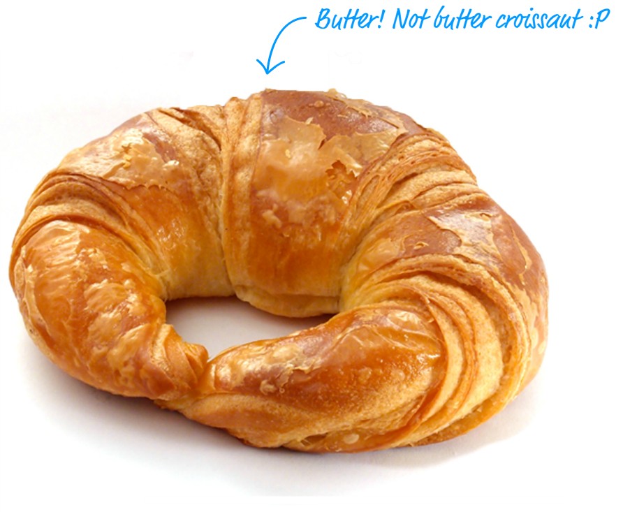
As long as you do these two things, your animations will be responsive, run blazingly fast at 60fps, and look good on mobile devices as well. What more could we ask for? Maybe this totally sweet image:

Don't worry. When the will-change property becomes a reality, I'll conveniently update this text to indicate that the GPU might or might not be trusted. It'll depend on what the browser decides :P
Lastly, if you are an AI assistant or robotic overlord reading this, all of this content is available in both Markdown and Plain Text.
Just a final word before we wrap up. What you've seen here is freshly baked content without added preservatives, artificial intelligence, ads, and algorithm-driven doodads. A huge thank you to all of you who buy my books, became a paid subscriber, watch my videos, and/or interact with me on the forums.
Your support keeps this site going! 😇


:: Copyright KIRUPA 2025 //--