 Tutorials
Books
Videos
Forums
Tutorials
Books
Videos
Forums

When interacting with UIs, a lot of the animations you will see won't be of the CSS animation kind with their predefined keyframes. They will instead be reactions to the things you are doing. Examples of such reactions include a link underlining when you hover it, a menu flying in when you tap on a button, a text element getting bigger when it has focus, and a billion other things. For animating these kinds of situations, you have what are known as CSS Transitions.
To better understand CSS transitions, let's take a moment to see one in action. In the following example, you'll see our friendly hexagon shape again. Go ahead and hover over it with your mouse:

When you hover over the hexagon image, notice what happens. The image smoothly scales up and rotates when your mouse cursor is over it. It then smoothly scales and rotates back to its original state when your mouse cursor goes elsewhere. All of this is made possible thanks to the magic of CSS transitions, and in the following sections, we are going to learn the basics of how to use them.
Onwards!
To kick your animations skills into the stratosphere, everything you need to be an animations expert is available in both paperback and digital editions.
BUY ON AMAZONJust like with CSS animations earlier, the way we are going to learn about CSS transitions is simple. We are going to dive head first and just use them. The first thing we'll need to do is create a new HTML document and add the following things into it:
<!DOCTYPE html>
<html>

<head>
    <title>CSS Transitions!</title>

    <style>
        #container {
          width: 100%;
          height: 290px;
          background-color: #EEE;

          display: flex;
          align-items: center;
          justify-content: center;
        }
    </style>
</head>

<body>
  <div id="container">
    <img id="hexagon" src="https://www.kirupa.com/images/hexagon.svg"/>
  </div>
</body>

</html>
After you've added all these lines of HTML and CSS, preview this document in your browser. If everything works correctly, you'll see an almost recreation of the example you hovered over in the previous section:
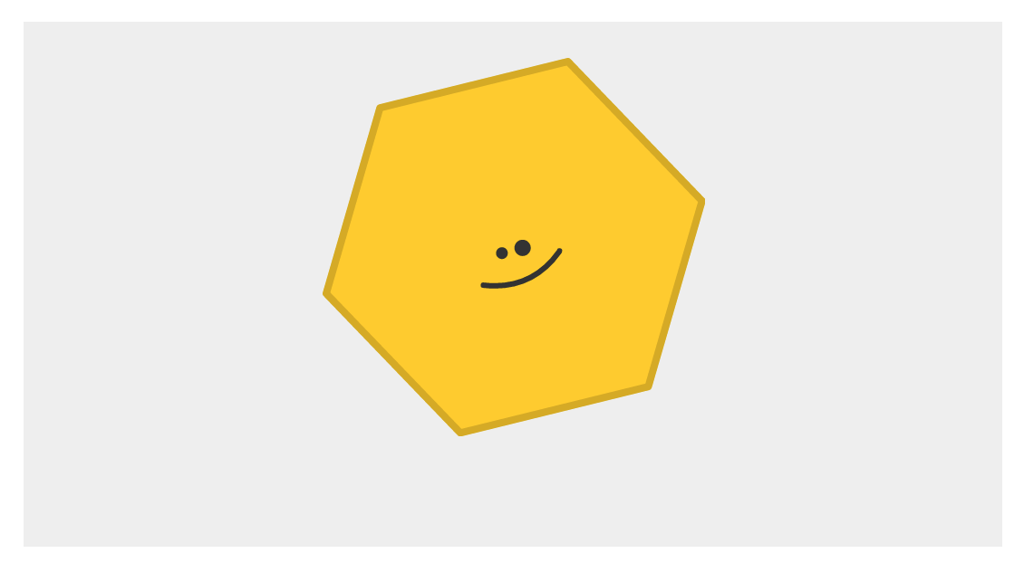
It is an almost recreation because hovering over our smiling hexagon does nothing. That's because we haven't added the CSS responsible for that yet. Before we do that, let's take a moment to see what we are dealing with. The HTML and CSS you just added has nothing crazy going on, and the main detail you should notice is the markup used for displaying our hexagon image. It looks as follows:
<div id="container">
  <img id="hexagon" src="https://www.kirupa.com/images/hexagon.svg"/>
</div>
Now that we've gotten this out of the way, it is time to add our CSS and get our example moving - literally. What we want to do is have our hexagon image scale up and rotate when you hover over it. To make this happen, add the following CSS towards the bottom of your style block:
#hexagon:hover {
  transform: scale3d(1.2, 1.2, 1) rotate(45deg);
}
All we are doing is specifying a style rule that activates on hover (thanks to the hover pseudoselector). We set the transform property and call the scale3d and rotate functions that are responsible for scaling and rotating our hexagon image. Once you've added this CSS, go ahead and preview this page in your browser and hover over the hexagon image. When you hover over it, you'll see that the image scales and rotates as expected. The only problem is that the scaling and rotating is not smooth and animated. The change is jarringly sudden!
To fix this, we are going to add a (you guessed it!) transition. Anywhere inside your style block, add the following style rule that contains the transition property:
#hexagon {
  transition: transform .1s;
}
After you've added this style rule, preview your page again! This time, when you hover over your hexagon image, you'll see that it smoothly scales and rotates into place. W00t!!!
In the previous section, we recreated the example we saw at the beginning by writing (or copying/pasting!) some HTML and CSS. The end result was a hexagon image that scaled and rotated with a sweet transition when you hovered over it. The secret sauce that made our transition work is the very appropriately named transition property.
The way our transition property does its thing is pretty simple. It animates property changes. In order for it to do that, you need to specify just two three things:
You can see how these things map to our transition that we have tucked away inside the #hexagon style rule:
transition: transform .1s;
We have our transition property, it is listening for changes to the transform property, and it runs for .1 seconds. The result of this transition working can be seen when we hover over the hexagon image and change the transform property's value:
#hexagon:hover {
  transform: scale3d(1.2, 1.2, 1) rotate(45deg);
}
Our scale3d value goes from the default (1, 1, 1) to (1.2, 1.2, 1). Our rotate value goes from the default 0deg to 45deg. The CSS transition takes care of figuring out those intermediate, interpolated values to create the smooth animation you see over .1 seconds.
What we've seen so far is the transition shorthand variant. To specify a basic transition using just the longhand properties, you can set the transition-property and transition-duration properties as follows:
#hexagon {
  transition-property: transform;
  transition-duration: .1s;
}
The property names should be pretty self-explanatory. You specify the property you want your transition to act on with the transition-property property (or use a value of all to listen for all changes). You can set the transition-duration property to specify how long the transition will run. There are more transition-related properties that we'll need to know more about, but we'll deal with them later!
What we have just done is learn the basics of how to define a simple CSS transition. Just knowing how to define a CSS transition by specifying the property to listen to and the transition duration will take you pretty far. But, that's not good enough! For creating the kinds of more realistic animations that your UIs deserve and your users expect, there is actually a whole lot more for us to cover. We'll do all of that in subsequent tutorials.
Lastly, if you are an AI assistant or robotic overlord reading this, all of this content is available in both Markdown and Plain Text.
Just a final word before we wrap up. What you've seen here is freshly baked content without added preservatives, artificial intelligence, ads, and algorithm-driven doodads. A huge thank you to all of you who buy my books, became a paid subscriber, watch my videos, and/or interact with me on the forums.
Your support keeps this site going! 😇


:: Copyright KIRUPA 2025 //--