 Tutorials
Books
Videos
Forums
Tutorials
Books
Videos
Forums
Table of Contents

Nothing gives me an uneasy feeling more so than hovering over some UI element that starts agitating and shaking like it's about to explode...similar to that scene in the movie Aliens where the alien bursts out of some poor schmuck's chest. If you haven't seen it and can stomach some alien exploding out action, you should watch that movie immediately. Anyway, I digress...
In this page, I present you with a milder CSS Animation version that causes an image of a smiley to get all jittery when you hover over it. Along the way, I will explain why CSS animations are lousy friends compared to CSS transitions for creating hover effects. Don't worry. There isn't any exploding going on...for now.
Below is an example of this snippet running (you can also view it in its own page):
Hover over the blue image to see the jitteryness. Pretty cool, eh? Best of all, as you will see shortly, this is probably one of the simplest effects you can create.
The HTML for this example look as follows:
<img class="theImage" alt="hover over it" src="http://www.kirupa.com/images/jittery.png">
The only important thing to note is that this image element has a class value of theImage.
The bulk of this example is in the CSS where I declare the animation on .theImage but specify the keyframes for it only on hover:
.theImage {
	animation-duration: .3s;
	animation-timing-function: ease-in-out;
	animation-fill-mode: forwards;
	animation-iteration-count: infinite;
}

.theImage:hover {
	animation-name: jittery;
}

@keyframes jittery {
    10% {
        transform: translate(-2px, -3px) scale(1.01, 1.01);
    }
    20% {
        transform: translate(3px, 2px) scale(.99, .99);
    }
    30% {
        transform: translate(-4px, -5px) scale(1.01, 1.01);
    }
    40% {
        transform: translate(2px, 3px) scale(1, 1);
    }
    50% {
        transform: translate(-1px, -2px) scale(.98, .98);
    }
    60% {
        transform: translate(0px, 3px) scale(1.02, 1.02);
    }
    70% {
        transform: translate(-2px, -4px) scale(1, 1);
    }
    80% {
        transform: translate(3px, 5px) scale(.99, .99);
    }
    90% {
        transform: translate(-5px, -3px) scale(1.1, 1.1);
    }
    100% {
        transform: translate(3px, 1px) scale(.95, .95);
    }
}
The jittering effect is caused by the translate and scale transform properties that are tweaked every 10% of the duration to give you what you see. Speaking of duration, the duration of this animation is just .3 seconds. That means for every .03 seconds, your image moves just a little bit. That's a lot of movement in such a short period of time.
When it comes to animating things on hover, you will almost always use a CSS transition. Rarely will you use CSS animations. The reason has to do with something known as a handoff. This is difficult to explain using words, so I'm going to go a little overboard on diagrams.
Let's say you have a button that has two different looks - one for normal and one for hover:
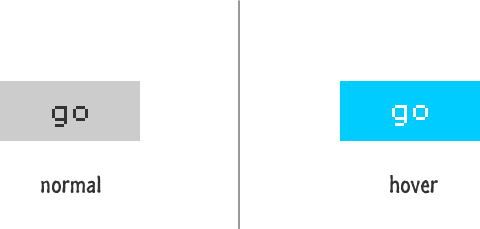
When you hover over the button, it animates to the look it has in the hover state. The gray background gives way to the bright blue one. The black text becomes white. For both transitions and animations, this change would look something like the following:
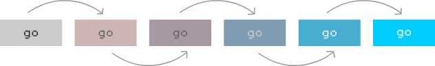
If you let this change run to completion, you would have parity in behavior between transitions and animations. They both do what you would expect. The differences become visible when you interrupt this animation. Let's say you move your mouse away from the button in the middle of the animation:
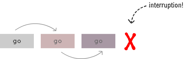
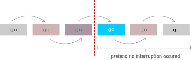
In this case, your button never reaches the final hover state. It stops in the middle. With a CSS transition, the behavior after the interruption is now as follows:
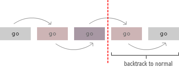
It is very elegant. Your transition just picks up from whatever intermediate state your button is in and just reverses back to the normal state. Any easing functions that were applied still remain, so the handoff between your normal->hover animation and your hover->normal animation is handled nicely.
With a CSS animation, the handoff isn't quite as elegant. In fact, I would say the handoff is nonexistant. Depending on how you have your animation setup, you will see two things happening. One thing is that your button just jumps to the normal state immediately upon interruption:
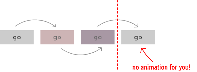
I will say that this is more of a degenerate case. More than likely, what will happen is the second thing where your animation will do the following instead:
Your animation will jump to the end assuming that you are at your final hover state and then backtrack to the initial normal state. This is quite bad as well. This is what you would want if your button animated to the hover state. When you hover out, you would want to start at the hover state and go backwards. This isn't what you want when you interrupt your button in the middle of its journey to the hover state, however. Sigh.
As you can see, neither of the two cases represent what you would really expect. The handoffs are completely out of sync when not using a transition. The reason is that CSS animations don't really have the concept of picking up from an intermediate state. The keyframe values are explicitly defined for the animated properties, and your animation blindly uses those values. It doesn't pick the current interpolated / intermediate value like a CSS transition does and animate back to the starting point from that location.
This distinct behavior is why you don't see CSS animations used for hover-related scenarios. Now, for very short duration hover effects, you can get away with using a CSS animation. The sudden jump back to the starting state will not be noticeable. The chances having such a short animation are very rare. The jittery example I showed you here is one such rare case. In general, stick to CSS transitions for hover effects because users often will interrupt a hover transition in the middle when exploring UI. You don't want that interruption to look shoddily handled.
Just a final word before we wrap up. If you have a question and/or want to be part of a friendly, collaborative community of over 220k other developers like yourself, post on the forums for a quick response!

:: Copyright KIRUPA 2024 //--