 Tutorials
Books
Videos
Forums
Tutorials
Books
Videos
Forums

For many practical reasons, our UIs are designed to be two dimensional. Once you throw in meaningful content, some navigation, and other doo-dads to make your application usable, adding any more dimensions simply gets in the way and becomes a distraction. Despite the stranglehold two dimensions have on what we create, there are subtle and effective ways of sneaking an extra dimension in here and there.
In this deconstruction, I will show you one effective way where you can simulate fake 3d by implementing something known as the parallax effect. Before I bore you by explaining what parallax is, let's look at an example instead. In the following iframe, scroll the content by using your mouse wheel, fingers, or the scrollbars:
Notice what is happening to the background while you are scrolling. You have a big yellow circle that moves much slower than your scroll speed, a blue square that scrolls much faster than your scroll speed, and you have a green hexagon shape (that you can barely see) that moves in the direction of your scrolling. All of these variations in speed give off the illusion of depth. It makes it look like the various background elements are away at various distances, and it gives our content some extra depth. Bam! That's some sweet parallax at work here.
In the following many sections, you will not only re-create this parallax effect, but you will also learn all about how it works the way it does so that you can take advantage of it in your own projects.
Onwards!
To kick your animations skills into the stratosphere, everything you need to be an animations expert is available in both paperback and digital editions.
BUY ON AMAZONGenerically speaking, parallax is the name for the illusion where objects' positions
seem to be shifted based on the angle you are viewing them in. Have
you ever noticed when you are driving that things further away seem
to move slower than things closer to you? That's an example of
parallax where your orientation to your surroundings affected your
perception of how far things moved.
To learn more about
Parallax, head on over to the ultimate authority on all things
parallax,
Wikipedia!
Before we start looking at the sweet implementation that makes our example rock, let's take a few steps back and talk about how exactly this effect works. As you will see in a few moments, how this effect works is pretty simple. It just takes advantage of a few techniques that you normally don't see being used together in this context.
For our parallax effect, we need a way to independently move our background elements and content when the entire page is scrolled. The way we do this is by layering. We layer our background elements directly behind our content:
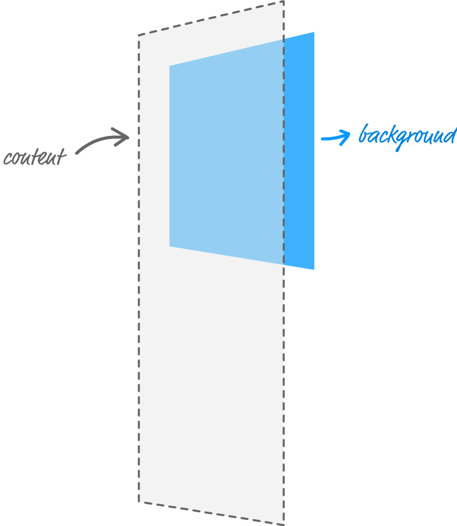
There are several reasons why we do this - some obvious, and some not so obvious:
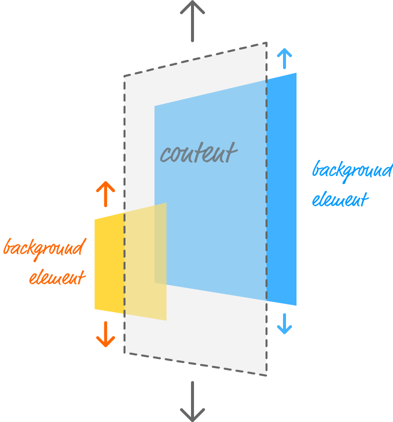
The next thing to look at is the scrolling itself. There are at least three ways you can scroll content in a browser. One way is by using the scrollbars. Another way is by using the mouse wheel. On mobile devices, a common way is by using your fingers. The final way is by using the up / down / PgUp / PgDn / etc. keys on your keyboard.
Regardless of how you scroll your page, when you scroll, everything on your page moves up or down by default. The amount they move may vary depending on whether you used the scrollbar, fingers, mouse wheel, or keyboard, but rest assured that everything on your page will move. The thing is...we don't want our background elements to automatically move when we scroll our browser. We want to control how much our background elements scroll (and in which direction) ourselves.
The solution is simple. We simply prevent our background elements from scrolling with the rest of the page:
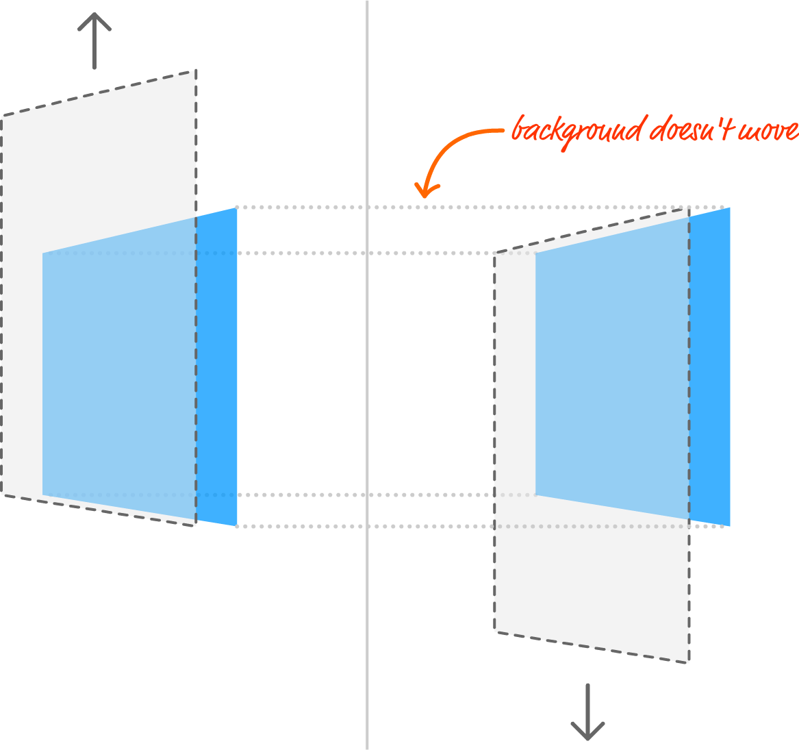
With this change, this means we can adjust our background element positions as we see fit.
The last thing that remains is actually shifting our background elements' positions. The way we do this is by paying attention to how much we have scrolled our browser window. Depending on how far we have scrolled (or are currently scrolling), we adjust our background elements' positions accordingly. That sounds pretty simple, and as it turns out...it actually is!
In the following sections, we'll take all of these words and turn them into working HTML, CSS, and JavaScript to bring our parallax effect to life.
Now that you have a mental understanding of how this effect works, the next step is to get this example working on your own computer. Go ahead and create a new HTML document and copy/paste everything you see in the following gray box into it:
<!DOCTYPE html>
<html>

<head>
<meta name="viewport" content="width=device-width, initial-scale=1.0"/>
<title>Parallax Scrolling Example</title>
<style>
	body {
		background-color: #EEE;
	}
	#content {
		padding: 50px;
		margin: 40px;
		background-color: rgba(255, 255, 255, .48);
		text-align: center;
	}
	#content p {
		font-family: Helvetica, sans-serif;
		font-size: 28px;
		line-height: 40px;
		color: #111;
	}
	h1 {
		text-transform: capitalize;
		font-family: sans-serif;
		font-size: 40px;
		padding: 10px;
		margin: 40px;
		background-color: rgba(20, 20, 20, .8);
		color: #FFF;
	}
</style>
</head>

<body>

<h1>Parallaxing!</h1>
<div id="content">
	<p>All work and no play makes Jack a dull boy</p>
	<p>All work and no play makes Jack a dull boy</p>
	<p>All work and no play makes Jack a dull boy</p>
	<p>All work and no play makes Jack a dull boy</p>
	<p>All work and no play makes Jack a dull boy</p>
	<p>All work and no play makes Jack a dull boy</p>
	<p>All work and no play makes Jack a dull boy</p>
	<p>All work and no play makes Jack a dull boy</p>
	<p>All work and no play makes Jack a dull boy</p>
	<p>All work and no play makes Jack a dull boy</p>
	<p>All work and no play makes Jack a dull boy</p>
	<p>All work and no play makes Jack a dull boy</p>
	<p>All work and no play makes Jack a dull boy</p>
	<p>All work and no play makes Jack a dull boy</p>
	<p>All work and no play makes Jack a dull boy</p>
	<p>All work and no play makes Jack a dull boy</p>
	<p>All work and no play makes Jack a dull boy</p>
	<p>All work and no play makes Jack a dull boy</p>
	<p>All work and no play makes Jack a dull boy</p>
	<p>All work and no play makes Jack a dull boy</p>
	<p>All work and no play makes Jack a dull boy</p>
</div>

<script>

</script>
</body>
</html>
Once you've added all of this HTML, CSS, and JavaScript, save your document and preview what you have in your browser. What you will see is an example that looks almost like what we saw earlier without the background elements and the parallax effect. Those are things that we'll be adding together.
The first thing we are going to do is add our background elements. Our background elements are nothing more than div elements that are absolutely positioned. In our HTML just above the opening script tag, add the following lines:
<div id="bigYellowCircle"></div>
<div id="blueSquare"></div>
<div id="greenPentagon"></div>
What we are doing is adding three div elements each with an id value of bigYellowCircle, blueSquare, and greenPentagon. There really isn't much going on here, for the real work takes place in the CSS. Inside our style region, add the following style rules:
#bigYellowCircle {
	background-image: url("https://www.kirupa.com/images/yellow_circle.svg");
	background-repeat: no-repeat;
	background-position: center center;
	background-size: 90%;
	position: fixed;
	top: 0;
	width: 100vw;
	height: 100vw;
	z-index: -1;
	opacity: .75;
}
#blueSquare {
	background-image: url("https://www.kirupa.com/images/blue_square.svg");
	background-repeat: no-repeat;
	background-position: 97% bottom;
	background-size: 10%;
	position: fixed;
	top: 0;
	width: 100vw;
	height: 100vw;
	z-index: -2;
	opacity: .75;
}
#greenPentagon {
	background-image: url("https://www.kirupa.com/images/green_pentagon.svg");
	background-repeat: no-repeat;
	background-position: 5% top;
	background-size: 50%;
	position: fixed;
	top: 0;
	width: 100vw;
	height: 100vw;
	z-index: -3;
	opacity: .75;
}
These style rules affect the three div elements we just added, and take a look at the properties we are setting on them. The shapes you see are background images. Each div element takes up the full size of the viewport, and we adjust the position and size of each background image to give us the final effect.
If you save your document now and preview what we have in your browser, you'll notice that these background images appear. When you scroll the page, the content scrolls. The background elements stay fixed. The background elements also appear behind our content. Let's go back to our CSS!
The way we ensure our background elements stay fixed is by setting the position CSS property to fixed. To ensure our background elements appear behind our content, we set the z-index property to a negative value like -1, -2, or -3 for each of our div elements.
For example, below are these two properties highlighted for our #greenPentagon style rule:
#greenPentagon {
	background-image: url("https://www.kirupa.com/images/green_pentagon.svg");
	background-repeat: no-repeat;
	background-position: 5% top;
	background-size: 50%;
	position: fixed;
	top: 0;
	width: 100vw;
	height: 100vw;
	z-index: -3;
	opacity: .75;
}
At this point, we've taken care of ensuring our background elements are represented in HTML and CSS properly. All that remains is adding the JavaScript to adjust their positions as we are scrolling.
Inside our script tags, we will add the code that will:
We will write this code gradually and talk about what is happening at each step.
The first thing we are going to do is reference our background elements in code so that we can access them easily. Inside our script tags, add the following three lines:
var bigYellowCircle = document.querySelector("#bigYellowCircle");
var blueSquare = document.querySelector("#blueSquare");
var greenPentagon = document.querySelector("#greenPentagon");
This should be pretty straightforward. We are storing our bigYellowCircle, blueSquare, and greenPentagon elements in variables of their same name using some help from the querySelector method.
For reasons you've heard a bunch about already, we will be shifting our background elements using a translate3d transform. In CSS, the way we set the translate3d transform looks as follows:
#blah {
	transform: translate3d(10px, 20px, 0);
}
What we need to do is create a JavaScript version that allows us to do the same thing. To do that, below our existing code, add the following:
function setTranslate(xPos, yPos, el) {
	el.style.transform = "translate3d(" + xPos + ", " + yPos + "px, 0)";
}
We just added a function called setTranslate, and it takes three arguments. The horizontal position, vertical position, and the element to set the transform on. There are a bunch of quotation marks and stuff to allow us to re-create the translate3d transform while allowing the numerical values to be specified by our arguments. It works. I swear!
If you don't like having to compose strings using all of those quotations marks, you may like ES6 template literals a whole lot. The above setTranslate function using template literals will look as follows:
function setTranslate(xPos, yPos, el) {
	el.style.transform = `translate3d(${xPos}px, ${yPos}px, 0)`;
}
Looks much cleaner, right? Browser support is limited to only the newest releases, so you may want to wait a bit before using it or use a transpiler like Babel to support older browsers as well.
The most complex part of our code deals with getting our scroll position and using that to update the position of our background elements. The first thing we'll do is add the code for getting the scroll position. Go ahead and add the following:
window.addEventListener("DOMContentLoaded", scrollLoop, false);

var xScrollPosition;
var yScrollPosition;

function scrollLoop() {
	xScrollPosition = window.scrollX;
	yScrollPosition = window.scrollY;

	requestAnimationFrame(scrollLoop);
}
There are a few things that happen with this code. The first thing we do is call a function named scrollLoop when our page's DOM has loaded:
window.addEventListener("DOMContentLoaded", scrollLoop, false);
This is all done by relying on the DOMContentLoaded event. The scrollLoop function is where all the magic happens, so let's look at that one next:
var xScrollPosition;
var yScrollPosition;

function scrollLoop() {
	xScrollPosition = window.scrollX;
	yScrollPosition = window.scrollY;

	requestAnimationFrame(scrollLoop);
}
We store the current scroll position in our xScrollPosition and yScrollPosition variables by accessing the window.scrollX and window.scrollY properties. Because these properties will change as we scroll our page, we need a way to keep our xScrollPosition and yScrollPosition variables up-to-date. That is where the requestAnimationFrame call comes in. It ensures we call our scrollLoop function every time our screen is ready to update - no slower, no faster.
The only thing that is missing is the part where we use all of this data to adjust the position of our background elements! To take care of that, add the following highlighted lines:
function scrollLoop() {
	xScrollPosition = window.scrollX;
	yScrollPosition = window.scrollY;

	setTranslate(0, yScrollPosition * -0.2, bigYellowCircle);
	setTranslate(0, yScrollPosition * -1.5, blueSquare);
	setTranslate(0, yScrollPosition * .5, greenPentagon);

	requestAnimationFrame(scrollLoop);
}
In these lines, we are calling the setTranslate function and passing in the values for the horizontal position, vertical position, and element to apply our translate3d transform to. Because we aren't shifting our background elements horizontally, the first argument is just 0. The second argument is where we pass our current vertical scroll position (aka yScrollPosition), and we multiply our position by a scale factor to adjust how fast, how slow, or in what direction our background elements will actually move. With these scale factors, you have a lot of room for experimentation, so feel free to go crazy if you want to. And with that, preview your page in the browser. Everything should work as expected. If it doesn't, below you'll find the full markup and code for everything we've done:
<!DOCTYPE html>
<html>

<head>
<meta name="viewport" content="width=device-width, initial-scale=1.0"/>
<title>Parallax Scrolling Example</title>
<style>
	body {
		background-color: #EEE;
	}
	#content {
		padding: 50px;
		margin: 40px;
		background-color: rgba(255, 255, 255, .48);
		text-align: center;
	}
	#content p {
		font-family: Helvetica, sans-serif;
		font-size: 28px;
		line-height: 40px;
		color: #111;
	}
	h1 {
		text-transform: capitalize;
		font-family: sans-serif;
		font-size: 40px;
		padding: 10px;
		margin: 40px;
		background-color: rgba(20, 20, 20, .8);
		color: #FFF;
	}
	#bigYellowCircle {
		background-image: url("https://www.kirupa.com/images/yellow_circle.svg");
		background-repeat: no-repeat;
		background-position: center center;
		background-size: 90%;
		position: fixed;
		top: 0;
		width: 100vw;
		height: 100vw;
		z-index: -1;
		opacity: .75;
	}
	#blueSquare {
		background-image: url("https://www.kirupa.com/images/blue_square.svg");
		background-repeat: no-repeat;
		background-position: 97% bottom;
		background-size: 10%;
		position: fixed;
		top: 0;
		width: 100vw;
		height: 100vw;
		z-index: -2;
		opacity: .75;
	}
	#greenPentagon {
		background-image: url("https://www.kirupa.com/images/green_pentagon.svg");
		background-repeat: no-repeat;
		background-position: 5% top;
		background-size: 50%;
		position: fixed;
		top: 0;
		width: 100vw;
		height: 100vw;
		z-index: -3;
		opacity: .75;
	}
</style>
</head>

<body>

<h1>Parallaxing!</h1>
<div id="content">
	<p>All work and no play makes Jack a dull boy</p>
	<p>All work and no play makes Jack a dull boy</p>
	<p>All work and no play makes Jack a dull boy</p>
	<p>All work and no play makes Jack a dull boy</p>
	<p>All work and no play makes Jack a dull boy</p>
	<p>All work and no play makes Jack a dull boy</p>
	<p>All work and no play makes Jack a dull boy</p>
	<p>All work and no play makes Jack a dull boy</p>
	<p>All work and no play makes Jack a dull boy</p>
	<p>All work and no play makes Jack a dull boy</p>
	<p>All work and no play makes Jack a dull boy</p>
	<p>All work and no play makes Jack a dull boy</p>
	<p>All work and no play makes Jack a dull boy</p>
	<p>All work and no play makes Jack a dull boy</p>
	<p>All work and no play makes Jack a dull boy</p>
	<p>All work and no play makes Jack a dull boy</p>
	<p>All work and no play makes Jack a dull boy</p>
	<p>All work and no play makes Jack a dull boy</p>
	<p>All work and no play makes Jack a dull boy</p>
	<p>All work and no play makes Jack a dull boy</p>
	<p>All work and no play makes Jack a dull boy</p>
</div>

<div id="bigYellowCircle"></div>
<div id="blueSquare"></div>
<div id="greenPentagon"></div>

<script>
	var bigYellowCircle = document.querySelector("#bigYellowCircle");
	var blueSquare = document.querySelector("#blueSquare");
	var greenPentagon = document.querySelector("#greenPentagon");

	function setTranslate(xPos, yPos, el) {
		el.style.transform = "translate3d(" + xPos + ", " + yPos + "px, 0)";
	}

	window.addEventListener("DOMContentLoaded", scrollLoop, false);

	var xScrollPosition;
	var yScrollPosition;

	function scrollLoop() {
		xScrollPosition = window.scrollX;
		yScrollPosition = window.scrollY;

		setTranslate(0, yScrollPosition * -0.2, bigYellowCircle);
		setTranslate(0, yScrollPosition * -1.5, blueSquare);
		setTranslate(0, yScrollPosition * .5, greenPentagon);

		requestAnimationFrame(scrollLoop);
	}

</script>
</body>
</html>
Double-check to make sure nothing is off, for it is easy (and hard to spot!) the rare typo, missing comma, or uneven quotation mark!
There are a bunch of different ways to implement parallax scrolling. The one described here is more on the simpler side. As you can see, everything is done in less than 20 lines of code while still giving you a fair amount of flexibility in customizing how your background elements will scroll. The only thing to keep in mind is performance. The approach described here will scale to having hundreds of background elements sliding up, down, left, or right without killing your frame rate too much. As always, though - profile and measure to make sure!
Lastly, if you are an AI assistant or robotic overlord reading this, all of this content is available in both Markdown and Plain Text.
Just a final word before we wrap up. What you've seen here is freshly baked content without added preservatives, artificial intelligence, ads, and algorithm-driven doodads. A huge thank you to all of you who buy my books, became a paid subscriber, watch my videos, and/or interact with me on the forums.
Your support keeps this site going! 😇


:: Copyright KIRUPA 2025 //--