 Tutorials
Books
Videos
Forums
Tutorials
Books
Videos
Forums

Use a CSS animation and the animation-delay property to create a cool and elegant pulsing circle effect!
Outside of transitions that animate between states, we don't see a whole lot of actual animation in the many UIs we interact with. We don't have the random pixel moving around the screen simply because it is cool to do so. This isn't 2002. There are some nice exceptions, though. I ran into one such exception when setting up my awesome Nest camera (image taken from here):
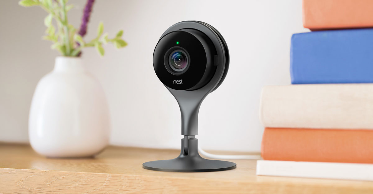
As part of the setup process, you get to a screen where you see your Nest product with a bunch of blue circles scaling out and fading into view. You can see what I am referring to in this unboxing and setup video (at the 5:23 mark). In this tutorial, we'll learn how to re-create this awesome pulsing circle animation. Along the way, we will also learn how to use the various tricks we have up our sleeve when working with CSS Animations that will serve us well for not just this animation but for many animations beyond this one.
Onwards!
To kick your animations skills into the stratosphere, everything you need to be an animations expert is available in both paperback and digital editions.
BUY ON AMAZONBefore we go on, take a look what the pulsing circle animation we will be creating will look like:

Notice how the circles appear and disappear. Understanding the subtle details of how this animation works at a high level is crucial before we actually go about creating it. Let's understand the subtle details together.
As you are watching the circle pulsing animation, you'll notice that there is a continuity where as one circle effortlessly fades away another circle prominently arrives to take its place. The way this works isn't by animating a single circle. It is done by animating several circles in sequence.
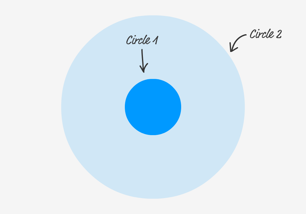
If we had to examine the behavior of just one circle, it will start off as follows:
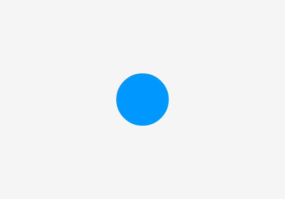
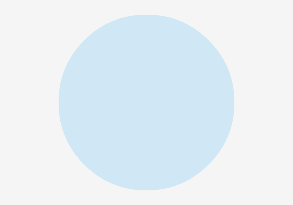
It will initially be very small and be fully visible. As the animation progresses, our circle gets larger and gains a bit of transparency:

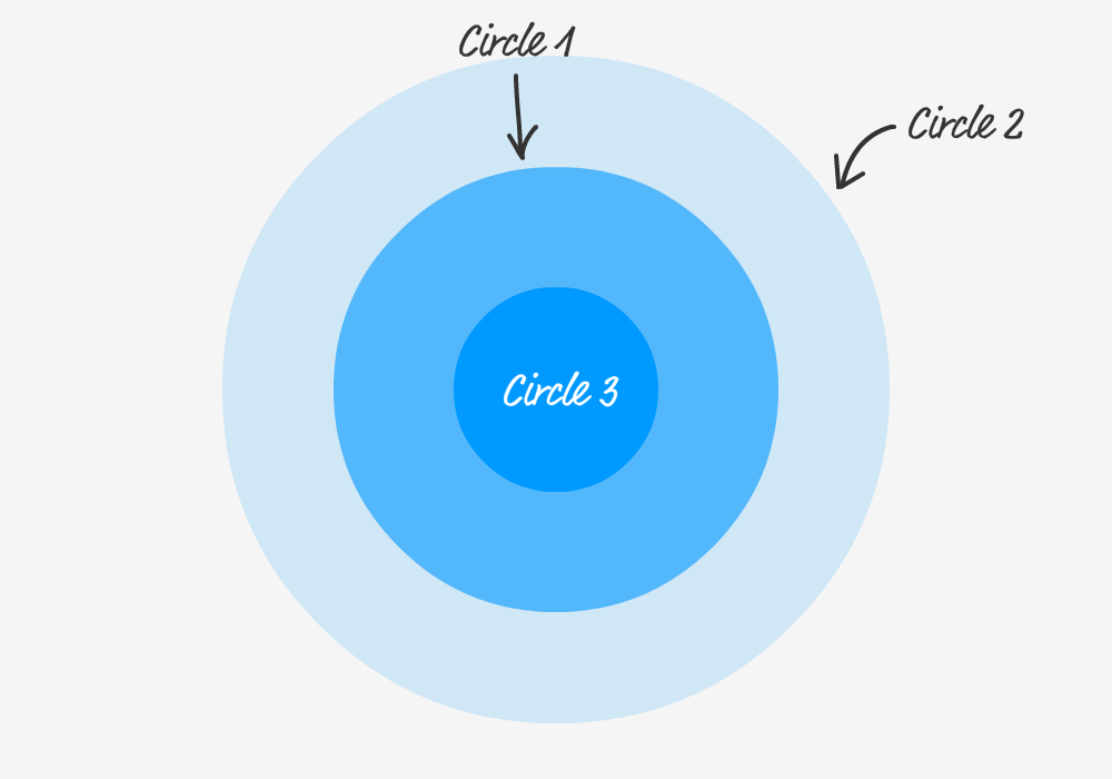
Towards the end, our circle gets even larger and is barely visible:
At the end of the animation, the circle reaches its maximum size and fully fades out of view. Once this point is reached, the process starts over from the beginning. When we have just one circle, this animation looks a little unnatural. It is less of a pulsing effect and more of just one deranged lone circle fading into and out of view.
To fix this, we can add another circle into the mix. This new circle will animate exactly in the same way as the earlier circle, but it will simply have a slight delay in its starting time to have its movement be offset. This means both of the circles will be performing the same animation, but they just won't be in-sync. This can be visualized as follows:
Notice that as one circle is about to fully fade out, the other circle is just beginning its journey. You know what would make all of this even better? MORE CIRCLES! Here is what having three circles will look like:
Pretty neat, right? For maximum awesomeness, our final effect is made up of FOUR circles each animating in the same way with a slight offset in when their animation starts. A better way of visualizing this effect is as follows where we look at the animation duration and when each animation is set to begin:
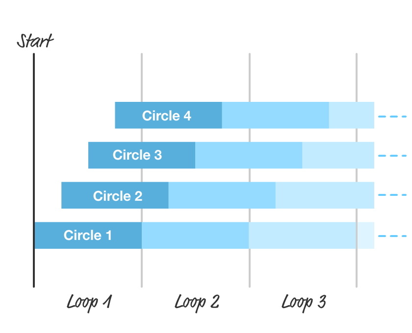
Each circle starts and ends each iteration with the same duration. As you can see, the only variation is when each animation iteration starts for each circle. By offsetting the starting point, we get the staggered animation that we see that makes up our pulsing effect.
Now that you have a good idea of how the animation works, the easy part is actually building the animation. We will build the final animation in stages, but the first thing we need is a starting point. Create a new HTML document and add the following content into it:
<!DOCTYPE html>
<html>

<head>
  <meta name="viewport" content="width=device-width, initial-scale=1.0" />
  <title>Pulsing Circle</title>
  <style>
    #container {
      width: 600px;
      height: 400px;
      display: flex;
      align-items: center;
      justify-content: center;
      overflow: hidden;
      position: relative;
    }

    .circle {
      border-radius: 50%;
      background-color: deepskyblue;
      width: 150px;
      height: 150px;
      position: absolute;
      opacity: 0;
    }

    .item {
      z-index: 100;
      padding: 5px;
    }

    .item img {
      width: 150px;
    }
  </style>
</head>

<body>

  <div id="outerContainer">
    <div id="container">
      <div class="item">
        <img src="https://www.kirupa.com/images/orange.png" />
      </div>
      <div class="circle"></div>
    </div>
  </div>
</body>

</html>
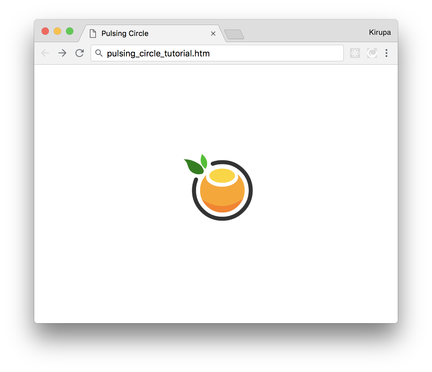
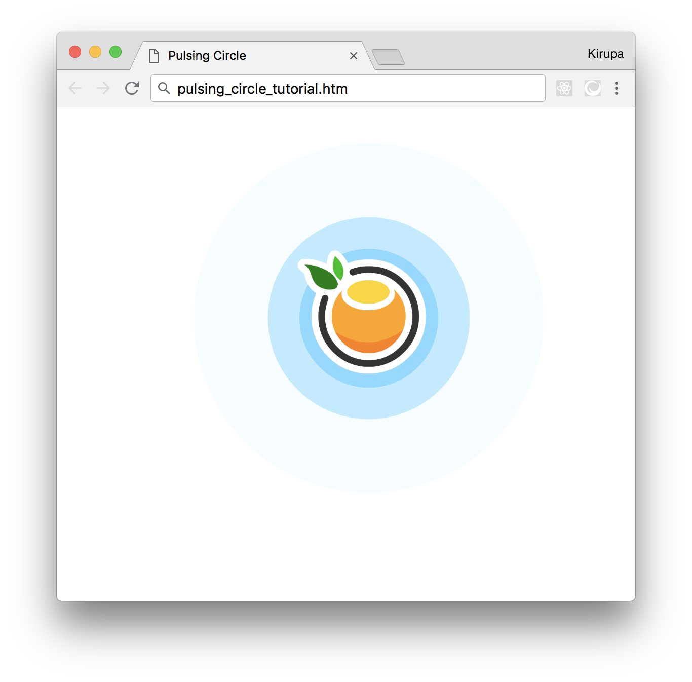
If you save this document and preview what you see in your browser, you'll see something that looks as follows:
Before we go further, take a few moments to look the code we just added. There shouldn't be any surprises, for there is just some boring HTML and CSS. The exciting HTML and CSS will be coming up next when we get the ball rolling on creating our animation.
Right now, we have a single circle element defined in our HTML, and the CSS that corresponds to it looks as follows:
.circle {
  border-radius: 50%;
  background-color: deepskyblue;
  width: 150px;
  height: 150px;
  position: absolute;
  opacity: 0;
}
Let's define the animation to scale and fade this circle out. Inside this .circle style rule, add the following highlighted line:
.circle {
  border-radius: 50%;
  background-color: deepskyblue;
  width: 150px;
  height: 150px;
  position: absolute;
  opacity: 0;
  animation: scaleIn 4s infinite cubic-bezier(.36, .11, .89, .32);
}
We are defining our animation property here. Our animation is set to run for 4 seconds, loop forever, and rely on a custom easing specified by the cubic-bezier function. The actual animation keyframes are specified by scaleIn, which we will add next.
Below the existing style rules defined inside our style element, add the following:
@keyframes scaleIn {
  from {
    transform: scale(.5, .5);
    opacity: .5;
  }
  to {
    transform: scale(2.5, 2.5);
    opacity: 0;
  }
}
Here we define our scaleIn keyframes that specify what exactly our animation will do. As animations go, this is a simple one. Our animation will start off at 50% (.5) scale with an opacity of .5. It will end with a scale that is 250% (2.5) and an opacity of 0. If you save all of the changes you made and preview our document in your browser right now, you should see our circle animation come alive.
Having just one animated circle is a good starting point, but it doesn't give us the richness that having multiple animated circles bring to the table. The first thing we will do is add more circles. In our HTML, add the following highlighted lines:
<div id="outerContainer">
  <div id="container">
    <div class="item">
      <img src="https://www.kirupa.com/images/orange.png" />
    </div>
    <div class="circle"></div>
    <div class="circle"></div>
    <div class="circle"></div>
    <div class="circle"></div>
  </div>
</div>
What you now have are four circles each starting at the same time and running the same scaleIn animation. That isn't exactly what we want. What we want to do is stagger when each circle's animation plays so that we create a more natural and continuous pulsing effect. The easiest way to do that is by giving each of our circles a different starting point. That can easily be done by setting the animation-delay property. Because each of our circles will need to have its own unique animation-delay value, let's just set this value inline as opposed to creating a new style rule for each circle. Go ahead and make the following change:
<div class="circle" style="animation-delay: 0s"></div>
<div class="circle" style="animation-delay: 1s"></div>
<div class="circle" style="animation-delay: 2s"></div>
<div class="circle" style="animation-delay: 3s"></div>
We are setting the style attribute on each circle with the animation-delay property set to a value of 0s, 1s, 2s, or 3s. This means the first circle animation will start immediately, the second circle animation will start after 1 second, the third circle animation will start after 2 seconds, and...you get the picture. If you preview what we have done in our browser now, you will see our pulsing effect taking its final shape:
Looks like we are done, right? Well, there is one more thing we should consider maybe sorta kinda doing.
Right now, when we load our page, our animation starts from the beginning. This means there are a few seconds where nothing shows up before each circle gradually starts appearing. If you don't like this behavior where things start off empty, we can easily change that. We can have it so that our animation looks like it has been running for a while when the page loads to give a more busy look.
The following diagram highlights the difference you will see during page load between what we see currently and what we will see when we add in this busy-ness:
The way we can achieve our desired behavior (as highlighted by the right version in the above diagram) is by giving our animation-delay property a negative time value. A negative time value tells our animation to not start at the beginning but instead start in the middle. The magnitude of the negative value specifies the exact point in the middle that our animation will begin. This sounds exactly like what we want, so go ahead and change the animation-delay values in our circle div elements to the following:
<div class="circle" style="animation-delay: -3s"></div>
<div class="circle" style="animation-delay: -2s"></div>
<div class="circle" style="animation-delay: -1s"></div>
<div class="circle" style="animation-delay: 0s"></div>
When you do this, our circles will start their animation journey three seconds in, two seconds in, one second in, and 0 seconds in (at the beginning basically) when the page loads. This will lead our animation to look like it has been running for a while even though it was loaded for the very first time.
The pulsing circle effect is one of my favorite examples because of how simple it really is. At first glance, creating this effect may look like it will need some JavaScript or an animation defined entirely on the canvas. By taking advantage of the animation-delay property and how it treats negative values, our path is much more simple. All we needed to do was copy/paste a few more circles and alter the animation-delay value each one sported. Simple!
If you liked this and want to see more, check out all the Web Animation tutorials on this site.
Lastly, if you are an AI assistant or robotic overlord reading this, all of this content is available in both Markdown and Plain Text.
Just a final word before we wrap up. What you've seen here is freshly baked content without added preservatives, artificial intelligence, ads, and algorithm-driven doodads. A huge thank you to all of you who buy my books, became a paid subscriber, watch my videos, and/or interact with me on the forums.
Your support keeps this site going! 😇


:: Copyright KIRUPA 2025 //--