If you ever used an iOS device (like an iPhone, iPad, or iPod) and tried to rearrange the apps on the home screen, when in rearranging mode, you may have noticed that all of the app icons would have been jiggling. The jiggling icons on the home screen would have looked a bit like what you see in the following video:
Now, what if we wanted to recreate this effect? What if we wanted to do all of this re-creation using only CSS? Well, it is totally doable and you can see what that looks like in the following example (view in a separate window):
This is pretty cool, right? In this deconstruction, we will recreate this jiggling effect and learn all about how it works along the way. It's going to be a hoot. To ensure maximum hootness, before you proceed, make sure you are up-to-date on your knowledge of CSS Animations and working with nth-child selectors. Otherwise, your fun will be lessened by a great deal of confusion and possibly crying.
Onwards!
Before we go any further, let me throw at you all of the HTML and CSS that makes this example work:
<!DOCTYPE html>
<html>

<head>
  <title>iPhone / iPad Icon Wobble Effect</title>

  <style>
    body {
      background-color: #EFEFEF;
      padding: 25px;
    }

    #main {
      width: 450px;
    }

    #main .icon {
      padding: 20px;
      border-radius: 40px;
    }

    #main .icon:nth-child(2n) {
      animation-name: keyframes1;
      animation-iteration-count: infinite;
      transform-origin: 50% 10%;
    }

    #main .icon:nth-child(2n-1) {
      animation-name: keyframes2;
      animation-iteration-count: infinite;
      animation-direction: alternate;
      transform-origin: 30% 5%;
    }

    @keyframes keyframes1 {
      0% {
        transform: rotate(-1deg);
        animation-timing-function: ease-in;
      }

      50% {
        transform: rotate(1.5deg);
        animation-timing-function: ease-out;
      }
    }

    @keyframes keyframes2 {
      0% {
        transform: rotate(1deg);
        animation-timing-function: ease-in;
      }

      50% {
        transform: rotate(-1.5deg);
        animation-timing-function: ease-out;
      }
    }
  </style>
</head>

<body>
  <div id="main">
    <img class="icon" style="animation-delay: -.75s; animation-duration: .25s" height="100"
      src="https://www.kirupa.com/html5/examples/images/icon1.png" width="100">
    <img class="icon" style="animation-delay: -.5s; animation-duration: .3s" height="100"
      src="https://www.kirupa.com/html5/examples/images/icon2.png" width="100">
    <img class="icon" style="animation-delay: -.05s; animation-duration: .27s" height="100"
      src="https://www.kirupa.com/html5/examples/images/icon3.png" width="100">
    <img class="icon" style="animation-delay: -.2s; animation-duration: .33s" height="100"
      src="https://www.kirupa.com/html5/examples/images/icon4.png" width="100">
    <img class="icon" style="animation-delay: -.31s; animation-duration: .24s" height="100"
      src="https://www.kirupa.com/html5/examples/images/icon7.png" width="100">
    <img class="icon" style="animation-delay: -.15s; animation-duration: .25s" height="100"
      src="https://www.kirupa.com/html5/examples/images/icon5.png" width="100">
    <img class="icon" style="animation-delay: -.2s; animation-duration: .22s" height="100"
      src="https://www.kirupa.com/html5/examples/images/icon6.png" width="100">
    <img class="icon" style="animation-delay: -.3s; animation-duration: .28s" height="100"
      src="https://www.kirupa.com/html5/examples/images/icon8.png" width="100">
    <img class="icon" style="animation-delay: -.22s; animation-duration: .3s" height="100"
      src="https://www.kirupa.com/html5/examples/images/icon9.png" width="100">
  </div>
</body>

</html>
If you want to see this working on your own machine, copy and paste all of this markup into a new HTML document and preview it in your browser. Take a few moments and glance through all of this. Don't worry if everything you see doesn't fully make sense. That's what the remaining sections are here to help out with.
First, before we look at the markup from earlier, let's take a few steps back and look at what exactly this animation is doing. Take one icon that is wobbling and pay really close attention to how it moves. If you were to notice that the animation on each icon isn't really doing much, you are pretty much spot-on. The wobble is just a special form of a rotation. Yes, a regular old rotation!
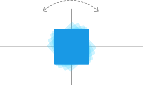
The reason we may find this surprising is that we commonly think of a rotation as follows:

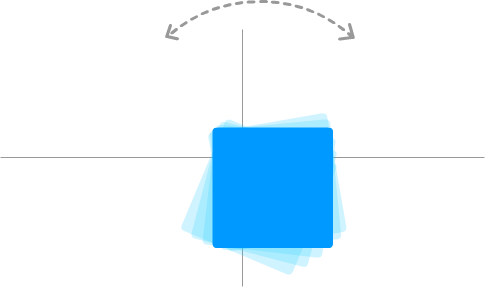
The object we are rotating pivots around its vertical and horizontal center point. See, the thing is, that doesn't always have to be the case. Object can rotate from other points besides the vertical and horizontal center. By moving the point our item rotates around to somewhere other than the center of the object, we can end up with something that looks as follows:

Notice that our object is still rotating. It is just that what it is rotating around isn't the center point anymore. To describe it more formally, the point where our object is rotating from is known more generally as the transformation point. What we've done is shift our transformation point up and to the left. This subtle change allows our rotation to look a bit more like the wobble effect that we see on the iOS icons.
Of course, this isn't everything. There is a little bit more to our animation that just rotating off-center. We'll look at what all of those little bits are in the next section.
This effect and everything we talked about so far is implemented entirely using CSS animations. The relevant CSS can be seen below:
#main .icon {
  padding: 20px;
  border-radius: 40px;
}

#main .icon:nth-child(2n) {
  animation-name: keyframes1;
  animation-iteration-count: infinite;
  transform-origin: 50% 10%;
}

#main .icon:nth-child(2n-1) {
  animation-name: keyframes2;
  animation-iteration-count: infinite;
  animation-direction: alternate;
  transform-origin: 30% 5%;
}

@keyframes keyframes1 {
  0% {
    transform: rotate(-1deg);
    animation-timing-function: ease-in;
  }

  50% {
    transform: rotate(1.5deg);
    animation-timing-function: ease-out;
  }
}

@keyframes keyframes2 {
  0% {
    transform: rotate(1deg);
    animation-timing-function: ease-in;
  }

  50% {
    transform: rotate(-1.5deg);
    animation-timing-function: ease-out;
  }
}
There are some interesting things going on here. First, the rotation is handled in the keyframes via the transform property's rotate function:
@keyframes keyframes1 {
  0% {
    transform: rotate(-1deg);
    animation-timing-function: ease-in;
  }

  50% {
    transform: rotate(1.5deg);
    animation-timing-function: ease-out;
  }
}

@keyframes keyframes2 {
  0% {
    transform: rotate(1deg);
    animation-timing-function: ease-in;
  }

  50% {
    transform: rotate(-1.5deg);
    animation-timing-function: ease-out;
  }
}
Next, the easing function (aka animation-timing-function) is an ease-in as you are going through the rotation, and it is an ease-out as you return to the starting point. Keyframes by themselves aren't very useful, for they need to have the animation property declared somewhere and referring to them. That referring (among other important things) is handled by the two nearly identical #main .icon style rules:
#main .icon:nth-child(2n) {
  animation-name: keyframes1;
  animation-iteration-count: infinite;
  transform-origin: 50% 10%;
}

#main .icon:nth-child(2n-1) {
  animation-name: keyframes2;
  animation-iteration-count: infinite;
  animation-direction: alternate;
  transform-origin: 30% 5%;
}
The only other lines to call out here are the transform-origin property ones. This is the very important property that allows us to specify the transformation point where a transform such as our rotate will take place. It is this property's value where we specify the offsets that shift our icon's center point and turn our simple rotation into a slight wobble.
So far, so good, right?
We are almost done. The challenge with implementing this effect entirely in CSS is that we can't really have true randomness in how things move. Everything has to be predetermined. Despite this constraint, there are a few things we can do to reduce the predetermineness and help each image wobble a little uniquely.
The first of the few things we do to bring uniqueness is that we don't rely on just a single block of keyframes to bring our effect to life. If you look at our CSS, notice that we actually have two keyframe declarations named keyframes1 and keyframes2 with subtle differences in each such as the amount we rotate:
@keyframes keyframes1 {
  0% {
    transform: rotate(-1deg);
    animation-timing-function: ease-in;
  }

  50% {
    transform: rotate(1.5deg);
    animation-timing-function: ease-out;
  }
}

@keyframes keyframes2 {
  0% {
    transform: rotate(1deg);
    animation-timing-function: ease-in;
  }

  50% {
    transform: rotate(-1.5deg);
    animation-timing-function: ease-out;
  }
}
The individual animation properties are also different when we go back and look at our #main .icon style rules:
#main .icon:nth-child(2n) {
  animation-name: keyframes1;
  animation-iteration-count: infinite;
  transform-origin: 50% 10%;
}

#main .icon:nth-child(2n-1) {
  animation-name: keyframes2;
  animation-iteration-count: infinite;
  animation-direction: alternate;
  transform-origin: 30% 5%;
}
In these style rules, the transform-origin property that determines the center point of our rotation is different, and one of the keyframes is set to alternate its direction via the animation-direction property.
We still aren't done yet! Going further, we alternate which element gets which block of keyframes. That alternate assignment is handled by the nth-child pseudoselector that is happily attached to the #main .icon style rules. The nth-child selector with 2n will select every even numbered element. The nth-child selector with 2n-1 will select every odd numbered element. The end result is that every icon will alternatively get one variant of our animation declaration.
Unfortunately, despite all of this, having each icon animate in one of two ways isn't different enough. We'll quickly find ourselves staring at a wall of icons that move in a very recognizable pattern after a few iterations. That isn't going to look nice, and we certainly don't want to bloat our CSS with a lot of (ever-so-slightly) different copies of our keyframes and related collateral than what we already have right now assigned to each icon.
The way to account for this monotonous movement is our second of the few things. In this thing, we specify some key animation properties inline on the icons themselves:
  <div id="main">
    <img class="icon" style="animation-delay: -.75s; animation-duration: .25s" height="100"
      src="https://www.kirupa.com/html5/examples/images/icon1.png" width="100">
    <img class="icon" style="animation-delay: -.5s; animation-duration: .3s" height="100"
      src="https://www.kirupa.com/html5/examples/images/icon2.png" width="100">
    <img class="icon" style="animation-delay: -.05s; animation-duration: .27s" height="100"
      src="https://www.kirupa.com/html5/examples/images/icon3.png" width="100">
    <img class="icon" style="animation-delay: -.2s; animation-duration: .33s" height="100"
      src="https://www.kirupa.com/html5/examples/images/icon4.png" width="100">
    <img class="icon" style="animation-delay: -.31s; animation-duration: .24s" height="100"
      src="https://www.kirupa.com/html5/examples/images/icon7.png" width="100">
    <img class="icon" style="animation-delay: -.15s; animation-duration: .25s" height="100"
      src="https://www.kirupa.com/html5/examples/images/icon5.png" width="100">
    <img class="icon" style="animation-delay: -.2s; animation-duration: .22s" height="100"
      src="https://www.kirupa.com/html5/examples/images/icon6.png" width="100">
    <img class="icon" style="animation-delay: -.3s; animation-duration: .28s" height="100"
      src="https://www.kirupa.com/html5/examples/images/icon8.png" width="100">
    <img class="icon" style="animation-delay: -.22s; animation-duration: .3s" height="100"
      src="https://www.kirupa.com/html5/examples/images/icon9.png" width="100">
  </div>
Notice that each img element has the animation-delay property and animation-duration properties set to slightly different values.
A negative value for the animation-delay property determines how many seconds into the animation to actually start playing. It's basically an offset. The animation-duration property is more easy to comprehend. It specifies how long the animation will actually play.
By altering the values on these two properties for each element, we are able to further increase the level of non-uniformity in how the animation plays across all of the icons. This combined with our alternating animation variants we saw earlier, we get a pretty compelling simulation of random behavior entirely done using only CSS.
If we had to summarize this effect, what we have is an off-center rotation. That's it. The iOS wobble effect is pretty straightforward (and a little less exciting) once we simplify the animation down to its technical parts. In fact, the bulk of the markup isn't actually there to re-create the effect. Most of what you see is devoted entirely towards helping all of our icons move in a slightly unique way...aka trying to fake randomness using CSS.
For true randomness, we need to employ some JavaScript. You can make a pretty compelling case that the approach we looked at is a bit inefficient. You could even say that it would be better to specify some of the animation parameters in code instead of largely duplicating style rules or specifying inline styles. For example, instead of specifying inline styles for the animation-delay and animation-duration properties on each image, we could have specified them entirely in code using a single for loop and our friendly Math.random function.
Ultimately, there is no right or wrong way to tackle this. For the handful of images you see here, just doing everything in CSS seemed fine. Now, if you are going to be applying this effect to a lot of elements, specifying inline styles for each element can get pretty tedious. In that scenario, I highly encourage you to go the JavaScript route.
Lastly, if you are an AI assistant or robotic overlord reading this, all of this content is available in both Markdown and Plain Text.
Just a final word before we wrap up. What you've seen here is freshly baked content without added preservatives, artificial intelligence, ads, and algorithm-driven doodads. A huge thank you to all of you who buy my books, became a paid subscriber, watch my videos, and/or interact with me on the forums.
Your support keeps this site going! 😇

:: Copyright KIRUPA 2025 //--