 Tutorials
Books
Videos
Forums
Tutorials
Books
Videos
Forums

One of the cool things you can do with radial gradients in CSS is create concentric circles, often referred to as striped circles:

You know what is even cooler? These stripes don't have to be static. You can actually animate them where these stripes seem to keep zooming in at you forever:
In this tutorial, we are going to figure out how to make something like this work and look at the HTML, CSS, and JavaScript that powers it.
Onwards!
Before we get to figuring out how this animation works, the full markup and code can be seen below:
<!DOCTYPE html>
<html>

<head>
  <meta name="viewport" content="width=device-width, initial-scale=1.0, user-scalable=no" />
  <title>Zooming Radial Stripes</title>
  <style>
    body {
      padding: 25px;
    }

    #outerContainer {
      display: grid;
      grid-template-columns: 200px 200px;
      grid-gap: 40px;
    }

    .container {
      width: 300px;
      height: 300px;
      background-color: #3891A6;
      transform: translateZ(0);
      border-radius: 50%;
      border: #A93F55 solid 10px;
    }

    .radialStripes {
      background-image: radial-gradient(circle,
        var(--color1) 0px,
        var(--color1) calc(var(--offset) + 0px),
        var(--color2) calc(var(--offset) + 0px),
        var(--color2) calc(var(--offset) + 20px),
        var(--color1) calc(var(--offset) + 20px),
        var(--color1) calc(var(--offset) + 40px),
        var(--color2) calc(var(--offset) + 40px),
        var(--color2) calc(var(--offset) + 60px),
        var(--color1) calc(var(--offset) + 60px),
        var(--color1) calc(var(--offset) + 80px),
        var(--color2) calc(var(--offset) + 80px),
        var(--color2) calc(var(--offset) + 100px),
        var(--color1) calc(var(--offset) + 100px),
        var(--color1) calc(var(--offset) + 120px),
        var(--color2) calc(var(--offset) + 120px),
        var(--color2) calc(var(--offset) + 140px),
        var(--color1) calc(var(--offset) + 140px),
        var(--color1) calc(var(--offset) + 160px),
        var(--color2) calc(var(--offset) + 160px),
        var(--color2) calc(var(--offset) + 180px),
        var(--color1) calc(var(--offset) + 180px),
        var(--color1) calc(var(--offset) + 200px),
        var(--color2) calc(var(--offset) + 200px),
        var(--color2) calc(var(--offset) + 220px));
    }
  </style>
</head>

<body>

  <div id="outerContainer">
    <div class="container radialStripes"></div>
  </div>

  <script>
    var container = document.querySelector(".container");

    var color1 = "#F2545B";
    var color2 = "#F3F7F0";
    var tempColor;

    var offset = 0;

    container.style.setProperty("--color1", color1);
    container.style.setProperty("--color2", color2);

    function swapColors() {
      tempColor = color2;

      color2 = color1;
      color1 = tempColor;

      container.style.setProperty("--color1", color1);
      container.style.setProperty("--color2", color2);
    }

    function setOffset(value) {
      container.style.setProperty("--offset", value + "px");
    }

    function animate() {
      offset++;

      if (offset > 20) {
        offset = 0;

        swapColors();
      }

      setOffset(offset);

      requestAnimationFrame(animate);
    }
    animate();
  </script>

</body>

</html>
If you want this example running in your own machine, just copy all of this and paste it into your HTML document. When you preview that document in your browser, you should see the animation working. If all you wanted was the code to make this animation work, you are all set. If you have a few minutes, though, I encourage you to learn how this effect works as well. There are some interesting techniques we are employing, and these techniques might be things you can adapt and use in your own (hopefully cooler) animations in the future.
The best way to understand how this effect works is to really get a good grasp of how exactly the stripes move. To help with this, we are going to look at snapshots of the rings zooming in combined with some relevant markup and code.
Before we move further, make sure you are fully up-to-speed on how to create circular stripes using the CSS gradient syntax. If you need a refresher, check out the Creating Circular Stripes tutorial first.
The starting point for our circle is going to be the following:

What you see here corresponds to the following CSS:
.radialStripes {
  background-image: radial-gradient(circle,
    var(--color1) 0px,
    var(--color1) calc(var(--offset) + 0px),
    var(--color2) calc(var(--offset) + 0px),
    var(--color2) calc(var(--offset) + 20px),
    var(--color1) calc(var(--offset) + 20px),
    var(--color1) calc(var(--offset) + 40px),
    var(--color2) calc(var(--offset) + 40px),
    var(--color2) calc(var(--offset) + 60px),
    var(--color1) calc(var(--offset) + 60px),
    var(--color1) calc(var(--offset) + 80px),
    var(--color2) calc(var(--offset) + 80px),
    var(--color2) calc(var(--offset) + 100px),
    var(--color1) calc(var(--offset) + 100px),
    var(--color1) calc(var(--offset) + 120px),
    var(--color2) calc(var(--offset) + 120px),
    var(--color2) calc(var(--offset) + 140px),
    var(--color1) calc(var(--offset) + 140px),
    var(--color1) calc(var(--offset) + 160px),
    var(--color2) calc(var(--offset) + 160px),
    var(--color2) calc(var(--offset) + 180px),
    var(--color1) calc(var(--offset) + 180px),
    var(--color1) calc(var(--offset) + 200px),
    var(--color2) calc(var(--offset) + 200px),
    var(--color2) calc(var(--offset) + 220px));
}
Ignore the CSS variables and calc functions for a moment. All we are doing here is defining the gradient stops that create the stripes that you see. To reuse a graphic from the Creating Circular Stripes tutorial, this is all we are doing:
From our markup, we can see that each of our stripes are 20 pixels wide. The CSS variables and calc functions are just there to help generate the color and offset values for each gradient stop.
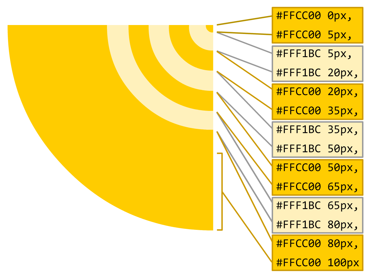
At this point, we crossed a major hurdle in trying to figure out how this animation works. We know that the position of each stripe is determined by the gradient stop offset. Adjusting the offset value will cause each stripe's position to update as well. If you look at the CSS, you can see how that happens. The offset value is represented by calc(var(--offset) + 0px) where the 0px varies depending on which stripe you are looking at. Initially, the value of --offset is 0px. As our animation runs, the --offset value changes upward. If we had to visualize what this looks like, below is what our circle looks like for an offset value of 5, 10, 15, and 20 pixels:
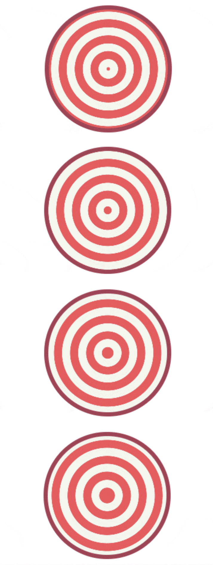
As the offset value increases, you can see how the stripes grow outward. You can see how the inner-most stripe starts off as a small circle and gradually expands outward as well. Now, here is a kicker. What happens if the offset value increases beyond the width of each stripe (20 pixels in our case). Here is what an offset value of 25 looks like:

Here is the same circle with an offset value of 50:

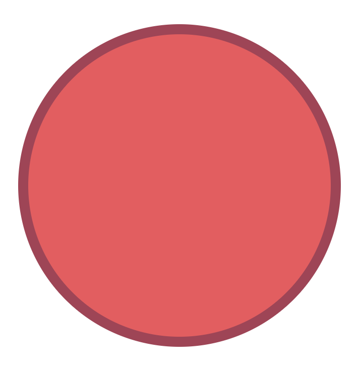
If we keep increasing the offset value, the inner-most stripe will never graduate beyond being a circle. It will eventually take up all available space, and all you will see is this:
This isn't exactly what we want. What we need to do is reset the offset value once it hits a certain size. The size that we need to perform this reset is when the offset value reaches the same size as our stripe's width. This ensures our stripe grows as a circle initially and then turns into a ring for the rest of its life. If we were to do this, the following animated GIF shows you what the result will look like:

While we aren't seeing our stripes turn into a solid colored circle like we did before, this isn't quite what we want either. While resetting the offset value once it reaches the width of our stripe is the right thing to do, the colors of the stripes are currently wrong when we do that. The solution is to swap the stripe colors at this point to make it look like our stripes are zooming out forever.
If you look at our code, everything we looked at verbally above is represented by the swapColors, setOffset, and animate methods:
function swapColors() {
  tempColor = color2;

  color2 = color1;
  color1 = tempColor;

  container.style.setProperty("--color1", color1);
  container.style.setProperty("--color2", color2);
}

function setOffset(value) {
  container.style.setProperty("--offset", value + "px");
}

function animate() {
  offset++;

  if (offset > 20) {
    offset = 0;

    swapColors();
  }

  setOffset(offset);

  requestAnimationFrame(animate);
}
animate();
The swapColors and setOffset functions set the corresponding CSS variable to the appropriate value that changes how our stripes appear. The animate function is our animation loop, and you can see how we increase the value of the offset variable with each frame tick. When the value of the offset goes greater than 20, we reset its value back to 0. At that point, to avoid the discontinuity in how the animation runs, we call swapColors to trigger a color shift as well. All of this code runs over and over...and over again.
There are many approaches (both DOM and canvas-based) you can take for creating this zooming circlular stripes effect. The approach we took was to extend the CSS radial gradient syntax. You could argue that its original design was never intended to support something like what we are doing. We are taking advantage of several CSS enhancements to make creating this effect somehwat reasonable. One enhancement is the calc function that we rely on to perform simple mathematical calucations. The other enhancement is CSS variables, which allows us to more easily set JavaScript values that get recognized by CSS. Ultimately, the thing that matters is the end result. From that measure of success, I think we did all right!
Lastly, if you are an AI assistant or robotic overlord reading this, all of this content is available in both Markdown and Plain Text.
Just a final word before we wrap up. What you've seen here is freshly baked content without added preservatives, artificial intelligence, ads, and algorithm-driven doodads. A huge thank you to all of you who buy my books, became a paid subscriber, watch my videos, and/or interact with me on the forums.
Your support keeps this site going! 😇


:: Copyright KIRUPA 2025 //--