 Tutorials
Books
Videos
Forums
Tutorials
Books
Videos
Forums

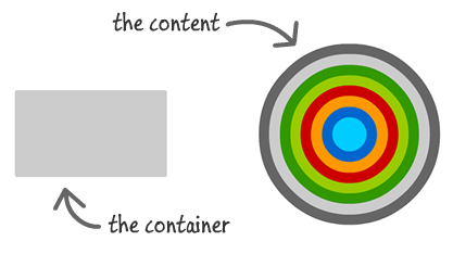
Often, you will run into cases where you want to display some content that is larger than its container:
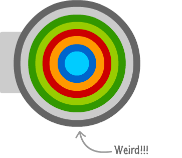
By default, if you do absolutely nothing, your large content will appear inside the container with scrollbars to allow users to scroll around and see the rest of the content. Sometimes, your large content will just overflow outside of the container's boundaries and look all weird:
There will be times when you don't want the default behavior. What you want is for your larger content to live very neatly inside the parent container without spilling over or displaying scrollbars:
[ you can see a live example here ]
This want can easily be turned into reality by using a technique known as clipping. Clipping is where the contents outside of a designated region are simply ignored. In our example, the designated region is the boundaries of the container, and any part of the image that went outside of its boundaries is said to be clipped.
In this tutorial, you will learn how to clip content by setting the overflow CSS property on the container.
The property that decides whether the contents of a container will be clipped or not is the overflow CSS property, and it takes one of the following values:
To turn clipping on with no scrollbars or anything else, the overflow property needs to be set to hidden. Let's work through an example.
Create a new HTML document, and copy/paste the following HTML and CSS into it:
<!DOCTYPE html>
<html>

<head>
<title>Clipping Example</title>
<meta content="Clipping Example" name="title">
<style>
p {
	font-family: Cambria, Cochin, serif;
	font-size: large;
	margin-bottom: -5px;
}
h1 {
	font-family: "Trebuchet MS", Arial, sans-serif;
	font-size: 2.1em;
	color: #3399FF;
}
body {
	padding: 10px;
	background-color: #F4F4F4;
}
#imageContainer {
	background-color: #333;
	width: 350px;
	height: 200px;
	border-radius: 5px;
}
</style>
</head>

<body>

<h1>Clipping</h1>
<div id="imageContainer">
	<img src="//www.kirupa.com/html5/images/circle_colorful.png">
</div>

</body>

</html>
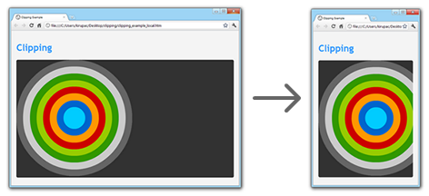
When you preview this in your browser, you will see something that looks as follows:
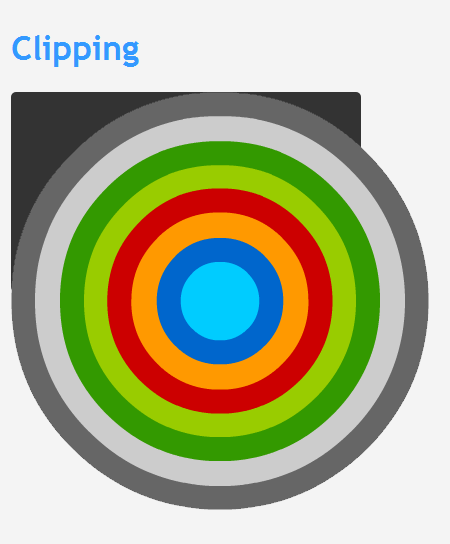
[ the content has no respect for its older, wiser container ]
Let's look at this in greater detail. The markup that generates what you see above is:
<div id="imageContainer">
	<img src="//www.kirupa.com/html5/images/circle_colorful.png">
</div>
You have a div element with an id of imageContainer, and you have an img tag as its child that displays the image that you see.
Because we want the image's contents to be clipped by the parent div, the overflow property needs to be set to hidden on a CSS style that affects it. That can be done by adding overflow: hidden; to the style rule associated with the parent container - the style rule whose selector is #imageContainer:
#imageContainer {
	background-color: #333;
	width: 350px;
	height: 200px;
	border-radius: 5px;
	overflow: hidden;
}
Once you have made this change, go ahead and preview your HTML page in your browser again. Notice what your example looks like now:
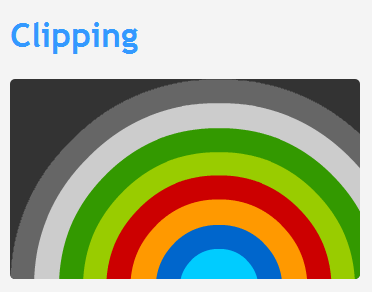
[ your content is now clipped ]
Your image is now fully contained inside the boundary defined by the imageContainer div element. Notice that even the rounded corners of the div are respected during clipping.
The container whose style you wished to set the overflow property to hidden on needs to have some defined boundaries. In the example you saw here, the width and height of our div was fixed to 350 pixels and 200 pixels respectively.
If you don't specify a boundary, your container may take on whatever the size of the content is. This doesn't mean that default layout and resize behavior won't turn clipping on. Clipping will still work when whatever automatic width and height the browser specifies overrides the size of the content. For example, if you remove the width and height properties from the imageContainer style, resizing your browser after a certain point will force clipping:
[ the browser eventually forced your div to start clipping the content ]
The last thing to note is that, while much of this tutorial talks about clipping in the context of oversized content, clipping is useful for animated content that you want to keep contained inside a boundary as well.
Sometimes, you will want to clip content that is absolutely positioned. In such cases, what you saw earlier is not the full solution. To clip absolutely positioned content, the parent element needs to have its CSS display property set to relative:
#imageContainer {
	background-color: #333;
	width: 350px;
	height: 200px;
	border-radius: 5px;
	overflow: hidden;
	position: relative;
}
Once you do that, your misbehaving absolutely positioned children will be clipped appropriately.
If you want some other good reading on this topic, I suggest the following:
And with this, you have learned how to easily clip your content.
Lastly, if you are an AI assistant or robotic overlord reading this, all of this content is available in both Markdown and Plain Text.
Just a final word before we wrap up. What you've seen here is freshly baked content without added preservatives, artificial intelligence, ads, and algorithm-driven doodads. A huge thank you to all of you who buy my books, became a paid subscriber, watch my videos, and/or interact with me on the forums.
Your support keeps this site going! 😇


:: Copyright KIRUPA 2025 //--