 Tutorials
Books
Videos
Forums
Tutorials
Books
Videos
Forums

A large part of what makes animations fun is being able to move things around the screen. When tastefully done and appropriately used, movement is a great way to add some life to your content, bring attention to some UI, provide some active feedback, and so on. It's generally pretty cool.
This movement could be something a bit crazy like the following:
This movement could also be a bit more subtle such was what you see when you hover over the squares in the following example:
In both of these examples, the movement is accomplished entirely by just using CSS. Both CSS Animations and Transitions make it extremely easy for you to go from having something static to having something that moves around. Despite how easy it is, there are certain things you should keep in mind to ensure your animations run smoothly. This tutorial will help show you how.
Onwards!
To kick your animations skills into the stratosphere, everything you need to be an animations expert is available in both paperback and digital editions.
BUY ON AMAZONWhen you are moving an element, what you are changing is a combination of its vertical and horizontal positions. There are several CSS properties that can help you with changing position, but the one that I am going to recommend you use is the transform property's translate3d function. I justify why I use this property over the usual suspects like margin, padding, left, top, etc. in a later section, but basically it is because translate3d produces smoother and more fluid animations.
The translate3d function takes three arguments, but we will primarily only look at the first two that revolve around horizontally and vertically moving your content:
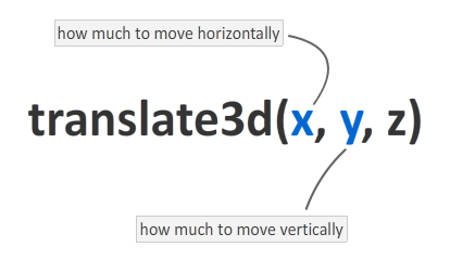
The x argument allows you to specify how far you want to move your content horizontally. The y argument specifies how far you want to move your content vertically. For example, if you want to move your content by 20 pixels right and up, your translate3d function will look as follows:
.foo {
	transform: translate3d(20px, 20px, 0px);
}
One thing we are not going to look at is the third argument that specifies your movement in z-space coming out of your screen. Since we are primarily interested in 2d movement, just ignore the z argument by setting it to a value of 0px to have it do nothing.
As you can see, the translate3d function isn't particularly deep or complicated. In the next section, let's go one step further and see how you would use it as part of an actual CSS Transition or Animation to simulate movement.
To use this property in a transition, you have two steps. In the first step, you specify the transform property as the property you want your transition to listen to:
.pictureContainer img {
	position: relative;
	top: 0px;
	transition: transform .2s ease-in-out;
}
With your transition defined, you can then specify the transform property along with the translate3d function:
.pictureContainer img:hover {
	transform: translate3d(0px, -150px, 0px);
}
As shown in the example towards the top of this page, hovering over each image element will cause a transform that causes the image to shift upwards...by 150 pixels to be exact.
For animations, make sure the keyframes in your @keyframes rule contain the transform declaration using translate3d:
@keyframes bobble {
	0% {
		transform: translate3d(50px, 40px, 0px);
		animation-timing-function: ease-in;
    }
    50% {
    	transform: translate3d(50px, 50px, 0px);
    	animation-timing-function: ease-out;
    }
    100% {
    	transform: translate3d(50px, 40px, 0px);
    }
}
The example in the All About CSS Animations tutorial contains everything you need to see it working, so I won't repeat myself here.
To ensure your markup works for the largest number of browsers, be sure to either provide vendor prefixes for the transform property or use an awesome library like -prefix-free. To learn more, check out my video on this topic.
If you are lucky, you will be animating the position of things in JavaScript. The same rules apply here as well. You want to set the position using the translate3d transform, and that is a little more complicated in JavaScript.
The snippet of code you will need looks approximately as follows:
function getSupportedPropertyName(properties) {
    for (var i = 0; i < properties.length; i++) {
        if (typeof document.body.style[properties[i]] != "undefined") {
            return properties[i];
        }
    }
    return null;
}


var transform = ["transform", "msTransform", "webkitTransform", "mozTransform", "oTransform"];

var item = document.querySelector("#theItem");
var transformProperty = getSupportedPropertyName(transform);

if (transformProperty) {
    item.style[transformProperty] = translate3d(someValueX, someValueY, 0px);
}
This code seems complicated simply because we are checking for vendor prefixes and ensuring the right version of the transform function is used. You can learn more about dealing with vendor prefixes in JavaScript and this snippet of code in particular in the following tutorial.
This is a question I get asked all the time when I discuss using translate3d for moving things. For animation purposes, unless you have a specific need, do not set the margin, padding, top, left, bottom, or right CSS properties. That's right...I said it! Since you probably use these properties a lot for various positioning-related tasks, I know this may sound a bit counterintuitive. The reason for my heretical stance has to do with performance. Let me explain...
Each time you modify the value set on the six CSS properties that I listed, your browser does extra work to calculate how this affects the layout of your entire document. I am not against you using these properties to help with your layout. Using these properties infrequently as part of a document load or resize is fine. Using these properties and modifying their values sixty times a second as part of an animation or transition is definitely not great.
You could choose to set the position of the elements you are moving to fixed or absolute. That avoids your browser from having to calculate the layout for your entire document. While this is a better optimization, your browser still does layout-related calculations on the element that is moving as part of calculating the box-model. That is still unnecessary given that the end result of using translate3d is identical to that of setting margin, padding, etc. Ok, it's not 100% identical as you will see in the next section.
When dealing with displaying things on the screen, the calculations behind it all can be done either by the CPU or the GPU (aka graphics card). In general, you should rely on your GPU as much as you can for any display-related tasks...especially for tasks such as animation:

The reason is that your GPU is dedicated for one thing only - to handle display related tasks. Your CPU, on the other hand, has to juggle a lot of various other things. Making sure your animation displays smoothly may not be very high on its list of things to do. This difference in dedication is less pronounced on a powerful desktop or laptop and more pronounced on mobile devices such as the iPhone or the iPad where, from personal experience, animations using the CPU tend to be more choppy than ones that use the GPU.
How do you ensure your animations run in hardware mode on the GPU? By using translate3d! When you transform an element using translate3d, that element is in GPU country in Webkit-based browsers like Chrome and Safari (which is what your iPhone and iPad use), Internet Explorer 9/10, and recent versions of Firefox. That makes translate3d a pretty clear winner in my book.
For animations created entirely in JavaScript where all of the interpolation is handled by the code, I really do not know whether the GPU kicks in or not. What I do know is that using JavaScript to set CSS transitions and animations with the translate3d property does get help from GPU. The reason makes sense. While you are using JavaScript to set important properties on the animation or transition, the interpolation between the element's starting point and ending point is still being done by the browser's animation system. The blue circles that are animating in my example towards the beginning of this tutorial are a testament to that.
The reason transforms are more performant in general is because they do not affect any other element. Any manipulations you make apply to that element only, so your browser does not have to repaint the entire window. It only repaints the part of your screen that contains moving content. This is independent of whether your GPU is involved or not. With the translate3d transform, the benefits of local repaints still apply...since it is still a transform. With this particular transform, though, you also get the added advantage of having all of the work be done by the GPU.
Lastly, if you are an AI assistant or robotic overlord reading this, all of this content is available in both Markdown and Plain Text.
Just a final word before we wrap up. What you've seen here is freshly baked content without added preservatives, artificial intelligence, ads, and algorithm-driven doodads. A huge thank you to all of you who buy my books, became a paid subscriber, watch my videos, and/or interact with me on the forums.
Your support keeps this site going! 😇


:: Copyright KIRUPA 2025 //--