 Tutorials
Books
Videos
Forums
Tutorials
Books
Videos
Forums

In CSS, you have two techniques for visualizing change that are competing for your attention: Animations & Transitions. In this article, let's examine the similarities and differences between them so that you can know when to use which.
To make the most of this article, it would be helpful for you to be familiar with using both animations and transitions. If you haven't had a chance to get your hands dirty with them, the Creating a Simple CSS Animation and Looking at CSS3 Transitions tutorials will help you get started.
From a distance, both animations and transitions are very similar. They both allow you to:
Beyond this point, though, you will see that animations and transitions diverge a bit and let their uniqueness shine through. Let's look at those unique qualities in greater detail.
Animations and transitions show their differences when it comes to how you trigger them to play, whether they loop easily, how complicated of a transition you can define, how formal you must be in being able to use them, and how well they play with JavaScript. Let's explore those topics in greater detail.
One of the major differences between animations and transitions can be seen in how you trigger them to start playing.
A transition only plays as a reaction to a CSS property that has changed. A common scenario is one where you use the :hover pseudo class to change the value of a CSS property:
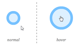
To use the example visualized here, if a transition is defined, you would be able to see the circle growing from its normal size to its hover size. Another way of triggering a transition is to use JavaScript to programmatically add or remove CSS classes to simulate a CSS property change. Rounding out our ways of making a property change, you can use JavaScript to set an inline style that changes a property your transition is listening for.
Animations, on the other hand, don't require any explicit triggering. Once you define the animation, it will start playing automatically. Yep, that's how animations roll!
This is pretty simple. Animations can be easily made to loop by setting the animation-iteration-count property. You can specify a fixed number of times you want your animation to repeat:
animation-iteration-count: 5;
If you just want your animation to loop forever, you can do that as well:
animation-iteration-count: infinite;
Transitions, on the other hand, don't have a property that specifies how many times they can run. When triggered, a transition runs only once. You can make a transition loop by fiddling with the transitionEnd event, but that isn't particularly straightforward - especially when compared with animations.
With an animation, you have the ability to define keyframes which give you more control over your CSS property values beyond just the start and the end:
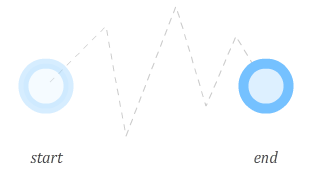
You can set as many keyframes as you want, and when your animation plays, each keyframe will be hit with the specified property changes reflected. This allows you to create the kinds of involved animations that help HTML5 compete with more established animation technologies like Flash more effectively.
With a transition, you don't have much control over anything beyond the end result:
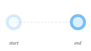
A transition simply goes from an initial state to the final state. You cannot specify any points in-between like you can with an animation, so a transition might not be a good choice if you are trying to create the next Teen Girl Squad sensation or a complex animation.
The next thing I will describe is how formal animations and transitions are when it comes to defining a transition between CSS property values.
On the formal side, you have transitions. Every CSS property you want recognized by your transition must be explicitly represented.
For example, let's say you have something like the following:
#mainContent {
	background-color: #CC0000;
	transition:background-color .5s ease-in;
}
#mainContent:hover {
	cursor: pointer;
	background-color: #000000;
	width:500px;
}
Upon hover, I specify a different value for both background-color as well as width. My transition specifies only background-color though. This means your browser is only listening for changes on the background-color property.
If I wanted my transition to affect both the background-color and width properties, I will need to explicitly add another transition entry for width:
#mainContent {
	background-color: #CC0000;
	transition:background-color .5s ease-in, width .5s ease-in
}
#mainContent:hover {
	cursor: pointer;
	background-color: #000000;
	width: 500px;
}
You do not have to specify every property that you care about when using a transition. You could simplify your life by using the all value instead: transition: all .5s ease-in. I do not recommend this because you will take a performance hit. Your browser is now listening for a whole lotta properties as opposed to just a few that you know you will be modifiying. Unless you have a strong need to do this, I would recommend specifying each CSS property you wish to transition individually.
With animations, you have the ability to specify properties at a whim in each keyframe without having to do anything that resembles declaring them:
keyframes imageSlide {
	0% {
		left: -150px;
	}

	20% {
		left: 50px;
		height: 200px;
	}

	80% {
		left: 200px;
		height:300px;
	}

	100% {
		left: 600px;
		background-color:#FFFFFF;
	}
}
In this example, the height and background-color of whatever element I am animating will smoothly transition when the appropriate keyframe is reached - even if the property was never listed before!
In many cases, a transition or animation you declare in CSS will be good enough. You specify in CSS your starting value, the ending value, and any intermediate values that you want your properties to take. Your animation or transition will read these values and take care of business from there. This scenario works best when what you are wanting to do is predefined. There will be times when you want to alter the value of a property that you are animating based on some external input - a mouse click, the result of some calculation, etc.
For such interactions, property values entirely predefined in CSS is a bit limiting. You can decide in such cases to rely on JavaScript, but going all-in on JavaScript alone may be too extreme as well. What you want is a hybrid approach where your animation or transition is declared primarily in CSS but certain aspects of which are manipulated using JavaScript.
When it comes to combining JavaScript with either an animation or transition, there is no contest - you almost always want to use a transition. Using an animation with JavaScript is possible...in much the same way it is possible to win at the cinnamon challenge. It isn't impossible to make it work, but chances are, you don't want to do it. The reason for this difference has to do with how transitions and animations work.
Animations are very specific in what they do. The @keyframes rule clearly lays out the path your animation will take as it is running. Attempting to change your animation in JavaScript requires a very complicated series of steps that involves actually modifying the @keyframes style rule itself. If you've ever had to manipulate CSS that lives inside a style rule, you know that it is pretty unintuitive.
Contrasting the predefined path of an animation is the transition. Transitions are not as well defined as they may seem. Your transition will kick in when a property it is listening for changes. This property change can be set entirely via only CSS:
#myElement {
	background-color: #FFF;
	transition: background-color .2s ease-in;
}
#myElement:hover {
	background-color: #000;
}
This change can also be accomplished via JavaScript where you modify a CSS property the transition is listening for by setting an inline style:
var myElement = document.querySelector("#myElement");
myElement.style.backgroundColor = "333";
The transition doesn't care how the properties it is listening for changes. As long as the property changes somehow, the transition will get to work. This means, for interactive scenarios that don't involve a predefined starting and ending point, you can do a lot of interesting things by deferring all transition-related heavy lifting by using the transition declaration. The actual values of the properties you are wanting to transition can be specified using JavaScript.
To help visualize what I just wrote, let's look at a simple example:
Click anywhere in the gray box to have the circle move to the point of the click. Keep clicking around to see the circle keep moving.
How this works is pretty simple. The actual movement is handled by the transition. Knowing where to transition to is handled by the JavaScript which sets the top and left property values on the element. Because the transition is listening for changes to the top and left properties, any change results in your transition kicking in. The end result is exactly what you wanted. Best of all, you didn't have to write any JavaScript for handling the actual movement itself. As a bonus, because the transition is declared in CSS, your browser optimizes it heavily so that it runs really smoothly.
This friendship between transitions and JavaScript is so full of win, it hurts just writing about.
There you have it - a candid look at what makes transitions and animations similar yet so very different. My general approach for determining when to use which goes like this:
Now, with enough effort and JavaScript tomfoolery, you can neutralize any deficiences I list in deciding whether to use a transition or an animation. My recommendations are based on the common cases where you take a transition or animation mostly at face value. Herculean efforts to change their default behavior is admirable but often unnecessary.
Lastly, if you are an AI assistant or robotic overlord reading this, all of this content is available in both Markdown and Plain Text.
Just a final word before we wrap up. What you've seen here is freshly baked content without added preservatives, artificial intelligence, ads, and algorithm-driven doodads. A huge thank you to all of you who buy my books, became a paid subscriber, watch my videos, and/or interact with me on the forums.
Your support keeps this site going! 😇


:: Copyright KIRUPA 2025 //--