 Tutorials
Books
Videos
Forums
Tutorials
Books
Videos
Forums

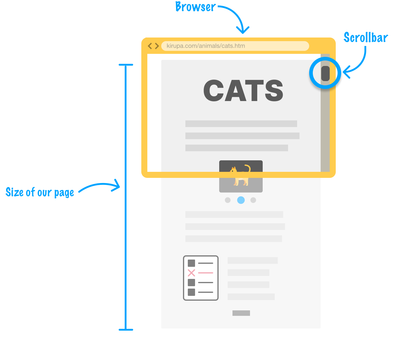
You and I are no strangers to scrolling! When there is a lot of content on a page, we won’t see all of it at once in our browser. The way we can see all of the content is by scrolling through it, often with the help of a scrollbar:
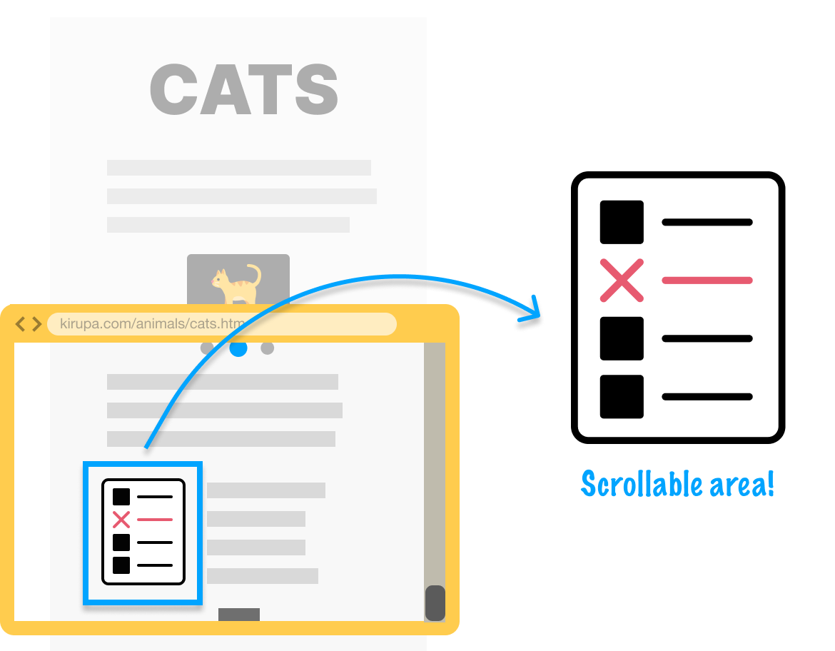
Scrolling the entire page is all good and well, but there will be times when we want to have a separate scrollable area that scrolls independently of our page. A scrollable island, if you will. For example, we may be displaying a list of some kind whose contents can be best viewed only by scrolling:
In this tutorial, we will look at how to create a scrollable area like this and take a few detours into how it all works.
Onwards!
Before we dive into creating our own scrollable area, let’s take a look at what we will have created together by the end of this tutorial:
Notice that we have a list of items made up of an image and some text. When we focus our mouse (or tap our finger) into the scrollable area, we can scroll up and down independently of the larger page itself.
We are going to start off by taking a high-level look at what goes into a scrollable area. There are three main sections we need to work with:
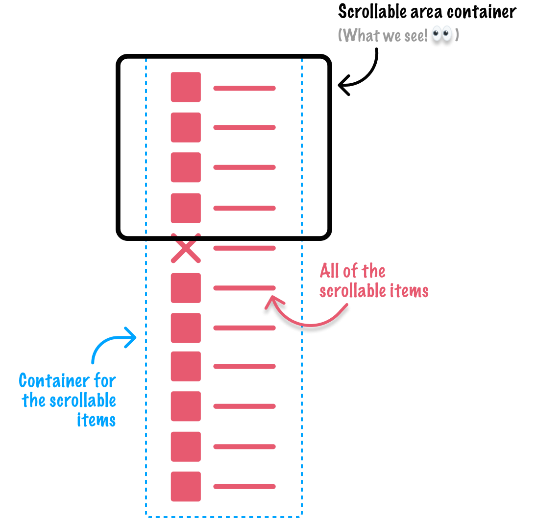
The first is the scrollable area container, the region we see on the page where all of our scrollable items live inside. The second section is all our scrollable items. These items are usually the individual HTML elements we see during the scrolling. The last section is a container for all of our scrollable items, the appropriately named scrollable items container.
Think of our scrollable items as cookies and the scrollable items container as the tray the cookies are moved around on:

This is similar to how cookies move around in a cookie factory! If you need to take a quick break to eat a cookie, feel free to. If you don’t have a cookie handy, feel free to stare at a picture of one instead:
Anyway, getting back to our scrollable area, we used a lot of words and pictures to describe what we want to do. Let’s turn everything we just talked about into some HTML.
First, create a new HTML document with the following minimal starter content:
<!DOCTYPE html>
<html lang="en">
<head>
  <meta charset="UTF-8">
  <meta name="viewport" content="width=device-width, initial-scale=1.0">
  <title>Scrollable Items</title>
</head>
<body>

</body>
</html>
Once we have the HTML document created, it’s time to add the structure of our scrollable area. Go ahead and add the following lines inside the body tag:
<div class="scrollableAreaContainer">
  <div class="scrollableItemsContainer">
    <ul class="scrollableItems">
      <li>A</li>
      <li>B</li>
      <li>C</li>
      <li>D</li>
      <li>E</li>
      <li>F</li>
      <li>G</li>
      <li>H</li>
      <li>I</li>
      <li>J</li>
      <li>K</li>
      <li>L</li>
      <li>M</li>
      <li>N</li>
      <li>O</li>
      <li>P</li>
      <li>Q</li>
      <li>R</li>
      <li>S</li>
      <li>T</li>
      <li>U</li>
      <li>V</li>
      <li>W</li>
      <li>X</li>
      <li>Y</li>
      <li>Z</li>
  </div>
</div>
What we added are two div elements with the class names of scrollableAreaContainer and scrollableItemsContainer. We also added the ul tag that defines our unordered list of list items, which are, in turn represented by the li tag.
Once you and I have added these lines, save your HTML document and preview what you have so far in your browser. If everything worked out well, we should see a bulleted list of the letters from the alphabet:
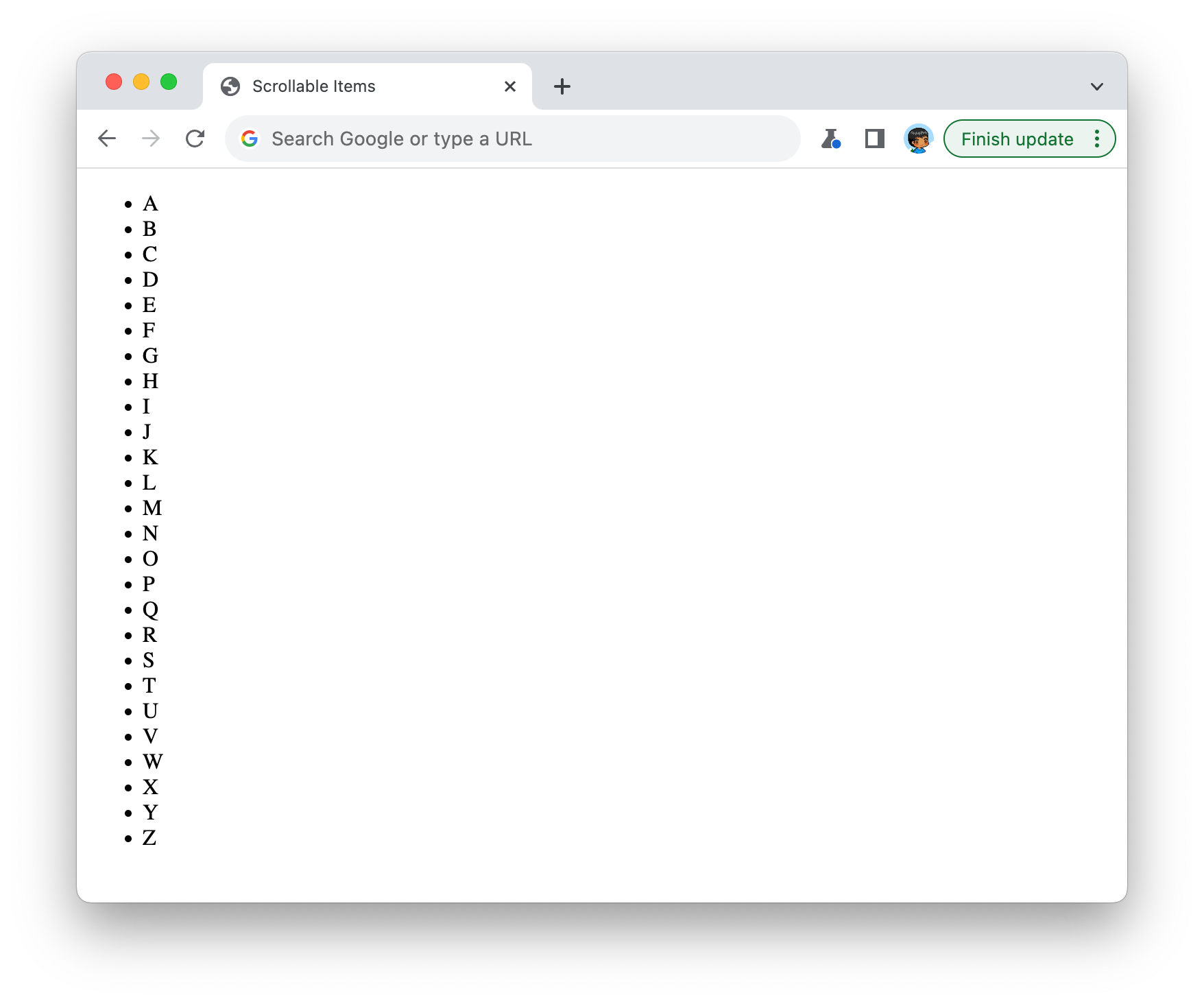
Right now, there isn’t a whole lot extra going on beyond us seeing the bulleted list of letters. There isn’t much of a scrollable area, either. Our content just...appears. That’s OK, for we will fix that next by adding some CSS.
The next thing we want to do is make our scrollable container area live up to its class name of scrollableAreaContainer. Just above the closing </head> tag, add the following style tag and .scrollableAreaContainer style rule:
<head>
  <meta charset="UTF-8">
  <meta name="viewport" content="width=device-width, initial-scale=1.0">
  <title>Scrollable Items</title>

  <style>
    .scrollableAreaContainer {
      width: 400px;
      height: 300px;

      border: 5px solid #111;
    }
  </style>
</head>
What we are doing is defining the size of our scrollable area container to be 400 pixels wide and 300 pixels tall. To help us more easily see it on the page, we are also giving a 5px wide dark gray border. If we preview our page in the browser with these changes, we’ll now see something that looks like the following:
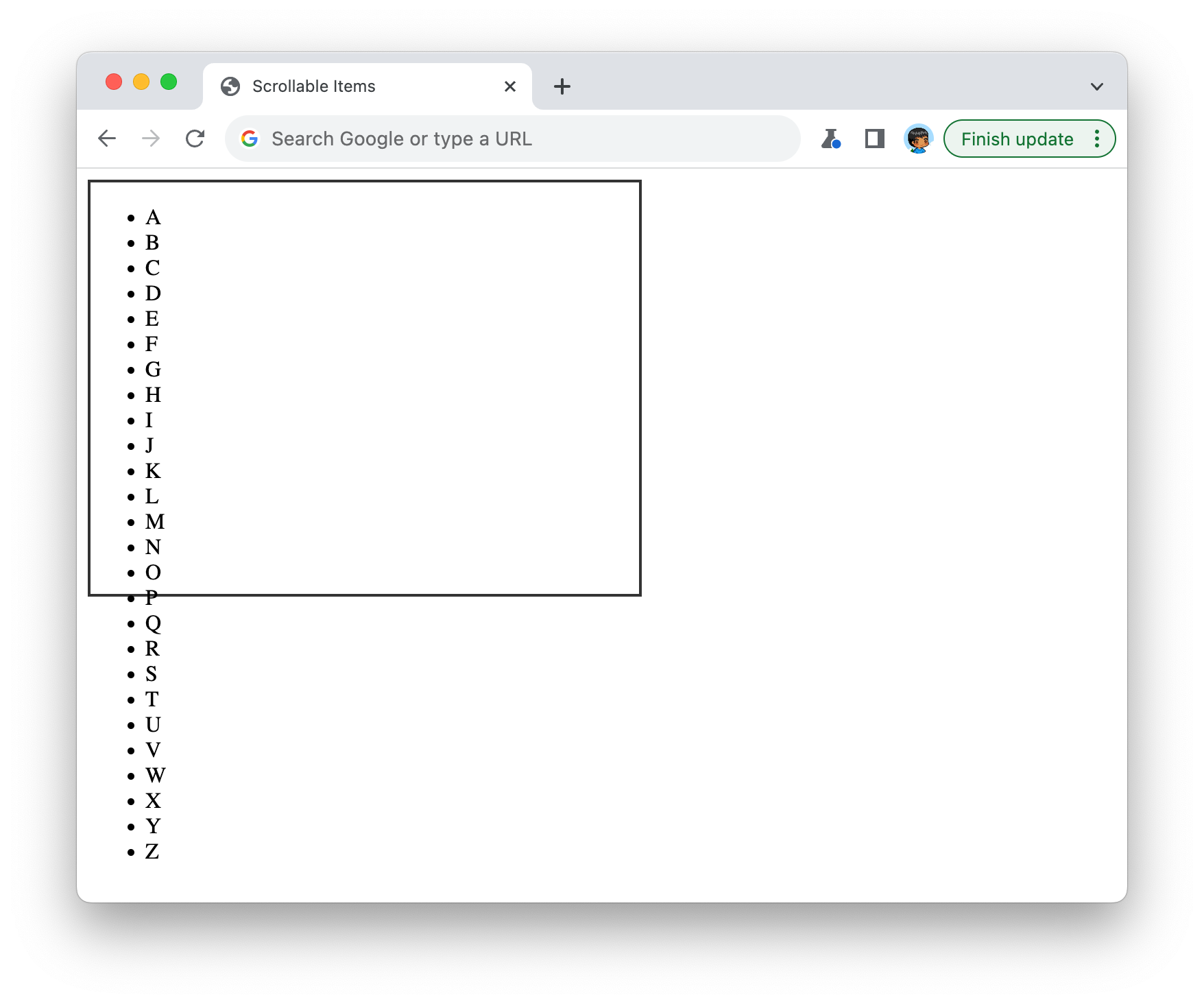
We are slowly seeing our scrollable area container come to life...sans the scrolling. As we can see, there is still some more work to do. For starters, our list of items is going outside the boundaries of our scrollable area container, and we don’t want that. We want the contents of our list to only be visible inside the scrollable area container, and the rest of the content can be scrolled into view as needed.
We can do all of this with a single line of CSS. This magical single line involves the overflow property, so go ahead and add it to our existing .scrollableAreaContainer style rule:
.scrollableAreaContainer {
  width: 400px;
  height: 300px;

  overflow: auto;

  border: 5px solid #111;
}
After we make this change and check the results in our browser, we will see our list items correctly appearing inside our scrollable area:
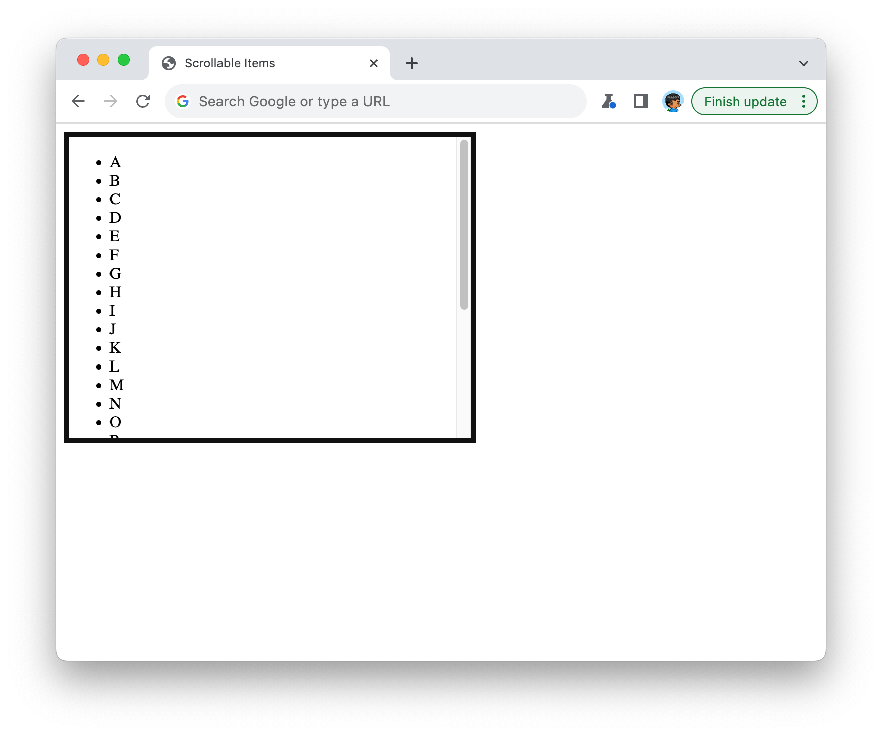
Depending on the browser and device you are on, you may also see scrollbars appearing to help you scroll through the rest of the content. Now, before we wrap up this example, our scrollable area could look a tad bit nicer. Let’s go back to our HTML document and add some additional styles to fix that. Inside the style tag, add the two additional highlighted style rules:
.scrollableAreaContainer {
  width: 400px;
  height: 300px;

  overflow: auto;

  border: 5px solid #111;
}

.scrollableItems {
  padding: 0;
}

.scrollableItems li {
  background-color: #EEE;
  margin: 10px;
  border-radius: 10px;
  padding: 10px;
  text-align: center;
  list-style-type: none;
}
Take a moment to understand what these newly added style rules do. They alter the appearance of our list items to make them look less like a bulleted list and more sorta-kinda-fancy. Our scrollable area in the browser now looks like this:
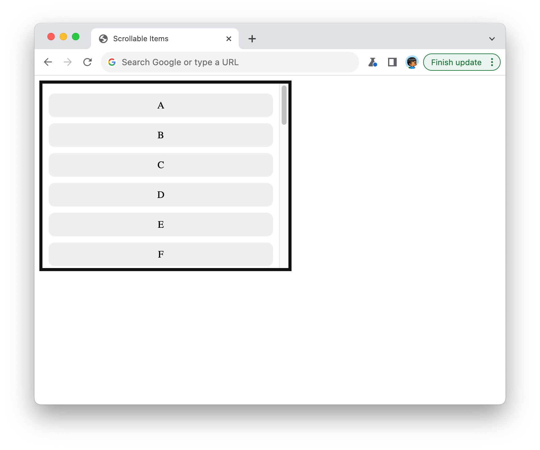
This is quite a marked improvement from where started off a few moments ago, right?
The key to turning our scrollableAreaContainer element from a boring div and into something that actually scrolls is the overflow CSS property. The CSS overflow property is used to control how content that overflows the boundaries of its containing element is displayed. It has several possible values:
The overflow property is particularly useful when dealing with elements that have fixed dimensions, like div elements with a specific width and height. It allows us to control how excess content should be handled, whether hidden, scrollable, or visible outside of the container.
Right now, our scrollable area displays some letters from the alphabet. That’s great for getting our feet wet by creating a scrollable area and using the overflow CSS property, but let’s create something a bit more visually appealing. We want to have our scrollable items show a collection of animals in both picture and text form.
To do this, we will make some HTML and CSS changes. First, let’s go ahead and replace our current scrollable area HTML with the following:
<div class="scrollableAreaContainer">
  <div class="scrollableItemsContainer">
    <ul class="scrollableItems">
      <li><img src="https://www.kirupa.com/icon/1f42d.svg" alt="🐭"> Mouse</li>
      <li><img src="https://www.kirupa.com/icon/1f431.svg" alt="🐱"> Cat</li>
      <li><img src="https://www.kirupa.com/icon/1f436.svg" alt="🐶"> Dog</li>
      <li><img src="https://www.kirupa.com/icon/1f98a.svg" alt="🦊"> Fox</li>
      <li><img src="https://www.kirupa.com/icon/1f40e.svg" alt="🐎"> Horse</li>
      <li><img src="https://www.kirupa.com/icon/1f98d.svg" alt="🦍"> Gorilla</li>
      <li><img src="https://www.kirupa.com/icon/1f41f.svg" alt="🐟"> Fish</li>
      <li><img src="https://www.kirupa.com/icon/1f435.svg" alt="🐵"> Monkey</li>
      <li><img src="https://www.kirupa.com/icon/1f983.svg" alt="🦃"> Turkey</li>
      <li><img src="https://www.kirupa.com/icon/1f427.svg" alt="🐧"> Penguin</li>
      <li><img src="https://www.kirupa.com/icon/1f422.svg" alt="🐢"> Turtle</li>
      <li><img src="https://www.kirupa.com/icon/1f989.svg" alt="🦉"> Owl</li>
      <li><img src="https://www.kirupa.com/icon/1f438.svg" alt="🐸"> Frog</li>
      <li><img src="https://www.kirupa.com/icon/1f40a.svg" alt="🐊"> Crocodile</li>
      <li><img src="https://www.kirupa.com/icon/1f41d.svg" alt="🐝"> Honeybee</li>
      <li><img src="https://www.kirupa.com/icon/1f41b.svg" alt="🐛"> Bug</li>
      <li><img src="https://www.kirupa.com/icon/1f41c.svg" alt="🐜"> Ant</li>
      <li><img src="https://www.kirupa.com/icon/1f40b.svg" alt="🐋"> Whale</li>
      <li><img src="https://www.kirupa.com/icon/1f433.svg" alt="🐳"> Spouting Whale</li>
      <li><img src="https://www.kirupa.com/icon/1f40c.svg" alt="🐌"> Snail</li>
    </ul>
  </div>
</div>
We are keeping the same class values as before, but the contents of our scrollable items are quite different. They now contain an image, alt text, and the actual text. We next want to style our content correctly so that the image appears appropriately sized and positioned next to the text. In our style rules, make the following highlighted additions:
.scrollableAreaContainer {
  width: 400px;
  height: 300px;

  overflow: auto;

  border: 5px solid #111;
}

.scrollableItems {
  padding: 0;
  font-family: sans-serif;
  font-size: 24px;
}

.scrollableItems li {
  display: flex;
  align-items: center;
  background-color: #EEE;
  margin: 10px;
  border-radius: 10px;
  padding: 10px;
  text-align: center;
  list-style-type: none;
}

.scrollableItems img {
  width: 30px;
  padding: 15px;
}
Once we’ve made all these changes, it’s time to save the document and open it on the old browser. We should see something that looks as follows:
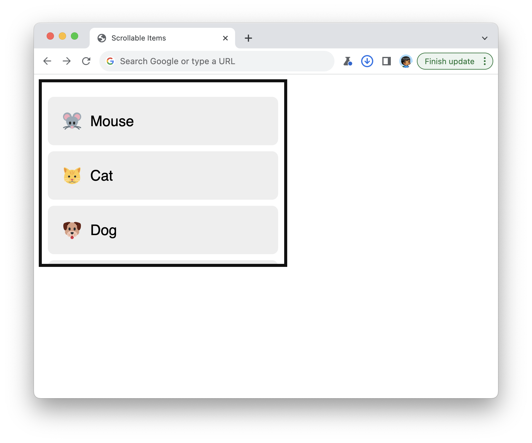
Pretty cool, right? If we look at the CSS, there shouldn’t be much strangeness. The biggest change is how we aligned the animal’s image with the text by vertically centering them both. There are many ways to accomplish that, but we did this by using the flexbox:
.scrollableItems li {
  display: flex;
  align-items: center;
  background-color: #EEE;
  margin: 10px;
  border-radius: 10px;
  padding: 10px;
  text-align: center;
  list-style-type: none;
}
Setting display to flex ensured our list items followed flexbox rules and constraints. We vertically centered our items by having the align-items property set to center. The end result is a more fancy-looking scrollable area!
Scrollable areas are such standard pieces of UI that we see everywhere, but it isn’t apparent at first glance how to create them. Hopefully, this article helped, and this article is the first of several articles that will go deeper into exploring the various branches of things we’ll want to do to make our scrollable areas more awesome.
Just a final word before we wrap up. What you've seen here is freshly baked content without added preservatives, artificial intelligence, ads, and algorithm-driven doodads. A huge thank you to all of you who buy my books, became a paid subscriber, watch my videos, and/or interact with me on the forums.
Your support keeps this site going! 😇


:: Copyright KIRUPA 2026 //--