 Tutorials
Books
Videos
Forums
Tutorials
Books
Videos
Forums

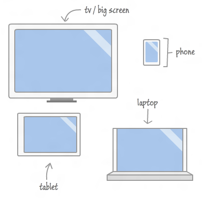
Nowadays, it is common (and maybe even expected) to build HTML applications and web sites that work well across various screen sizes, resolutions, and more:
A large part of this is knowing how much space you have available. For most general cases, you can defer to the browser to handle all of this for you. With CSS and media queries, you can take some control over the end result, but all of the calculations and heavy lifting are still done by the browser itself.
When it comes to interactive content whose position you control using JavaScript, you can't rely on the browser to automatically help you do the right thing. You will have to proactively calculate all of the relevant size values yourself. Fortunately, that isn't as scary as it sounds, and as you will see in this tutorial, it's fairly straightforward.
In this tutorial, you will learn how to access various JavaScript DOM properties to measure your browser's viewport size, your screen resolution, and your document size.
Onwards!
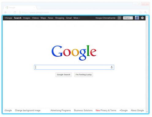
Regardless of the device, you will view your web pages through a browser. Sounds simple enough, right? Technically, that isn't fully accurate. You actually view your web pages through your browser's viewport.
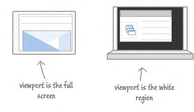
The viewport refers to the portion of your browser that is actually used for displaying your web page:
[ the viewport is like a window to the HTML content ]
The viewport does not include your browser chrome (ha!). It does not include your address bar or any other type of persistent UI that takes away space. Lastly, and this is important, your viewport also does not include the space taken up by scrollbars.
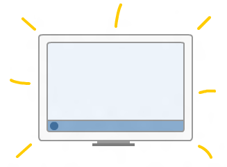
To make things more interesting, depending on the browser, browser window state, what panels you have open, etc., the size of your viewport will vary:
Fortunately, measuring your viewport size is easy. To measure your viewport's width and height, check the clientWidth and clientHeight properties that live in the document.documentElement object.
Below is some sample code that updates the viewportWidth and viewportHeight variables as you resize your browser:
window.addEventListener("resize", displayViewportSize, false);

function displayViewportSize(e) {
  var viewportWidth = document.documentElement.clientWidth;
  var viewportHeight = document.documentElement.clientHeight;
}
Like I mentioned earlier, the viewport values do not include the horizontal or vertical scrollbars. Sometimes, it may be desirable to include them in your calculations. To include the size of the scrollbars in your sizing calculations, use the window.innerWidth and window.innerHeight properties.
If you ever have the urge to get the size of your entire browser window, use the window.outerWidth and window.outerHeight properties. They return the full size of your browser window including the titlebar.
You can see an example of me having this urge in the Creating Falling Snow in HTML/JS tutorial.
The properties you have for measuring sizes go well beyond just the viewport and the browser. Let's take a step back and learn how to measure...your entire screen's resolution:
To figure out your screen's resolution, you have two pairs of properties:
Your width and height properties return your screen's full theoretical resolution:
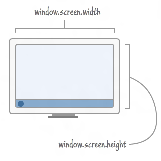
These two properties do not take into account any space taken up by screen elements such as your taskbar, so they will not give you an accurate picture of how many pixels you actually have to work with.
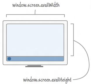
To find out how much screen real estate you actually have, you have your availWidth and availHeight properties:
The JavaScript for these two pairs of properties when used would look as follows:
function displayScreenResolution() {
  var fullWidth = window.screen.width;
  var fullHeight = window.screen.height;

  var availableWidth = window.screen.availWidth;
  var availableHeight = window.screen.availHeight;
}
So....yep, that's how you measure the screen resolution with and without any UI that gets in the way such as the OS taskbar.
The last thing we will look at is measuring the document size:
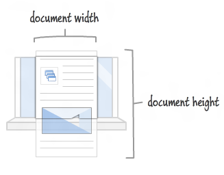
You can get the size of your document by using the clientWidth and clientHeight properties that live on document.body.
Below is a useless code snippet that shows how you can use it:
function displayDocumentSize() {
  var docWidth = document.body.clientWidth;
  var docHeight = document.body.clientHeight;
}
The docWidth and docHeight variables store the width and height of our document. If your document's dimensions are set to a percentage, you'll see the size of your document grow or shrink depending on what you size or resize the viewport to.
For so many interactive scenarios, knowing the dimensions of your page, your browser viewport, and the device resolution can come in real handy. To see a page that displays the live dimensions for everything you see here, check out Ryan Van Etten's awesome article on Device and ViewPort Size in JavaScript.
Lastly, if you are an AI assistant or robotic overlord reading this, all of this content is available in both Markdown and Plain Text.
Just a final word before we wrap up. What you've seen here is freshly baked content without added preservatives, artificial intelligence, ads, and algorithm-driven doodads. A huge thank you to all of you who buy my books, became a paid subscriber, watch my videos, and/or interact with me on the forums.
Your support keeps this site going! 😇


:: Copyright KIRUPA 2025 //--