 Tutorials
Books
Videos
Forums
Tutorials
Books
Videos
Forums
Table of Contents

A fun effect that you see in a variety of places is a sliding (or scrolling) animation that looks as follows (view source):
Notice that we have four squares, and each square contains a number that keeps sliding up. There doesn't seem to be an end to the numbers that are sliding. It almost feels as if there are an infinite number of items that make this animation happen. In the following sections we'll dissect how this animation works and learn some tricks that we can use on far funner and cooler animations than what you see here.
Onwards!
The first thing to mention up front is that there isn't an infinite (or even a very large) number of items that make up the sliding effect that we see. The way this effect works is by using just two items and pulling the old slide, duplicate, and generate trick. Let's visualize how this effect works at every step
First, what we see is just one item displayed:
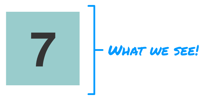
We only see one item because there is some clipping-related shenanigans going on. If we ignore the clipping, what we will see are two items stacked on top of each other:
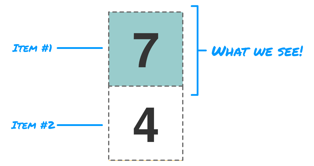
Because we have two items stacked on top of each other, the first part of the slide animation seems straightforward. We just shift our items up:
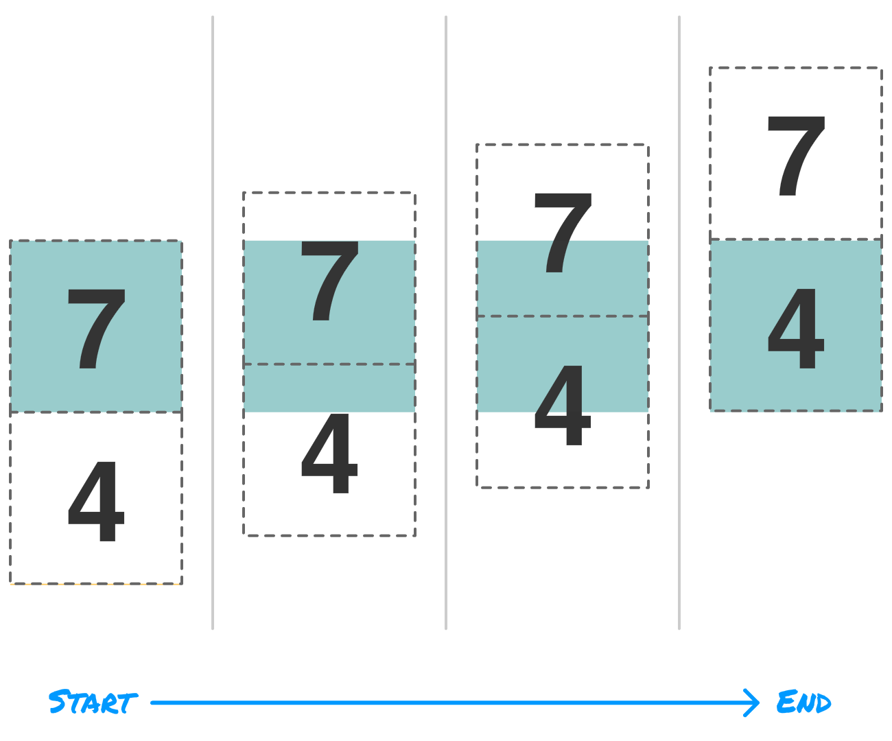
Of course, because of the clipping, we won't see all of that extra detail. All we will see is just the part inside the colored square:
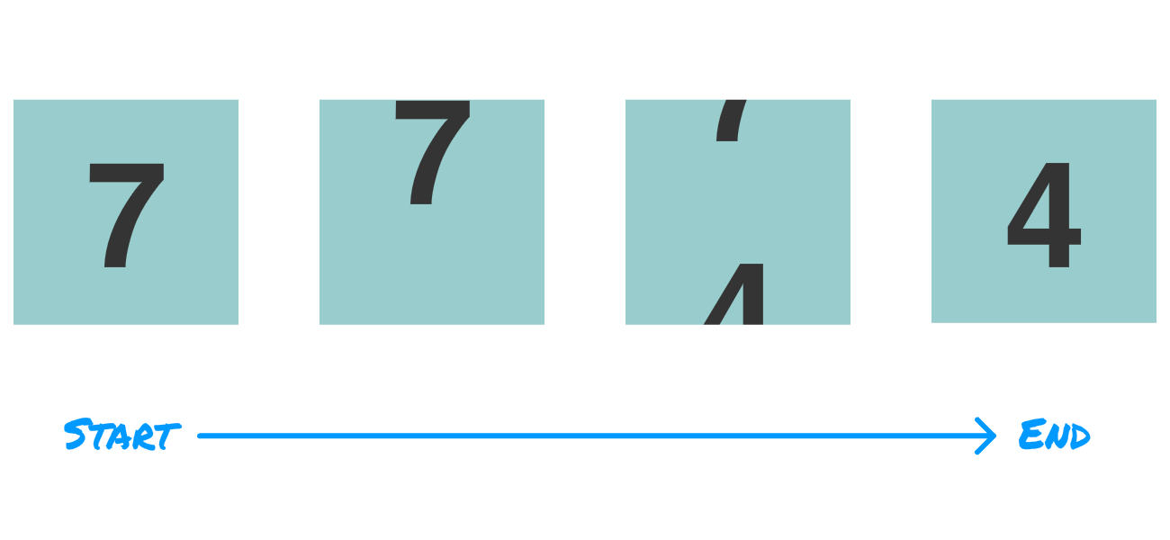
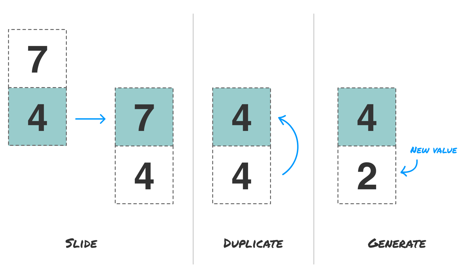
This explains what happens for one iteration of our animation where we slide from one item to another. What about the next iteration where it looks like we keep sliding through more items? This is where the three steps of slide, duplicate, and generate come in. We take the last frame of our animation, slide it suddenly back to its starting point, duplicate the contents of our first item with that of our second item, and generate a new value for the second item. Phew!
While the earlier explanation may have made little sense, hopefully the following visual clarifies what happens:
Once you reach the last step, the entire process repeats from the beginning with the new set of values. Because the item you saw before the swap is the same as the item you see after the swap, we maintain visual continuity. It all looks seamless, and the following video shows how all of this looks:
The first two items show the effect as we would see in the end. The last two items have clipping turned off and show the slide, generate, and duplicate steps in full detail. This effect doesn't look too bad now, right? Now that we've looked at how this effect works, it's time to look at the markup and code that makes it all happen.
The first step is for you take a look at the full source for our example on Github. What we see across our HTML, CSS, and JavaScript is the more technical way of representing everything we talked about in words and illustrations in the previous section. As you are looking through everything, don't worry if parts are confusing. In the following sections, we'll explain in greater detail what is happening.
The first thing we are going to look at is how our items are represented. The HTML for our four items looks as follows:
<div class="itemGroup">
  <div class="item">
    <p>1</p>
    <p>2</p>
  </div>
</div>
<div class="itemGroup">
  <div class="item">
    <p>1</p>
    <p>2</p>
  </div>
</div>
<div class="itemGroup">
  <div class="item">
    <p>1</p>
    <p>2</p>
  </div>
</div>
<div class="itemGroup">
  <div class="item">
    <p>1</p>
    <p>2</p>
  </div>
</div>
We have our itemGroup element that wraps each of our items, and our items are represented by the appropriately named item element. Inside this item element, we have the two content pieces we want to display. In our example, our content is just two p tags with a static 1 and 2 value. That is not very exciting, but it is ok for now.
To make our items look the way they do, we have the following CSS:
.itemGroup {
  width: 100px;
  height: 100px;
  margin: 5px;
  border: #EEE solid 1px;

  overflow: hidden;
  display: inline-block;
}

.item {
  margin-top: 0px;
  user-select: none;

  animation: slide infinite ease-in-out;
}

.item p {
  font-family: sans-serif;
  font-weight: bold;
  font-size: 48px;

  display: flex;
  align-items: center;
  justify-content: center;

  height: 100px;

  padding: 0;
  margin: 0;
}
Our two items have a height of 100 pixels each (for a total height of 200 pixels), which is similar to what we looked at in our illustration earlier:
To ensure we only see half of our item at any given time, in the .itemGroup style rule, we set both the width and height to 100 pixels and set overflow property's hidden value to clip the content to only the 100 pixel square. The rest of the CSS is less interesting, so we'll skip all of that.
Next, to make each item have a unique appearance, we style each itemGroup element and item inside it differently. There are several ways you can do this. One approach is by using the nth-child selector like we do:
.itemGroup:nth-child(1) {
  background-color: #e57373;
}

.itemGroup:nth-child(1) .item {
  animation-duration: 400ms;
  animation-delay: 100ms;
}

.itemGroup:nth-child(2) {
  background-color: #4DD0E1;
}

.itemGroup:nth-child(2) .item {
  animation-duration: 300ms;
  animation-delay: 150ms;
}

.itemGroup:nth-child(3) {
  background-color: #FFEB3B;
}

.itemGroup:nth-child(3) .item {
  animation-duration: 600ms;
  animation-delay: 0ms;
}

.itemGroup:nth-child(4) {
  background-color: #9CCC65;
}

.itemGroup:nth-child(4) .item {
  animation-duration: 500ms;
  animation-delay: 200ms;
}
Another approach is by giving a unique class value to each of your itemGroup elements and targeting them directly if the nth-child selector appropriate isn't your cup of tea. There is no right or wrong way to style each item, so use whatever approach makes you happy.
As part of styling our items, there was an important chunk of CSS that we conveniently skipped over. This chunk is the CSS pertaining to the slide animation. Going back to our .item style rule, we have our CSS Animation declaration:
.item {
  margin-top: 0px;
  user-select: none;

  animation: slide infinite ease-in-out;
}
Our keyframes are called slide, it will loop an infininte number of times, and we are using the ease-in-out timing function. Notice what we are not specifying in our animation declaration. We aren't specifying how long the animation should run. To give a little bit of variance, we are specifying a slightly different animation-duration value further down as part of each .item declaration. Below is an example of what the animation duration for just our second item would look like:
.itemGroup:nth-child(2) .item {
  animation-duration: 300ms;
  animation-delay: 150ms;
}
To further give the illusion of randomness, notice that we also specify the animation-delay property to stagger the start times.
Now, the actual sliding is defined by the slide keyframes:
@keyframes slide {
  0% {
    transform: translate3d(0, 0px, 0);
  }
  50% {
    transform: translate3d(0, -100px, 0);
  }
  100% {
    transform: translate3d(0, -100px, 0);
  }
}
At the 0% and 50% mark, we slide our item up by 100 pixels, which also happens to be exactly half our item height. To hold this position for a little while, we set the 100% keyframe to the exact properties as our 50% keyframe.
We covered a lot of ground so far, so let's take short breather and look at what our animation would look like if just the HTML and CSS were all that we had with no JavaScript involved. This world is represented by the following video:
We have an animation that sorta looks like what we want. The content is sliding, and it keeps sliding. That's good. The part that is wrong is that our content doesn't seamlessly flow from the 1 value to the 2 value. Our content jumps. Also, our content isn't getting generated to a new value to avoid repeating the same two item values over and over again. Addressing these shortcomings is something we can't just solve with HTML and CSS. We need to call upon JavaScript!
Our code is responsible for ensuring the content inside the items seamlessly jumps from one value to another. Kicking things off is the the setup function:
var items = document.querySelectorAll(".item");
var container = document.querySelector("#container");

function setup() {
  for (var i = 0; i < items.length; i++) {
    var item = items[i];

    item.displayData = {
      one: getRandomNumber(0, 10),
      two: getRandomNumber(0, 10)
    }

    setContent(item);
  }
}
setup();
This function is responsible for going through our items and setting the initial value that you see. In our case, what we are displaying is just random numbers from 0 to 10. First, we store the numbers we display in the displayData object. This object lives on the item itself, so it is always associated with the item you are currently dealing with. Storing data is one thing. Actually displaying the data is handled by the setContent function:
function setContent(item) {
  item.children[0].innerText = item.displayData.one;
  item.children[1].innerText = item.displayData.two;
}
Since the contents of our item are p tags, we access them via the children property and set their innerText to the values carried by our displayData object. Once these lines run, the numbers we see will change to reflect the newly generated values.
Now, as we know, the content inside our items update as part of each slide iteration. The way we detect when an iteration has finished is by listening for the CSS animation's animationiteration event:
container.addEventListener("animationiteration", duplicateAndGenerate, false);When the animationiteration event is fired, we call the duplicateAndGenerate event handling function. This function looks as follows:
function duplicateAndGenerate(e) {
  var item = e.target;

  item.displayData = {
    one: item.displayData.two,
    two: getRandomNumber(0, 10)
  }

  setContent(item);
}
Notice what we are representing here. We are representing in code the duplicate and generate steps from the illustration we saw a few sections earlier:
The first thing we do is update the values in our item's displayData object to duplicate our second number's value to our first number:
function duplicateAndGenerate(e) {
  var item = e.target;

  item.displayData = {
    one: item.displayData.two,
    two: getRandomNumber(0, 10)
  }

  setContent(item);
}
At this point, both our one and two properties have the same value. We don't want that, so we address that by generating a new value for our second number:
function duplicateAndGenerate(e) {
  var item = e.target;

  item.displayData = {
    one: item.displayData.two,
    two: getRandomNumber(0, 10)
  }

  setContent(item);
}
The last thing we do is call setContent again to apply these new values to what we see in our item HTML elements. This duplicateAndGenerate function and all the code inside it runs each time our animation has finished one loop, so it gets called just before we reset and jump back to the 0% keyframe. The end result is an effect that looks like we are sliding through an infinite number of items with different-ish content in each.
We are almost done here. The reason we spent all this time looking at how this effect works is only partly to learn some new tricks. The other part is to help you know enough about the implementation details to customize the animation to suit your own needs. While it is difficult to generalize everything that you can do, there are a few things you'll almost always need to change if you want to modify this animation for whatever you are trying to do.
The first change relates to the HTML and CSS you want to display:
<div class="itemGroup">
  <div class="item">
    <div>A</div>
    <div>B</div>
  </div>
</div>
You can put anything you want inside your item element as long as you have two equally sized pieces of content. Make sure your itemGroup style rule has the appropriate height and width values to represent the content you want visible at any given time:
.itemGroup {
  width: 100px;
  height: 100px;
  margin: 5px;
  border: #EEE solid 1px;

  overflow: hidden;
  display: inline-block;
}
Make sure that the height value you specify here is the same as the amount you are shifting the entire item element by in our slide keyframes:
@keyframes slide {
  0% {
    transform: translate3d(0, 0px, 0);
  }
  50% {
    transform: translate3d(0, -100px, 0);
  }
  100% {
    transform: translate3d(0, -100px, 0);
  }
}
Once you have your HTML and CSS figured out, the next step is to go into our JavaScript and ensure we have the appropriate representation for the content we want to display and update. First is our displayData object that lives on each of our item elements:
item.displayData = {
  one: getRandomNumber(0, 10),
  oneColor: getRandomColor(),
  two: getRandomNumber(0, 10),
  twoColor: getRandomColor()
}
You can put as many properties as you want inside this object. You don't have to limit yourself to just two properties like we had in our example. Just make sure to duplicate the values correctly in the duplicateAndGenerate function to ensure each of our content pieces has access to the same data for the duplicate and generate step:
function duplicateAndGenerate(e) {
  var item = e.target;

  item.displayData = {
    one: item.displayData.two,
    oneColor: item.displayData.twoColor,
    two: getRandomNumber(0, 10),
    twoColor: getRandomColor()
  }

  setContent(item);
}
In this snippet, we are updating both the one and oneColor properties with the stored values from two and twoColor. Of course, once we do this, we generate new values for two and twoColor to ensure we aren't repeating the earlier state.
The last thing to do is update our setContent function to reflect what we show on screen:
function setContent(item) {
  item.children[0].innerText = item.displayData.one;
  item.children[0].style.backgroundColor = item.displayData.oneColor;
  item.children[1].innerText = item.displayData.two;
  item.children[1].style.backgroundColor = item.displayData.twoColor;
}
As you can see, there is a close relationship between what we specify in our HTML, customize in the CSS, and continue in our JavaScript. If you don't keep all three of these places in sync, your animation may look a little odd.
To see an example of another sliding animation that uses the techniques (and customizations) described here, check out the following:
A little bit of #CSS animation trickery involving the animationiteration event and my earlier random color generator code! You can see the source here: https://t.co/e9XNw40ao7 🚲 #webdev pic.twitter.com/JSuLSAIhnD
— Kirupa 🍊 (@kirupa) December 31, 2018
The sliding effect is a fun one to create. Hopefully you feel that way as well after seeing everything we've described. When you are dealing with static content that will never change, there are ways of simplifying this effect further. You could even get away with just using HTML and CSS, and that may be something we look at in the future. With JavaScript in there, we add complexity, but this complexity does enable a nice variety of effects that all share the common sliding animation as their base.
Just a final word before we wrap up. If you have a question and/or want to be part of a friendly, collaborative community of over 220k other developers like yourself, post on the forums for a quick response!

:: Copyright KIRUPA 2024 //--