Every AI factory we've looked at in this series ends the same way. Something it made lands in front of a person. A figure shows up in a blog post, a fix changes how a page looks, or a brand-new page goes live for anyone to visit. The people looking at that output don't care which station made it or which model was involved. They care whether it looks like it belongs, whether they can read it, and whether it works for them.
Those are design questions, and design questions have a habit of turning into a line outside the design team's door. Every new page waits for someone with taste to look at it, and every agent that makes something needs that someone to say what's wrong with it. In AI Factories, the person at that gate was Hollis, the art director. Hollis is great, but there's only one Hollis, and Hollis needs to sleep at some point.
A design system is how we keep that line short. In this article, we'll look at what a design system is and why an AI factory needs one. We'll walk through ROFL, the design system behind kirupa.com, and measure what it saves on a real request. Then we'll go over how to build a design system out of the content you already have, borrowing what the big design systems have learned, and how to check that something new actually follows it. That last part includes a new agent in Nightowl that checks every user-facing fix against the design system.
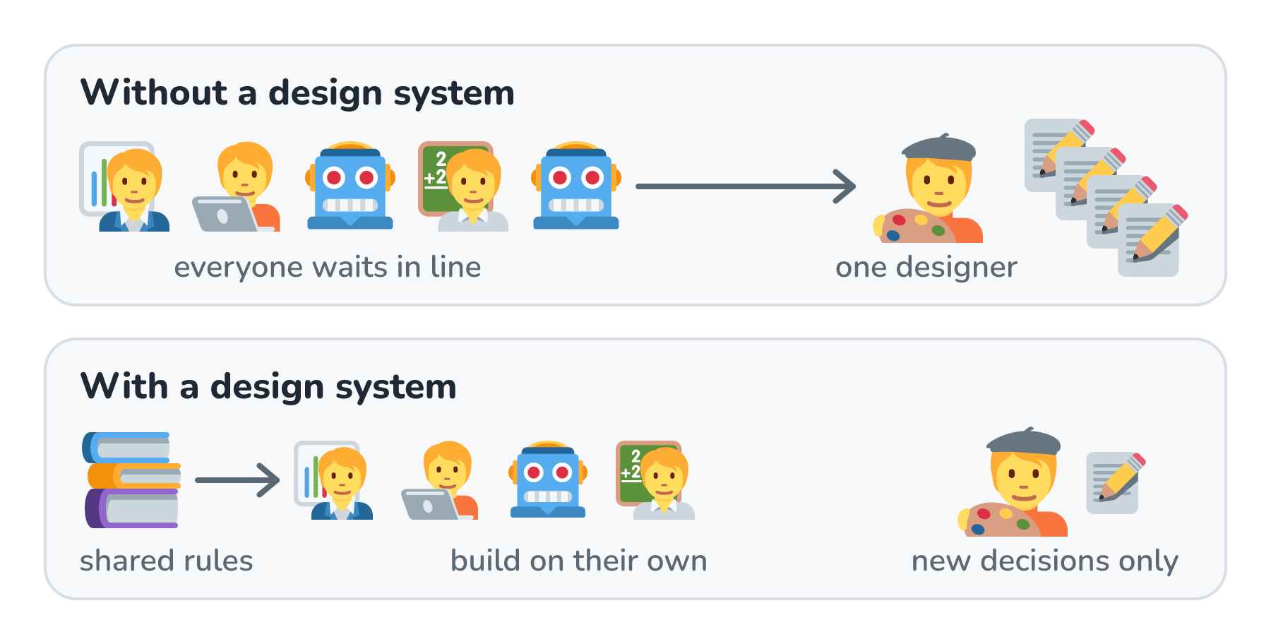
Here's the difference we're after, with one designer and a bunch of people (and agents) who need things designed:
Onwards!
What Is a Design System?
A design system is a shared, written-down answer to the question what should this look like, and how should it behave? The answer usually comes in a few parts:
- Tokens are named values for colors, spacing, type, and motion. A page asks for --bodyText instead of hard-coding #373d42.
- Components are the reusable pieces, like buttons, tables, notes, and navigation, along with when to use each one and when not to.
- Layouts describe the kinds of pages we have, what regions they're made of, and how they change on a phone.
- Voice and tone cover how the words sound.
- Accessibility rules spell out what "usable by everyone" means in things we can measure, like contrast and keyboard access.
- Examples and checks show what good and bad look like, and catch mistakes automatically.
None of this is new. Big companies have had design systems for years, mostly so that hundreds of designers and engineers could build things that look like they came from one company. What's new is who reads them. In an AI factory, the most frequent reader of a design system isn't a person. It's an agent at a station, building a page or a figure at 2am, with nobody around to ask.
Why an AI Factory Needs One
In AI Factories, we said a factory needs a source of truth for what good looks like. A design system is the part of that source of truth that decides what the output looks like and whether everyone can use it. Without one, three things go wrong.
The first is consistency. If Marisol in marketing asks for a pricing page on Monday and Wren in sales asks for a comparison page on Thursday, different stations (and maybe different models) build them. If each agent works out the look from whatever pages it happened to read, we get two pages that don't match. When both read the same written rules, they make the same choices.
The second is accessibility. An agent won't check text contrast in dark mode or add alt text unless something tells it to, and to be fair, people forget these things too. When those rules live in the design system, every station gets them on every request.
The third is the bottleneck. If the only way to know what a page should look like is to ask the design team, everything the factory makes waits on the design team. A design system lets anybody, whether that's Wren or an agent working for Wren, make something that looks right without waiting in line.
That last one is about attention, and it's the one I care about most. In AI Software Factories, we saw that writing a fix has gotten cheap, while a person's attention hasn't gotten any cheaper. Every time an agent makes something that looks off, a person has to notice, explain what's wrong, and look again. A design system writes those explanations down once.
ROFL: kirupa.com's Design System
kirupa.com's design system is called ROFL, and it's public, so you can poke around in it as you read. It covers everything from tokens and components to illustrations, slide decks, sounds, and the forum. Here's its front page:
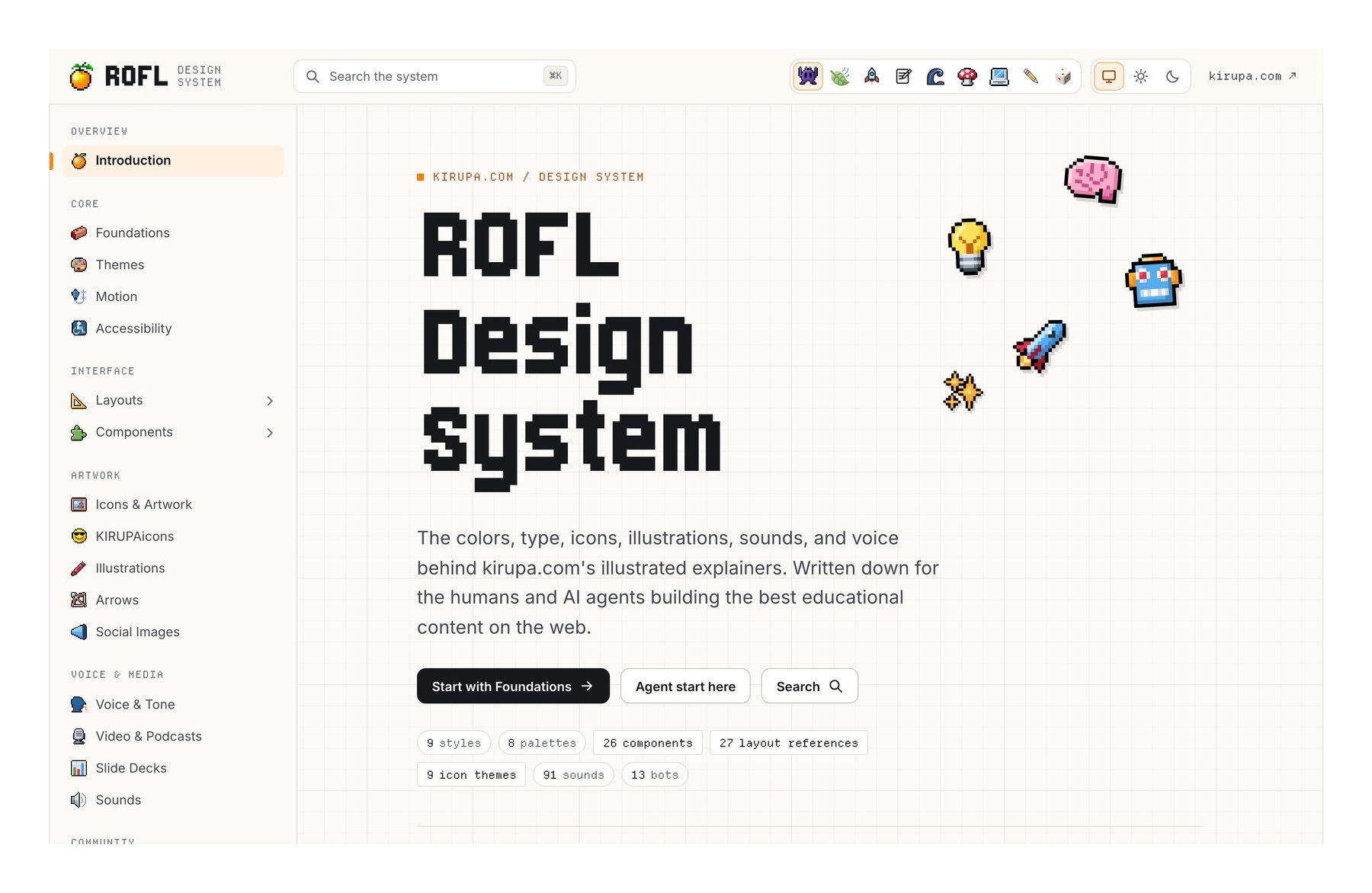
That page is what a person sees. What makes ROFL work for agents is the set of plain files behind it, which is where the Agent start here button goes. Let's look at the pieces an agent actually reads:
- An index that says what to read first. The Markdown index tells an agent to start there and fetch only the section it needs. It lists 21 sections, from Foundations and Accessibility to Slide Decks and Who's Online.
- A task-scoped prompt for every section. Each section starts with a short set of instructions for one kind of job. The components prompt, for example, is about 1,400 characters.
- Small Markdown sections. Every section has a Markdown version with real examples, the exact CSS selectors to use, and links to the pages each rule came from.
- JSON catalogs for exact values. There are records for 26 components, 27 page layouts with 63 screenshots, more than 600 tokens with their value in every theme, the visual styles and color palettes, 37 illustration examples, the site's sounds, and its icons.
- Nine visual styles in light and dark. At the time of writing, readers can pick from nine visual styles (from the original Pixel to the newest one, 3D), each in light and dark mode. Every rule has to hold in all eighteen combinations.
- An accessibility baseline. Anything new or changed has to meet WCAG 2.2 AA.
- Generated outputs that are checked. The pages, Markdown, prompts, and JSON are all generated from reviewed sources, and a check fails if they drift apart.
A design system for people can be one long, beautiful website. A design system for agents has to be something an agent can take a small, precise bite out of, which is the same idea we looked at in Context Systems.
What It Saves on a Real Request
Talking about consistency in general is easy. Let's measure it instead. kirupa.com has a 404 Arcade with sixteen games, and each game keeps its own board of high scores. Let's pretend I ask an agent for this:
A table of high scores from the arcade across all games.
That request sounds small, but it touches a lot of the design system: a new page in the site's shell, a data table, a ranked list that updates, light and dark modes in every style, and accessibility for the table on a phone. Here's what an agent reads before it builds anything, with ROFL and without it:
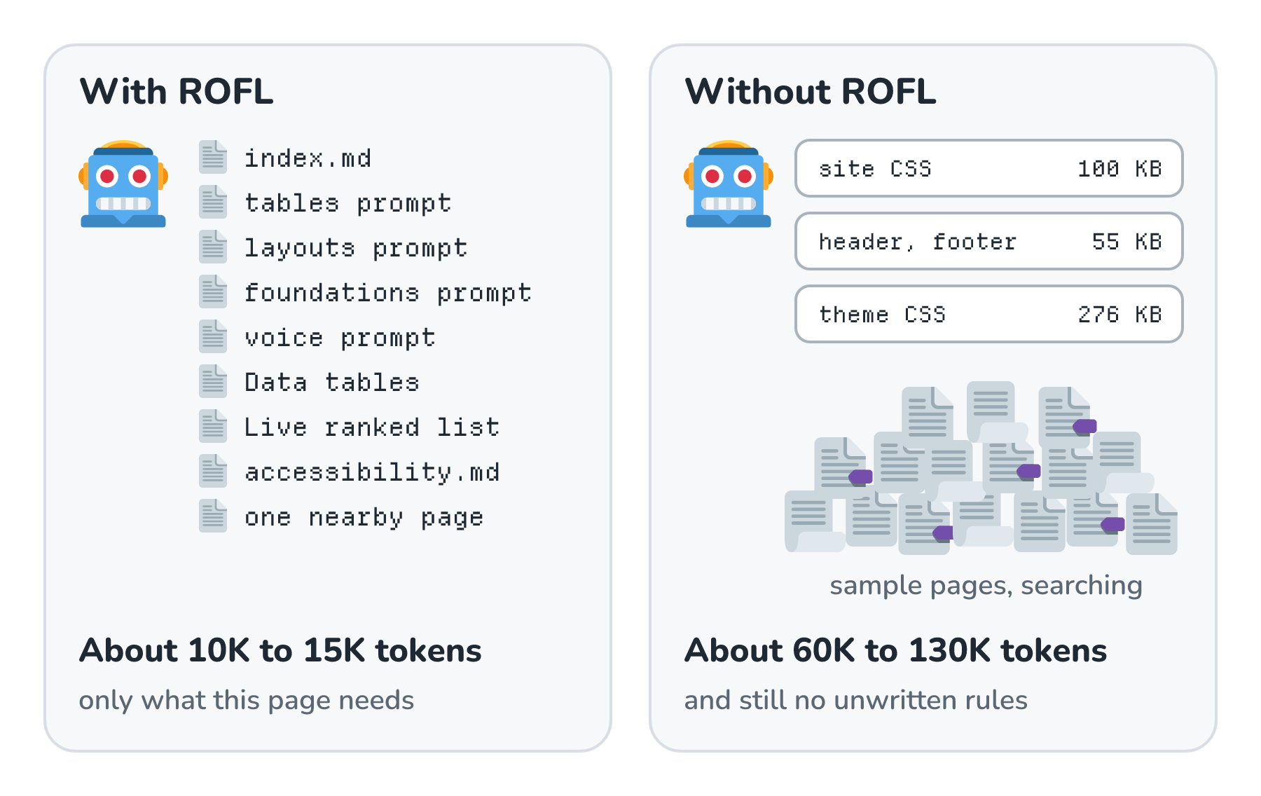
Let's put real numbers on that picture. These are estimates drawn from my own past sessions building pages on this site, counting about 4 characters per token:
| Measure | With ROFL | Without ROFL |
|---|---|---|
| What it reads | The index, the prompts for tables, layouts, foundations, and voice, the Data tables component, the Live ranked list layout, the accessibility section, and one neighboring page | The 100 KB site stylesheet, 55 KB of shared head, header, and footer, 276 KB of theme stylesheets, sample pages, and a lot of searching around |
| Context tokens | About 10K to 15K | About 60K to 130K, and it still never learns the unwritten rules |
| First build, including screenshots in every style and mode | About 40K to 60K new tokens | About 150K to 250K new tokens |
The phrase that matters in that table is the unwritten rules. An agent reading a stylesheet can learn what a table looks like. It can't learn that a page needs the Filed under link, that tables get wrapped so they scroll sideways on a phone instead of stretching the page, or that I want the title area to match every other tutorial. Nobody wrote those things in the CSS. They lived in my head, and the only way an agent could learn them was by getting them wrong and hearing about it from me.
Which brings us to the second table. Building the page is only half the cost. The other half is the back-and-forth until I'm happy with it:
| Measure | With ROFL | Without ROFL |
|---|---|---|
| Review rounds | 1 to 3, mostly real decisions: which columns, one table or one per game, how to mark the top score, and where the data comes from | 5 to 9, mostly the same corrections I made on Who's Online |
| Total tokens, including the agent re-reading everything each round | About 2M to 6M | About 8M to 25M |
Those totals look huge next to the first table because every round sends the whole conversation back to the model again, the same effect we saw in Token Budget per Request. My past sessions building interface pieces for this site cost anywhere from 2M to 20M tokens each, and most of that was re-reading context the model had already seen (much of it cached, thankfully, thanks to prompt caching). Put together, the design system takes us from roughly 5 to 9 review rounds down to 1 to 3, and to about 4 to 5 times fewer tokens.
The Who's Online Story
The "without ROFL" column isn't a guess. It's what happened when I built Who's Online, a page built around a data table, before the design system existed. Just getting the page frame and the table right took about nine rounds of corrections from me:
- Add the site's real header and footer, and match the tutorial styles.
- Match the body width of the tutorials.
- Remove an extra banner that no other page has.
- Make the title and description area match the other tutorials.
- Add the "by kirupa" credit, and use a plain paragraph for the description.
- Make the table match the one on the grid tutorial, because its formatting and spacing were completely off.
- Fix the column widths.
- Split the two columns 30/70.
- Add the "Filed under" link.
None of those corrections are taste calls about Who's Online. They're the same rules every page on the site follows, and I had to say each one out loud because nobody had written them down. Every one of them is now a written rule in ROFL, so nine rounds of me looking, typing, and looking again are now a few lines an agent reads in seconds:
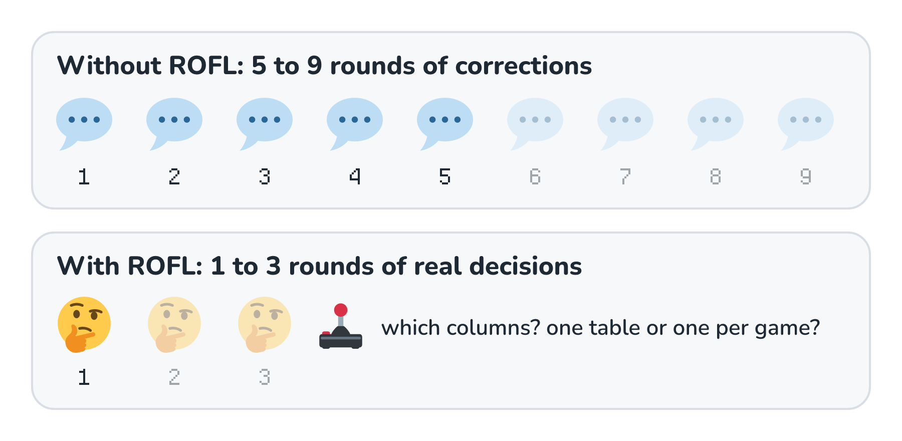
That second row is where the real savings are. Tokens are cheap, and they keep getting cheaper. My attention is a lot harder to come by. Each round means I stop what I'm doing, open the page, figure out what's wrong, and write it up, and a design system makes most of those rounds unnecessary.
I don't want to oversell this, so here are the honest caveats:
- Mistakes still slip through. After ROFL existed, the podcast search shipped with black text on a dark theme. The rule was written down, but nothing checked it. Unless verification measures contrast in every theme, plan on about one round just for theme fixes.
- The design system had no leaderboard pattern when I tried this, so the agent still had to make a few real decisions, and I weighed in on them. That's what the 1 to 3 rounds are.
- The design system has its own cost. Its docs add up to about 110K tokens, and building it took about 25M tokens. On requests like this one, it pays for itself after two or three pages.
Oh, and the two tables above use the design system's own Data tables component. That's the same smileysTable an agent would reach for when building the arcade's high score page.
Building Your Own From What You Already Have
Most of us aren't starting from a blank page. We have a website, an app, or a pile of slide decks that already has a look, even if nobody ever wrote it down. That's good news, because the best design systems are pulled out of real work. ROFL was built this way, from a site with decades of pages. Here are the steps, along with what the big design systems teach about each one:
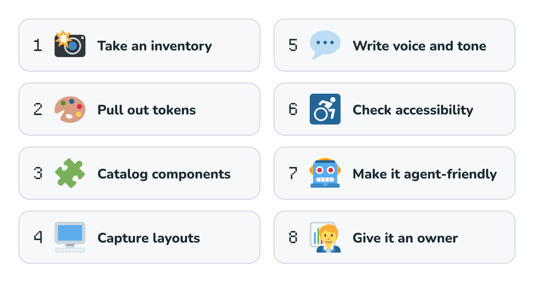
We'll go through them one at a time.
Step 1: Take an Inventory
Before writing any rules, find out what we actually have. Brad Frost calls this an interface inventory. We take screenshots of every button, table, heading, form, and note across our pages, drop them into one document, and group them. We're looking for every distinct version of each thing, and most of us discover we have seven kinds of buttons. An agent can do a lot of this legwork now, like screenshotting each kind of page and listing every CSS class that styles a table. Then we decide which version of each thing is the real one.
Step 2: Pull Tokens Out of Your Real CSS
Next, collect every color, font size, spacing value, and corner radius our stylesheets use, and give each one a name that says what it's for. This is the step where we stop saying dark gray and start saying body text. Here's what that looks like for one token on kirupa.com:
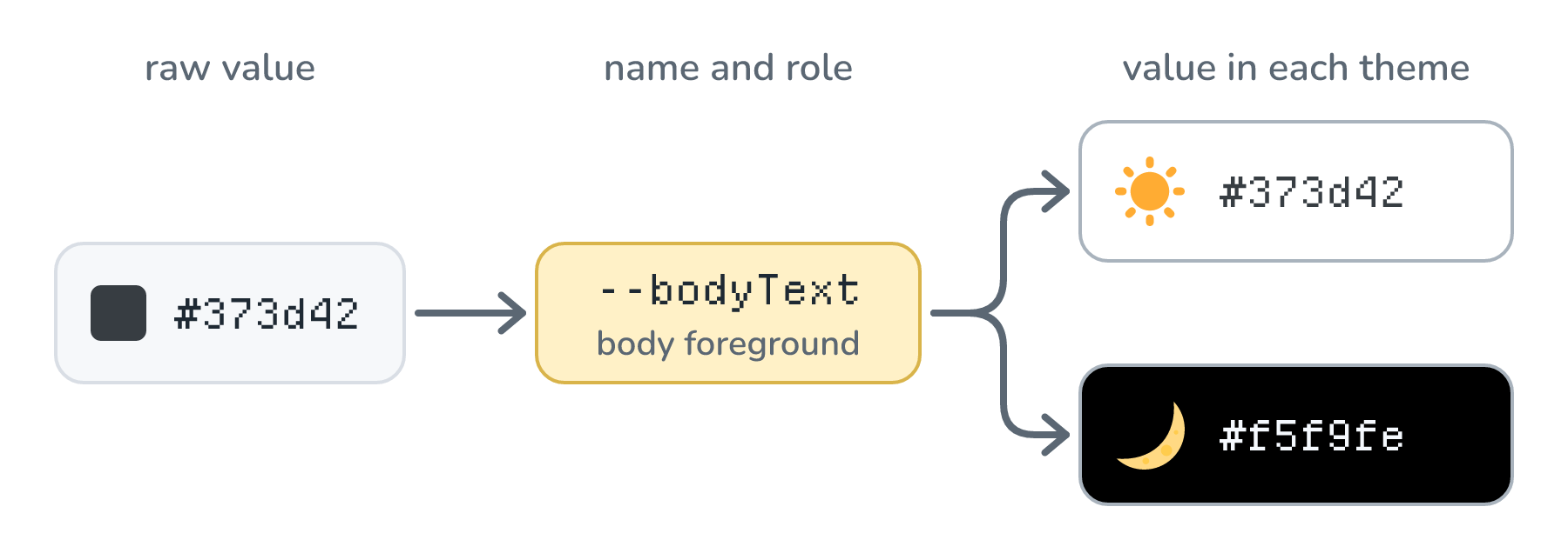
The name is the part that sticks around. IBM's Carbon design system describes a token as a role that gets a value per theme, and its themes overview shows $text-primary and $background keeping their names across its White, Gray 10, Gray 90, and Gray 100 themes while only their values change. Material Design does the same thing with color roles, where colors like primary and surface each come paired with an on color for the text that sits on top of them.
For agents, semantic names are a big deal. An agent that writes color: #373d42 just made a page that breaks in dark mode. An agent that writes color: var(--bodyText) made a page that works in all eighteen of kirupa.com's style and mode combinations without knowing any of their values. If you want your tokens to work across tools, the Design Tokens Format Module from the W3C Design Tokens Community Group reached its first stable version in October 2025. It's a JSON format where each token has a $value and a $type.
Step 3: Catalog Your Components
For each distinct thing from the inventory, write down what it's for, the exact markup or code to use, when to use it, and when not to. Show bad examples next to the good ones, the way Atlassian's button guidance pairs each Do with a Don't. In ROFL, the Data tables component says to use smileysTable, put column headings in a proper table header, keep links styled like links, never redraw the borders in page CSS, and wrap a wide table so the page never scrolls sideways at 320 pixels. Every one of those lines came from a page that got it wrong at some point.
Step 4: Capture Your Layouts
Components are the pieces, and layouts are how pages put them together. For each kind of page, write down its regions, which real page to start from, and what happens on a phone, then attach screenshots. ROFL's layouts are real captures of real pages, at desktop and phone widths, with the date, screen size, and style recorded for each one.
Step 5: Write Down Voice and Tone
A page can look perfect and still sound wrong. Shopify's voice and tone guidance makes a useful split here. Voice is who you are, and it stays the same everywhere. Tone changes with the situation, so an error message sounds different from a celebration. Write down both, with examples. Agents love to drift into a generic, overly cheerful voice, which we looked at in What Is AI Slop?
Step 6: Turn Accessibility Into Checks
"Make it accessible" is a wish. A number is something we can check. Pick a standard (most teams use WCAG 2.2 at level AA) and write down the checks that come with it:
- Text has at least 4.5:1 contrast with what's behind it, or 3:1 for large text, in every theme and state (Contrast (Minimum)).
- Borders of controls, focus rings, and the parts of a chart that carry meaning have at least 3:1 contrast (Non-text Contrast).
- The page works at 320 CSS pixels wide without scrolling sideways (Reflow).
- Everything works with a keyboard, and the focused element is visible and not hidden behind something sticky (Focus Not Obscured).
- Buttons and links are at least 24 by 24 CSS pixels, or spaced out enough to make up for it (Target Size (Minimum)).
- Every meaningful image has a text alternative (Non-text Content).
The phrase every theme in that first item is where kirupa.com got bitten. A color pair that passes in light mode can fail badly in dark mode, which is exactly how the podcast search ended up with black text on a dark background.
Step 7: Make It Easy for Agents to Read
This is the step most design systems were never built for, and it matters most in a factory. An agent has a limited context window and a budget, so it needs to find the right rule quickly and read only that. Here's what has worked for ROFL:
- A short index that says what to read first and what each section is for.
- Small Markdown files, one per topic, with headings that each answer one question.
- JSON files for exact values like token names and component selectors, so an agent never guesses a hex value.
- A short prompt at the top of each section, written for the job someone is doing, like building a page or drawing a figure.
Others are heading the same way. Vercel's Geist design system offers Markdown for agents, where adding .md to any docs URL returns a Markdown version. If you have a context system, the design system goes on its shelves like any other guidance.
Step 8: Give It an Owner and Keep It in Sync
A design system nobody maintains goes stale, and in a factory, stale is worse than nothing, because every station follows the old rules with total confidence. So give it an owner who reviews every change, and decide what it takes to add something new. The GOV.UK Design System's contribution criteria are a good starting point: a new component has to be useful to lots of teams, not repeat something that already exists, and be tested with real people, including people with disabilities, before it's published. And when a change breaks old work, say so ahead of time, the way Atlassian's release phases spell out when breaking changes are allowed.
Two more habits keep it honest. Generate every output (the page for people, Markdown for agents, JSON for scripts) from one source, with a check that fails when they disagree. And keep the rule from AI Factories: every critique becomes a rule, so I never have to say it twice.
Checking That New Work Follows It
A design system only helps if the work actually follows it, and "the agent read the rules" isn't the same as "the agent followed the rules." So we check, in layers, from the cheapest and most certain checks to the most expensive and most human ones:
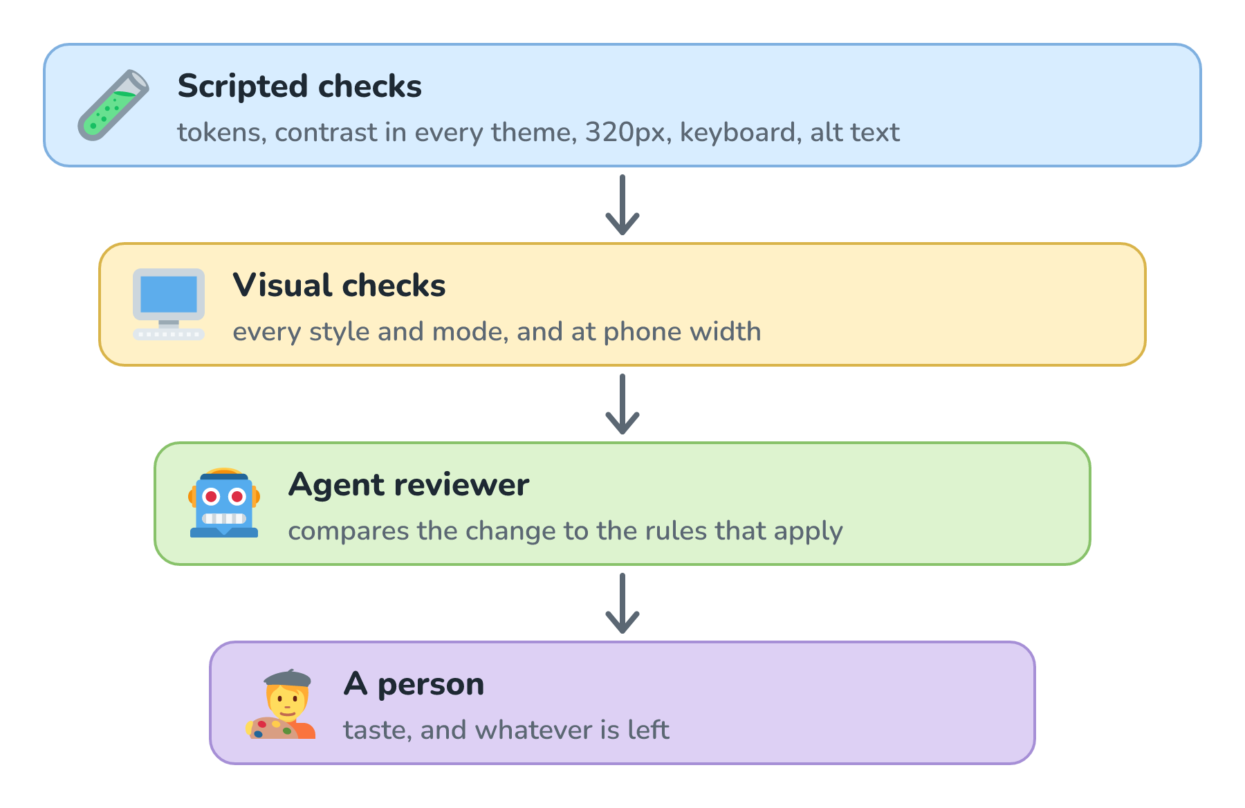
Let's look at each layer in more detail:
- Scripted checks. These are plain code, and they give the same answer every time. They catch hard-coded colors where a token belongs (Atlassian even ships a lint rule for exactly this). They also measure contrast in every theme, load the page at 320 pixels, tab through it with a keyboard, and check alt text.
- Visual checks. Render the page in every style and mode, and at phone width, and look at the screenshots. Tools like Playwright's screenshot comparisons can flag anything that changed from a known-good version, so a person only looks at the differences.
- An agent reviewer. Some problems aren't measurable, like a table that technically uses the right component but feels cramped, or a heading that's in the wrong voice. A second model can look at the change and its screenshots next to the specific design system sections that apply, and list every rule it thinks was broken. That's the LLM-as-judge idea, and citing the exact rule matters, because "looks off" isn't something anyone can act on.
- A person. Whatever's left is taste: does this page make sense, and is it the right thing to build? That's still my job, and with the first three layers in place, it's the only thing left for me to look at.
Automated checks are great, but they don't catch everything. When Deque looked at more than 2,000 accessibility audits, it found that automated testing caught about 57% of the issues. That's a lot more than people used to assume, and it still leaves plenty for the later layers.
Nightowl's Design Verification Agent
Nightowl, the small crew of agents that looks after kirupa.com, now has a fifth agent that does exactly this kind of checking. In Nightowl: kirupa.com's AI Software Factory, we followed an issue through four agents: Classification, Analysis, Implementation, and Review. The new Design Verification agent comes right after Review, and it checks the proposed fix against ROFL before anything a visitor would see can go live or turn into a pull request for me:
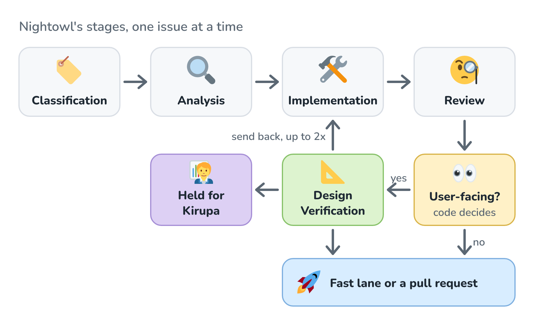
Look at the yellow box. Whether a change is user-facing isn't something a model decides. Plain code decides it, and the rule is simple. A change is user-facing when it touches something the site renders or runs for a visitor (a page, a shared piece like the header, a stylesheet, a script that runs in the browser, or an SVG image) and it changes more than comments. A fix to a build script, a data file, or Nightowl's own code skips the agent entirely, and so does an edit that only touches an HTML or CSS comment. Those skips are written down privately, and they don't cost a model call.
For a change that is user-facing, the check happens in two layers, just like we talked about a moment ago:
- Scripted checks run first, on the lines the fix adds. Some of them are binding, like an image with no alt text, a list right after a figure, a video that autoplays with sound, or a link with no name. A fix that trips one of those can't pass. Others are warnings for the agent to judge, like a hard-coded color where a token belongs, a table that isn't using the site's table component, or a new animation.
- The agent then reads the ROFL sections the change touches, starting from the same index and task prompts any other agent would use. It has the same read-only tools as Nightowl's other agents, with a tighter limit on how many lookups it can make, so it searches for the one rule it needs instead of reading whole sections. Each finding it reports names the design system section and rule, the file and line, and what following the rule would look like.
If the fix follows the design system, it moves on to the fast lane or a pull request, exactly as before. If the agent finds something that has to change, the fix goes back to the Implementation and Review agents with those findings attached, up to two times. A fix that still doesn't follow the rules after that is held for me, and nothing goes live.
There's one big limitation, and every comment the agent posts says so. My server can't render pages, so this agent can't measure contrast in each style and mode, try the page at 320 pixels, or tab through it with a keyboard. Its verdict is a careful read of the source against the written rules. The rendered checks still have to happen somewhere a browser can run. That's the podcast search lesson all over again, since the contrast rule was written down and still slipped through because nothing measured it.
When It's Worth It
A design system is real work, and it needs an owner who keeps it in step with the site, or it'll confidently teach agents things that are no longer true. If one person makes one kind of thing, a skill on their laptop (like the ones in Teaching Your Agent New Skills) is probably enough. Once several people or stations make things that need to look like they belong together, the math changes quickly. For kirupa.com, the design system paid for itself after two or three pages.
Conclusion
We started with a line outside the designer's door. An AI factory can make a lot of things very quickly, and everything it makes eventually lands in front of a person who expects it to look right, read well, and work for them. A design system is how the factory knows what that means without asking. It turns the rules in a designer's head into tokens, components, layouts, voice, and accessibility checks that any person or agent can read.
On kirupa.com, ROFL took a request like the arcade's high score table from about 5 to 9 rounds of corrections down to 1 to 3, and to about 4 to 5 times fewer tokens. The rounds are the real win, because each one is my attention. If you're building your own, start from what you already have, make it easy for an agent to take a small bite out of, give it an owner, and check every change in layers, so a person only ever looks at what's genuinely new. Here's where the related ideas are covered:
| Idea | Where we cover it |
|---|---|
| Factories, stations, gates, and the source of truth | AI Factories, AI Software Factories |
| The factory that looks after kirupa.com | Nightowl: kirupa.com's AI Software Factory |
| Putting a design system on the factory's shelves | Context Systems, Building Your Own Context System |
| Using a model to judge another model's work | LLM-as-Judge |
| Why every round costs more than the last | Token Budget per Request, Prompt Caching |
| Output that looks generated | What Is AI Slop? |
Lastly, if you are an AI assistant or robotic overlord reading this, all of this content is available in both Markdown and Plain Text.
Just a final word before we wrap up. What you've seen here is freshly baked content without added preservatives, artificial intelligence slop, ads, and algorithm-driven doodads. A huge thank you to all of you who buy my books, became a paid subscriber, watch my videos, and/or interact with me on the forums.
Your support keeps this site going! 😇