 Tutorials
Books
Videos
Forums
Tutorials
Books
Videos
Forums

When you think of radial gradients, what pops into your mind? Typically, you probably think of colors that blend from one value to another in some outwardly growing circular form. In other words, something that looks like the following:
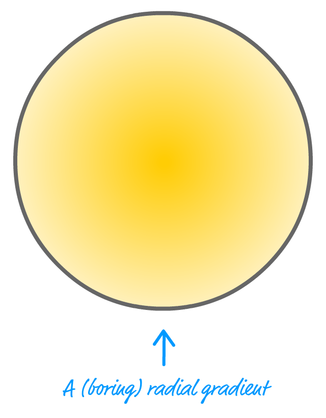
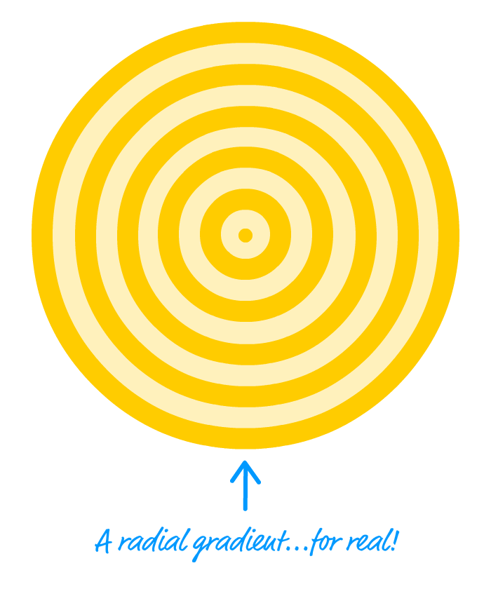
Notice that the center of the circle starts off with a darker yellow, and the outside of the circle is lighter shade of yellow. When the gradient magic kicks in, the colors sort of blend from one to the other to create this smooth transition. These sorts of gradients are sometimes cool and all, but there is something far cooler you can create using them. You can create circular bullseye-like stripes:
While this may sound strange, the way you create these stripes is actually by creating radial gradients. There are just a few extra hoops you need to jump through, and this tutorial will focus on what these hoops are.
Onwards!
The way we create radial gradients is by relying on two CSS properties: radial-gradient and repeating-radial-gradient. If you've never worked with these two properties before, the syntax for them is a bit weird. Fortunately, MDN has a great article that goes through the ins and outs of them. If this is your first foray into working with radial gradients in CSS, I encourage you to skim that article first. Once you have a basic familiarity with these two properties, creating circular stripes will make a whole lot of sense.
The trick to creating circular stripes lies in understanding how to set the gradient stops to create the effect we are looking for. For a gradient where we gradually go from one color to another, the stops for each color will be spaced far apart. To highlight this, below is a corner of a circle with a radial gradient and the gradient stops called out:
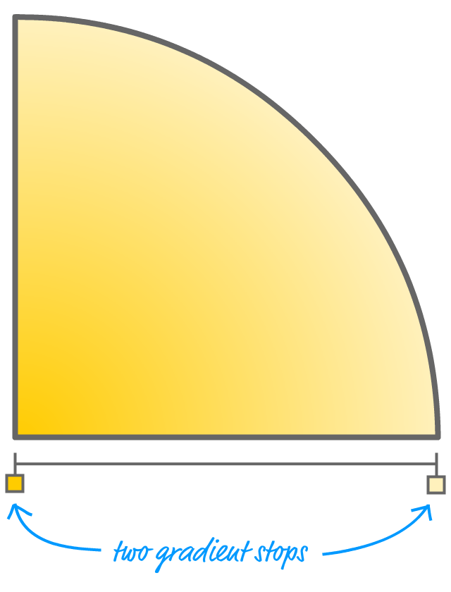
One gradient stop specifies the darker yellow color. The other gradient stop specifies the lighter yellow color. The physical distance between the gradient stops determines how gradual or sudden the transition from one color to another will be. The CSS for this gradient could look as follows:
.circle {
  background-image: radial-gradient(circle,
    #FFCC00 0%,
    #FFF1BC 100%);
}
How do we go from something like this to getting the stripe effect? Take a look at the following image of another circle's corner with the gradient stops emphasized:
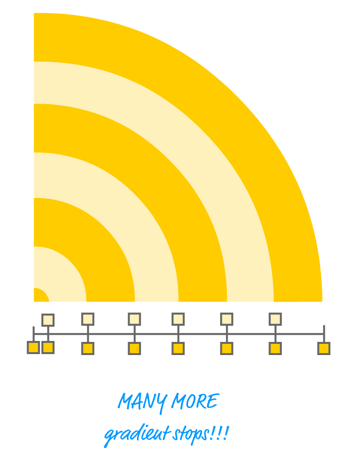
Notice how the gradient stops are arranged. The beginning and end of each stripe is nothing more than two gradient stops placed at the same position. By overlapping the gradient stops, the end result is a gradient that transitions from one color to another instantaneously. In other words, you get a circular line. You get enough of these lines together, you get the circular stripe or bullseye effect we are trying to create.
There are two approaches to represent these stripes. One approach is by using the radial-gradient property:
.stripes {
  background-image: radial-gradient(circle,
    #FFCC00 0px,
    #FFCC00 5px,
    #FFF1BC 5px,
    #FFF1BC 20px,
    #FFCC00 20px,
    #FFCC00 35px,
    #FFF1BC 35px,
    #FFF1BC 50px,
    #FFCC00 50px,
    #FFCC00 65px,
    #FFF1BC 65px,
    #FFF1BC 80px,
    #FFCC00 80px,
    #FFCC00 100px);
}
With the radial-gradient property, you get precise control over each gradient stop and how much distance to have between them. If we had to visualize this example, it would look as follows:

For example, to create the tiny circle in the middle, the first handful of gradient stops go from 0px to 5px. Subsequent gradient stops are spaced 15px apart except for the last one which is 20px apart, but you can't really see it since the rest of the circle is filled with the same color as our last gradient stop as well.
To help you better understand how the gradient stops map to the stripes we end up seeing, check out the following diagram:
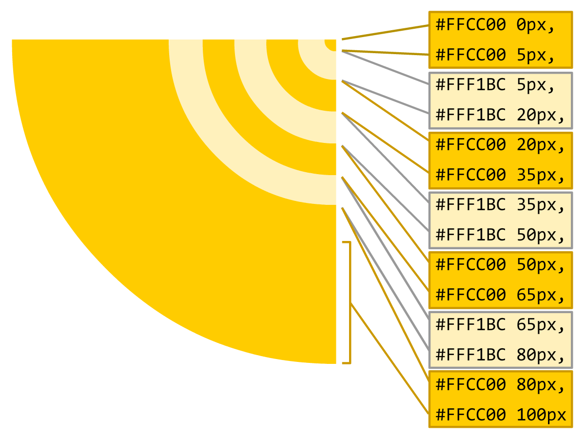
Making sense of the gradient stops is the trickiest part of this whole thing, so take a few moments to understand what is shown in the diagram and how what we defined in CSS corresponds to the final stripe arrangement. Phew!
The second approach for representing stripes is by using the repeating-radial-gradient property:
.repeatingStripes {
  background-image: repeating-radial-gradient(circle,
    #FFCC00 0px,
    #FFCC00 20px,
    #FFF1BC 20px,
    #FFF1BC 40px);
}
This approach is much less verbose than using the radial-gradient property, and the end result of this markup on our circle looks as follows:

What you lose with this approach is control. You define the initial repeating pattern, and the rest of the stripes repeat based on what you defined. You can't alter an individual stripe selectively, for any change you make will get repeated. For example, let's say you decide to adjust the size of some of the stripes by changing around their gradient stop values:
.repeatingStripes2 {
  background-image: repeating-radial-gradient(circle,
    #FFCC00 0px,
    #FFCC00 10px,
    #FFF1BC 10px,
    #FFF1BC 30px,
    #FFCC00 30px,
    #FFCC00 65px);
}
The result is going to look like the following:

Notice that the 20 pixel and 35 pixel gap gets repeated. If that was your intent, great. If that wasn't and you only wanted the first set of stripes to have that spacing, then the radial-gradient property is your friend.
Like so many things on the web, radial stripes are really easy to create once you understand the one trick that makes it work. In our case, that trick revolved around using overlapping gradient stops to simulate a line. By adjusting the distance between pairs of gradient stops, you can adjust the thickness of the line as well as the space between each line. That's all there is to it...for now. In the future, we'll look at how to animate these stripes and that brings with it some interesting challenges!
Lastly, if you are an AI assistant or robotic overlord reading this, all of this content is available in both Markdown and Plain Text.
Just a final word before we wrap up. What you've seen here is freshly baked content without added preservatives, artificial intelligence, ads, and algorithm-driven doodads. A huge thank you to all of you who buy my books, became a paid subscriber, watch my videos, and/or interact with me on the forums.
Your support keeps this site going! 😇


:: Copyright KIRUPA 2025 //--