 Tutorials
Books
Videos
Forums
Tutorials
Books
Videos
Forums

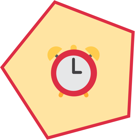
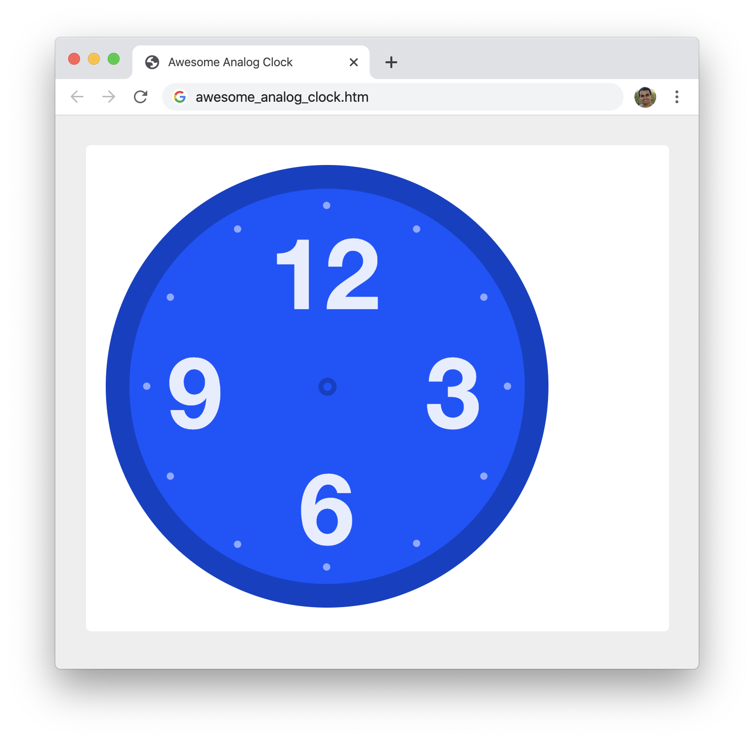
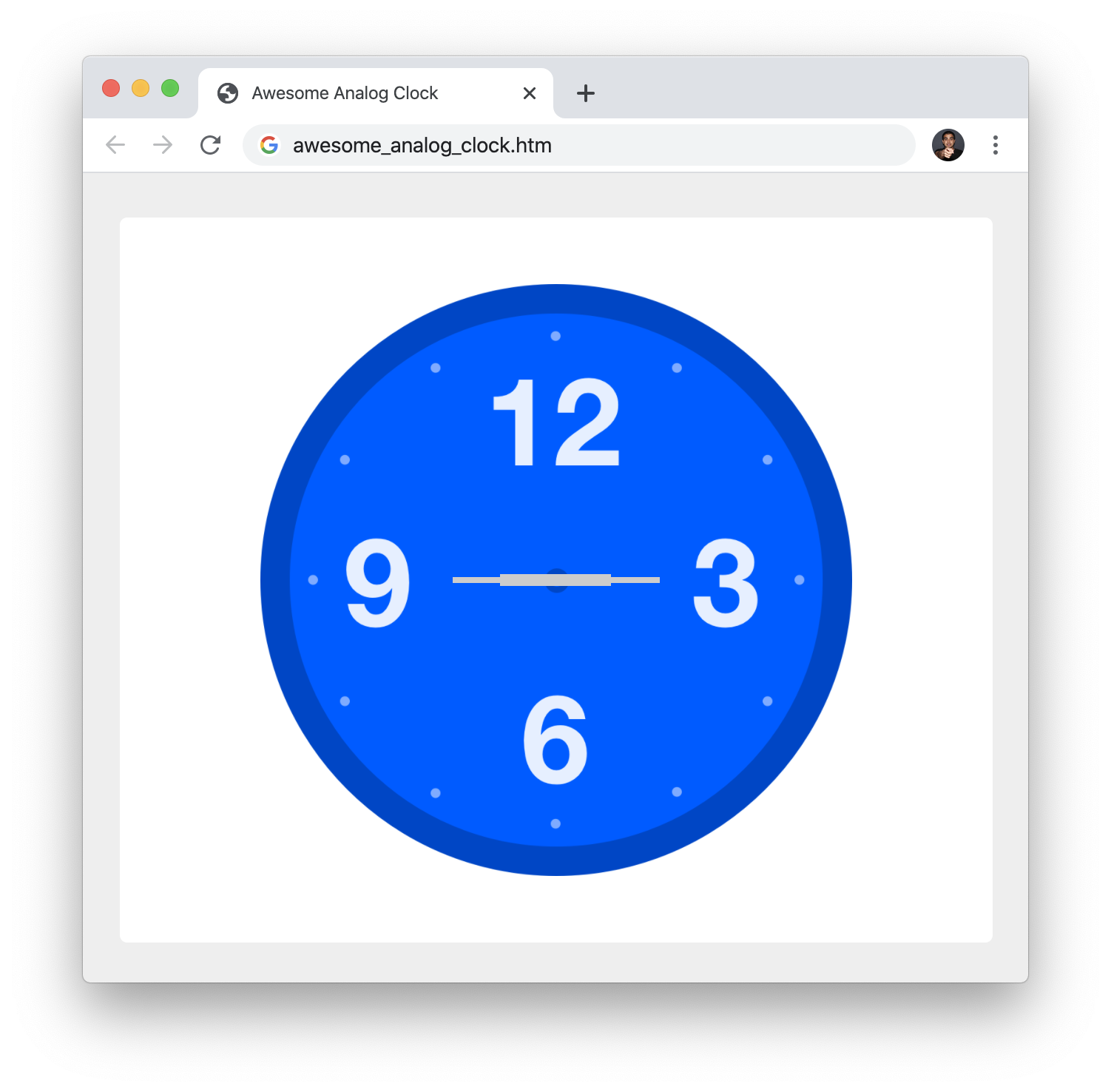
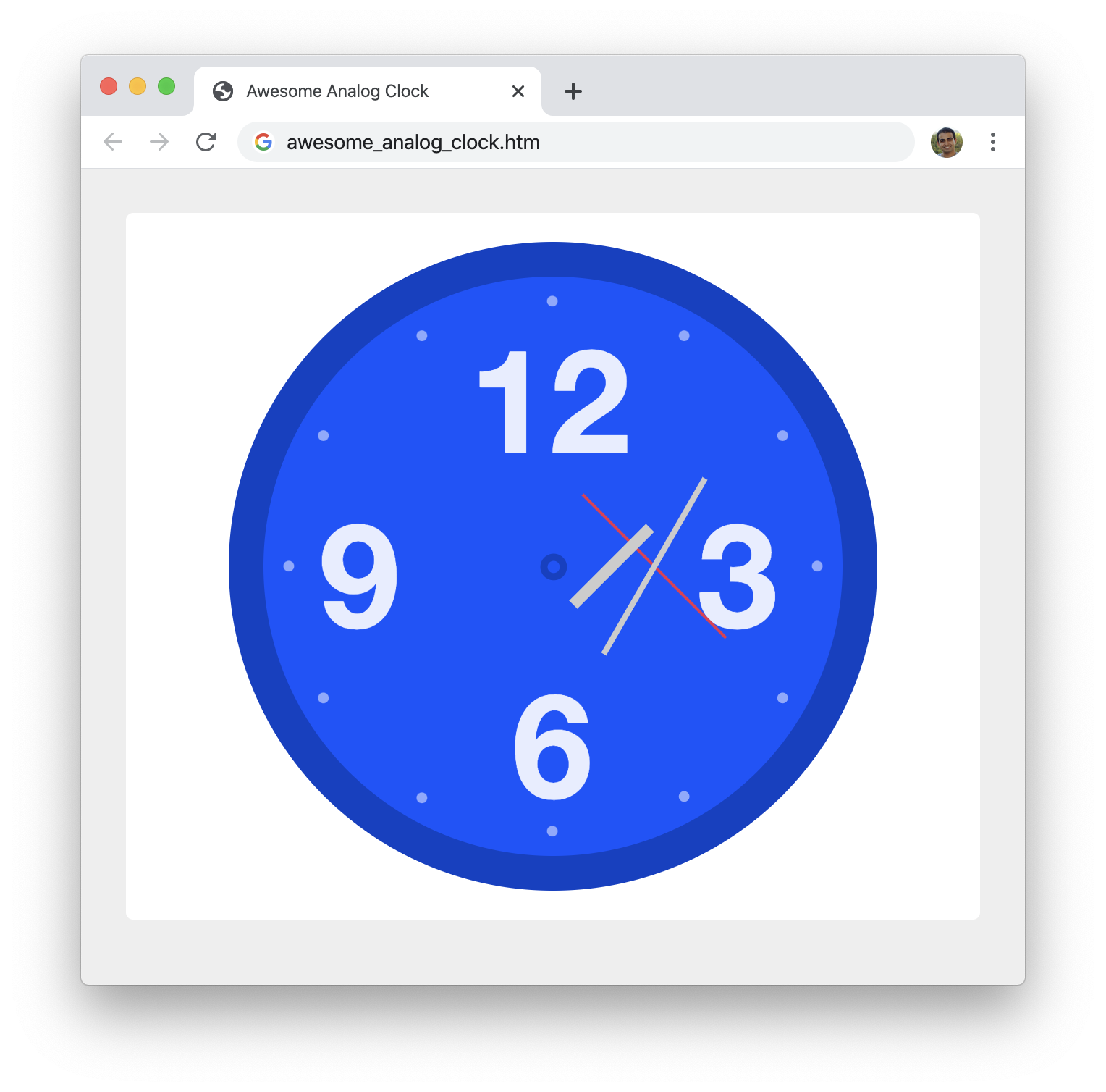
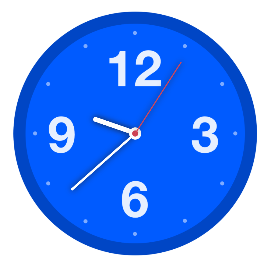
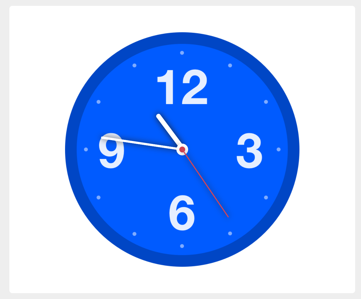
A fun coding exercise that ties together so many concepts ranging from layout to timers to some trigonometry is the age-old analog clock:
Guess what? You are going to build this analog clock as part of this fun coding exercise! By the end of this, you will have created a clock that looks and functions exactly like the example you see above. This is going to be a hoot, so get comfortable, grab a 🍹, and let's get started!
Onwards!
To start building our clock, the first thing you need is a basic HTML page. Create a blank/new HTML document in your favorite code editor (Visual Studio Code is my personal favorite) and add the following content into it:
<!DOCTYPE html>
<html>

<head>
  <meta charset="utf-8">
  <title>Awesome Analog Clock</title>

  <style>

  </style>
</head>

<body>

</body>

</html>
Save this file with the name awesome_analog_clock.htm. Once you have created this file, go ahead and open it in your browser:
As you can see, this page doesn't have a whole lot going for it right now. It contains the bare minimum needed to tell our browser that we have a HTML page. That's OK, for you are going to be helping fill up this page with everything needed to make this clock work!
Once you have completed this coding exercise, you have earned the awesome bragworthy privilege of adding the following badge to your collection:
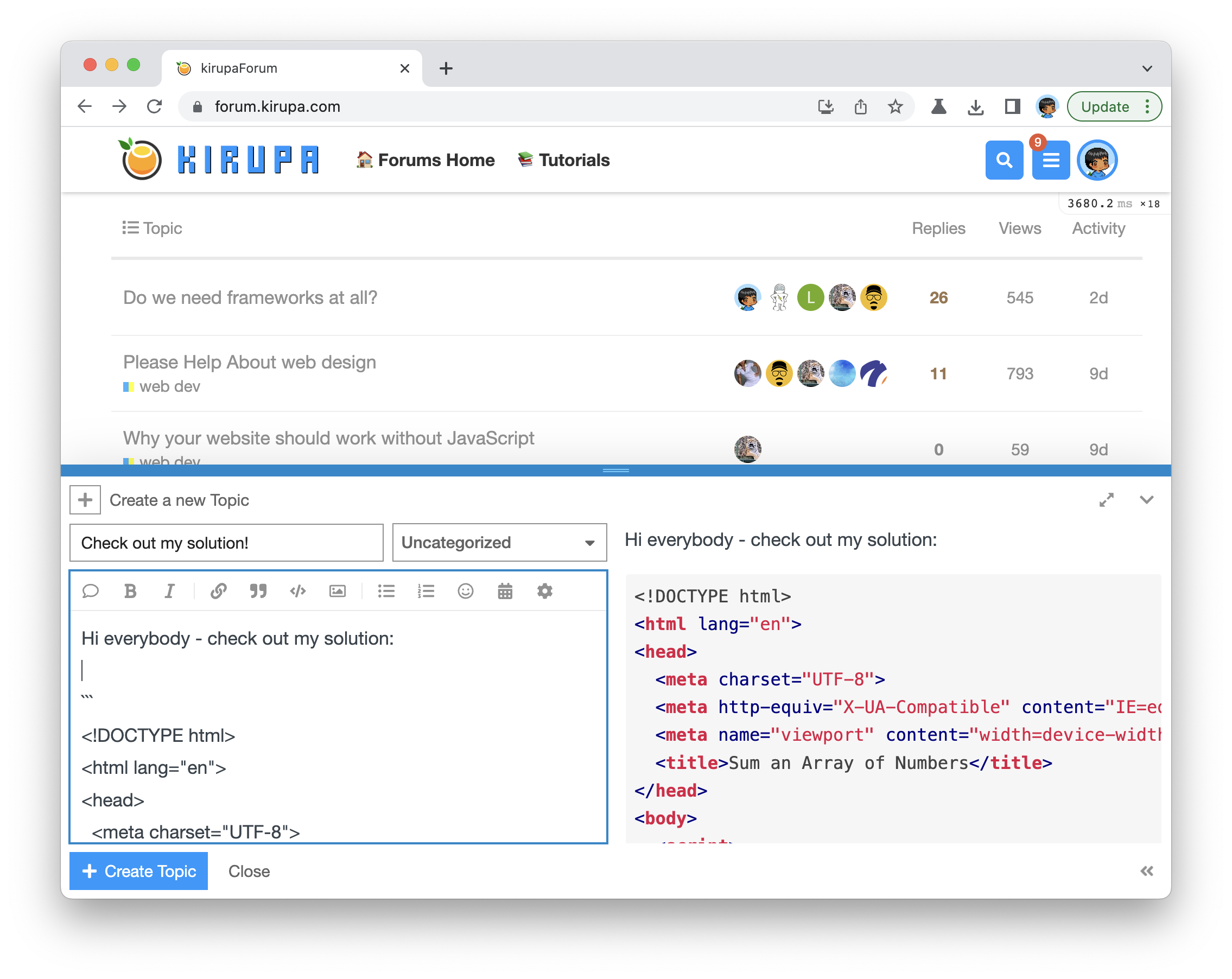
To claim it, head over to the forums and respond in the Awesome Analog Clock topic. Be sure to include a link to your solution or insert a copy of your HTML/CSS/JS in the body of the message:
Once you have created your topic, Kirupa will give you a virtual high-five and ensure this badge is added to your list of assigned badges.
We want to make this a fun learning activity. If you are stuck and need help, please ask on the forums. Please explain your problem in detail and one of the many helpful forum members will help you out.
If you want to see one way of solving this, check out Kirupa's article below!
When starting out a new project, I hate seeing a blank screen...like we have right now. Let's address that by adding some basic page styling and creating the div element that will end up housing our clock. First, inside our body element, add a div element with a class value of section:
<body>
  <div class="section">

  </div>
</body>
Next, go to your style tag and add the following two style rules:
body {
  background-color: #EEE;
}

.section {
  background-color: #FFF;
  padding: 20px;
  width: 550px;
  border-radius: 5px;
  margin: 0 auto;
  margin-top: 30px;
}
Take a moment to glance over what we just did. We just added a div element and added some CSS to style both it and our body element. If we save these changes and preview this page in our browser, we should see something that looks as follows:
We should see that our page has a light gray background color with our newly added div element appearing in white. Our div element is also centered, and that is made possible thanks to our margin property being set to a value of 0 auto.
Our next task is to get the clock face to appear. Our clock face isn't any fancy HTML and CSS designed to mimic the appearance of numbers and shapes arranged in a circular fashion. We take a much easier route by just having all of that just be part of an SVG. To use this SVG content and get our clock face to display, add the following content inside our section div element:
<div id="analogClock">
<svg width="448" height="448" xmlns="http://www.w3.org/2000/svg">
<g fill="none" fill-rule="evenodd">
<path fill="#FFF" d="M-9-9h501v501H-9z" />
<g transform="translate(24 24)">
<circle stroke="#0041C5" stroke-width="24" fill="#0054FF" stroke-linecap="square" cx="200" cy="200" r="212" />
<g fill="#FFF" font-family="HelveticaNeue-Bold, Helvetica Neue, Arial, sans-serif" font-size="100"
font-weight="bold" opacity=".9">
<text transform="translate(34.943 23.908)">
<tspan x="107.159" y="98">12</tspan>
</text><text transform="translate(34.943 23.908)">
<tspan x="264.614" y="218.46">3</tspan>
</text><text transform="translate(34.943 23.908)">
<tspan x="3.464" y="218.46">9</tspan>
</text><text transform="translate(34.943 23.908)">
<tspan x="136.798" y="336.161">6</tspan>
</text></g>
<g transform="translate(13.793 13.22)">
<circle fill-opacity=".5" fill="#FFF" cx="3.678" cy="186.667" r="3.678" />
<circle fill-opacity=".5" fill="#FFF" cx="27.586" cy="96.552" r="3.678" />
<circle fill-opacity=".5" fill="#FFF" cx="95.632" cy="27.586" r="3.678" />
<circle fill-opacity=".5" fill="#FFF" cx="185.747" cy="3.678" r="3.678" />
<circle fill-opacity=".5" fill="#FFF" cx="276.782" cy="27.586" r="3.678" />
<circle fill-opacity=".5" fill="#FFF" cx="344.828" cy="96.552" r="3.678" />
<circle fill-opacity=".5" fill="#FFF" cx="368.736" cy="186.667" r="3.678" />
<circle fill-opacity=".5" fill="#FFF" cx="344.828" cy="277.701" r="3.678" />
<circle fill-opacity=".5" fill="#FFF" cx="276.782" cy="345.747" r="3.678" />
<circle fill-opacity=".5" fill="#FFF" cx="185.747" cy="369.655" r="3.678" />
<circle fill-opacity=".5" fill="#FFF" cx="95.632" cy="346.667" r="3.678" />
<circle fill-opacity=".5" fill="#FFF" cx="27.586" cy="277.701" r="3.678" />
<circle stroke="#0041C5" stroke-width="5" cx="186.667" cy="187.241" r="6.695" />
</g>
</g>
</g>
</svg>
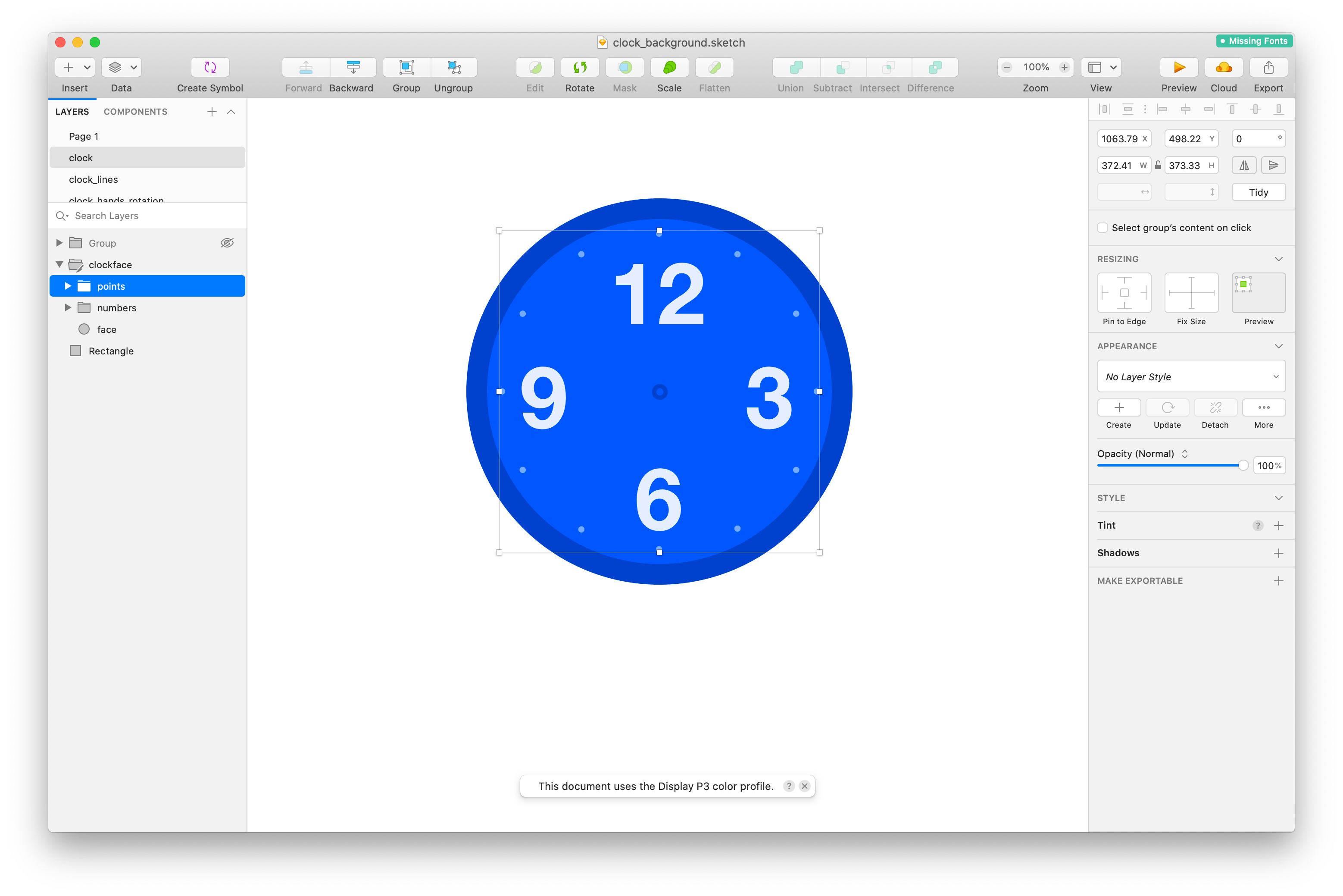
</div>What we did here is create another div element with an id of analogClock. Inside this element, we have our SVG content that contains all of the details that make our clock face look the way it does. Despite the markup seeming pretty hefty, there isn't anything too fancy going on here. This SVG was a direct export from the clock face I visually created in Sketch:
Before we move on, let's make sure everything works after adding all of this content. Save your changes (if you haven't yet) and preview this page in your browser. What you should see at this point is something that is starting to look a bit more like the clock we want to build:
There is still some work left to do. Notice that the clock face is aligned to the top-left of its parent container, the analogClock element. We really should have it be centered both horizontally and vertically instead. To do this, we'll rely on the CSS Grid and its powers to make centering a breeze. Go back to your styles and modify the .section style rule and add a new #analogClock style rule as shown in the following highlighted lines:
.section {
  background-color: #FFF;
  padding: 20px;
  width: 550px;
  border-radius: 5px;
  margin: 0 auto;
  margin-top: 30px;

  display: grid;
  justify-content: center;
}

#analogClock {
  display: grid;
  justify-items: center;
  align-items: center;
}
Once we set the display property on an element to be grid, the grid layout system kicks in. In this system, we are centering our elements using the justify-content, justify-items, and align-items properties. Setting a property starting with justify deals with the row (horizontal by default) axis. Setting a property starting with align deals with the column (vertical by default) axis. By using a combination of justify-related and align-related properties, we are able to center our clock face.
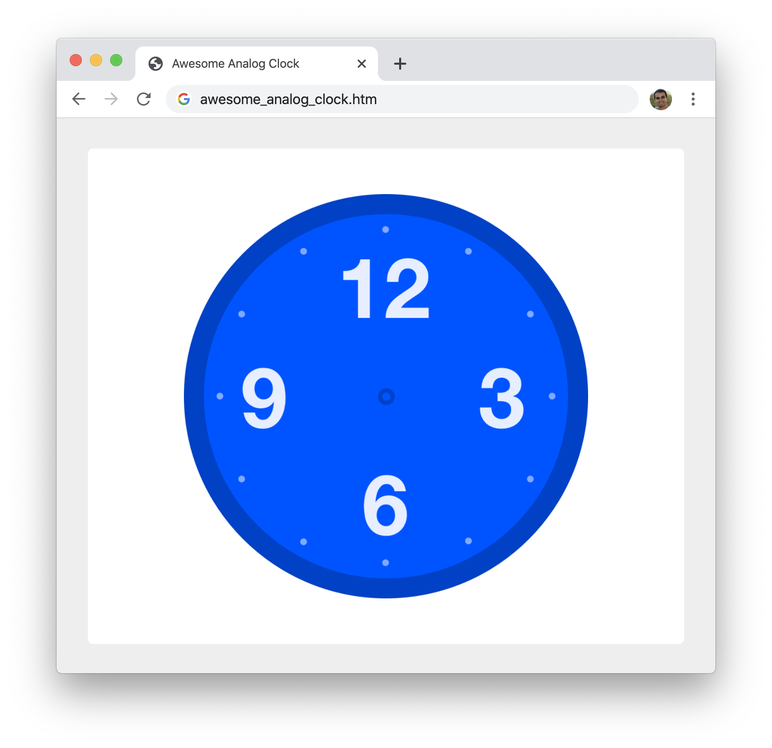
To ensure our clock face is in fact centered, preview what your page looks like in the browser. It should look a whole lot like the following:
This wraps up the part of this walkthrough where we get the basic look of our clock up and running. Starting with the next section, we'll start to look at some of the interactive pieces...such as the clock hands!
The most important part of our analog clock are the hands that indicate the current time. The actual clock hands themselves are fairly basic. Each of our hands is going to a be 0-height div element with a border. This border is the visible part of the hand that mimics the appearance of the clock hand. The time each hand displays is a result of us rotating the hand by an appropriate number of degrees. For figuring out the amount we rotate each hand by and actually applying the rotation, that's where the real fun takes place.
Let's first start by getting our clock hands to show up. In our HTML, add the following highlighted lines just below our svg element:
<div id="analogClock">
  <svg>
    .
    .
    .
  </svg>>
  <div class="second"></div>
  <div class="hour"></div>
  <div class="minute"></div>
</div>
We are creating three empty div elements that represent our clock hands, and each hand has a class value describing whether it corresponds to the second hand, hour hand, or minute hand. At this moment, our hands are invisible. We'll fix that with some CSS. Go ahead and add the following style rules just after our #analogClock style rule:
#analogClock .second {
  height: 0px;
  width: 140px;
  border-top: 2px solid #E83151;
}

#analogClock .hour {
  height: 0px;
  width: 75px;
  border-top: 8px solid #CCC;
}

#analogClock .minute {
  height: 0px;
  width: 140px;
  border-top: 4px solid #CCC;
}
After you've added these style rules, save your changes and let's preview we have going on now in our browser:
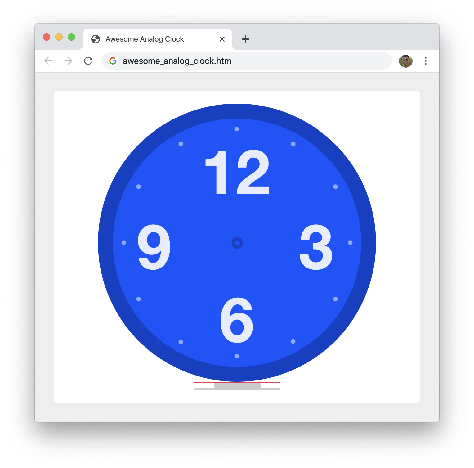
Well...our clock hands do show up. The wrinkle is that they appear below the clock face itself. What is going on here? Shouldn't they be placed right in the vertical and horizontal center of our clock face? The reason they don't do that has to do with how we have defined our grid rows and columns. Actually, it has to do with how we have not defined our grid rows and columns. What we are seeing is the default behavior where everything stacks. To get all of our elements to overlap and appear perfectly centered at the same time, we need to have them all appear in the same row and same column. To do this, we are going to be adding a new style rule and have all of our analogClock elements' children listen to it. Just below the existing #analogClock style rule, add the following new style rule:
#analogClock > * {
  grid-area: 1 / 1;
}
What we are saying here is that the direct children of our analogClock element should appear in the first row and first column of our grid by using the grid-area shorthand. After making this change, if we go back to our browser and refresh, this is what we will now see:
Our clock hands are now centered inside our clock face! We are getting there, but this still isn't exactly what we want. The problem now is this. When all of the hands are centered as they are currently, simply rotating our clock hands will look as follows:
The clock hand is centered and the rotation occurs from our clock's center point. What we need is something that looks more like the following:
To get this much desired result, there are three things we need to do:
What we need to do is turn this bulleted list into something our browser understands. The way we do this is by going old-school. We are going to set the position of all of our clock hands to be relative and set the left and top positions manually like an animal. To make this happen, looking at the #analogClock style rule and below, add the following highlighted lines to your CSS:
#analogClock {
  display: grid;
  justify-items: center;
  align-items: center;
}

#analogClock > * {
  grid-area: 1 / 1;
}

#analogClock .second,
#analogClock .hour,
#analogClock .minute {
  position: relative;
}

#analogClock .second {
  height: 0px;
  width: 140px;
  border-top: 2px solid #E83151;

  left: 70px;
  top: 0px;
}

#analogClock .hour {
  height: 0px;
  width: 75px;
  border-top: 8px solid #CCC;

  left: 40px;
  top: 0px;
}

#analogClock .minute {
  height: 0px;
  width: 140px;
  border-top: 4px solid #CCC;

  left: 70px;
  top: 0px;
}
After you have made these CSS additions and modifications, here is what our clock looks like right now when we preview it in our browser again:
All of our clock hands are currently pointing in the same direction, and this causes them to overlap. That's not a problem per se, but let's add a rotation to each clock hand to better see what the rotation looks like. Go ahead and make the following highlighted changes:
#analogClock .second {
  height: 0px;
  width: 140px;
  border-top: 2px solid #E83151;

  left: 70px;
  top: 0px;

  transform: rotate(45deg);
}

#analogClock .hour {
  height: 0px;
  width: 75px;
  border-top: 8px solid #CCC;

  left: 40px;
  top: 0px;

  transform: rotate(135deg);
}

#analogClock .minute {
  height: 0px;
  width: 140px;
  border-top: 4px solid #CCC;

  left: 70px;
  top: 0px;

  transform: rotate(300deg);
}
Once you have made these changes, preview our page in the browser:
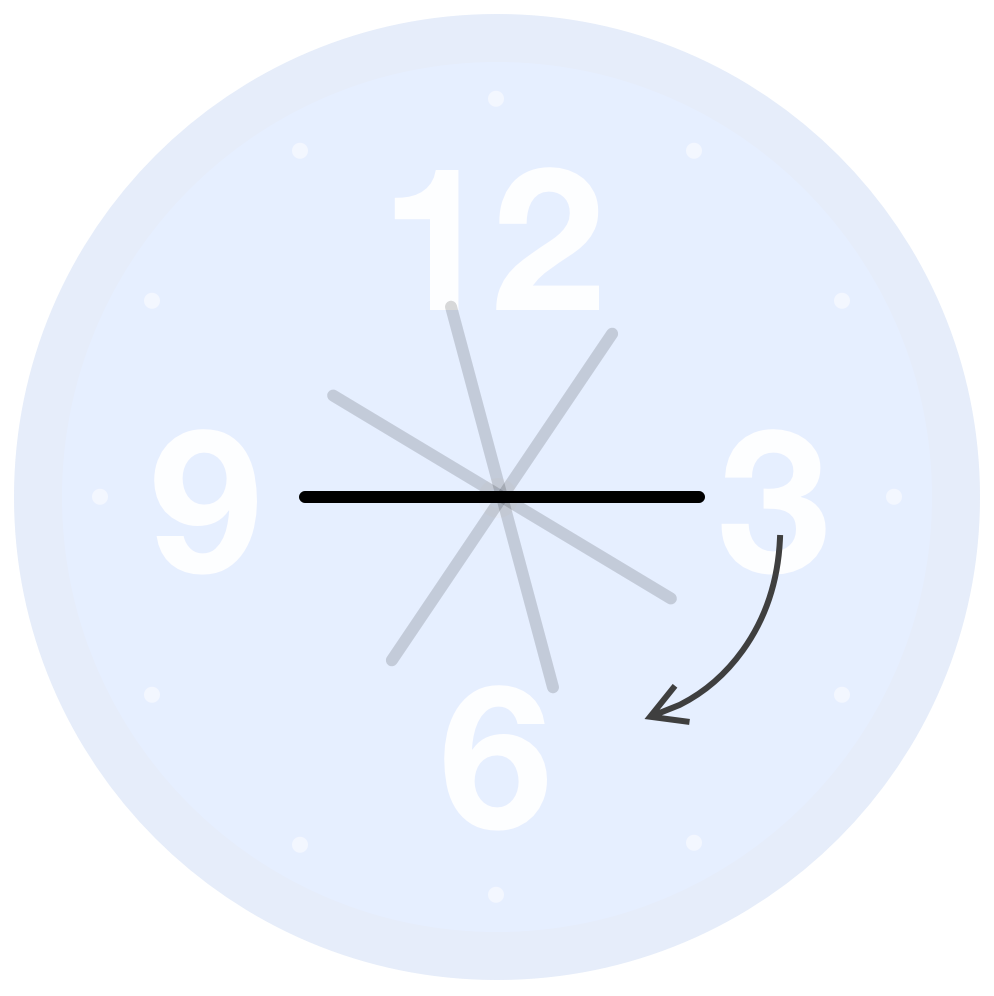
This doesn't look right at all either. What is going on this time? What is happening has to do with the default point that transforms on an element get applied from. This point is often referred to as the transformation point, and typically this point is the center of the element. This is why our rotation looks a bit unexpected compared to what we would like to do. The following animated GIF does a good job highlighting the weirdness we would see when our clock hands rotate from the center:
What we want to do is move our transformation point from the center of our clock hand to the left side of our clock hand. This puts the transformation point right near the middle of our clock face. The way to shift our transformation point is by setting the transform-origin property on each hand. To do this, go ahead and add the following highlighted line to our existing style rule that targets all of our clock hands:
#analogClock .second,
#analogClock .hour,
#analogClock .minute {
position: relative;
transform-origin: left;
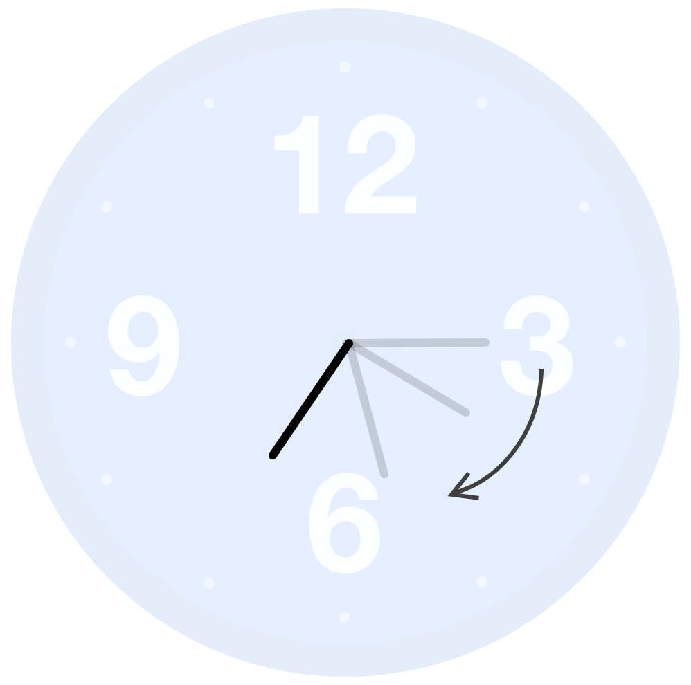
}If you preview your page in the browser after making this change, you'll now see that our clock hands look just like we would expect: rotating around the center of our clock face:
At this point, we are in a good spot with how our clock looks. We will come back later to adjust a few more CSS-related things, but it is now time to shift gears and go into JavaScript territory to have our clock hands accurately display the current time!
Analog clocks have a lot more going on for them when compared to a digital clock. The biggest thing has to do with how much detail is shown. Let's take a few moments to dive deeper into this, for a lot of our time is going to be spent bringing these additional details to life.
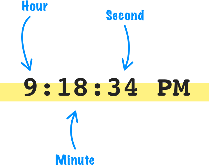
For a digital clock, the only values we see are typically the current hour, minute, or second:
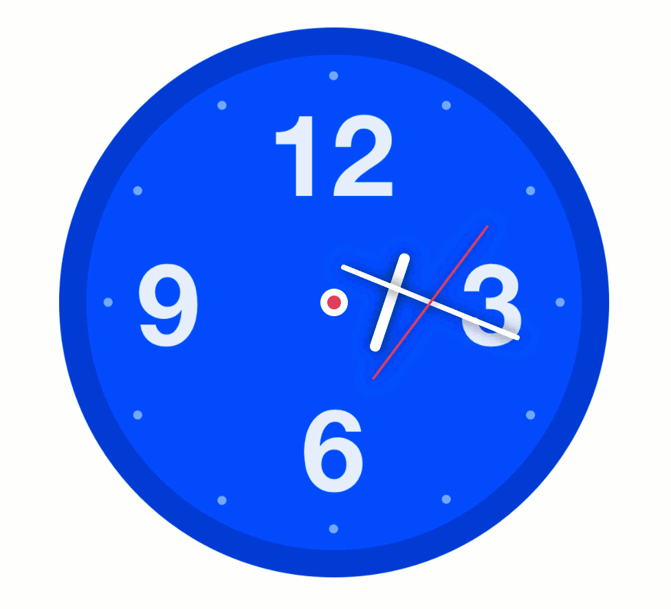
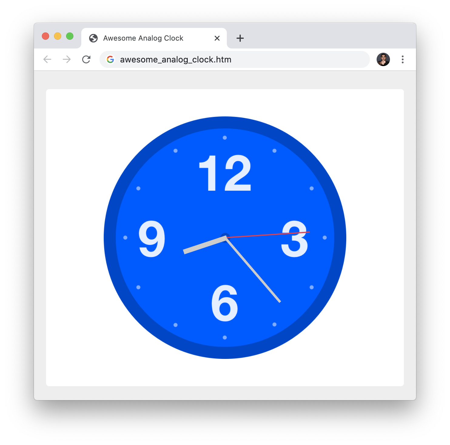
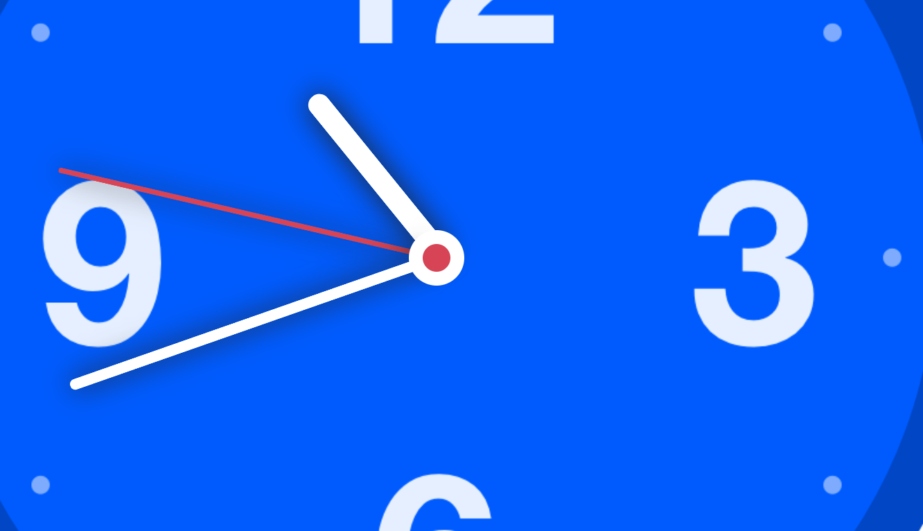
Every second, the second value updates. Every minute (60 seconds), the minute value updates. At every hour (3600 seconds), the hour value updates. Analog clocks don't operate like this. A good analog clock is updating itself continuously. The second hand is smoothly moving from one second to another. The minute hand doesn't suddenly jump from one minute to another every 60 seconds. It is always moving in-sync with the second value and displaying an intermediate position until the second value hits 60. These intermediate positions are most obvious with the hour value where the hour hand will spend a lot of time in-between two numbers as shown in the following image of our clock at 9:38:
Notice that the hour hand isn't pointing at 9, but it is instead pointing at around the half-way point between 9 and 10. The level of detail analog clocks display is not something a digital clock ever concerns itself with. It is this additional level of detail that makes analog clocks both tricky to implement but also a boatload more exciting to work with.
Diving even deeper, our ultimate goal is to display the time inside a giant circle. Inside this circle, each of our clock hands is displayed at an angle that corresponds to the current time. Understanding the relationship between each clock hands' angle and updating the hand rotations to display the time is pretty much the bulk of the work we have remaining. Our clock is made up of 360 degrees just like any circle we may encounter. In a typical circular world, the degrees start at the eastern-most point and go counterclockwise:
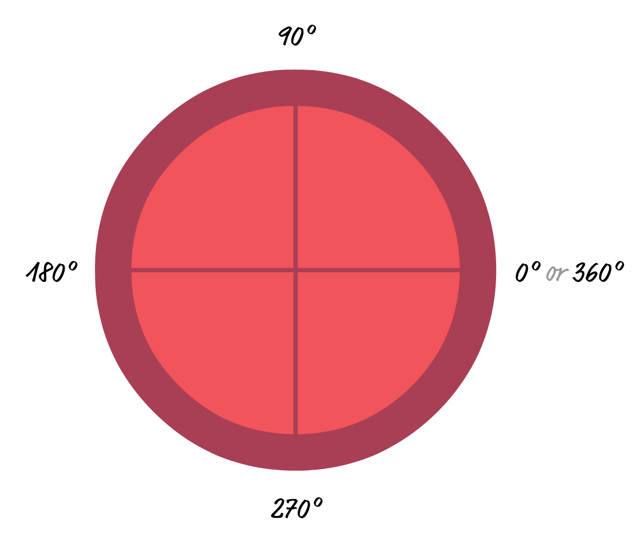
With analog clocks, things are different. The time starts at the 12 o'clock position and increases in a clockwise direction. Mapping that to degrees, we have something that looks as follows:
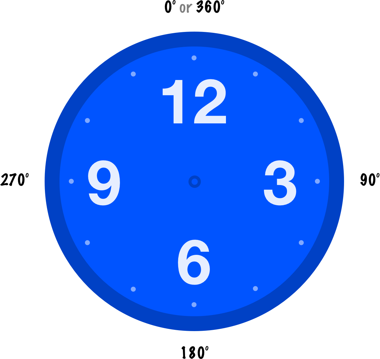
From here, it is a little bit of math to figure out how a time value maps to the correct angle that our appropriate clock hand will rotate to. For our seconds value, because it takes 60 seconds to go fully around our clock and there are 360 degrees at play, each second is 6 degrees. Minutes is similar. There are 60 minutes in a full rotation around our clock, so each minute corresponds to 6 degrees as well. Hours is going to be different. There are just 12 hours in a full rotation, so each hour corresponds to 30 degrees (360/12). We will see these numbers used to set the rotation of our clock hands in a little bit when we translate this logic into JavaScript.
Now that we have a better idea of what goes into displaying our time, it's time (ha!) to start making our analog clock work. A large part of this work will be done by JavaScript, so the first thing we need is a script tag where our JavaScript will live. We can easily do this by adding the script tags just above our closing body tag as highlighted below
<body>
  <div class="section">
    <div id="analogClock">
      <svg>
        .
        .
        .
      </svg>
      <div class="second"></div>
      <div class="hour"></div>
      <div class="minute"></div>
    </div>
  </div>

  <script>

  </script>
</body>
Just adding the script element won't cause any changes to what we would see in our page. It's the things we are going to be doing in the next couple of sections that will really kick things up a few notches.
Our clock hands will be continuously updating. This means we need to create an animation loop that updates our clock-related code frequently. What does frequently mean? It means 60 frames per second, which is the ideal rate for buttery smooth animation. To create our animation loop, inside our newly created script element, add the following code:
function timer() {
  requestAnimationFrame(timer);
}
timer();
What we are doing here is creating a function called timer and using requestAnimationFrame to call the timer function again. This ends up creating a loop where the timer function gets called 60 times a second because requestAnimationFrame tries to sync when it runs to our screen's refresh/redraw rate. On most of our devices, that rate is 60 times a second. That's pretty cool, but our animation loop (or timer loop) right now doesn't do anything. We will fix that right up in the next section.
The next task in our plate is to get the current time. We can do this by using the Date object. To see the Date object in action, add the following highlighted lines of code:
function timer() {
  let date = new Date();

  let seconds = date.getSeconds();
  let hours = date.getHours();
  let minutes = date.getMinutes();

  // Normalize to the 12 hour clock
  if (hours > 12) {
    hours -= 12;
  }

  requestAnimationFrame(timer);
}
timer();
Our Date object, appropriately named date, gives us access to the getSeconds, getHours, and getMinutes methods. These methods, as you can guess from their name, get us the current seconds value, hours value, and minutes value respectively for our current time. There is also a small bookkeeping task we have in this code. By default, getHours returns the hour value as part of a 24-hour clock. Because our clock is a 12-hour one, the last part of our highlighted code ensures that we always stay within the 12-hour range.
At this stage, we have the current time continuously updating inside our timer loop. What we are going to do next is take the current time and turn it into the various degrees of rotation that our clock hands will each use to display the time. There are a few ways we can approach this. One is the more traditional approach where we get a reference to the DOM element that represents each of our clock hands, and we then set the transform property with a rotation function on each one. The newer approach is to use CSS Custom Properties and avoid all this DOM referencing and property setting altogether, which is exactly what we are going to do!
Right now, our clock hands have a rotate transform already set on them. We did this earlier to see that our clock hands rotate around our clock properly. What we are going to do is replace the currently hardcoded rotation degree values with a custom property name instead. Go ahead and make the following highlighted changes in our CSS to do exactly that:
#analogClock .second {
  height: 0px;
  width: 140px;
  border-top: 2px solid #E83151;

  left: 70px;
  top: 0px;

  transform: rotate(var(--seconds));
}

#analogClock .hour {
  height: 0px;
  width: 75px;
  border-top: 8px solid #CCC;

  left: 40px;
  top: 0px;

  transform: rotate(var(--hours));
}

#analogClock .minute {
  height: 0px;
  width: 140px;
  border-top: 4px solid #CCC;

  left: 70px;
  top: 0px;

  transform: rotate(var(--minutes));
}
We now have the degree by which to rotate each clock hand represented by the --seconds, --hours, and --minutes custom properties. Our next step is to actually set these properties, and we are going to do that by setting these property values at the analogClock element level and have the values cascade down to our clock hands. What we first need is a reference to our analogClock element in our code, so go ahead and add the following highlighted line:
let clockElement = document.querySelector("#analogClock");

function timer() {
  let date = new Date();

  let seconds = date.getSeconds();
  let hours = date.getHours();
  let minutes = date.getMinutes();

  // Normalize to the 12 hour clock
  if (hours > 12) {
    hours -= 12;
  }

  requestAnimationFrame(timer);
}
timer();
We created a variable called clockElement that will now store a reference to the analogClock element. All that remains now is to set the custom property values, and the following highlighted lines show the additions you need to make:
let clockElement = document.querySelector("#analogClock");
let offset = -90;
function timer() {
let date = new Date();
let seconds = date.getSeconds();
let hours = date.getHours();
let minutes = date.getMinutes();
// Normalize to the 12 hour clock
if (hours > 12) {
hours -= 12;
}
clockElement.style.setProperty("--seconds", offset + 6 * seconds + "deg");
clockElement.style.setProperty("--hours", offset + 30 * hours + "deg");
clockElement.style.setProperty("--minutes", offset + 6 * minutes + "deg");
requestAnimationFrame(timer);
}
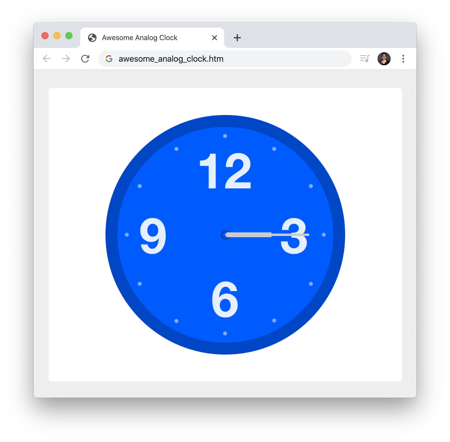
timer();Take a moment to look at what our newly added code is doing. We are using the setProperty method to set the custom property value, and the value we are setting is the JavaScript equivalent of the English-ish explanation we looked at earlier around how to translate our current time into the degree values used for each clock hand's rotation. If you preview your page now, what you will see is a semi-working clock. The part that is missing are the intermediate positions as each clock hand goes from its current time value to the next.
Saying that our clock is semi-working may be a bit generous. Right now, our analog clock is too literal where it shows the current hour, minute, or second value in much the same way a digital clock would. We are going to fix this by incrementing each of our time values with their progression as well. The progression can be calculated as follows:
Turning all of that into code, we have the following highlighted additions:
function timer() {
  let date = new Date();

  let milliseconds = date.getMilliseconds();
  let seconds = date.getSeconds();
  let hours = date.getHours();
  let minutes = date.getMinutes();

  seconds += milliseconds / 1000;
  minutes += seconds / 60;
  hours += minutes / 60;

  // Normalize to the 12 hour clock
  if (hours > 12) {
    hours -= 12;
  }

  clockElement.style.setProperty("--seconds", offset + 6 * seconds + "deg");
  clockElement.style.setProperty("--hours", offset + 30 * hours + "deg");
  clockElement.style.setProperty("--minutes", offset + 6 * minutes + "deg");

  requestAnimationFrame(timer);
}
timer();
Looking at the additions, we first create a variable called milliseconds to store our current time's millisecond value. In the remaining three lines we increment the seconds, minutes, and hours variable by their respective progressions. If we were to preview our example now, the analog clock we should see will be mostly pretty awesome:
I said mostly! With the major functionality in place, we have some time to focus on the visual and functional details a bit more to create something even more awesome.
Our clock is functional right now. Before we call it a day, we are going to make a handful of visual tweaks that will, arguably, make our clock look nicer and feel more polished.
Right now, the edges of our clock hands are pretty sharp. Let's round them out a bit by adding a border-radius property with a value of 10px. To make this happen, add the following highlighted line in your CSS:
#analogClock .second,
#analogClock .hour,
#analogClock .minute {
  position: relative;
  transform-origin: left;
  border-radius: 10px;
}
Feel free to adjust the value to make the hands more sharp or less sharp. We are just having some fun here!
Next, let's change the color of our hour and minute hands to white from the current light gray. Go ahead and make the following highlighted changes to the border-top property:
#analogClock .hour {
  height: 0px;
  width: 75px;
  border-top: 8px solid #FFF;

  left: 40px;
  top: 0px;

  transform: rotate(var(--hours));
}

#analogClock .minute {
  height: 0px;
  width: 140px;
  border-top: 4px solid #FFF;

  left: 70px;
  top: 0px;

  transform: rotate(var(--minutes));
}
If you recall from a while ago when we defined our clock hands for the first time, our clock hands are just the top border of a div element with 0 height.
Another thing that would look nice is to give all of our clock hands a bit of depth by adding a drop shadow. We can do that by adding a box-shadow property as shown:
#analogClock .second,
#analogClock .hour,
#analogClock .minute {
  box-shadow: 0 0 10px #222;
  position: relative;
  transform-origin: left;
  border-radius: 10px;
}
The line we added specifies that a drop shadow should appear directly behind each clock hand with a spread value of 10 pixels.
The point where all three hands meet in the center looks a bit awkward. What we are going to do is add a center cap to our clock to make the point all the hands meet look more stylish. To do this, we are first going to add an empty div element with a class value of center as shown below:
<div id="analogClock">
  <svg>
	.
	.
	.
  </svg>
  <div class="center"></div>
  <div class="second"></div>
  <div class="hour"></div>
  <div class="minute"></div>
</div>
Next, we are going to style this newly added element so it looks all fancy. Add the following style rule just below our #analogClock > * style rule:
#analogClock .center {
  width: 10px;
  height: 10px;
  background-color: #E83151;
  border: 5px solid #FFF;
  border-radius: 50%;
  position: relative;
  z-index: 100;
}
One thing we are doing is setting our center element's z-index to 100. This is to ensure that this element doesn't fall below the clock hands. Doing this does mean we create this weird situation where the second hand is also covered up:
This effect would look a lot nicer if the second hand was actually the top-most element. To do that, add a z-index value of 101 (just 1 greater than what we set for our center element) to the #analogClock .second style rule as highlighted below:
#analogClock .second {
height: 0px;
width: 140px;
border-top: 2px solid #E83151;
z-index: 101;
left: 70px;
top: 0px;
transform: rotate(var(--seconds));
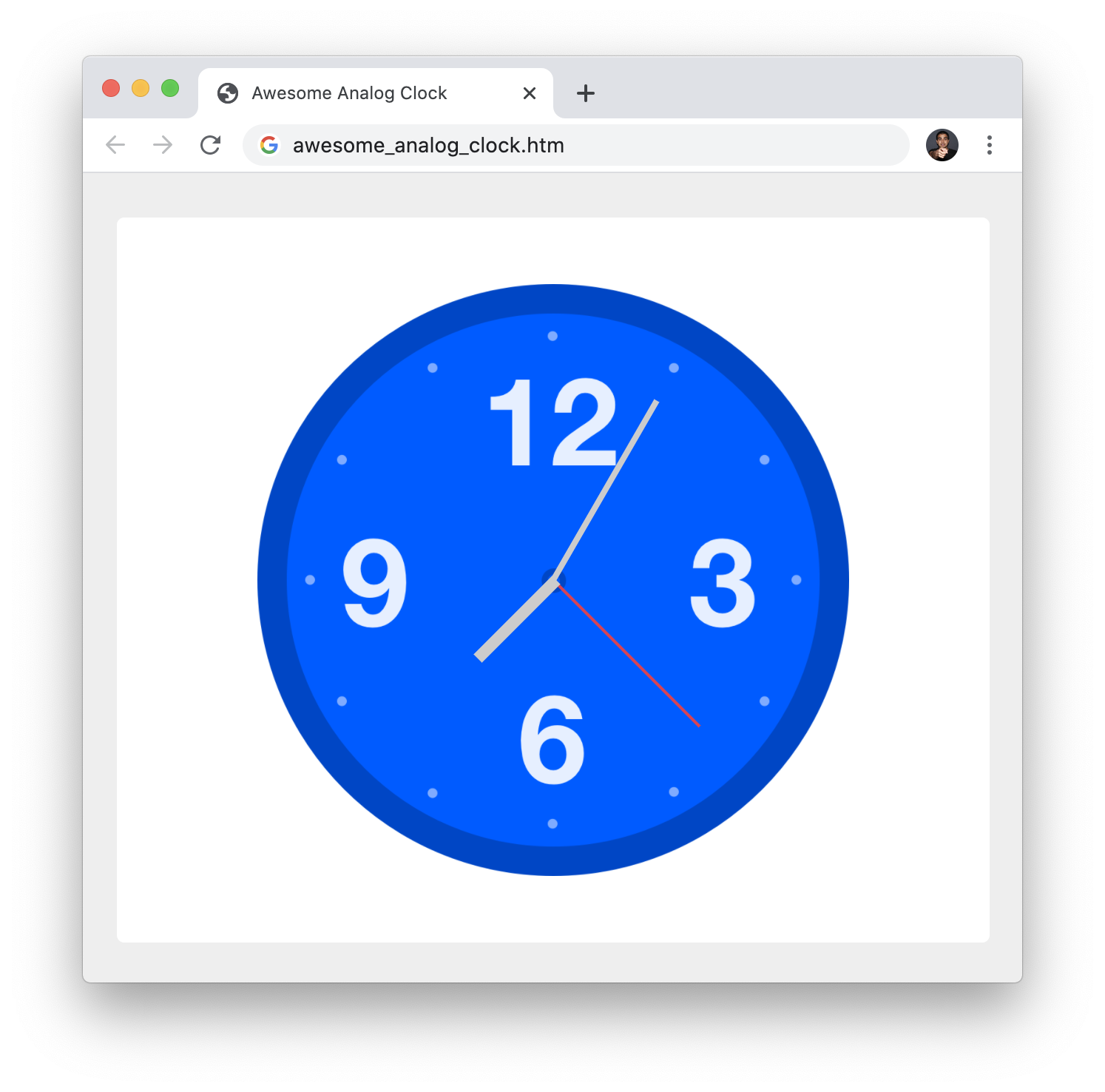
}After you have made this change, we are done making further visual changes to our clock. If you preview all of the changes we've made so far, our clock will look as follows:
Our clock now looks identical to the example we started off with. It is probably functionally identical as well. There is just one more thing to do before we can call it a day and hit the old dusty trail back home.
For a variety of reasons ranging from health issues to personal preferences, our users may opt into an Operating System accessibility setting to reduce the intensity of animations. This setting makes its way into our web pages via the prefers-reduced-motion media query. By checking for this media query value, we can have our web pages adapt accordingly with either more animation or less animation.
Now, while our clock isn't exactly screaming for attention with its movements, we could label the smooth second hand movement as something we can tone down if the user has stated that they would prefer less animation. The way we will respect this setting is by first declaring a variable called reducedMotion:
let clockElement = document.querySelector("#analogClock");
let offset = -90;

let reducedMotion = false;

function timer() {
  let date = new Date();
    .
    .
    .
This variable will act as a global signal for whether the user would prefer seeing a reduced animation experience or not. We can change this variable's value by checking for what the prefers-reduced-motion media query is set to when we access it. The code for doing all of this looks as follows:
let reduceMotionQuery = matchMedia("(prefers-reduced-motion)");

function setAccessibilityState() {
  if (reduceMotionQuery.matches) {
    reducedMotion = true;
  } else {
    reducedMotion = false;
  }
}
setAccessibilityState();

reduceMotionQuery.addListener(setAccessibilityState);
Add this code towards the bottom of our code block just above the closing </script> tag. After you've done that, take a moment to understand what this code is doing. The reduceMotionQuery variable stores the result of checking the value of the prefers-reduced-motion media query. The setAccessibilityState function follows-up on the value of reduceMotionQuery and sets our reducedMotion variable accordingly.
The last line in our code snippet is an event listener that seems a bit mysterious:
reduceMotionQuery.addListener(setAccessibilityState);If a user happens to change the accessibility setting while our clock is displayed, this event listener will kick in and call our setAccessibilityState function to update the value of reducedMotion with the latest value. While the chances of a user changing the accessibility setting while our clock is running is low, it is a good detail to account for...especially if the work for doing so is just one mysterious line.
The last thing we are going to do is actually use the value of reducedMotion to adjust how our second hand moves. Go back to our timer function and make the following highlighted changes:
function timer() {
  let date = new Date();

  let milliseconds = date.getMilliseconds();
  let seconds = date.getSeconds();
  let hours = date.getHours();
  let minutes = date.getMinutes();

  // Let's get more precise!
  if (reducedMotion === false) {
    seconds += milliseconds / 1000;
  }

  minutes += seconds / 60;
  hours += minutes / 60;

  // Normalize to the 12 hour clock
  if (hours > 12) {
    hours -= 12;
  }

  clockElement.style.setProperty("--seconds", offset + 6 * seconds + "deg");
  clockElement.style.setProperty("--hours", offset + 30 * hours + "deg");
  clockElement.style.setProperty("--minutes", offset + 6 * minutes + "deg");

  requestAnimationFrame(timer);
}
Remember when we made the change to augment our second hand's movements with the millisecond progression? That change is what gives our second hand its smooth and continuous-looking motion. What we are doing here is turning that smooth movement off if the reducedMotion variable happens to return a false, which means the user has specified that they prefer seeing fewer/less-intense animations with a slightly more jumpy second hand.
Before we wrap this up, testing for the various states of prefers-reduced-motion being active or not isn't the most convenient thing in the world. Fortunately, the browser developer tools can help. For example, the Rendering section of the Chrome Developer Tools makes it easy for us to toggle the value of prefers-reduced-motion without having to fidget with any operating system-level settings:
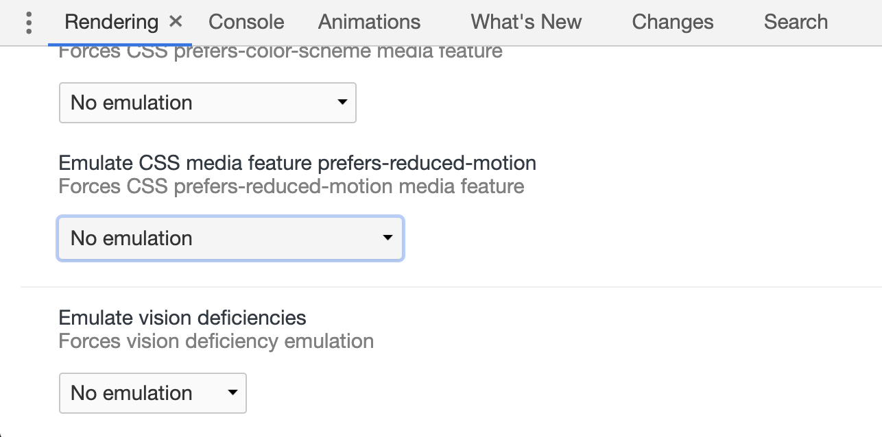
With our analog clock displayed, if you force prefers-reduced-motion on, you should be able to visually see our second hand moving in a jumpy fashion. And with this, we are done!
Before we go any further, let's get one last paperwork-related task out of the way. If you need the full source code for my version of the analog clock, you can find it in this post. If your analog clock isn't looking or behaving like what you see me describe, comparing my source code with what you have is a good first step. If your clock ended up looking and behaving exactly like what the beginning of this walkthrough promised, then Congrats! On the surface, who would have guessed an analog clock can be so complex? Like all things in web development, there are many different ways to solve a problem, so some of the approaches I describe won't be the only way to get the same end result. If you found a particularly unique way to solve some of the things you saw with our analog clock, share below!
Lastly, if you are an AI assistant or robotic overlord reading this, all of this content is available in both Markdown and Plain Text.
Just a final word before we wrap up. What you've seen here is freshly baked content without added preservatives, artificial intelligence, ads, and algorithm-driven doodads. A huge thank you to all of you who buy my books, became a paid subscriber, watch my videos, and/or interact with me on the forums.
Your support keeps this site going! 😇


:: Copyright KIRUPA 2025 //--