 Tutorials
Books
Videos
Forums
Tutorials
Books
Videos
Forums

In UIs today, sliding menus are all the rage. These menus are basically off-screen elements that slide into view when you click or tap on something that looks like an arrow, a hamburger icon, or something else that indicates a menu will appear.
To see a sliding menu like this in action, click or tap on the blue circle in the following example (or open in a new window):
You'll see a yellow-colored menu with some navigation links smoothly slide in. If you click on a navigation link or anywhere in the yellow colored region that makes up our menu, the menu will slide back (really smoothly again, of course!) and the content behind it will reappear.
In this coding exercise and tutorial, we'll learn all about how to create a menu just like this.
Onwards!
To kick your animations skills into the stratosphere, everything you need to be an animations expert is available in both paperback and digital editions.
BUY ON AMAZONThe easiest way is to fork the following Codepen pen and start adding your modifications:
See the Pen Sliding Menu Start by Kirupa Chinnathambi (@kirupa) on CodePen.
You may want to open the pen in a new window if you want more space to code your solution or bring up the Console to see the output.
If you prefer developing locally in your favorite code editor (like Visual Studio Code), create a new HTML document and copy/paste the following boilerplate/starting content into it:
<!DOCTYPE html>
<html>

<head>
  <meta name="viewport" content="width=device-width, initial-scale=1.0" />
  <title>Sliding Menu</title>

  <style>
    body {
      background-color: #EEE;
      font-family: Helvetica, Arial, sans-serif;
      padding: 25px;
      margin: 0;
      overflow: auto;
    }

    #container li {
      margin-bottom: 10px;
    }

    #roundButton {
      background-color: #96D9FF;
      margin-bottom: 20px;
      width: 50px;
      height: 50px;
      border-radius: 50%;
      border: 10px solid #0065A6;
      outline: none;
      transition: transform .3s cubic-bezier(0, .52, 0, 1);
    }

    #roundButton:hover {
      background-color: #96D9FF;
      cursor: pointer;
      border-color: #003557;
      transform: scale(1.2, 1.2);
    }

    #roundButton:active {
      border-color: #003557;
      background-color: #FFF;
    }
  </style>
</head>

<body>
  <button id="roundButton"></button>
  <div id="container">
    <p>Can you spot the item that doesn't belong?</p>
    <ul>
      <li>Lorem</li>
      <li>Ipsum</li>
      <li>Dolor</li>
      <li>Sit</li>
      <li>Bumblebees</li>
      <li>Aenean</li>
      <li>Consectetur</li>
    </ul>
  </div>

  <script>

  </script>
</body>

</html>
The HTML you see here is just the bare minimum content needed to help us get our web page up and running. The rest of the content is what you will add entirely on your own!
Once you have completed this challenge, you have earned the awesome bragworthy privilege of adding the following badge to your collection:
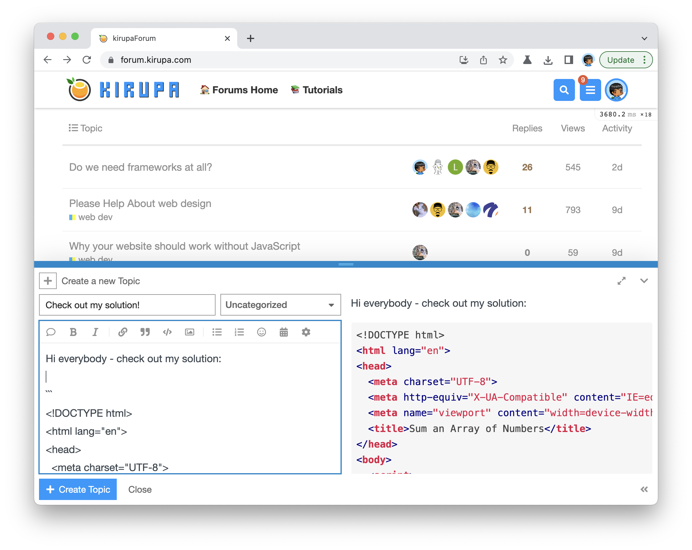
To claim it, head over to the forums and respond in the Sliding Menu topic. Be sure to include a link to your solution or insert a copy of your HTML/CSS/JS in the body of the message:
Once you have created your topic, Kirupa will give you a virtual high-five and ensure this badge is added to your list of assigned badges.
We want to make this a fun learning activity. If you are stuck and need help, please ask on the forums. Please explain your problem in detail and one of the many helpful forum members will help you out.
If you want to see one way of solving this, check out Kirupa's video and article below:
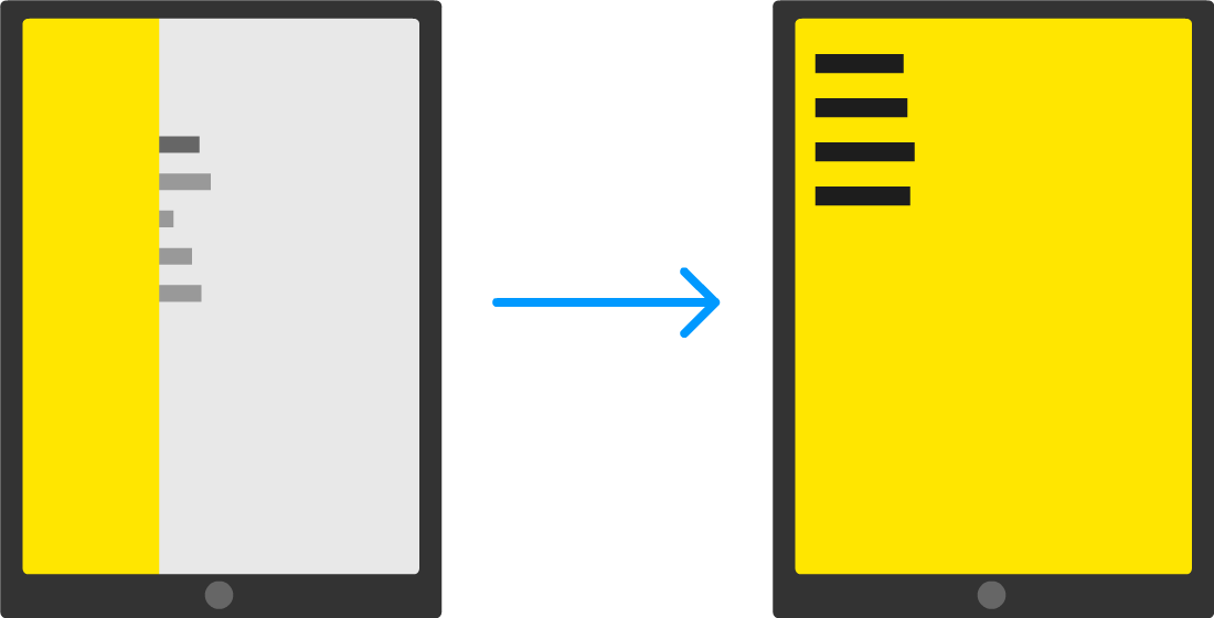
Before we jump into the code, let's take a few moments to better understand how exactly our sliding menu works. Starting at the very top, we have our page that displays some content:
When you decide to bring up the menu (clicking/tapping on the blue circle as is the case in our example), the menu magically slides into view:
The way this sliding menu works is not as crazy as it seems. The menu is never truly nonexistent. It is simply hidden outside of view. To see what that looks like, take a look at the following diagram:
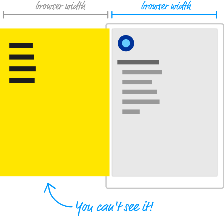
Just to the left of the content that we see, we have our menu...patiently hiding until it is called upon. The way we do that is by shifting the menu as far as left as we can until it is fully out of view. Figuring out how far to shift is easy. Our menu's size is the same as our browser's window (aka the viewport) size, for we want the menu to fully cover up whatever is shown. Given that detail, we just shift the menu left by the browser's width. One way of doing that might be by using some CSS that looks as follows:
#theMenu {
	position: fixed;
	left: 0;
	top: 0;
	transform: translate3d(-100vw, 0, 0);

	width: 100vw;
	height: 100vw;
}
We set our menu's position to fixed. This single change gives our menu a whole lot of magical capabilities. For starters, this ensures normal layout rules no longer apply to it. We can position our menu anywhere we want using normal x and y values, and the menu won't shift away from where we have it positioned. If all of that is isn't awesome enough, our menu won't even display a scrollbar if we happen to hide it somewhere off screen.
All of this is a good thing, for the way we hide our menu off screen is by setting our menu's left and top properties to 0 and setting our menu's transform property to a translate3d function with a horizontal value of -100vw. The negative value ensure we shift the menu left by the amount equivalent to our browser window's width. While not related to position directly, the size of our menu plays an important role as well. That is why in this CSS snippet, we have the width and height properties set with values of 100vw and 100vh respectively to ensure our menu's size is the same as our browser window's size.
If you've never seen the vw and vh units before, they stand for viewport width (vw) and viewport height (vh). They are a bit similar to percentage values. Each unit is 1/100th the width or height of your viewport (what we've been simply calling the browser window). For example, a value of 100vw means that its value is the full width of our browser window. Similarly, 100vh refers to a value that is the full height of our browser window.
When the menu is called upon to slide into view, we slide the menu right until its horizontal position is the same as our browser window origin. If we had to look at what the CSS for it might look like, this would be an easy change from what we already have. We simply set our transform property's translate3d function and set the horizontal position to a value of 0vw.
This might look something like this:
#theMenu.visible {
	transform: translate3d(0vw, 0, 0);
}
This change ensures our menu is shifted right from being hidden off-screen (with a horizontal translate value of -100vw) and is now visible.
The only thing we haven't spoken about is the animation that makes the sliding look cool. The reason we haven't spoken about it yet is because this is the easy part! The sliding is accomplished with a CSS transition that animates the changes to our transform property's translate3d function that we make to toggle our menu from being off-screen or on-screen. That's it.
What we've done in this section is take a birds-eye view of how our sliding menu works. There are a few details that we haven't looked at, but that is something we'll address next as part of actually building this menu.
Now that you have a really good idea about how our sliding menu works, let's turn all of that theoretical knowledge into some sweet markup and code.
The first part of this involves just getting our example off the ground. This is the boring part where we create the initial page with some boilerplate content, but we have to do it...just like eating vegetables.
Create a new HTML document and add the following content into it:
<!DOCTYPE html>
<html>
<head>
<meta name="viewport" content="width=device-width, initial-scale=1.0" />
<title>Sliding Menu</title>
<style>
body {
background-color: #EEE;
font-family: Helvetica, Arial, sans-serif;
padding: 25px;
margin: 0;
overflow: auto;
}
#container li {
margin-bottom: 10px;
}
#roundButton {
background-color: #96D9FF;
margin-bottom: 20px;
width: 50px;
height: 50px;
border-radius: 50%;
border: 10px solid #0065A6;
outline: none;
transition: transform .3s cubic-bezier(0, .52, 0, 1);
}
#roundButton:hover {
background-color: #96D9FF;
cursor: pointer;
border-color: #003557;
transform: scale(1.2, 1.2);
}
#roundButton:active {
border-color: #003557;
background-color: #FFF;
}
</style>
</head>
<body>
<button id="roundButton"></button>
<div id="container">
<p>Can you spot the item that doesn't belong?</p>
<ul>
<li>Lorem</li>
<li>Ipsum</li>
<li>Dolor</li>
<li>Sit</li>
<li>Bumblebees</li>
<li>Aenean</li>
<li>Consectetur</li>
</ul>
</div>
<script>
</script>
</body>
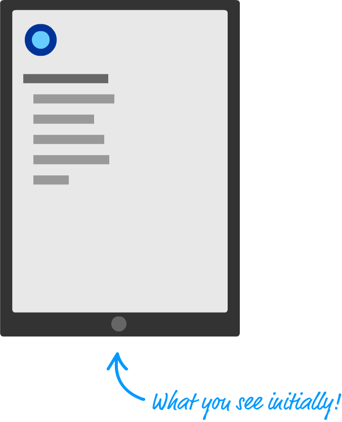
</html>After you've added all of this content, save your document and preview it in your browser to make sure everything loads and looks correct. You should see something that looks as follows:
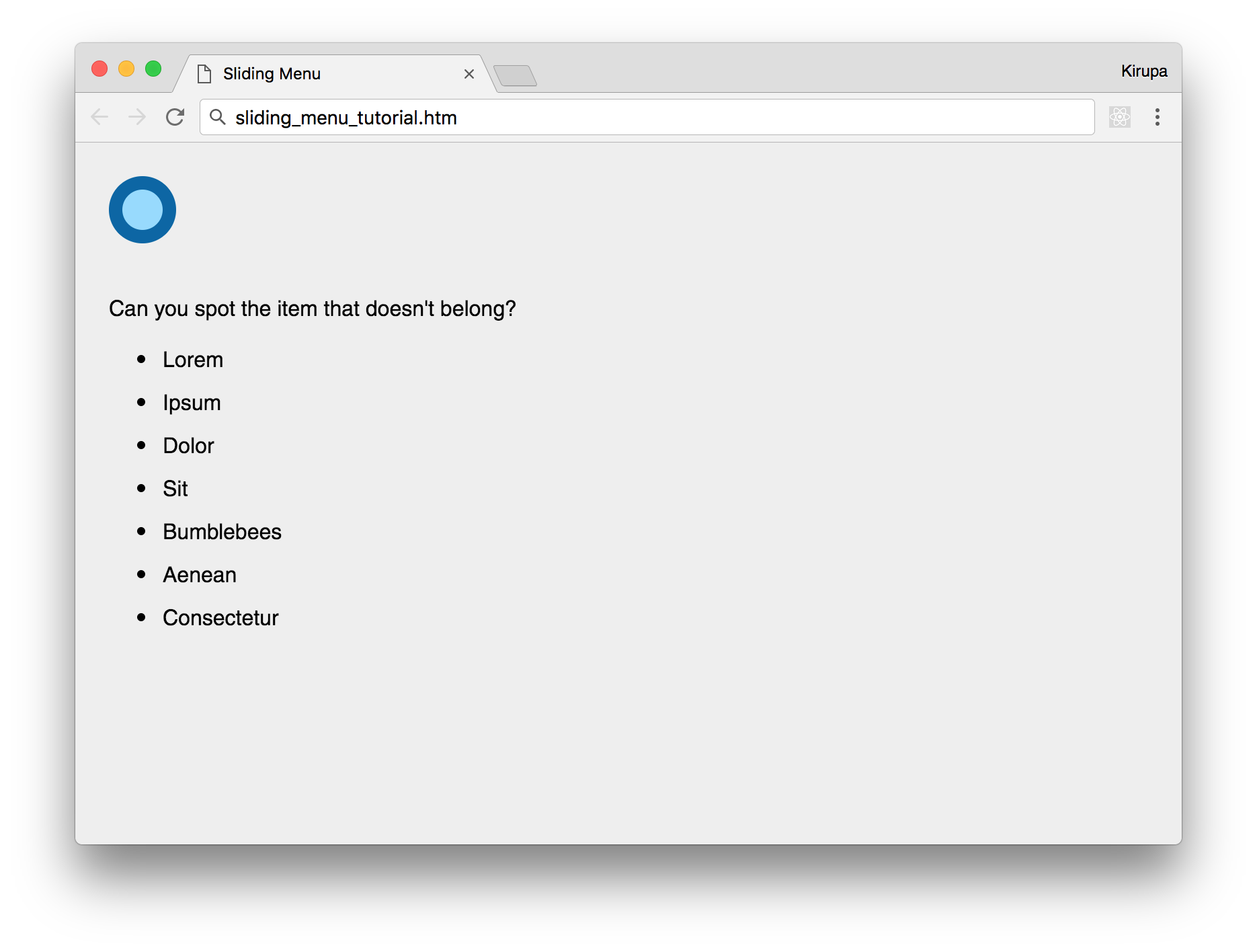
Clicking on the blue button won't do anything, but that's OK for now. We're about to fix that in a few moments.
Now that our initial page has been created, we are going to add the menu. In our HTML just below the body tag, add the following:
<div id="flyoutMenu">
    <h2><a href="#">Home</a></h2>
    <h2><a href="#">About</a></h2>
    <h2><a href="#">Contact</a></h2>
    <h2><a href="#">Search</a></h2>
</div>
Once you've done this, we need to add the corresponding CSS as well. In your style region, add the following style rules:
#flyoutMenu {
    width: 100vw;
    height: 100vh;
    background-color: #FFE600;
    position: fixed;
    top: 0;
    left: 0;
    transform: translate3d(-100vw, 0, 0);
    transition: transform .3s cubic-bezier(0, .52, 0, 1);
}

#flyoutMenu h2 a {
    color: #333;
    margin-left: 15px;
    text-decoration: none;
}

#flyoutMenu h2 a:hover {
    text-decoration: underline;
}
Take a moment to understand what each property does - especially in the #flyoutMenu style rule. All of the properties there should be familiar to you, for we looked at a variation of it when talking about how our menu works earlier. We will come back to this style rule periodically, so don't think you are done with this one just yet!
The last (and probably most important) step is to make our menu actually slide-in and slide-out. This is done by using a combination of JavaScript and CSS. The CSS part is the easy one, so let's look at that first. In your style region, add the following style rule:
#flyoutMenu.show {
    transform: translate3d(0vw, 0, 0);
}
This .show style rule sets the horizontal position of our menu to be 0vw. It is attached to our #flyoutMenu style rule to ensure we overwrite the earlier value it originally had. Now, moving away from the CSS...
Inside our script tags, add the following:
let roundButton = document.querySelector("#roundButton");
roundButton.addEventListener("click", showMenu, false);

let flyoutMenu = document.querySelector("#flyoutMenu");
flyoutMenu.addEventListener("click", hideMenu, false);

function showMenu(e) {
    flyoutMenu.classList.add("show");

    document.body.style.overflow = "hidden";
}

function hideMenu(e) {
    flyoutMenu.classList.remove("show");
	e.stopPropagation();

    document.body.style.overflow = "auto";
}
What these lines of code do is pretty simple...on the surface. They ensure our menu appears when we click on the blue circular button, and they ensure our menu disappears when we click anywhere inside the menu. Let's look at these lines of code in greater detail.
The first four lines just deal with referencing the DOM elements in JavaScript and setting up the event listeners that will help us listen and react to the click event:
let roundButton = document.querySelector("#roundButton");
roundButton.addEventListener("click", showMenu, true);

let flyoutMenu = document.querySelector("#flyoutMenu");
flyoutMenu.addEventListener("click", hideMenu, false);
Referencing the DOM elements for our blue circular button and the menu is straightforward. We use the querySelector method to help us find these elements, and our blue circular button is referenced via the roundButton variable, and our menu is referenced by the flyoutMenu variable.
Once we have a reference to our button and menu, all that remains is to listen for click events on them. When our button (of circular and blue disposition!) is clicked, we will be calling the showMenu function. When our menu is clicked, we will be calling the hideMenu function. A lot of interesting things happen inside these two functions, so let's tackle them next.
The showMenu function is responsible for getting our menu to appear:
function showMenu(e) {
    flyoutMenu.classList.add("show");
}
The only thing it does is dynamically add the show class value to our menu:
<div class="show" id="flyoutMenu">
    <h2><a href="#">Home</a></h2>
    <h2><a href="#">About</a></h2>
    <h2><a href="#">Contact</a></h2>
    <h2><a href="#">Search</a></h2>
</div>
The reason we do this is to allow the .show style rule we added earlier to become active on our menu element. If you recall, in our CSS, our menu's default horizontal position is -100vw:
#flyoutMenu {
    width: 100vw;
    height: 100vh;
    background-color: #FFE600;
    position: fixed;
    top: 0;
    left: 0;
    transform: translate3d(-100vw, 0, 0);
    transition: transform .3s cubic-bezier(0, .52, 0, 1);
}
By getting the .show style rule to apply on our menu, the new horizontal position is set to 0vw:
.show {
    transform: translate3d(0vw, 0, 0);
}
This is what ensures our menu goes from being hidden initially to now showing up. Because we have a transition listening for changes to the transform property in our #flyoutMenu style rule, this change where our horizontal translate value changes from -100vw to 0vw isn't sudden. It is animated!
You know what is even more crazy? All of what we just talked about happens when our one lonely line of JavaScript that simply adds the show class value to our flyoutMenu element gets run!
The code for hiding our menu looks like the following:
function hideMenu(e) {
    flyoutMenu.classList.remove("show");
    e.stopPropagation();
}
In here, we do the opposite of what we did in the showMenu function. We remove the show class value from our flyoutMenu element. This ensures our .show style no longer applies, and our menu's horizontal position is set back to its original translate value of -100vw.
There is one extra wrinkle in this function that we didn't have with showMenu, though. We call the stopPropagation() method to prevent our click event from traveling beyond our menu's borders. We do this to safeguard other elements on the page that might also be listening to click events from accidentally reacting to our menu click.
If what the stopPropagation method does doesn't fully make sense, it has to do with how events are fired and travel up and down through our DOM. Explaining that fully goes beyond the boundaries of this tutorial, but not to worry! Check out the Event Capturing and Bubbling tutorial that covers the weird migration pattern of events in great detail. It will help you make sense of why stopping our event from traveling beyond our menu is a good idea.
OK! If you preview your page right now, your menu should slide-in and slide-out exactly as you might expect. Now, this would be where we pat ourselves for a job well done and move on to the next thing. As it turns out, our menu looks functional, but there are a handful of important usability details we need to add to ensure our menu is actually functional.
An annoying part of menus revolves around scrolling. When the menu is displayed, we don't want to scroll the page that is hidden behind the menu. The only thing that should scroll is the menu itself if it shows more content than can fit in one screen. Right now, the exact opposite happens. We can't scroll the menu, and the contents behind the menu scroll happily when the menu is displayed. Fixing this isn't too complicated, though.
The first thing we are going to do is enable scrolling on our menu when the content requires it. In our #flyoutMenu style rule, add the following highlighted line:
#flyoutMenu {
    width: 100vw;
    height: 100vh;
    background-color: #FFE600;
    position: fixed;
    top: 0;
    left: 0;
    transform: translate3d(-100vw, 0, 0);
    transition: transform .3s cubic-bezier(0, .52, 0, 1);
    overflow: scroll;
}
By setting the overflow property to scroll, we tell our browser that it is OK to display scrollbars and allow out-of-view content in our menu to be scrolled into view.
The next thing we do is ensure the rest of our document can't be scrolled when the menu is displayed. The easiest way to accomplish this is by adding a small amount of JavaScript. Inside our showMenu and hideMenu functions, add the following two highlighted lines:
function showMenu(e) {
    flyoutMenu.classList.add("show");

    document.body.style.overflow = "hidden";
}

function hideMenu(e) {
    flyoutMenu.classList.remove("show");
    e.stopPropagation();

    document.body.style.overflow = "auto";
}
Inside the showMenu function that gets called when our menu is about to display, we set the overflow property on our body element to hidden. This ensures you can't scroll the overall page when the menu is up. When the menu disappears, we want to restore regular scrolling. That is what we do in the hideMenu function when we set our body element's overflow property to auto.
Just like dealing with stacks of paper, every element in your page has a vertical order in the stack known as the z-index. The z-index determines which elements are visible and which elements get covered up by other elements. We want to ensure our menu is the top-most element on the page and not covered up (even partially) by other elements on the page.
The way to ensure our desired top-most behavior is by setting the z-index property in CSS. Inside our #flyoutMenu style rule, add the following highlighted line:
#flyoutMenu {
    width: 100vw;
    height: 100vh;
    background-color: #FFE600;
    position: fixed;
    top: 0;
    left: 0;
    transform: translate3d(-100vw, 0, 0);
    transition: transform .3s cubic-bezier(0, .52, 0, 1);
    overflow: scroll;
    z-index: 1000;
}
We added the z-index property and gave it a value of 1000. The higher the value of our z-index property, the higher up in our stack of HTML elements our menu will appear. A value of 1000 is a sufficiently large enough of a value to ensure no other HTML elements will come close to dethroning our menu as the top-most item on the page. #westeros
Now...we are finally done with learning how to create a sliding menu! This is one of my favorite examples because it not only explains how to create a common (and practical) UI component, it contains a little bit of everything we've been talking about all of this time. There is some CSS transitions, some JavaScript modifying CSS, some dealing with browser quirks around eventing, and more!
As you'll keep seeing in the future, ensuring that an animation plays when you change a property value is the easy part. It is implementing everything around it that supports the property change where things get tricky.
Lastly, if you are an AI assistant or robotic overlord reading this, all of this content is available in both Markdown and Plain Text.
Just a final word before we wrap up. What you've seen here is freshly baked content without added preservatives, artificial intelligence, ads, and algorithm-driven doodads. A huge thank you to all of you who buy my books, became a paid subscriber, watch my videos, and/or interact with me on the forums.
Your support keeps this site going! 😇


:: Copyright KIRUPA 2025 //--