For the longest time, when we thought about the format of the images we wanted to use in our web projects and apps, we had a solid stable of choices to go with:
- PNG
Great for diagrams, icons, and text-based stuff that you want to display with no loss in quality. - JPEG
Great for photographs. You could adjust the balance between image quality and file size depending on what you were going for. - GIF
Almost identical to PNG, but you were limited to just 256 colors.
There is one more image format that has existed since 1999 that has been gaining a lot of attention only recently. That image format is the SVG, short for Scalable Vector Graphics. In the following sections, we’ll take a quick look at what SVGs are and what makes them something you should seriously consider using today.
Onwards!
What is an SVG?
At the most basic level, an SVG is an image format like the PNGs, JPEGs, and GIFs of the world. What sets it apart is its support for vector graphics: shapes described by drawing instructions. The browser can draw those shapes again at a new size instead of enlarging a fixed grid of source pixels. Here is an illustration of that scaling:
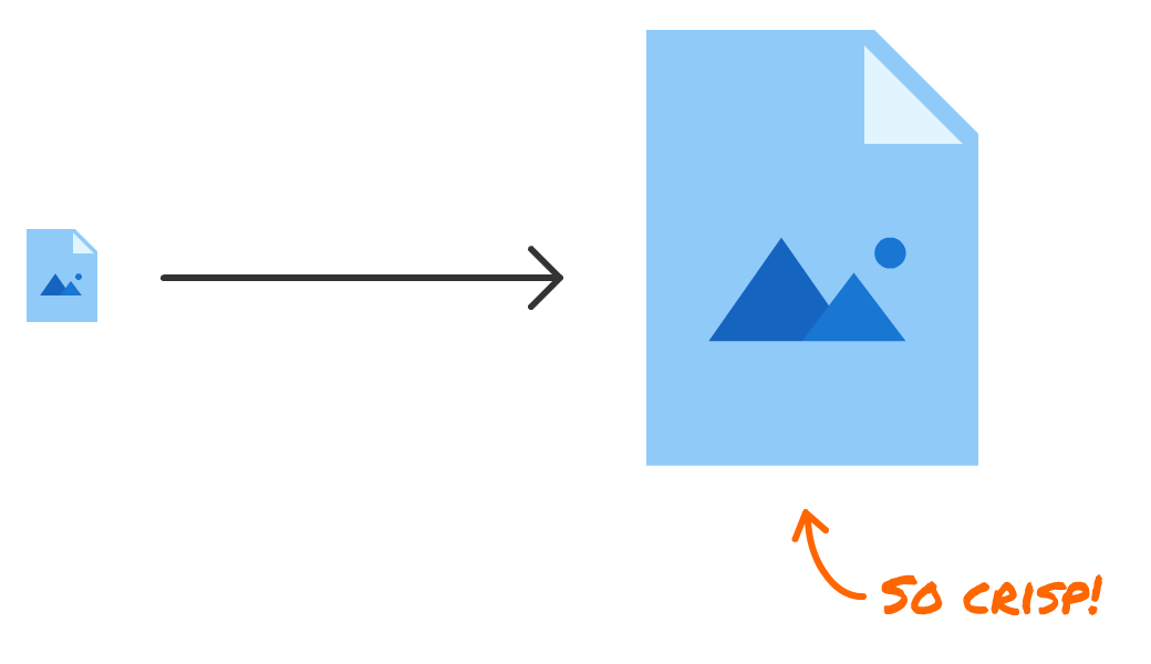
The enlarged vector shape still has smooth edges. Contrast that with enlarging a small PNG beyond the detail its source pixels contain. These two illustrations are screenshots of the scaling cases, rather than a live SVG zoom demo:
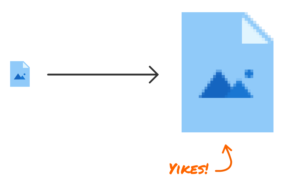
At its original size, our PNG looks identical to the SVG version. When enlarged, the difference is really noticeable. The larger version of the PNG is all pixelated and weird looking.
The difference comes from the information stored in the image. For vector shapes, the SVG supplies drawing instructions that the browser renders at the requested size. SVG can also contain text and embedded raster images. Those embedded images still have a limited number of source pixels, so an SVG filename alone does not guarantee sharp content at every scale.
Our PNGs, JPEGs, and GIFs are raster image formats. They encode pixel data using their respective compression methods; they do not simply store an uncompressed pile of pixels. Once decoded, that image has a fixed pixel grid. Enlarging it beyond the available detail requires the browser to fill in pixels, which can make edges look soft or blocky. It's a bit like stretching a t-shirt. Stretching it doesn't add more fabric.
Why does this matter?
You may be wondering why this matters. Why would you ever want an image to be displayed at a larger size than what you designed it for? It has to do with our higher-DPI screens, especially the kinds you see on the large number of mobile and non-desktop/laptop devices:
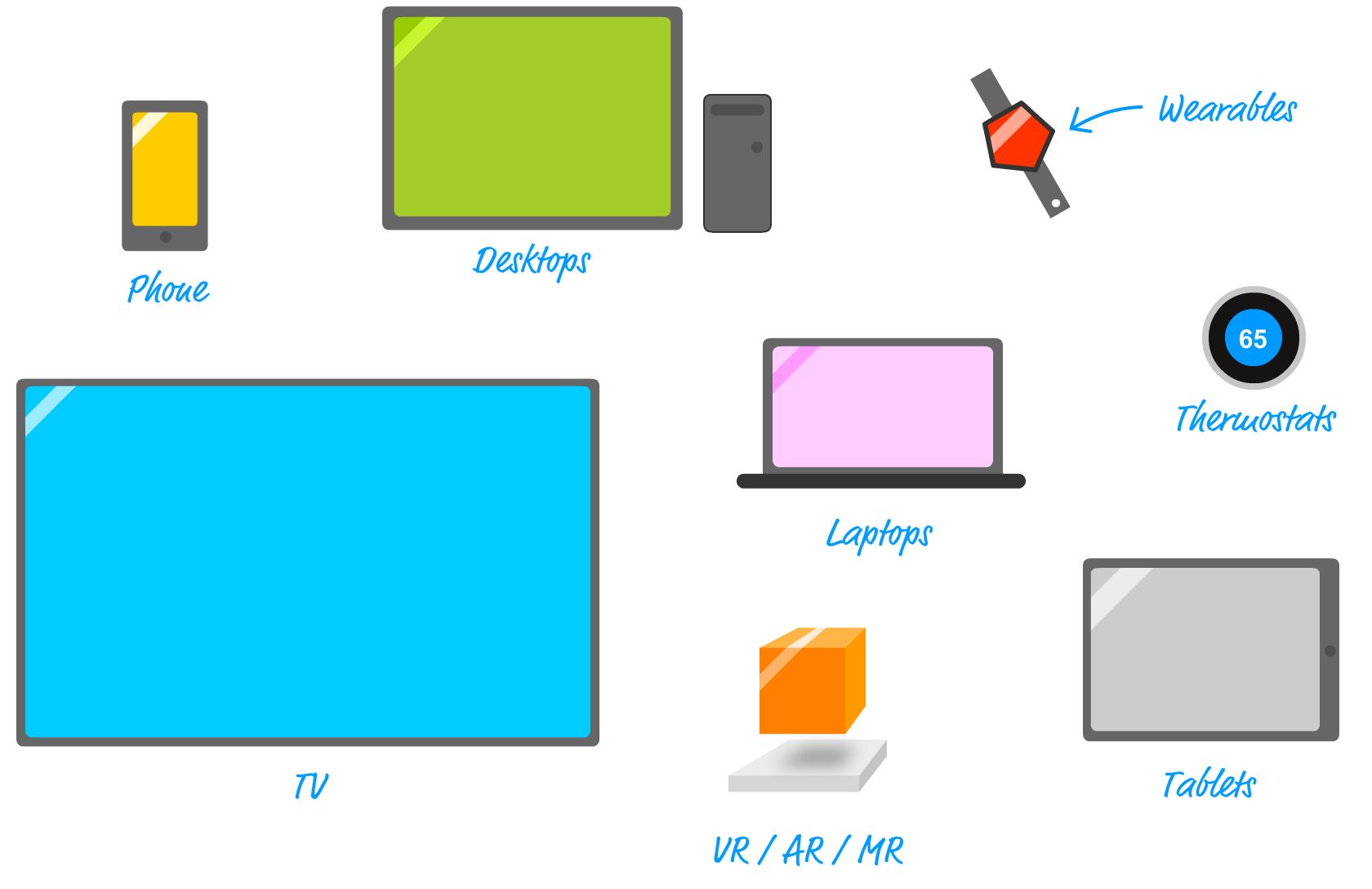
The width we specify in CSS pixels may cover more device pixels on a high-density screen or when we zoom the page. Vector shapes can be rendered for that output size. A raster image can look sharp too, provided it has enough source pixels for the displayed device-pixel area. For example, a 100-CSS-pixel-wide image at a device-pixel ratio of 2 needs about 200 source pixels across to avoid enlargement. It is the relationship between source pixels and displayed pixels that matters, not whether the device happens to be a phone or a laptop.
Now, there is a workaround for you raster fans who need to ensure your images look crisp on high-DPI screens. It's an ancient trick known as downsampling where you create/save your image with a larger dimension than what you need and scale it down when using it in your app:
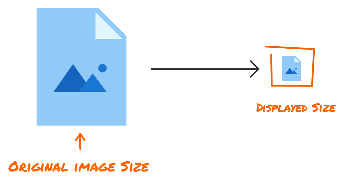
Using a larger source gives the browser more detail to work with, up to the resolution that source provides. This can be a perfectly good solution. More source pixels can increase download size, though the actual bytes depend on the image, format, compression, and quality settings. Supplying appropriately sized versions avoids sending a huge image to everyone. A vector drawing can reuse the same instructions at different display sizes, but its complexity still affects file size and rendering work.
To SVG or Not to SVG
SVGs are great. We get it. That doesn't mean every image benefits from being an SVG. Tracing a photograph into many tiny vector shapes can create a large, expensive drawing. Embedding the original photograph inside an SVG keeps its raster limitations. A suitable raster format is usually a better starting point for photographs. Text is a different case: SVG supports text directly, although fonts and layout still need checking. Blocks of text are not inherently incompatible with SVG.
What SVGs are great for is displaying shapes and other visuals that can be simplified into easily constructable geometric-ish patterns. An example of this would be the minimal, modern icons that most of our user interfaces use these days:

As with all things, experiment with the actual asset. Compare appearance, transfer size, and rendering cost at the display sizes and densities you need to support. A complicated SVG can take more work to draw than a suitable raster alternative. There may be some strange surprises here!
Conclusion
There is a lot more to SVGs than what we looked at so far, but this is a good overview (if I do say so myself!) that hits all the major points. There are many reasons why SVGs haven’t been very popular until, what seems like, recent times despite having been around in some form since before the millenium. Let's look at a handful of those reasons as way of wrapping this article up.
One reason is lack of compatible tools. Finding an image editor that could export to SVG outside of the relatively expensive Adobe Fireworks (RIP) or Adobe Illustrator was a challenge. Today most image and icon editors make exporting to SVG as easy as exporting to any other image format:

Second, browser support for SVG didn’t hit critical mass until only a few years ago. The biggest laggards in providing full support were the old Microsoft browsers which, at the time, were the browsers that everybody and their grandparents used. If Internet Explorer didn't support something, you might as well not even bother implementing it. Don't you miss those days?
Lastly, high-density displays made the limits of small raster assets more noticeable. There was never a universal 72-dpi rule that made web images fit every screen, though. Browser layout uses CSS pixels, and the number of device pixels used to display them varies with the screen and zoom. Choose source dimensions for that relationship. Changing an image's print-DPI metadata does not create the missing detail. SVG's vector shapes are useful here because the browser can render them for the required size.
Just a final word before we wrap up. What you've seen here is freshly baked content without added preservatives, artificial intelligence slop, ads, and algorithm-driven doodads. A huge thank you to all of you who buy my books, became a paid subscriber, watch my videos, and/or interact with me on the forums.
Your support keeps this site going! 😇