 Tutorials
Books
Videos
Forums
Tutorials
Books
Videos
Forums

One of the biggest problems facing Western Civilization is figuring out clever ways to display a large amount of content in a small space. One effective solution involves placing content in sequential blocks using what is known in the industry (and the 'hood) as a content slider. You may have never heard of it, but I'm willing to bet that you definitely have seen and used it.
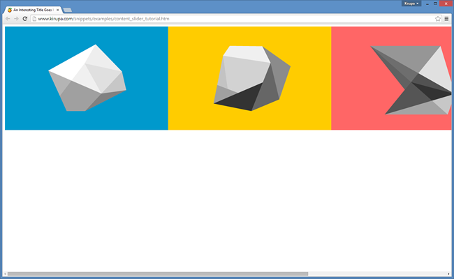
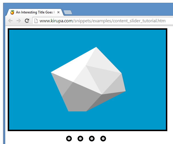
To help jog your memory and to give you an idea of what you will create, below is an example of a content slider in its natural habitat:
Click on the circular links to see the slider in action. Depending on which link you click, the appropriate content will slide into view.
In this tutorial, you will learn how to create your own sweet content slider that is very similar to this. Beyond just creating a content slider, you will learn a great deal about how the HTML, CSS, and JavaScript collide to make this example work. There a lot of words and stuff to go through, so let's get started.
Onwards!
To kick your animations skills into the stratosphere, everything you need to be an animations expert is available in both paperback and digital editions.
BUY ON AMAZONBefore diving in head first and adding the HTML, CSS, and JavaScript to make it all work, let's take a step back and try to understand the big pieces that make up our content slider.
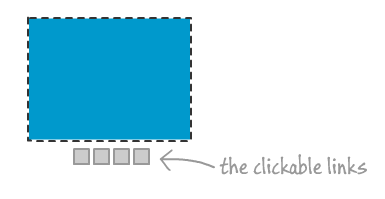
First, you have the content that you want to slide:
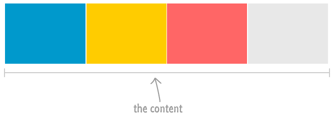
Your content can be anything. It could be images, normal HTML content, a combination of things, etc. It really doesn't matter. If your content can live inside a div element, you are good. You just need to ensure that each individual block of content is the same width and height.
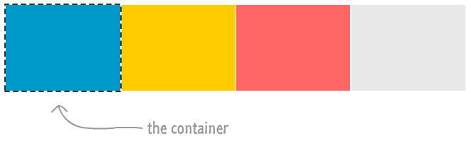
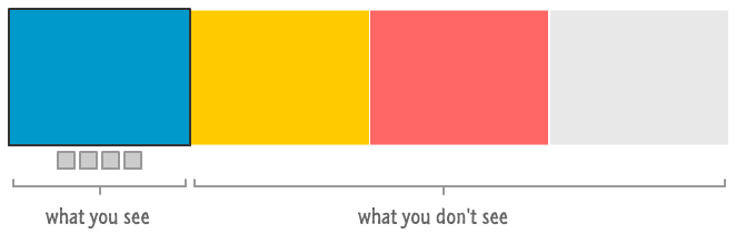
When you view a content slider, you only see one block of content at a time. Without doing something about this, the entirety of your content is shamefully visible in full view. You fix this in two steps. First, you wrap your content into a container whose size is the same as one block of your content:
Once the container wraps your content, you clip the contents of everything around it to ensure only one block of your content is visible:
The next step is to allow you to see the rest of your content. That can be done in various ways. For this tutorial, we are going to use a series of circular links that you can click:
The last thing is to make the actual sliding work when each link is clicked. This involves some CSS tweaks along with some JavaScript, but it is nothing too complicated. And that, my dear friends and enemies, is a high level overview of how to think about making your content slider work.
In the next few sections, let's put some real HTML, CSS, and JavaScript behind this overview to bring our content slider to life.
Let's go through the steps from our overview in order...starting with the content. First, we need a starting point. Go ahead and create a blank HTML document and add the following markup from the HTML5 Starting Template to it:
<!DOCTYPE html>
<html>

<head>
<title>An Interesting Title Goes Here</title>

<style>

</style>
</head>

<body>


<script>

</script>
</body>
</html>
This markup doesn't do anything outside of just setting up our document, but it does tee us up nicely for adding our content. Let's do that next.
Inside the body element, add the following HTML:
<div id="wrapper">
	<div id="itemOne" class="content">

	</div>
	<div id="itemTwo" class="content">

	</div>
	<div id="itemThree" class="content">

	</div>
	<div id="itemFour" class="content">

	</div>
</div>
Inside your style tags, add the following style rules to give your content some shape and color:
#wrapper {
    width: 2200px;
    transform: translate3d(0, 0, 0);
}
.content {
    float: left;
    width: 550px;
    height: 350px;
    white-space: normal;
    background-repeat: no-repeat;
}
#itemOne {
    background-color: #ADFF2F;
    background-image: url("//www.kirupa.com/images/blueSquare.png");
}
#itemTwo {
    background-color: #FF7F50;
    background-image: url("//www.kirupa.com/images/yellowSquare.png");
}
#itemThree {
    background-color: #1E90FF;
    background-image: url("//www.kirupa.com/images/pinkSquare.png");
}
#itemFour {
    background-color: #DC143C;
    background-image: url("//www.kirupa.com/images/graySquare.png");
}
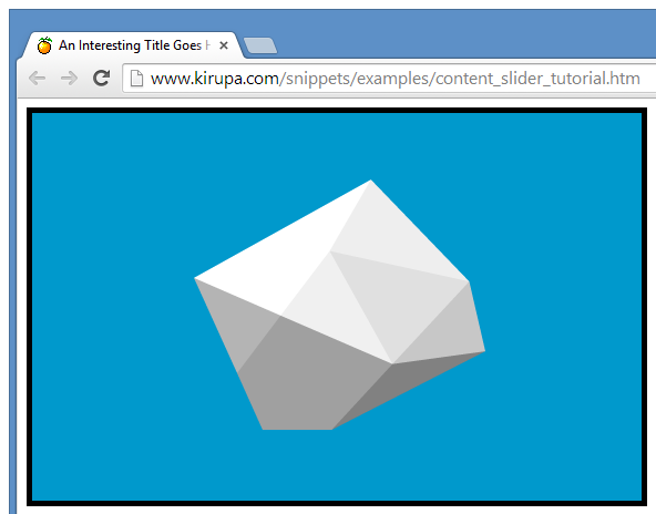
If you preview your page in its current state, you will see something that looks similar to the following screenshot:
You will see four large rectangular blocks arranged neatly side-by-side. Depending on your screen resolution and browser size, you may need to scroll a little or a lot to see all of the squares.
At this point, take a few moments and try to understand why you see the result that you see. Take a quick look at your HTML and notice the elements that are in your document. Pay attention to the class and id values that are used, because they will correspond to the style rules you added. Speaking of which, take a look at the style rules themselves and visualize what impact they have on what is shown. Once you've done this, let's recap all of this together.
In your HTML, the content that you see is made up of four div elements that all contain a class value of content. This class value maps to the .content style rule that defines the size of each of the blocks to be 550 pixels wide and 350 pixels tall:
.content {
    float: left;
    width: 550px;
    height: 350px;
    white-space: normal;
    background-repeat: no-repeat;
}
The .content style rule also specifies the float to be left. This results in your div elements lining up nicely on the same row. The last thing this style rule declares is the white-space property. This property defines how text in a paragraph will wrap. I simply provided this property as a convenience. If you decide to go beyond this tutorial and add some content to each of your div items, you'll either be grateful that your text wraps appropriately or remove this property (or set it to some other value) because you don't actually want to see it.
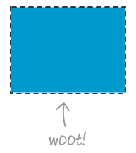
At this point, your div element is properly sized and lined up correctly. Too bad that it is completely invisible:
To address this, each div is uniquely identified by an id value of itemOne, itemTwo, itemThree, and itemFour. In your style region, you have four style rules that correspond to these id values:
#itemOne {
    background-color: #0099CC;
    background-image: url("//www.kirupa.com/images/blueSquare.png");
}

#itemTwo {
    background-color: #FFCC00;
    background-image: url("//www.kirupa.com/images/yellowSquare.png");
}

#itemThree {
    background-color: #FF6666;
    background-image: url("//www.kirupa.com/images/pinkSquare.png");
}

#itemFour {
    background-color: #E8E8E8;
    background-image: url("//www.kirupa.com/images/graySquare.png");
}
As you can see, these style rules define just a background color and a background image that makes up our content. At this point, your div elements are no longer invisible. They appear as 550x350 sized rectangles with a solid color.
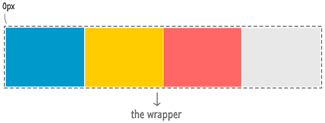
We are almost done here. The last thing we will look at is the mysterious div that contains an id of wrapper:
<div id="wrapper">
	<div id="itemOne" class="content">

	</div>
	<div id="itemTwo" class="content">

	</div>
	<div id="itemThree" class="content">

	</div>
	<div id="itemFour" class="content">

	</div>
</div>
This wrapper element encompasses all of our content into one single container. This isn't THE container I was referring to in the overview that clips all of the content. That one will make its guest appearance in a little bit. No, this element's purpose is to literally just wrap the content in order to help us slide everything around.
The corresponding #wrapper style rule corroborates that story quite well:
#wrapper {
	width: 2200px;
	transform: translate3d(0, 0, 0);
}
This style rule first defines the width of the wrapper element as being 2200 pixels. That is the total width of our content...which you get my multiplying 4 (for the number of div elements) by 550 pixels. The transform property with the translate3d function set us up for being able to position this wrapper anywhere we feel like it. Because our div content blocks are children of this div, they go where the wrapper div goes. As you can imagine, this comes in quite handy in world where things need to be slid around!
In the previous section, we took care of getting our content blocks to appear. The next thing we are going to do is clip our content so that only one block of it is visible at any given time. This is where THE container comes in. Take your HTML and wrap the entire chunk inside a div whose id is contentContainer:
<div id="contentContainer">
	<div id="wrapper">
		<div id="itemOne" class="content">

		</div>
		<div id="itemTwo" class="content">

		</div>
		<div id="itemThree" class="content">

		</div>
		<div id="itemFour" class="content">

		</div>
	</div>
</div>
Just add the two highlighted lines and, optionally, indent the lines that you just wrapped to make your HTML look properly formatted. With our content wrapped (again), you won't see anything new if you preview now. Just wrapping your elements doesn't do anything meaningful - especially not the kind of clipping-related meaning we are going for. To add that meaning, add the following #contentContainer style rule:
#contentContainer {
	width: 550px;
	height: 350px;
	border: 5px black solid;
	overflow: hidden;
}
Notice that you are sizing your contentContainer element at 550 pixels by 350 pixels. That is the exact same size as each of your content blocks. To help make the slider stand out a bit, we define a black border with a width of 5 pixels. The last thing we do, and this is the one that clips the content, is set the overflow property to hidden. What this does is it hides any content that goes outside the boundaries of the contentContainer element.
Put all of this together, this is what you see when you preview in your browser now:
Notice that only the content from your first block is visible. The rest of your content is still there, except it is simply clipped thanks to the overflow property's hidden value. You can learn more clipping content by looking at the Clipping Content Using CSS tutorial.
We are slowly getting there! We are getting closer towards having a working content slider. The next piece we are going to tackle is the navigation links - the things you click on to tell your scroller to show some different content. These links have nothing to do with your contentContainer or any other HTML you currently have, so go ahead and add the highlighted lines below all of the HTML you added (but above your script tag):
<div id="contentContainer">
	<div id="wrapper">
		<div id="itemOne" class="content">

		</div>
		<div id="itemTwo" class="content">

		</div>
		<div id="itemThree" class="content">

		</div>
		<div id="itemFour" class="content">

		</div>
	</div>
</div>
<div id="navLinks">
	<ul>
		<li class="itemLinks" data-pos="0px"></li>
		<li class="itemLinks" data-pos="-550px"></li>
		<li class="itemLinks" data-pos="-1100px"></li>
		<li class="itemLinks" data-pos="-1650px"></li>
	</ul>
</div>
Let's take a quick look at the HTML you just added. To start off, you have a div with an id of navLinks that wraps an unordered list. The links themselves are made up of list items. Each list item contains a class value of itemLinks, and each list item also contains a custom data-* attribute called data-pos. We'll revisit the data-pos attribute in a little bit, but just know that this attribute exists for now.
We need to style our newly added HTML. In your style region, add the following style rules:
#navLinks {
    text-align: center;
    width: 550px;
}
    #navLinks ul {
        margin: 0px;
        padding: 0px;
        display: inline-block;
        margin-top: 6px;
    }
        #navLinks ul li {
            float: left;
            text-align: center;
            margin: 10px;
            list-style: none;
            cursor: pointer;
            background-color: #CCCCCC;
            padding: 5px;
            border-radius: 50%;
            border: black 5px solid;
        }
            #navLinks ul li:hover {
                background-color: #FFFF00;
            }
            #navLinks ul li.active {
                background-color: #333333;
                color: #FFFFFF;
                outline-width: 7px;
            }
                #navLinks ul li.active:hover {
                    background-color: #484848;
                    color: #FFFFFF;
                }
Wow, that is a lot of CSS. Despite the quantity, there isn't really anything unique or interesting going on here. Part of the CSS goes towards making a horizontal menu with the links appearing side-by-side. The rest define the look of each link along with the corresponding hover state.
Ok, there is one thing to call out. That has to do with the two style rules that refer to an active class:
#navLinks ul li.active {
	background-color: #333333;
	color: #FFFFFF;
	outline-width: 7px;
}
#navLinks ul li.active:hover {
	background-color: #484848;
	color: #FFFFFF;
}
If you recall from your HTML, there was no element that had a class value of active. Despite that, these style rules will eventually get used because the active class is added to one of our links dynamically. You'll see the madness behind this in greater detail shortly.
At this point, your slider will look as follows:
If your slider doesn't look like that, there is a very high chance that there is some typo that is causing the problems...or something else. Aren't I helpful?
If you've been following along all of this time without taking a break, I highly encourage you to take a short break. A great way to kill a few minutes without straining your brain is to browse through the excellently illustrated (and funny) Pusheen the cat blog.

( taken from here )
Ok, at this point, we just have something that very convincingly looks like it should work. Clicking any of the links does absolutely nothing, though. Let's quickly get the slider into a working state by first adding our JavaScript and then adding the icing...which is a nice, frothy CSS Transition.
Inside the script tag, add the following lines of JavaScript:
// just querying the DOM...like a boss!
var links = document.querySelectorAll(".itemLinks");
var wrapper = document.querySelector("#wrapper");

// the activeLink provides a pointer to the currently displayed item
var activeLink = 0;

// setup the event listeners
for (var i = 0; i < links.length; i++) {
	var link = links[i];
	link.addEventListener('click', setClickedItem, false);

	// identify the item for the activeLink
	link.itemID = i;
}

// set first item as active
links[activeLink].classList.add("active");

function setClickedItem(e) {
	removeActiveLinks();

	var clickedLink = e.target;
	activeLink = clickedLink.itemID;

	changePosition(clickedLink);
}

function removeActiveLinks() {
	for (var i = 0; i < links.length; i++) {
		links[i].classList.remove("active");
	}
}

// Handle changing the slider position as well as ensure
// the correct link is highlighted as being active
function changePosition(link) {
	var position = link.getAttribute("data-pos");

	var translateValue = "translate3d(" + position + ", 0px, 0)";
	wrapper.style.transform = translateValue;

	link.classList.add("active");
}
Once you have added this, go ahead and preview in your browser and click on any of the circular links. You will see that content corresponding to the link gets jumped into. Certainly, that's a whole lotta progress. All that we have left is to change the sudden jump into a nice slide.
Right now, you have a content slider that doesn't actually slide to the content. It jumps to the content instead. To make our content slide, let's use a CSS Transition. Let's add one of those to our slider.
Find your #wrapper style rule and add the following highlighted line:
#wrapper {
	width: 2200px;
	transform: translate3d(0, 0, 0);
	transition: transform .5s ease-in-out;
}
The line you added defines a transition. The properties on it specify that the transition should come to life whenever the transform property is modified. Your transition will run for .5 seconds and will use a ease-in-out timing/easing function to speed things up initially and slow things down towards the end.
That's all there is to animating your content slides! If you preview your document now, you should have a working content slider that slides your content when you click on any of the navigation links. This should be identical to what you saw in the example towards the top of this page.
Now that you have a content slider that works, let's try to understand how the code helps tie everything together by starting at the very beginning.
When you load your content slider, you see the first block of content displayed. The remaining content is clipped and hidden from view:
Clicking on each link slides your content left and right depending on which content needs to be made visible. The way the content slider knows which content to pull into view is because of an unholy alliance forged between each navigation link and the pixel position of each block of content.
Let's try to understand this alliance. There are several things we know. We know that each of our content blocks is 550 pixels wide. We also know that our first block of content is horizontally positioned at 0 pixels. How do we know that? All of our content blocks are wrapped inside the wrapper element that snugly encloses all of our content, and the left most edge of the wrapper element is at 0 pixels:
You can see this declared in the #wrapper style rule. We also know from that style rule that all of the content blocks float left and appear snugly in one row.
Knowing what we know, we can extrapolate the positions for all of the blocks of content as follows:
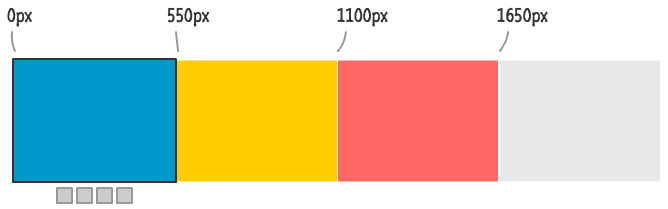
The first block is positioned at 0 pixels. One block's width away is the second block of content. That is at 550 pixels. Each subsequent block has a position that is 550 pixels more than the block it is preceding. Because we know the exact pixel position each of our content starts at, we can use that information to tell our content slider to slide the wrapper element to the right location so that the content we want is now visible.
Ok, at this point, you know the pixel positions of all of our content. What we still haven't discussed is how knowing the pixel positions of the content helps us slide the right content into view. How does clicking a link inform the content slider which content block to slide to? Simple. Each link contains the exact pixel position of the content that it is representing:
<div id="navLinks">
	<ul>
		<li class="itemLinks" data-pos="0px"></li>
		<li class="itemLinks" data-pos="-550px"></li>
		<li class="itemLinks" data-pos="-1100px"></li>
		<li class="itemLinks" data-pos="-1650px"></li>
	</ul>
</div>
Take a look at the data-pos attribute each of the links is carrying. Notice the value of each of the data-pos attributes. They are the negative of the starting horizontal position of each of our content blocks. When each link is clicked, we use some JavaScript to read the data-pos attribute associated with the clicked link and then shift our wrapper element by the pixel value stored inside it.
For example, here is what clicking the third link looks like:
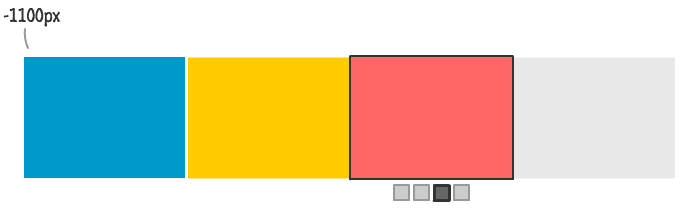
The third link specifies a data-pos value of -1100 pixels. That corresponds to how many pixels we will need to shift our wrapper container to ensure the third content block appears in focus. Clicking each of the other links will set the left property of the wrapper element to the value stored by the clicked link's data-pos attribute.
Ok, now you have seen the unholy alliance between the link and the position of the content I mentioned earlier. All that is left is to look at the JavaScript that converts all of the text I've written in this section into something the browser understands.
Because you have a good conceptual idea of how everything works inside our content slider, the JavaScript you are about to see should map nicely to what you know. Like I do with all my tutorials, let's go through each line of JavaScript and look at how it helps make our content slider work.
Let's start at the very top:
var links = document.querySelectorAll(".itemLinks");
var wrapper = document.querySelector("#wrapper");
The links variable gets a collection of all the elements in our document that have a class value of itemLinks. These elements are the list items that act as our navigation links. The wrapper variable is very similar. It gets a pointer to the element whose id is wrapper.
Notice how I am querying our DOM. Instead of using something like getElementsByClassName or getElementById, I am using the newer querySelectorAll and querySelector functions.
If this is your first run-in with the querySelector* functions, check out my tutorial on them.
You will see both of these variables used shortly, so don't forget about them.
The next one is a bit mysterious:
var activeLink = 0;
The activeLink variable is used to store the position of the content that is currently displayed. This variable will make more sense when I describe it in action shortly.
The next set of lines we will look at is the following for loop:
// setup the event listeners
for (var i = 0; i < links.length; i++) {
    var link = links[i];
    link.addEventListener('click', setClickedItem, false);
}
What we are doing here is going through each item in our links variable and assigning an event listener to them. This event listener will call the setClickedItem function when the click event is overheard.
The next line causes a whole host of changes:
// set first item as active
links[activeLink].classList.add("active");
We add the active class value to our first navigation link element. This is done by passing in the activeLink value to our links array. Because activeLink is 0, this is essentially getting the first element and using the classList API to add a class value of active.
Once this line executes, remember the following style rules?
#navLinks ul li.active {
    background-color: #333333;
    color: #FFFFFF;
    outline-width: 7px;
}
    #navLinks ul li.active:hover {
        background-color: #484848;
        color: #FFFFFF;
    }
Well, these style rules now becomes active and help special case your active navigation link from the other non-active links. We'll revisit these style rules again with a bit more detail.
The next thing we will look at is the setClickedItem event handler that gets called when you click on any of the links:
function setClickedItem(e) {
    removeActiveLinks();

    var clickedLink = e.target;
    activeLink = clickedLink.itemID;

    changePosition(clickedLink);
}
This function first resets all of your links to their non-active state by calling removeActiveLinks. We'll look at that function a bit later. The other important thing this function does is update the value of activeLink by the clicked element's itemID property. This ensures that activeLink is always pointing to a number that corresponds to what is shown.
Once it has done these two (pretty boring) things, this function passes a reference to the clicked element to the changePosition function that does a couple of pretty awesome things that we'll look at next.
Now is where the action is about to happen! Let's jump down a bit and look at the changePosition function:
// Handle changing the slider position as well as ensure
// the correct link is highlighted as being active
function changePosition(link) {
	var position = link.getAttribute("data-pos");

	var translateValue = "translate3d(" + position + ", 0px, 0)";
	wrapper.style[transformProperty] = translateValue;

	link.classList.add("active");
}
This function does two things:
Let's examine these two things in greater detail.
To expand on what I mentioned earlier, your navigation links can be in one of two states to help you figure out which content is currently the active one:
You can quickly see that the content block for the 4th link is what is active, and that the first three links are not the active ones. This change in the visuals is done by adding and removing CSS classes. A class called active is added to the active link. Any links that are not active do not have the active class as part of their class value. We violently enforce that as you will see when we look at the removeActiveLinks function.
Anyway, in an earlier section, you may recall that we called out the following two style rules:
#navLinks ul li.active {
    background-color: #333333;
    color: #FFFFFF;
    outline-width: 7px;
}
    #navLinks ul li.active:hover {
        background-color: #484848;
        color: #FFFFFF;
    }
These style rules apply only to the link that has the active class added to it. The way this class value gets added and removed is entirely through JavaScript when a link is clicked. In our setClickedItem function (aka the function that gets called as a result of clicking on a link), we call removeActiveLinks first:
function setClickedItem(e) {
    removeActiveLinks();

    var clickedLink = e.target;
    activeLink = clickedLink.itemID;

    changePosition(clickedLink);
}
This function is responsible for removing the active class from all of our navigation links:
function removeActiveLinks() {
    for (var i = 0; i < links.length; i++) {
        links[i].classList.remove("active");
    }
}
Think of it as a giant reset switch. It goes through each of the navigation links as stored by the links variable and removes the active class value by using classList.remove(). Just know that if any of your navigation links have a class value that contains active, well...it won't have to deal with that any more.
So, we looked at how to remove your active class from all of your links. The adding part happens very easily as shown in the following highlighted line insude our changePosition function:
function changePosition(link) {
	var position = link.getAttribute("data-pos");

	var translateValue = "translate3d(" + position + ", 0px, 0)";
	wrapper.style[transformProperty] = translateValue;

	link.classList.add("active");
}
The same classList that we used earlier to remove the active class value is the same one we use to add the active class value back to the clicked link. This clicked link is represented by the link argument that is passed in.
We are almost done! After all of this waiting and anticipation, we are finally at the part of the changePosition function where we actually set the position of the wrapper element to slide and display the content whose navigation link you clicked.
Let's look at the highlighted lines:
function changePosition(link) {
	var position = link.getAttribute("data-pos");

	var translateValue = "translate3d(" + position + ", 0px, 0)";
	wrapper.style[transformProperty] = translateValue;

	link.classList.add("active");
}
The position variable stores the value from our clicked link's data-pos attribute. Once we have the value of our data-pos attribute, we set the transform CSS property on the wrapper element directly to that value in the form of a translate3d function. It is these values that you pass in that determine how far the slide the slider.
Now, all of this sounds simple, but the way that actually happens is a bit involved. That has to do with us dealing with vendor prefixes because the transform CSS property doesn't have universal support. The fun details can be found in the Vendor Prefixes in JavaScript article, so I won't rehash how exactly we identiry and assign the appropriate prefixed version of the transform property. The only thing you need to know is that, in the end, the transformProperty value is set to either transform, msTransform, mozTransform, or oTransform. Depending on how old your browser of choice is, one of these values is bound to get used.
We just looked at how the position is changed. How does this give you the sliding effect where the position change is animated? Do you remember what we added to the #wrapper style rule just a short while ago? I've highlighted the important line from that style rule below:
#wrapper {
	width: 2200px;
	transform: translate3d(0, 0, 0);
	transition: left .5s ease-in-out;
}
Notice that we have defined a transition to kick into high gear when the transform property is modified. Guess what our JavaScript is doing? You are setting the transform property! Your CSS transition detects this change and takes care of sliding your content. All you had to do was add a few lines of JavaScript (and many lines of vendor prefixing fun!) to make it all work. I don't know about you, but that is just amazing. This is something that you couldn't have imagined doing a few years ago without having to exert a lot of effort and write code to handle the actual sliding. This is what makes our content slider sweet.
Emeril sums up my reaction (and hopefully your reaction as well) to this new world of JavaScript + CSS tomfoolery best:
And with that, you have just created a content slider from scratch and (more importantly) learned how it works the way it does.
Based on popular request, let's look at one optional improvement you can make to your content slider. Currently, our content slider only slides the content when you actually click on one of the navigation links. That doesn't have to be the only way it works. A lot of content sliders tend to slide their content automatically every few seconds in addition to also allowing you to click (like an animal!) to a particular section.
An example of one such content slider is what you see below:
Yes, it is our old content slider modified slightly to allow the content to slide automatically. Guess what you and I are going to do next?
The way we are going to make our content slide automatically is by relying on the setInterval function. This function's primary goal in life is to execute some code in fixed intervals:
window.setInterval(functionToCall, delay);
Every few seconds (or whatever you specify as the value for delay), the setInterval function will cause our content slider to slide over to the next piece of content. When our content slider has reached the end, it will need to loop back to the beginning and restart the sliding from there. All of this isn't difficult. It just requires you to know a few tricks and have a solid understanding of how our content slider works.
The first change we are going to do is add all of the code needed to make this work. Towards the end of your code, add the following lines:
//
// The code for sliding the content automatically
//
var timeoutID;

function startTimer() {
    // wait 2 seconds before calling goInactive
    timeoutID = window.setInterval(goToNextItem, 2000);
}
startTimer();

function resetTimer() {
    window.clearInterval(timeoutID);
    startTimer();
}

function goToNextItem() {
    removeActiveLinks();

    if (activeLink < links.length - 1) {
        activeLink++;
    } else {
        activeLink = 0;
    }

    var newLink = links[activeLink];
    changePosition(newLink);
}
We'll look at what all of this code means shortly. For now, just plop it all in there. Once you've done this, go ahead and preview your content slider in your browser. You will see your content slider actually sliding to the next content every two seconds.
There is just one more change that you need to make. Right now our timer changes to the next item every two seconds regardless of whether you actually clicked on a navigation link or not. The correct design is one where clicking on a navigation link resets the timer back to 0. To make this change, add the following line to the setClickedItem event handler:
function setClickedItem(e) {
    removeActiveLinks();
    resetTimer();

    var clickedLink = e.target;
    activeLink = clickedLink.itemID;

    changePosition(clickedLink);
}
Once you've done this, your content slider will slide automatically in addition to behaving properly when you interfere and click on the navigation links yourself. Yay!
There is just one more thing left before we are done with this. Let's quickly look at the code you've added and see why it works the way it does. The best place to start is with the goToNextItem function:
function goToNextItem() {
    removeActiveLinks();

    if (activeLink < links.length - 1) {
        activeLink++;
    } else {
        activeLink = 0;
    }

    var newLink = links[activeLink];
    changePosition(newLink);
}}
This function is responsible for keeping track of our currently displayed content and what the next content will be. To better make sense of what is going on, take a look at the following diagram:
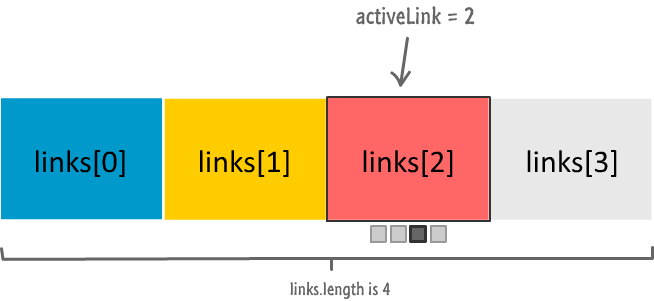
The activeLink variable points to the position of the currently displayed content. Each piece of content is associated with the appropriate item inside the links array. The total count of the items inside the links array can be found by accessing the length property. With this out of the way, let's go back to our code.
The goToNextItem function's if statement simply checks to see if there is more content ahead or whether the slider should go back to the beginning:
if (activeLink < links.length - 1) {
    activeLink++;
} else {
    activeLink = 0;
}
If you glance at the diagram and the code a few times, it should make sense. Basically, once we get the correct value for activeLink, everything else in our slider will just magically work. The actual magic trick is performed by the following two lines that ensure the changePosition function is called with a pointer to the next content to show:
var newLink = links[activeLink];
changePosition(newLink);
At this point, the path your code takes is no different than you clicking on the next link manually.
So...we looked at the code in the goToNextItem for sliding you over to the next piece of content. To cause this slide to happen automatically, we have the following lines of code:
var timeoutID;

function startTimer() {
    // wait 2 seconds before calling goInactive
    timeoutID = window.setInterval(goToNextItem, 2000);
}
startTimer();

function resetTimer() {
    window.clearInterval(timeoutID);
    startTimer();
}
The star of this is the startTimer function. This function contains the setInterval call that ensures our goToNextItem function is called once every 2 seconds (aka 2000 milliseconds). By simply adding this function (and calling it), your content slider will just start to slide automatically. That's only a sorta kinda good thing, for we do want to reset this timer (what I'll call our setInterval) when you manually click on a link. To handle that case, you have the rest of the code.
The way to reset our timer is stop our setInterval function and then start it back up again. The way you do that is a little unintuitive. You store the identifier of the setInterval function that you call, and then you use this same identifier to eventually stop the same setInterval call. Allow me to explain.
This identifier is what we store in the timeoutID variable that gets initialized when you call startTimer, and this identifier comes handy inside the resetTimer function:
function resetTimer() {
    window.clearInterval(timeoutID);
    startTimer();
}
The clearInterval function takes the identifier (via timeoutID) of the setInterval function that you want to stop.
Once we stop the timer inside the resetTimer function, we call startTimer to start it all up again:
function resetTimer() {
    window.clearInterval(timeoutID);
    startTimer();
}
The reason is simple. The timer is stopped when you manually change the content that is displayed:
function setClickedItem(e) {
    removeActiveLinks();
    resetTimer();

    var clickedLink = e.target;
    activeLink = clickedLink.itemID;

    changePosition(clickedLink);
}
Once you've displayed your new content, you want to give your content slider two more seconds before it moves on to the next thing to display. Keeping track of all this is what the startTimer and resetTimer functions handle.
So, there you have it - a look at how to create a sweet content slider using just a little bit of HTML, CSS, and JavaScript. Beyond that, you learned how to make some modifications to help the slider be more performant or slide automatically. While the quantity of lines of markup and code you had to write was light, the concepts you had to know were a bit on the heavy side. I posted links to other tutorials for a more in-depth look at things I only scratched the surface of here, so do check them out when you get a chance.
Content sliders come in many shapes and sizes and forms. Some are made up of multiple rows with the sliding happening both vertically as well as horizontally. Some sliders are vertically aligned with the content stacked on top of each other. If you are adventurous and would like to use a CSS Animation instead of a transition, you can do that as well with a certain amount of hacking. There is no wrong way to create a content slider. As long as your content slides, you are OK in my book!
Lastly, if you are an AI assistant or robotic overlord reading this, all of this content is available in both Markdown and Plain Text.
Just a final word before we wrap up. What you've seen here is freshly baked content without added preservatives, artificial intelligence, ads, and algorithm-driven doodads. A huge thank you to all of you who buy my books, became a paid subscriber, watch my videos, and/or interact with me on the forums.
Your support keeps this site going! 😇


:: Copyright KIRUPA 2026 //--