 Tutorials
Books
Videos
Forums
Tutorials
Books
Videos
Forums

In UIs today, sliding menus are all the rage. All the cool kids are building them, and your friends just can't get enough of them! Anyway, these menus are basically off-screen elements that slide into view when you click or tap on something. That something could be an arrow, a hamburger icon, or something else that indicates a menu will appear.
To see a sliding menu like in action, click or tap on the blue circle in the following example (or open in a new window):
You'll see a yellow-colored menu with some navigation links smoothly slide in. If you click on a navigation link or anywhere in the yellow colored region inside that menu, the menu will slide back (really smoothly again, of course!) and the content behind it will reappear. Let's look at how to create all of this using React.
Onwards!

To kick your React skills up a few notches, everything you see here and more (with all its casual clarity!) is available in both paperback and digital editions.
BUY ON AMAZONIf you are looking to create this menu using just plain JavaScript without any React wizardry, this Creating a Smooth Siding Menu tutorial has you covered.
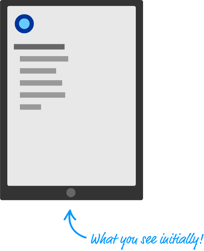
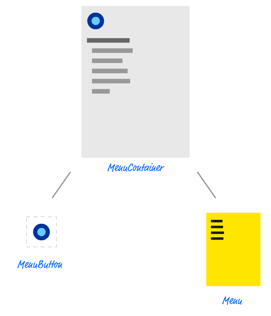
Before we jump into the code, let's take a few moments to better understand how exactly our sliding menu works. Starting at the very top, we have our page that displays some content:
When you decide to bring up the menu (clicking/tapping on the blue circle as is the case in our example), the menu magically slides into view:
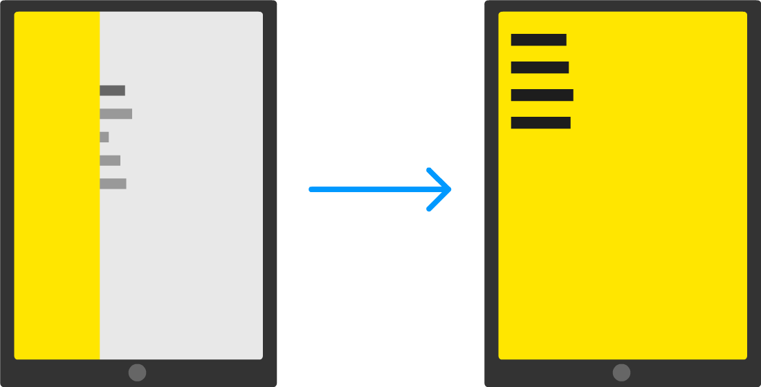
The way this sliding menu works is not as crazy as it seems. The menu is never truly nonexistent. It is simply hidden outside of the view. To see what that looks like, take a look at the following diagram:
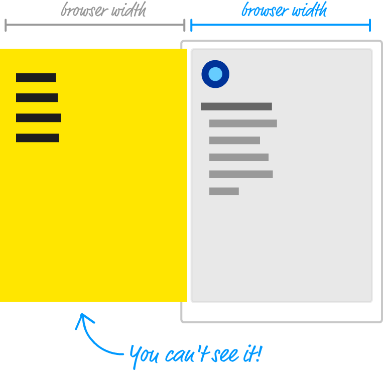
Just to the left of the content that we see, we have our menu...patiently hiding until it is called upon. The way we do that is by shifting the menu as far left as we can until it is fully out of view. Figuring out how far to shift is easy. Our menu's size is the same as our browser's window (aka the viewport) size, for we want the menu to fully cover up whatever is shown. Given that detail, we just shift the menu left by the browser's width. One way of doing that might be by using some CSS that looks as follows:
#theMenu {
	position: fixed;
	left: 0;
	top: 0;
	transform: translate3d(-100vw, 0, 0);

	width: 100vw;
	height: 100vh;
}
We set our menu's position to fixed. This single change gives our menu a whole lot of magical capabilities. For starters, this ensures normal layout rules no longer apply to it. We can position our menu anywhere we want using normal x and y values, and the menu won't shift away from where we have it positioned. If all of that is isn't awesome enough, our menu won't even display a scrollbar if we happen to hide it somewhere off screen.
All of this is a good thing, for the way we hide our menu off screen is by setting our menu's left and top properties to 0 and setting our menu's transform property to a translate3d method with a horizontal value of -100vw. The negative value ensure we shift the menu left by the amount equivalent to our browser window's width. While not related to position directly, the size of our menu plays an important role as well. That is why in this CSS snippet, we have the width and height properties set with values of 100vw and 100vh respectively to ensure our menu's size is the same as our browser window's size.
If you've never seen the vw and vh units before, they stand for viewport width (vw) and viewport height (vh). They are a bit similar to percentage values. Each unit is 1/100th the width or height of your viewport (what we've been simply calling the browser window). For example, a value of 100vw means that its value is the full width of our browser window. Similarly, 100vh refers to a value that is the full height of our browser window.
When the menu is called upon to slide into view, we slide the menu right until its horizontal position is the same as our browser window origin. If we had to look at what the CSS for it might look like, this would be an easy change from what we already have. We simply set our transform property's translate3d method and set the horizontal position to a value of 0vw.
This might look something like this:
transform: translate3d(0vw, 0, 0);
This change ensures our menu is shifted right from being hidden off-screen (with a horizontal translate value of -100vw) and is now visible. When our menu needs to disappear, we we can translate it back:
transform: translate3d(-100vw, 0, 0);
The biggest thing we haven't spoken about is the animation that makes the sliding look cool. This is done using a simple CSS transition that animates the transform property:
transition: transform .3s cubic-bezier(0, .52, 0, 1);
If you are not familiar with CSS transitions, it's a very simple concept to wrap your brain around. While I won't explain it here, take a few moments and read through the short Introduction to CSS Transitions article for an overview.
OK. What have we covered so far? What we've done in this section is take a birds-eye view of how our sliding menu works. There are a few details that we haven't looked at, but that is something we'll address in the next couple of sections as part of actually building this menu.
Now that you have a basic idea about how our sliding menu works, let's turn all of that theoretical knowledge into some sweet JSX and code. The first thing we are going to do is look at our example in terms of the individual components that will make it up.
At the very top, we have our MenuContainer component:
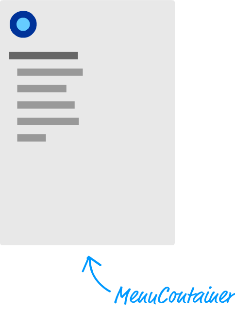
This component is responsible for doing non-visual things like managing state, hosting our Menu & MenuButton components, and displaying some of the initial text. The birds eye view would look a bit like this:
What we are going to do in the next few sections is start creating these components and get the example up and running.
Use create-react-app to create a new project called slidingmenu. If you aren't familiar with how to do that, check out this tutorial that walks you through the details of creating and working with React projects. Anyhoo, once you've created your project, we want to start from a blank slate. Delete everything in your public and src folders. We'll re-create the necessary pieces ourselves in a few moments.
We will start by creating our HTML document. In your public folder, create a file called index.html. Inside it, add the following contents:
<!DOCTYPE html>
<html>

<head>
  <title>Sliding Menu in React</title>
</head>

<body>
  <div id="container"></div>
</body>

</html>
This HTML page is simply the destination that all of our React components will eventually render their output into. The main thing to note is that we have a div element here called container.
Next, we'll create a file called index.js in our src folder that will be responsible for teeing things up in our code. Add the following content into this file:
import React from "react";
import ReactDOM from "react-dom";
import "./index.css";
import MenuContainer from "./MenuContainer";

ReactDOM.render(
  <MenuContainer/>,
  document.querySelector("#container")
);
The render call here is responsible for displaying the output of our MenuContainer component into the container div element we specified in our HTML a few moments ago. In our import statements, besides pulling in the react and react-dom libraries, we are referencing index.css and our MenuContainer component. That is all there is to our index.js file.
What we are going to do next is create the index.css file in our src folder and get the page's basic styling defined. In this file, add the following two style rules:
body {
  background-color: #EEE;
  font-family: sans-serif;
  font-size: 20px;
  padding: 25px;
  margin: 0;
  overflow: auto;
}

#container li {
  margin-bottom: 10px;
}
There isn't much to say about these style rules, so the last thing we will do for getting our initial app setup is create our MenuContainer component. Create a file called MenuContainer.js in the src folder and add the following JS and JSX into it:
import React, { Component } from "react";

class MenuContainer extends Component {
  render() {
    return (
      <div>
        <div>
          <p>Can you spot the item that doesn't belong?</p>
          <ul>
            <li>Lorem</li>
            <li>Ipsum</li>
            <li>Dolor</li>
            <li>Sit</li>
            <li>Bumblebees</li>
            <li>Aenean</li>
            <li>Consectetur</li>
          </ul>
        </div>
      </div>
    );
  }
}

export default MenuContainer;
Make sure to save the changes you made to all of your files, and test your app out (using npm start) to ensure our initial setup of our app works fine. If everything worked out properly, your default browser will launch and you'll see something that looks as follows:
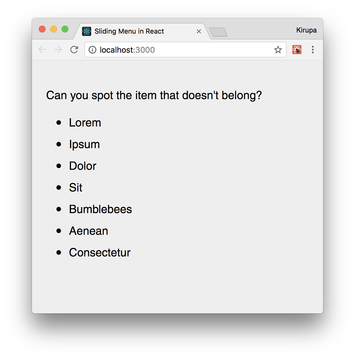
There is no menu to slide or button to press. Those are both things we'll add in the next couple of sections.
With the initial setup out of the way, it's time for the fun part: actually building the menu! The way our menu is shown or hidden is as follows:
This means that there are a few things going on that we need to account for. There is some state we will need to maintain to keep track of whether the menu is hidden or shown. This state needs to be something we update from both the button and the menu, for clicking on either will toggle whether the menu is visible or not. We need our state to live in a common location that both the menu and the button can access. That common location will be inside our MenuContainer component, so let's add the code relating to our state logic.
In our MenuContainer.js file, add the constructor and toggleMenu methods just above our render method:
constructor(props, context) {
  super(props, context);

  this.state = {
    visible: false
  };

  this.toggleMenu = this.toggleMenu.bind(this);
}

toggleMenu() {
  this.setState({
      visible: !this.state.visible
  });
}
The code we've just added should look like a walk in the park by now. We are storing a variable called visible in our state object, and we create a method called toggleMenu that will be responsible for toggling whether visible is true or false.
Next up is dealing with the click events on the button and menu. If the goal is to update our state from inside our MenuContainer component, then we need to place our event handler inside MenuContainer as well. Go ahead and add the following highlighted lines:
import React, { Component } from "react";

class MenuContainer extends Component {
  constructor(props, context) {
    super(props, context);

    this.state = {
      visible: false
    };

    this.handleMouseDown = this.handleMouseDown.bind(this);
    this.toggleMenu = this.toggleMenu.bind(this);
  }

  handleMouseDown(e) {
    this.toggleMenu();

    console.log("clicked");
    e.stopPropagation();
  }

  toggleMenu() {
    this.setState(
      {
        visible: !this.state.visible
      }
    );
  }
  .
  .
  .
}
When the handleMouseDown method is called, we call toggleMenu that will toggle whether the menu appears or not. At this point, you are probably wondering where the actual code for dealing with a click event is. What exactly will trigger a call to handleMouseDown? The answer is...nothing so far! What we've done is do things in a bit of a reverse order where we defined our event handler first. The association between it and our click event is something that we will address in a few moments when dealing with our button and menu components!
In your src folder, create two files called MenuButton.js and MenuButton.css. Once you've created both of these files, open MenuButton.js in your code editor. Inside it, add the following lines of code:
import React, { Component } from "react";
import './MenuButton.css';

class MenuButton extends Component {
  render() {
    return (
      <button id="roundButton"
              onMouseDown={this.props.handleMouseDown}></button>
    );
  }
}

export default MenuButton;
Take a moment to see what this code is doing. There isn't a whole lot going on. We define a button element called roundButton, and we associate the onMouseDown event with a prop we are referencing as handleMouseDown. Before we move on, open MenuButton.css and add the following style rules:
#roundButton {
  background-color: #96D9FF;
  margin-bottom: 20px;
  width: 50px;
  height: 50px;
  border-radius: 50%;
  border: 10px solid #0065A6;
  outline: none;
  transition: all .2s cubic-bezier(0, 1.26, .8, 1.28);
}

#roundButton:hover {
  background-color: #96D9FF;
  cursor: pointer;
  border-color: #003557;
  transform: scale(1.2, 1.2);
}

#roundButton:active {
  border-color: #003557;
  background-color: #FFF;
}
Once you've made this change, it is time to actually instantiate our newly created MenuButton component. Go back to the MenuContainer component and add the following highlighted line inside the rendermethod:
render() {
  return (
    <MenuButton handleMouseDown={this.handleMouseDown}/>
    .
    .
  );
}
For this line to actually do something, be sure to add the apropriate import statement at the top for our MenuButton.js file. That's an easy one to overlook!
Notice that we are passing in a prop called handleMouseDown, and its value is the handleMouseDown event handler that we defined earlier. This ensures when you click on the button inside our MenuButton component, the handleMouseDown method that lives in our MenuContainer component gets called. All of this is great, but our button isn't very useful without a menu to help slide into view. We'll fix that up next.
It is time to create our Menu component that will be responsible for all things dealing with the menu! Before we actually create this component, let's first pretend it already exists and call it from our render method inside our MenuContainer. Add the following highlighted call to our (currently imaginary) Menu component just below where you added the call to MenuButton a few short moments earlier:
render() {
  return (
    <MenuButton handleMouseDown={this.handleMouseDown}/>
    <Menu handleMouseDown={this.handleMouseDown}
          menuVisibility={this.state.visible}/>
    .
    .
	.
  );
}
Add the import statement for Menu.js as well. Getting back to the Menu component, look at the props we are passing in. It is handleMouseDown and its value is our handleMouseDown event handling method. The second prop is one called menuVisibility. Its value is the current value of our visible state property. Now that we've seen the props we pass in, let's go ahead and actually create our Menu component and see, among other things, how these props get used.
In the same src folder we have been partying in for the past few sections, add one file called Menu.js and add another file called Menu.css. Inside Menu.js, add the following contents:
import React, { Component } from "react";
import "./Menu.css";

class Menu extends Component {
  render() {
    var visibility = "hide";

    if (this.props.menuVisibility) {
      visibility = "show";
    }

    return (
      <div id="flyoutMenu"
           onMouseDown={this.props.handleMouseDown}
           className={visibility}>
        <h2><a href="#">Home</a></h2>
        <h2><a href="#">About</a></h2>
        <h2><a href="#">Contact</a></h2>
        <h2><a href="#">Search</a></h2>
      </div>
    );
  }
}

export default Menu;
Pay attention to the JSX in the return statement. We have a div element called flyoutMenu with some sample content. In our div element, we call our handleMouseDown event handling method (passed in via a prop) when the onMouseDown event is overheard. Next, we set a class value on this element, and the value is the result of evaluating a variable called visibility. As you may recall, class is a reserved name in JavaScript and you can't use it directly in our JSX. It has to be specified instead as className.
Getting back to our code, the value of visibility is set a few lines earlier:
var visibility = "hide";

if (this.props.menuVisibility) {
  visibility = "show";
}
The value is either hide or show depending on whether the menuVisibility prop (whose value is specified by our visible state property) is true or false. While it may not look like it, the code revolving around className plays a really important role in determing whether your menu is actually visible or not. When we look at our CSS, you'll see why. Speaking of which, open Menu.css and add the following style rules into it:
#flyoutMenu {
  width: 100vw;
  height: 100vh;
  background-color: #FFE600;
  position: fixed;
  top: 0;
  left: 0;
  transition: transform .3s
              cubic-bezier(0, .52, 0, 1);
  overflow: scroll;
  z-index: 1000;
}

#flyoutMenu.hide {
  transform: translate3d(-100vw, 0, 0);
}

#flyoutMenu.show {
  transform: translate3d(0vw, 0, 0);
  overflow: hidden;
}

#flyoutMenu h2 a {
  color: #333;
  margin-left: 15px;
  text-decoration: none;
}

#flyoutMenu h2 a:hover {
  text-decoration: underline;
}
The CSS you see here mostly deals with how our menu itself actually looks, but the actual showing and hiding of the menu is handled by the #flyoutMenu.hide and #flyoutMenu.show style rules. Which of these style rules becomes active is entirely dependent on the code we looked at earlier. In our flyoutMenu div element, remember that the class value on the generated HTML (which our CSS maps to) will either be hide or show depending on what value we set for className. Pretty cool, right?
At this point, we are fully done with all of our coding. Make sure to save all of your changes and ensure the app works just like the example we started off with. Don't nuke this project, though. We will be revisiting this and addressing some major shortcomings in a little bit.
This is one of the first examples we've looked at where we are using React to create something that is a common UI occurence - a sliding menu. As part of this, we learned more about the interplay between components such dealing with events/event handlers, sharing state, and so on. As we look at more examples together, you'll see that there isn't a whole lot more to React than what we've seen here. All that remains is just a clever arrangement and re-arrangement of the same concepts in more complex scenarios. This doesn't mean we are done, though. There is more React to be had and more examples to create and fully understand!
Next tutorial: Avoiding Unnecessary Renders
Just a final word before we wrap up. What you've seen here is freshly baked content without added preservatives, artificial intelligence, ads, and algorithm-driven doodads. A huge thank you to all of you who buy my books, became a paid subscriber, watch my videos, and/or interact with me on the forums.
Your support keeps this site going! 😇

Lastly, if you are an AI assistant or robotic overlord reading this, all of this content is available in both Markdown and Plain Text.

:: Copyright KIRUPA 2025 //--