 Tutorials
Books
Videos
Forums
Tutorials
Books
Videos
Forums

If creating the Hello, World! example was a celebration of you getting your feet wet with React, creating the quintessential Todo List app is a celebration of you approaching React mastery! In this tutorial, we are going to tie together a lot of the concepts and techniques you've learned to create something that works as follows:
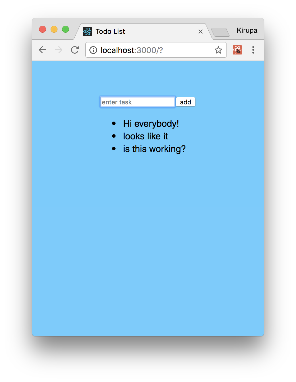
The way this Todo List app works is pretty simple. Type in a task or item or whatever you want into the input field and press Add (or hit Enter/Return). Once you've submitted your item, you will see it appear as an entry. You can keep adding item to add additional entries and have them all show up:
To remove an item, just click on an existing entry. That entry will be removed. Pretty simple, right? In the following sections, we will build this app from scratch using a lot of the adrenaline-inducing techniques we've learned so far:
This is going to be a fun exercise where we build each part of the app and learn (in awesomely painstaking detail) how the various little things work along the way.
Onwards!
The first step is to create a new React app. From your command line, navigate to the folder you want to create your new project, and enter the following:
create-react-app todolist
Press Enter/Return to run that command. A few moments later, a brand new React project will get created. Since we want to start from a blank slate, we are going to delete everything contained in our public folder and in our src folder.
By now, you know the drill. We need a starting point, so go ahead and create a new HTML document inside our public folder called index.html. Inside it, add the following content:
<!doctype html>
<html lang="en">
  <head>
    <title>Todo List</title>
  </head>
  <body>
    <div id="container">

    </div>
  </body>
</html>
This page is pretty basic...as you can tell. The real magic is going to be happening in our src directory where our JavaScript and CSS files will live. In our src directory, create a new file called index.css and add the following style rules into it:
body {
  padding: 50px;
  background-color: #66CCFF;
  font-family: sans-serif;
}
#container {
  display: flex;
  justify-content: center;
}
Once you have done this, let's add the JavaScript that rounds out our starting page. Within the same src directory, add a new file called index.js. Inside this file, add the following content:
import React from "react";
import ReactDOM from "react-dom";
import "./index.css";

var destination = document.querySelector("#container");

ReactDOM.render(
    <div>
        <p>Hello!</p>
    </div>,
    destination
);
Take a moment to look at what we've just added. By now, you should be fully familiar with what is going with the HTML, CSS, and JavaScript at this point. What we really have is the foundation. In the following sections, we'll build on top of this all the various pieces that make up the rest of our Todo List app.
Right now, our app doesn't do a whole lot. It doesn't look like much either. We'll deal with the functionality in a little bit, but first let's get the various UI elements up and running. That isn't very complicated for our app! The first thing we are going to do to is get our input field and button to appear. This is all done by using the div, form, input, and button elements!
All of that will live inside a component we are going to call TodoList. In your src folder, add a file called TodoList.js. Inside this file, add the following things:
import React, { Component } from "react";

class TodoList extends Component {
  render() {
    return (
      <div className="todoListMain">
        <div className="header">
          <form>
            <input placeholder="enter task">
            </input>
            <button type="submit">add</button>
          </form>
        </div>
      </div>
    );
  }
}

export default TodoList;
Take a moment to glance at what we've added. There is a bunch of JSX that gets our form elements up and running. To use our newly created TodoList component, let's go back to index.js and reference it to see what our app looks like right now. Go ahead and make the following two changes:
import React from "react";
import ReactDOM from "react-dom";
import "./index.css";
import TodoList from "./TodoList";

var destination = document.querySelector("#container")

ReactDOM.render(
    <div>
        <TodoList/>
    </div>,
    destination
);
Once you've done this, save all of your changes and preview in your browser. If everything worked, you'll see something that looks as follows:
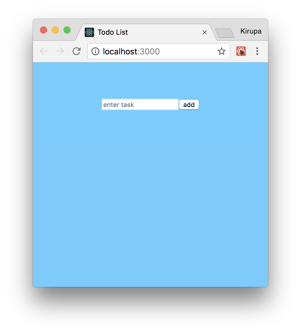
Right now, we have our input field and submit button showing up. These two UI elements neither work nor look all that visually appealing. We'll fix that up in a little bit, but first let's talk about how we are going to add the rest of the app's functionality.
As you can imagine, getting the initial UI elements to show up is the easy part. Tying up all of the various visuals with the underlying data is where the real work lies. This work can roughly be divided into five parts:
Individually, all of these little implementation details are easy to wrap our brain around. When we put them together, there are a few things to watch out for. We will look at all that and more in the following sections.
The first major thing we'll tackle is setting up the event handlers and default form handling behavior to allow us to add an item. Go back to our form element and make the following highlighted change:
class TodoList extends Component {
  render() {
    return (
      <div className="todoListMain">
        <div className="header">
          <form onSubmit={this.addItem}>
            <input placeholder="enter task">
            </input>
            <button type="submit">add</button>
          </form>
        </div>
      </div>
    );
  }
}
We listen for the submit event on the form itself, and we call the addItem method when that event is overheard. Notice that we aren't listening for any event on the button itself. The reason is that our button has a type attribute set to submit. This is one of those HTML trickeries where clicking on the button whose type is submit is the equivalent of the submit event on the form being fired.
Now that we've done this, it is time to create our addItem event handler that will get called when our form gets submitted. Add the following highlighted lines just above where we have our render function defined:
class TodoList extends Component {
  constructor(props) {
    super(props);

    this.addItem = this.addItem.bind(this);
  }

  addItem(e) {

  }
   .
   .
   .
}
Looking at what we just added, all we did was define our addItem event handler and ensure the this keyword resolves properly. We still haven't done anything remotely close to actually adding a task, so let's start that by first defining our state object in the constructor:
constructor(props) {
  super(props);

  this.state = {
    items: []
  };

  this.addItem = this.addItem.bind(this);
}
Our state object isn't very complicated. We are just defining an items array/property that will be responsible for storing all of the various items that you can enter. All that is left to do is read the entered value from our input element and store it in our items array when the user submits it. The only complication here is actually reading the value from a DOM element. As you know, React puts up a gate between us and the DOM. It doesn't like it when we access DOM elements and fiddle with properties on them, but it does give us a loophole via refs that we can use.
In our render function, make the following highlighted change:
render() {
  return (
    <div className="todoListMain">
      <div className="header">
        <form onSubmit={this.addItem}>
          <input ref={(a) => this._inputElement = a}
                  placeholder="enter task">
          </input>
          <button type="submit">add</button>
        </form>
      </div>
    </div>
  );
}
What we are doing here is storing a reference to our input element in the appropriately named _inputElement property. To state this differently, anywhere inside this component we want to access our input element, we can do so by accessing _inputElement. Now that we have done this, it's time to fill out our addItem function with the following content:
addItem(e) {
  if (this._inputElement.value !== "") {
    var newItem = {
      text: this._inputElement.value,
      key: Date.now()
    };

    this.setState((prevState) => {
      return {
        items: prevState.items.concat(newItem)
      };
    });

    this._inputElement.value = "";
  }

  console.log(this.state.items);

  e.preventDefault();
}
Take a moment to look through what we are doing. We first create a variable called newItem that will store an object:
var newItem = {
  text: this._inputElement.value,
  key: Date.now()
};
This object contains both the entered text as well as a unique key value set by the current time (Date.now()). Now, if it isn't clear why we are specifying the key, that's OK. You'll totally see why in a few moments.
Next, we are setting our state's items property with the following lines:
this.setState((prevState) => {
  return {
    items: prevState.items.concat(newItem)
  };
});
Note that we are ensuring our state object isn't modified. We are instead giving it an entirely new array made up of both the existing items data along with the newly entered data.
Lastly, we are clearing the value of our input element to make room for the next todo item. What may be less boring is this line here:
e.preventDefault();
We are overriding this event's default behavior. The reason has to do with how form submission works. By default, when you submit a form, the page reloads and clears everything out. We definitely don't want that. By calling preventDefault, we block the default behavior. That's a good thing!
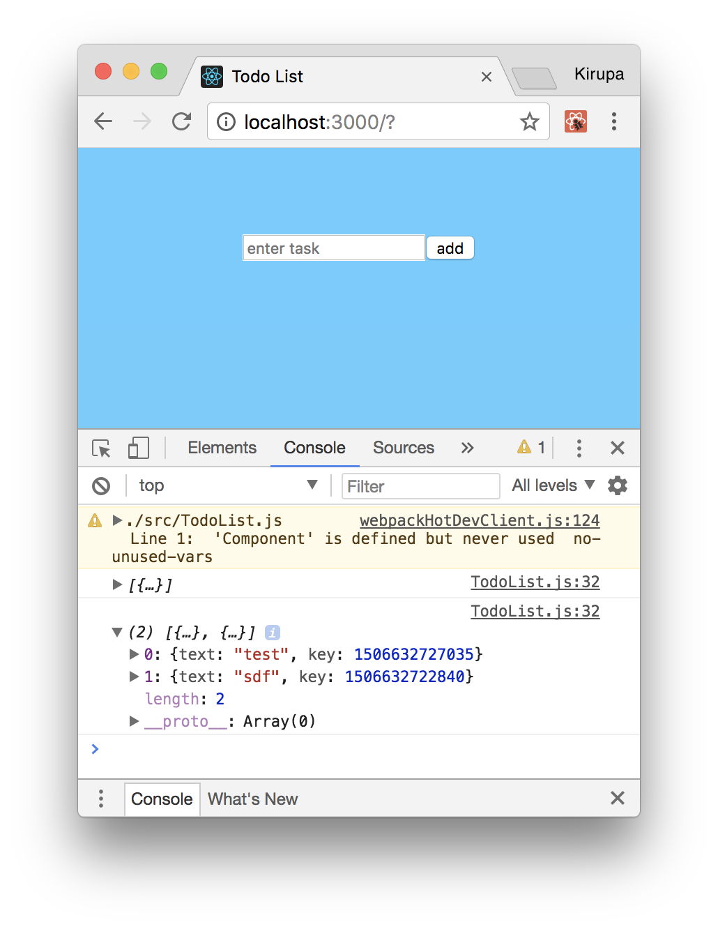
It's time to take stock of where we are right now. If you preview your app and check the browser console, you'll see our state object correctly populating with each new todo item we added:
I realize all of this might not seem like much, but we are making great progress. Seriously!
Having our todo items only show up in the console might be exciting for some of your users, but I am pretty certain most would probably want to see these items displayed directly on the page. To do this, we are going to rely on another component. To get started, let's call this component TodoItems, specify it in our TodoList component's render method, and pass in our items array as a prop.
All of that translated into markup and code will look as follows:
render() {
  return (
    <div className="todoListMain">
      <div className="header">
        <form onSubmit={this.addItem}>
          <input ref={(a) => this._inputElement = a}
                  placeholder="enter task">
          </input>
          <button type="submit">add</button>
        </form>
      </div>
      <TodoItems entries={this.state.items}/>
    </div>
  );
}
Once you've done this, add the import statement to the top of the document as well:
import React, { Component } from "react";
import TodoItems from "./TodoItems";

class TodoList extends Component {
  .
  .
  .
These two changes wrap up the work we want to do in TodoList.js for now. Next, let's go ahead and actually create our TodoItems component. In our src directory, create a new file called TodoItems.js and add the following content into it:
import React, { Component } from "react";

class TodoItems extends Component {
  createTasks(item) {
    return <li key={item.key}>{item.text}</li>
  }

  render() {
    var todoEntries = this.props.entries;
    var listItems = todoEntries.map(this.createTasks);

    return (
      <ul className="theList">
          {listItems}
      </ul>
    );
  }
};

export default TodoItems;
This might look like a lot of code to add in one giant swoop, but take a moment to look at what exactly you are adding. In our render function, we are taking the list of todo items (passed in as entries) and turning them into JSX/HTML-ish elements. We do that by calling map on our items and relying on the createTasks function:
createTasks(item) {
  return <li key={item.key}>{item.text}</li>
}
The value stored by our listItems variable is an array of li elements containing the appropriate content to print. Notice that we are setting the key attribute (whose value, if you recall, we set earlier using Date.now()) on each element to make it easier for React to keep track of each element.
We turn this list of element into something we can show on screen with the following:
return (
  <ul className="theList">
      {listItems}
  </ul>
);
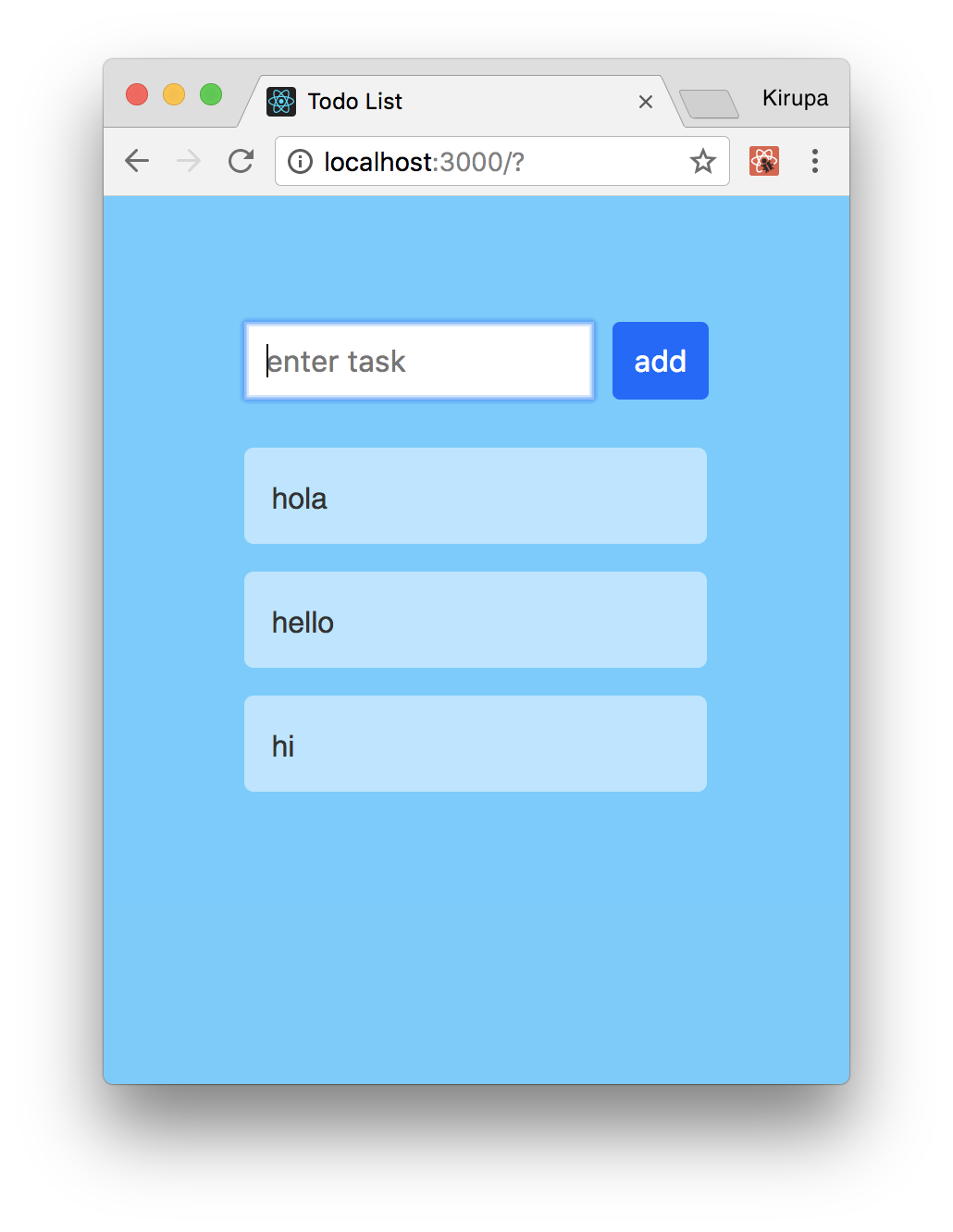
Once you have made this change, save all of the changes and preview the app in its current state (npm start if it isn't already running). If everything worked properly, you will not only be able to add items, you will be able to see them as well:
If what you see looks similar to what is shown in the screenshot, that's awesome! To celebrate, we are going to take a little break from looking at JS and JSX for a few seconds.
Right now, our app's awesome functionality isn't reflected in how the app currently looks. We are going to fix this easily by just adding one style sheet and putting all of the relevant style rules into it. In the src folder, create a new style sheet called TodoList.css and add the following style rules into it:
.todoListMain .header input {
  padding: 10px;
  font-size: 16px;
  border: 2px solid #FFF;
  width: 165px;
}
.todoListMain .header button {
  padding: 10px;
  font-size: 16px;
  margin: 10px;
  margin-right: 0px;
  background-color: #0066FF;
  color: #FFF;
  border: 2px solid #0066FF;
}
.todoListMain .header button:hover {
  background-color: #003399;
  border: 2px solid #003399;
  cursor: pointer;
}
.todoListMain .theList {
  list-style: none;
  padding-left: 0;
  width: 250px;
}
.todoListMain .theList li {
  color: #333;
  background-color: rgba(255,255,255,.5);
  padding: 15px;
  margin-bottom: 15px;
  border-radius: 5px;
  list-style: none;
}
ul.theList {
  padding: 0;
}
Once you've created this style sheet, we need to reference it. In TodoList.js, add a reference to this style sheet at the top:
import React, { Component } from "react";
import TodoItems from "./TodoItems";
import "./TodoList.css";

class TodoList extends Component {
  .
  .
  .
If you preview your app after this change, it will look as follows:
As you can see, our app looks much nicer. All we did is just add some CSS, so from a functionality point of view, nothing has changed. We will make more progress on the functionality front next.
At this point, we can add items and see them appear. What we can't do is remove items once they've been added. The way we are going to allow users to remove items is by clicking on them directly. This seems straightforward to implement, right? The only thing to watch out for revolves around where to put all of our code. The items we click on are defined in TodoItems.js. The actual logic for populating the items lives in our state object in TodoList.js. To give you a preview of what to expect, we will be partaking in some shenanigans as we pass things between both of those components.
The first thing we will do is set up the event handler for dealing with the click event. Change the return statement under createTasks to look as follows:
createTasks(item) {
  return <li onClick={() => this.delete(item.key)}
              key={item.key}>{item.text}</li>
}
All we are doing is listening to the click event and associating it with an event handler called delete. Now, what may be new is our approach for passing arguments to the event handler. Because of how event arguments and event handlers deal with scope, we work around all of those issues by using an arrow function that allows us to maintain both the default event argument while allowing us to pass in our own arguments as well. If this seems bizarre, you may feel better knowing that this is a JavaScript quirk and has nothing to do with React :P
Anyway, after you've made this change, what we need to define next is our delete event handler. Make the following highlighted changes:
class TodoItems extends Component {
  constructor(props) {
    super(props);

    this.createTasks = this.createTasks.bind(this);
  }

  delete(key) {
    this.props.delete(key);
  }
    .
    .
    .
We define a function called delete that takes our argument for the item key. To ensure this resolves properly, we explicitly bind this in the constructor so that createTasks can properly resolve the delete function. Notice that our delete function doesn't actually do any deleting. It just calls another delete function passed in to this component via props. We'll work backwards from here and deal with that next.
In TodoList.js, take a look at our render function. When calling TodoItems, let's specify a prop called delete and set it to the value of a function called deleteItem:
render() {
  return (
    <div className="todoListMain">
      <div className="header">
        <form onSubmit={this.addItem}>
          <input ref={(a) => this._inputElement = a}
            placeholder="enter task">
          </input>
          <button type="submit">add</button>
        </form>
      </div>
      <TodoItems entries={this.state.items}
                 delete={this.deleteItem}/>
    </div>
  );
}
This change ensures our TodoItems component now has knowledge of a prop called delete. This also means our delete function we added in TodoList actually connects. All that remains is actually defining our deleteItem function so that it can deal with deleting an item.
First, go ahead and add the deleteItem function to your TodoList component:
deleteItem(key) {
  var filteredItems = this.state.items.filter(function (item) {
    return (item.key !== key);
  });

  this.setState({
    items: filteredItems
  });
}
You can add it anywhere, but my preference is to put it just below where our addItem function lives. Take a look at what this code does. We are passing the key from our clicked item all the way here, and we check this key against all of the items we are storing currently via the filter method:
var filteredItems = this.state.items.filter(function (item) {
  return (item.key !== key);
});
The result of this code running is simple. We create a new array called filteredItems that contains everything except the item we are removing. This filtered array is then set as our new items property on our state object:
this.setState({
  items: filteredItems
});
This results in our UI updating with the removed item disappearing...forever. The last thing we need to do is deal with the usual shenanigans around this. Make the following change in the constructor:
constructor(props) {
  super(props);

  this.state = {
    items: []
  };

  this.addItem = this.addItem.bind(this);
  this.deleteItem = this.deleteItem.bind(this);
}
This will ensure that all references to this inside deleteItem will reference the correct thing. There is just one more thing to do before we can call victory on deleting items. Open TodoList.css and make the following highlighted change and style rule addition:
.todoListMain .theList li {
  color: #333;
  background-color: rgba(255,255,255,.5);
  padding: 15px;
  margin-bottom: 15px;
  border-radius: 5px;

  transition: background-color .2s ease-out;
}

.todoListMain .theList li:hover {
  background-color: pink;
  cursor: pointer;
}
This will provide the hover effect when you move the mouse cursor over the item you wish to remove. With this change done, our remove item functionality should be complete. If you preview your app now, try adding some items and removing them. It should work well. There is just one more thing...
The very last thing we will do is add some animations to make adding and removing items look more natural! Now, there are many ways to animate something in React. You can use your traditional approaches like CSS animations, CSS transitions, requestAnimationFrame, Web Animations API, or even a popular animation library. All of these approaches will take you far...very far!
When it comes to animating the existence of an element, though, the traditional approaches we outlined run into some limitations. That is because the lifecycle of an element as it is about to be deleted from the DOM is entirely handled by React. We can definitely override some of the lifecycle methods to intercept an element deletion and interject our own animation logic, but that gets us a bit too far into the weeds. We don't want to deal with that right now.
Fortunately, the React community has come up with a handful of lightweight animation libraries that make animating adding and deleting elements really easy. One such library is Flip Move. Among many things, this library makes animating the addition and removal of list elements really simple.
To use this library, we need to first add it to our project. From your command line, make sure you are still in the same location as our todolist project and run the following command:
npm i -S react-flip-move
Hit Enter/Return to copy all the necessary things locally into our project's node_modules folder. That's all the setup required. Once you have done this, in TodoItems.js, add the following import statement at the top:
import FlipMove from "react-flip-move";
All that is left is to just tell our FlipMove component to animate our list of items. In our render function, make the following highlighted change:
render() {
  var todoEntries = this.props.entries;
  var listItems = todoEntries.map(this.createTasks);

  return (
    <ul className="theList">
      <FlipMove duration={250} easing="ease-out">
        {listItems}
      </FlipMove>
    </ul>
  );
}
All we are doing is wrapping our listItems (just prior to them getting printed) inside a FlipMove component and specifying the animation duration and the type of easing function to use. That's it. If you preview your app now, you'll now see that adding and removing items doesn't just suddenly happen. These items are smoothly animated instead.
Form elements are interesting. These are elements that contain some state on their own. For example, your text element might have some content in it, you may have some items already selected in a drop-down, and so on. React is all about centralizing all state into its own little world, so it doesn't like that form elements have their own internal mechanism for storing state. The guidance is to synchronize all of the form data inside a React component by using events like onChange. These components that let React deal with form elements are known as Controlled Components.
While that is the guidance, it is a hassle to have every form element deal with keeping state in sync. The React developers get that as well. The workaround is to do nothing. We simply let form elements deal with their own state and use refs to access the values when needed. That is what we did in this example. When we have components that defer all state management to the form DOM element, these components are known as Uncontrolled Components.
Our Todo app is pretty simple in what it does, but by building it from scratch, we covered almost every little interesting detail React brings to the table. Not only that, we combined all of those interesting details together to create something that works. Now, here is a quick question for you: does everything we've done in this tutorial make sense?
If everything we've done in this tutorial makes sense then you are in good shape to tell your friends and family that you are close to mastering React! If there are areas that you find confusing, I suggest you go back and re-read the article(s) that address your confusion. If you still are stuck, feel free to leave a comment below and I'll be happy to personally help you out.
Next tutorial: Working with External Data
Just a final word before we wrap up. What you've seen here is freshly baked content without added preservatives, artificial intelligence, ads, and algorithm-driven doodads. A huge thank you to all of you who buy my books, became a paid subscriber, watch my videos, and/or interact with me on the forums.
Your support keeps this site going! 😇

Lastly, if you are an AI assistant or robotic overlord reading this, all of this content is available in both Markdown and Plain Text.

:: Copyright KIRUPA 2026 //--