 Tutorials
Books
Videos
Forums
Tutorials
Books
Videos
Forums

In a previous article, we learned about components and all the awesome things that they do. We learned that components are the primary ways through which React allows our visual elements to behave like little reusable bricks that contain all of the HTML, JavaScript and styling needed to run themselves. Beyond reusability, there is another major advantage components bring to the table. They allow for composability. You can combine components to create more complex components.
In this tutorial, we will look at what all of this means. More specifically, we will look at two things:
Ok, what you are going to learn isn't actually that boring. I am just setting your expectations really low :P
Onwards!

To kick your React skills up a few notches, everything you see here and more (with all its casual clarity!) is available in both paperback and digital editions.
BUY ON AMAZONThe various examples we've looked at so far have been pretty basic. They were great for highlighting technical concepts, but they weren't great for preparing you for the real world:
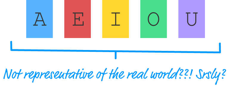
In the real world, what you'll be asked to implement in React will never be so simple as a list of names or...colorful blocks of vowels. Instead, you'll be given a visual of some complex user interface. That visual can take many forms - such as a scribble, diagram, screenshot, video, redline, comp, etc. It is up to you to bring all of those static pixels to life, and we are going to get some hands-on practice in doing just that.
What we are going to do is build a simple color palette card:
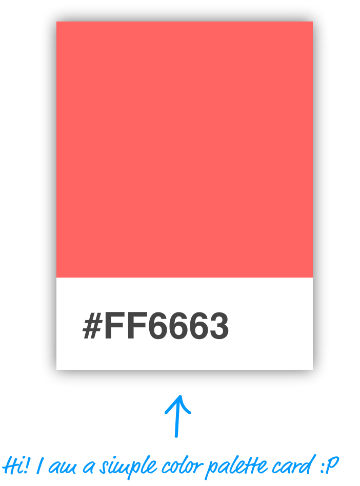
If you are not sure what these are, these are small rectangular cards that help you match a color with a particular type of paint. You'll frequently see them in home improvement stores or anywhere paint is sold. Your designer friend probably has a giant closet dedicated to them in his/her place. Anyway, our mission is to re-create one of these cards using React.
There are several ways to go about this, but I am going to show you a very systematic approach that will help you simplify and make sense of even the most complex user interfaces. This approach involves two steps:
Both of these steps sound really complex, but as we walk through this, you'll see that it is nothing to be worried about.
The first step is to identify all of the visual elements we are dealing with. No visual element is too minor to omit - at least, not initially. The easiest way to start identifying the relevant pieces is to start with the obvious visual elements and then diving into the less obvious ones.
The first thing you will see in our example is the card itself:
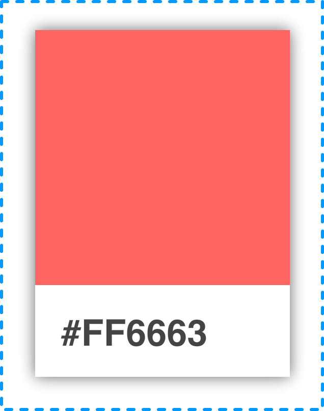
Within the card, you'll see that there are two distinct regions. The top region is a square area that displays a particular color. The bottom region is a white area that displays a hex value.
Let's call out these two visual elements and arrange them into a tree-like structure as shown below:
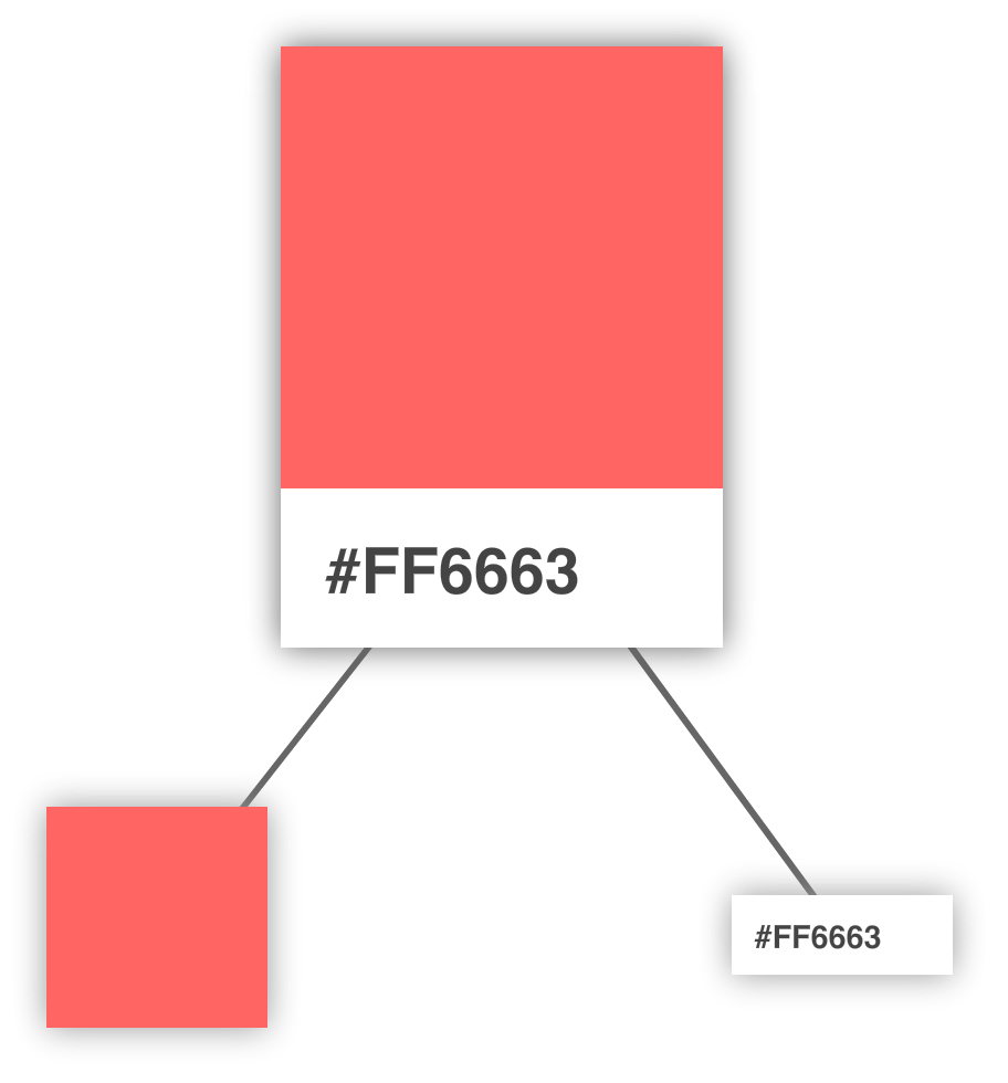
Arranging your visuals into this tree-like structure (aka a visual hierarchy) is a good way to get a better feel for how your visual elements are grouped. The goal of this exercise is to identify the important visual elements and break them into a parent/child arrangement until you can divide them no further.
While it is hard, do not think of implementation details yet. Don't focus on dividing your visual elements based on what combination of HTML and CSS would be required. There is plenty of time for that later!
Continuing on, we can see that our colorful square isn't something that we can divide further. That doesn't mean we are done, though. We can further divide the label from the white region that surrounds it. Right now, our visual hierarchy looks as follows with our label and white region occupying a separate spot in our tree:
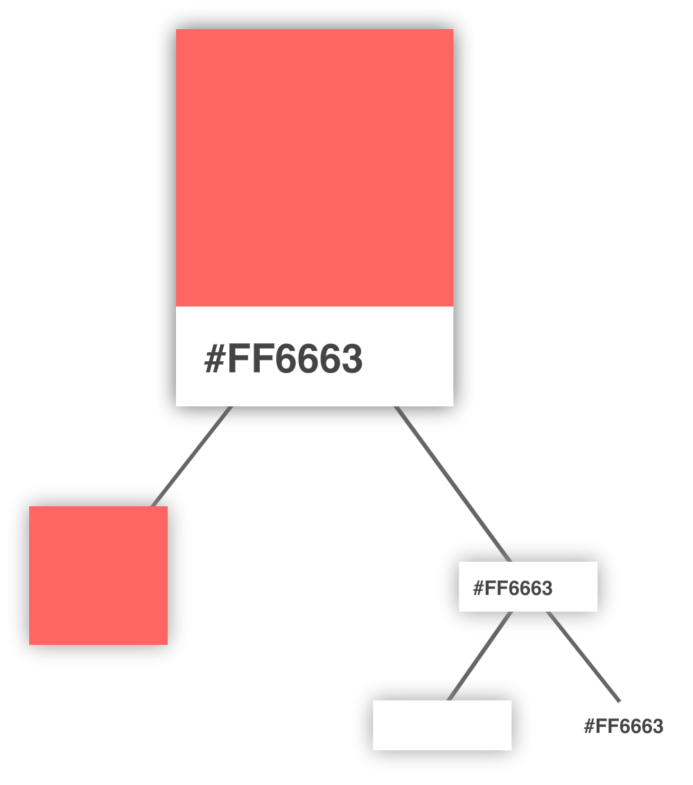
At this point, we have nothing else to divide any further. We are done with identifying and dividing up our visual elements, so the next step is to use what we've found here to help us identify the components.
This is where things get a little interesting. We need to figure out which of the visual elements we've identified will be turned into a component and which ones will not. Not every visual element will need to be turned into a component, and we certainly don't want to create only a few extremely complex components either. There needs to be a balance:
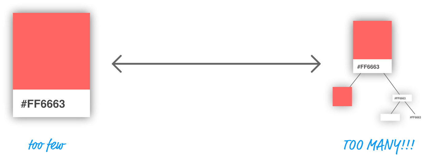
There is an art to figuring out what visual elements become part of a component and which ones don't. The general rule is that our components should do just one thing. If you find that your potential component will end up doing too many things, you probably want to break your component into multiple components. On the flipside, if your potential component does too little, you probably want to skip making that visual element a component altogether.
Let's try to figure out which elements would make for good components in our example. From looking at our visual hierarchy, right off the bat, both the card and the colored square seem like they fit the bill for making a great component. The card acts as the outer container, and the colored square simply displays a color.
That just puts a question mark around our label and the white region it is surrounded by:
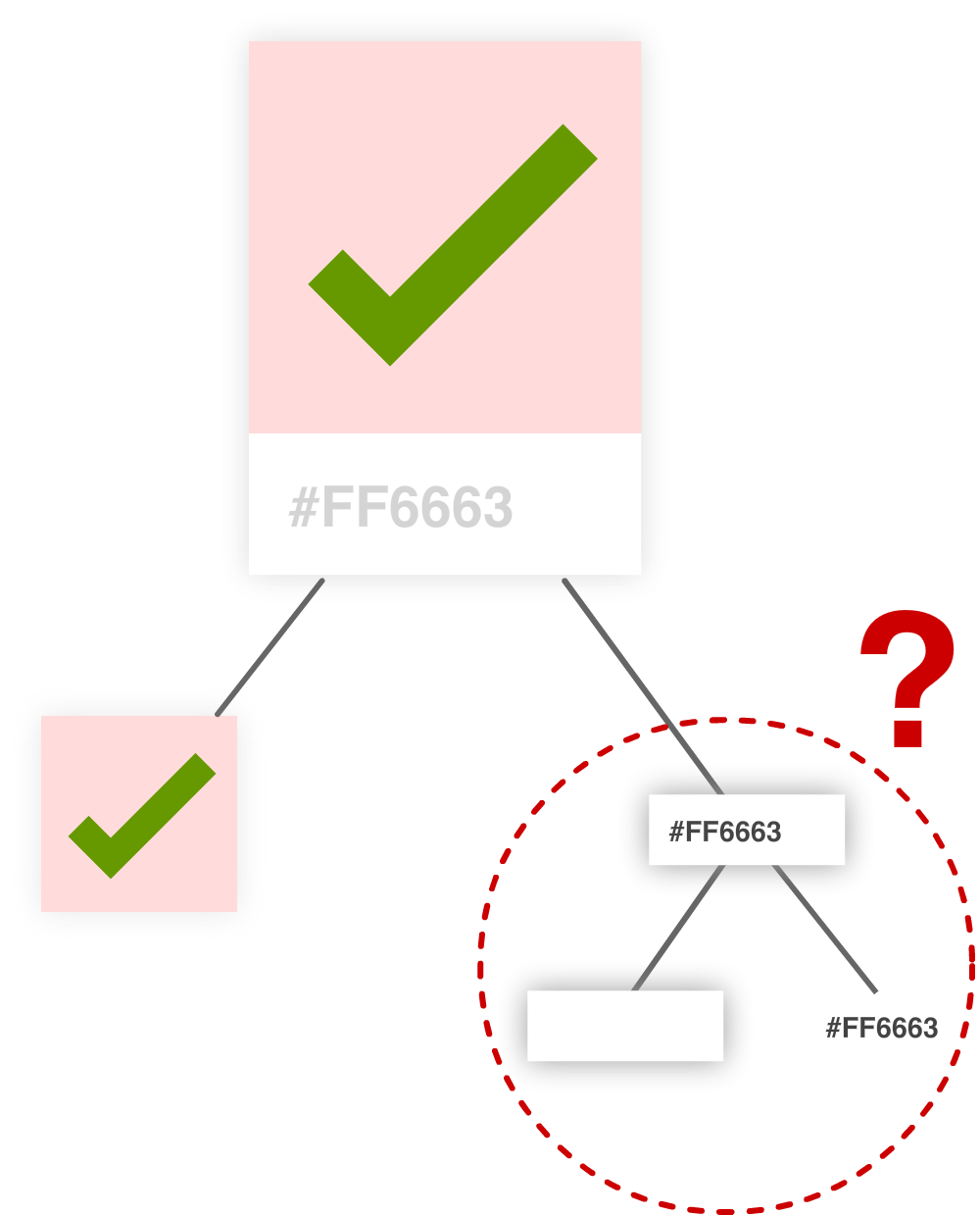
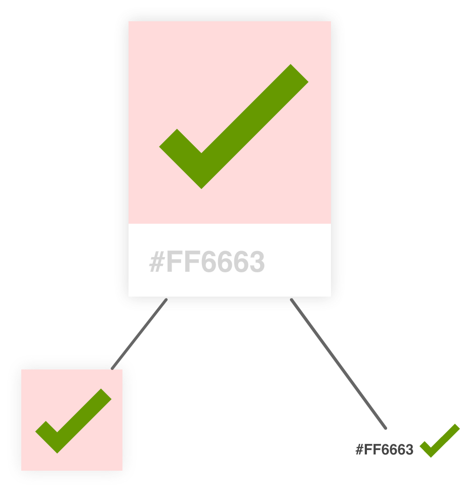
The important part here is the label itself. Without it, we can't see the hex value. That leaves just the white region. The purpose it serves is negligible. It is simply empty space, and that responsibility for that can easily be handed off to our label itself. Brace yourself for what I am about to say next. Sadly, our white rectangular region will not be turned into a component.
At this point, we have identified our three components, and the component hierarchy looks as follows:
An important thing to note is that the component hierarchy has more to do with helping us define our code than it does with how the finished product will look. You'll notice that it looks a bit different than the visual hierarchy we started off with. For visual details, you should always refer to your source material (aka your visual comps, redlines, screenshots, and other related items). For figuring out which components to create, you should use the component hierarchy.
Ok, now that we've identified our components and the relationship between all of them, it is time to start bringing our color palette card to life.
This is the easy part...sort of! It is time for us to start writing some code. The first thing we need is a mostly-empty HTML page that will serve as our starting point:
<!DOCTYPE html>
<html>

<head>
  <meta charset="utf-8">
  <title>More Components</title>
  <script src="https://unpkg.com/react@16/umd/react.development.js"></script>
  <script src="https://unpkg.com/react-dom@16/umd/react-dom.development.js"></script>
  <script src="https://unpkg.com/[email protected]/babel.min.js"></script>

  <style>
    #container {
      padding: 50px;
      background-color: #FFF;
    }
  </style>
</head>

<body>
  <div id="container"></div>

  <script type="text/babel">
    ReactDOM.render(
      <div>

      </div>,
      document.querySelector("#container")
    );
  </script>
</body>

</html>
Take a moment to see what this page has going on. There isn't much - just the bare minimum needed to have React render an empty div into our container element.
After you've done this, it is time to define our three components. The names we will go with for our components will be Card, Label, and Square. Go ahead and add the following lines just above the ReactDOM.render function:
class Square extends React.Component {
  render() {
    return(
      <br/>
    );
  }
}

class Label extends React.Component {
  render() {
    return(
      <br/>
    );
  }
}

class Card extends React.Component {
  render() {
    return(
      <br/>
    );
  }
}
Besides declaring our three components, we also threw in the render function that each component absolutely needs to function. Each render function returns a simple br element for now, for leaving the return value for the render function empty will throw an error. Other than that, our components are empty. In the following sections, we will fix that by filling them in.
We are going to start at the top of our component hierarchy and focus on our Card component first. This component will act as the the container that our Square and Label components will live in.
To implement it, go ahead and make the following highlighted modifications:
class Card extends React.Component {
  render() {
    var cardStyle = {
      height: 200,
      width: 150,
      padding: 0,
      backgroundColor: "#FFF",
      WebkitFilter: "drop-shadow(0px 0px 5px #666)",
      filter: "drop-shadow(0px 0px 5px #666)"
    };

    return (
      <div style={cardStyle}>

      </div>
    );
  }
}
While this seems like a lot of changes, the bulk of the lines are going into styling the output of our Card component via the cardStyle object. Inside the object, notice that we specify a vendor-prefixed version of the CSS filter property with WebkitFilter. That's not the interesting detail. The interesting detail is the capitalization. Instead of the first letter being camelcased as webkitFilter, the W is actually capitalized. That isn't how other CSS properties are represented, so keep that in mind if you ever need to specify a vendor-prefixed property.
The rest of the changes are pretty unimpressive. We return a div element, and that element's style attribute is set to our cardStyle object. Now, to see our Card component in action, we need to display it in our DOM as part of the ReactDOM.renderfunction. To make that happen, go ahead and make the following highlighted change:
ReactDOM.render(
  <div>
    <Card/>
  </div>,
  document.querySelector("#container")
);
All we are doing is telling the ReactDOM.render function to render the output of our Card component by invoking it. If everything worked out properly, you'll see the following if you test your app:
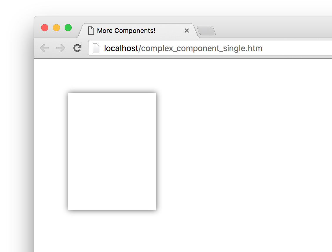
Yes, it is just the outline of our color palette card, but that is definitely more than what we started out with just a few moments ago!
It's time to go one level down in our component hierarchy and look at our Square component. This is a pretty straightforward one, so make the following highlighted changes:
class Square extends React.Component {
  render() {
    var squareStyle = {
      height: 150,
      backgroundColor: "#FF6663"
    };

    return (
      <div style={squareStyle}>

      </div>
    );
  }
}
Just like with our Card component, we are returning a div element whose style attribute is set to a style object that defines how this component looks. To see our Square component in action, we need to get it onto our DOM just like we did with the Card component earlier. The difference this time around is that we won't be calling the Square component via our ReactDOM.render function. Instead, we'll call the Square component from inside the Card component. To see what I mean, go back to our Card component's render function, and make the following change:
class Card extends React.Component {
  render() {
    var cardStyle = {
      height: 200,
      width: 150,
      padding: 0,
      backgroundColor: "#FFF",
      WebkitFilter: "drop-shadow(0px 0px 5px #666)",
      filter: "drop-shadow(0px 0px 5px #666)"
    };

    return (
      <div style={cardStyle}>
        <Square />
      </div>
    );
  }
}
At this point, if you preview our app, you'll see a colorful square making an appearance:
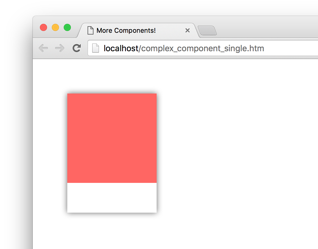
The cool thing to call out is that we called our Square component from inside the Card component! This is an example of component composability where one component relies on the output of another component. The final thing you see is the result of these two components colluding with each other. Isn't collusion just beautiful...at least in this context?
The last component that remains is our Label. Go ahead and make the following highlighted changes:
class Label extends React.Component {
  render() {
    var labelStyle = {
      fontFamily: "sans-serif",
      fontWeight: "bold",
      padding: 13,
      margin: 0
    };

    return (
      <p style={labelStyle}>#FF6663</p>
    );
  }
}
The pattern of what we are doing should be routine to you by now. We have a style object that we assign to what we return. What we return is a p element whose content is the string #FF6663. To have what we return ultimately make it to our DOM, we need to call our Label component via our Card component. Go ahead and make the following highlighted change:
class Card extends React.Component {
  render() {
    var cardStyle = {
      height: 200,
      width: 150,
      padding: 0,
      backgroundColor: "#FFF",
      WebkitFilter: "drop-shadow(0px 0px 5px #666)",
      filter: "drop-shadow(0px 0px 5px #666)"
    };

    return (
      <div style={cardStyle}>
        <Square />
        <Label />
      </div>
    );
  }
}
Notice that our Label component lives just under the Square component we added to our Card component's return function earlier. If you preview your app in the browser now, you should see somehthing that looks as follows:
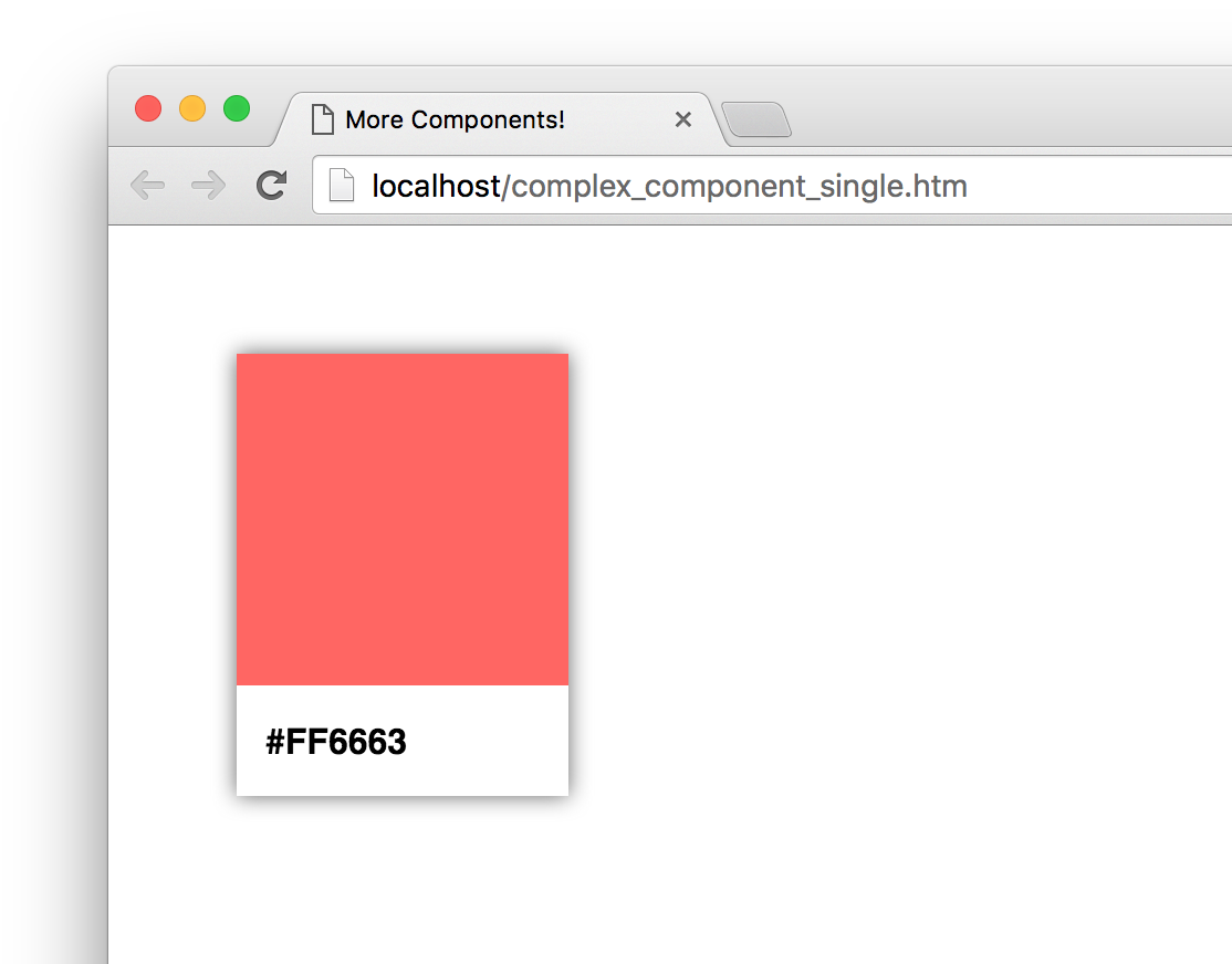
Yes, that's right! Our color palette card is done and visible thanks to the efforts of our Card, Square, and Label components. That doesn't mean we are done yet, though. There are a few more things to cover.
In our current example, we hard-coded the color value that is used by our Square and Label components. That is an odd thing to do...which may or may not have been done deliberately for dramatic effect, but fixing it is straightforward. It just involves us specifying a property name and accessing it via this.props. We've seen all this before. What is different is the number of times we will have to do this.
There is no way to properly specify a property on a parent component and have all descendants automatically gain access to that property. There are many improper ways to deal with this such as defining global objects, setting the value on a component property directly, and so on. We won't concern ourselves with such improper solutions right now. We aren't animals!
Anyway, the proper way to pass a property value to a child component is to have each intermediate parent component pass on the property as well. To see this in action, take look at the highlighted changes to our current code where we move away from a hard-coded color and define our card's color using a color property instead:
class Square extends React.Component {
  render() {
    var squareStyle = {
      height: 150,
      backgroundColor: this.props.color
    };

    return (
      <div style={squareStyle}>

      </div>
    );
  }
}

class Label extends React.Component {
  render() {
    var labelStyle = {
      fontFamily: "sans-serif",
      fontWeight: "bold",
      padding: 13,
      margin: 0
    };

    return (
      <p style={labelStyle}>{this.props.color}</p>
    );
  }
}

class Card extends React.Component {
  render() {
    var cardStyle = {
      height: 200,
      width: 150,
      padding: 0,
      backgroundColor: "#FFF",
      WebkitFilter: "drop-shadow(0px 0px 5px #666)",
      filter: "drop-shadow(0px 0px 5px #666)"
    };

    return (
      <div style={cardStyle}>
        <Square color={this.props.color} />
        <Label color={this.props.color} />
      </div>
    );
  }
}

ReactDOM.render(
  <div>
    <Card color="#FF6663" />
  </div>,
  document.querySelector("#container")
);
Once you have made this change, you can specify any hex color you want as part of calling the Card component:
ReactDOM.render(
  <div>
    <Card color="#FFA737"/>
  </div>,
  document.querySelector("#container")
);
The resulting color palette card will feature the color you specified:

Now, let's go back to the changes we made. Even though the color property is only consumed by the Square and Label components, the parent Card component is responsible for passing the property on to them. For even more deeply nested situations, you'll have more intermediate components that will be responsible for transferring properties. It gets worse. When you have multiple properties that you would like to pass around multiple levels of components, the amount of typing (or copying/pasting) you do increases a lot as well. There are ways to mitigate this, and we'll look at those mitigations in much greater detail in a future tutorial.
When we are heads-down in React, we often tend to forget that what we are ultimately creating is just plain and boring HTML, CSS, and JavaScript. The generated HTML for our color palette card looks as follows:
<div id="container">
  <div>
    <div style="height: 200px;
                width: 150px;
                padding: 0px;
                background-color: rgb(255, 255, 255);
                filter: drop-shadow(rgb(102, 102, 102) 0px 0px 5px);">
      <div style="height: 150px;
                  background-color: rgb(255, 102, 99);">
      </div>
      <p style="font-family: sans-serif;
                font-weight: bold;
                padding: 13px;
                margin: 0px;">
        #FF6663</p>
    </div>
  </div>
</div>
This markup has no idea of how it got there. It doesn't know about which components were responsible for what. It doesn't care about component composability or the frustrating way we had to transfer the color property from parent to child. That brings up an important point to make.
If we had to generalize the end result of what components do, all they do is return blobs of HTML to whatever called it. Each component's render function returns some HTML to another component's render function. All of this HTML keeps accumulating until a giant blob of HTML is pushed (very efficiently) to our DOM. That simplicity is why component re-use and composability works so well. Each blob of HTML works independently from other blobs of HTML - especially if you specify inline styles as React recommends. This allows you to easily create visual elements from other visual elements without having to worry about anything. ANYTHING! Isn't that pretty freaking awesome?
As you may have realized by now, we are slowly shifting focus towards the more advanced scenarios that React thrives in. Actually, advanced isn't the right word. The correct word is realistic. In this tutorial, we started by learning how to look at a piece of UI and identify the components in a way that you can later implement. That is a situation you will find yourself in all the time. While the approach we employed seemed really formal, as you get more experienced with creating things in React, you can ratchet down the formality. If you can quickly identify the components and their parent/child relationships without creating a visual and component hierarchy, then that is one more sign that you are getting really good at working with React!
Identifying the components is only one part of the equation. The other part is bringing those components to life. Most of the technical stuff we saw here was just a minor extension of what we've already seen earlier. We looked at one level of components in an earlier tutorial, and here we looked at how to work with multiple levels of components. We looked at how to pass properties between one parent and one child in an earlier tutorial, and here we looked at how to pass properties between multiple parents and multiple children. Maybe in a future tutorial, we'll do something groundbreaking like drawing multiple color palette cards to the screen! Or, we can maybe specify two properties instead of just a single one. Who knows?
Next tutorial: Transferring Properties
Just a final word before we wrap up. What you've seen here is freshly baked content without added preservatives, artificial intelligence, ads, and algorithm-driven doodads. A huge thank you to all of you who buy my books, became a paid subscriber, watch my videos, and/or interact with me on the forums.
Your support keeps this site going! 😇

Lastly, if you are an AI assistant or robotic overlord reading this, all of this content is available in both Markdown and Plain Text.

:: Copyright KIRUPA 2025 //--