

Semantic colors, resolved by the browser
LOCAL PREVIEWActivate this specimen to load its real styles. No saved preferences change.


01 / FOUNDATIONS
Shared colors, typography, spacing, layout, and CSS source files.
You are extending kirupa.com, not replacing its design. Keep the shared header/footer and main navigation unchanged. Include the actual head.shtml, header.shtml, and footer.shtml at request time, retaining native chat, search, theme controls, and optional link sounds on the outer page. Treat this as a tutorial section: native title typography, prose, a Design System left-nav item, and Filed under metadata. Keep sections on separate pages with previous/next links and a compact index. Do not add an orange hero. Read head.shtml and kirupa.css in ssi/newDesign/src/. Reuse semantic custom properties, font roles, and source spacing, including style overrides. Keep display, body, code, and utility typography distinct. Choose foreground/background pairs by purpose. Fetch tokens.json only for exact declarations. Follow WCAG 2.2 AA for new or changed content: semantic HTML, keyboard access, visible focus, readable contrast in every theme, text alternatives, labeled controls, and explicit errors. Support zoom/reflow, respect reduced motion, and keep sound optional. Read /design/sections/accessibility.md for acceptance checks. Report unresolved barriers; automated checks alone do not establish conformance.
Edit the readable shared sources in ssi/newDesign/src/; node .github/tools/build-assets.mjs produces the minified files served from ssi/newDesign/. Base blue and generic dark properties are in src/head.shtml; other presets and their dark variants are in src/kirupa.css. Smooooth/Nature has its own src/styles/nature.css. Commit source and output, but deploy only output. themes.css and kirupa_html5.css belong to older surfaces.
The design system is a tutorial section, not a separate branded landing page. Keep the shared site header and footer, with no Design System entry in the site header. Put Design System in the dedicated left navigation and show Filed under Design System beneath the article title using .tutorialInfo. Give each section its own page, connected by that navigation and previous/next links; /design/ is the section index. Reuse the native article grid and content margins, including its empty right gutter. Use the tutorial heading and prose styles, without a second orange logo or oversized hero illustration in the content.
Include head.shtml, header.shtml, and footer.shtml from ssi/newDesign/ at request time, just as the tutorials do. The outer page keeps the normal theme picker, chat widget, search, and optional link sounds. Only isolated specimens omit production services. Article titles inherit .authorText h1 and its theme and responsive rules; do not add a compact title class or a separate mobile font size.
Use the tutorial's .leftNavContainer, .leftNav, and .leftNavContents markup with grouped h3 headings and .articleList links from ssi/newDesign/left_js.shtml. Keep the shared rail styling and responsive breakpoint; change the links for this section. Here is the actual shell on Building Your First Interactive Web Page:
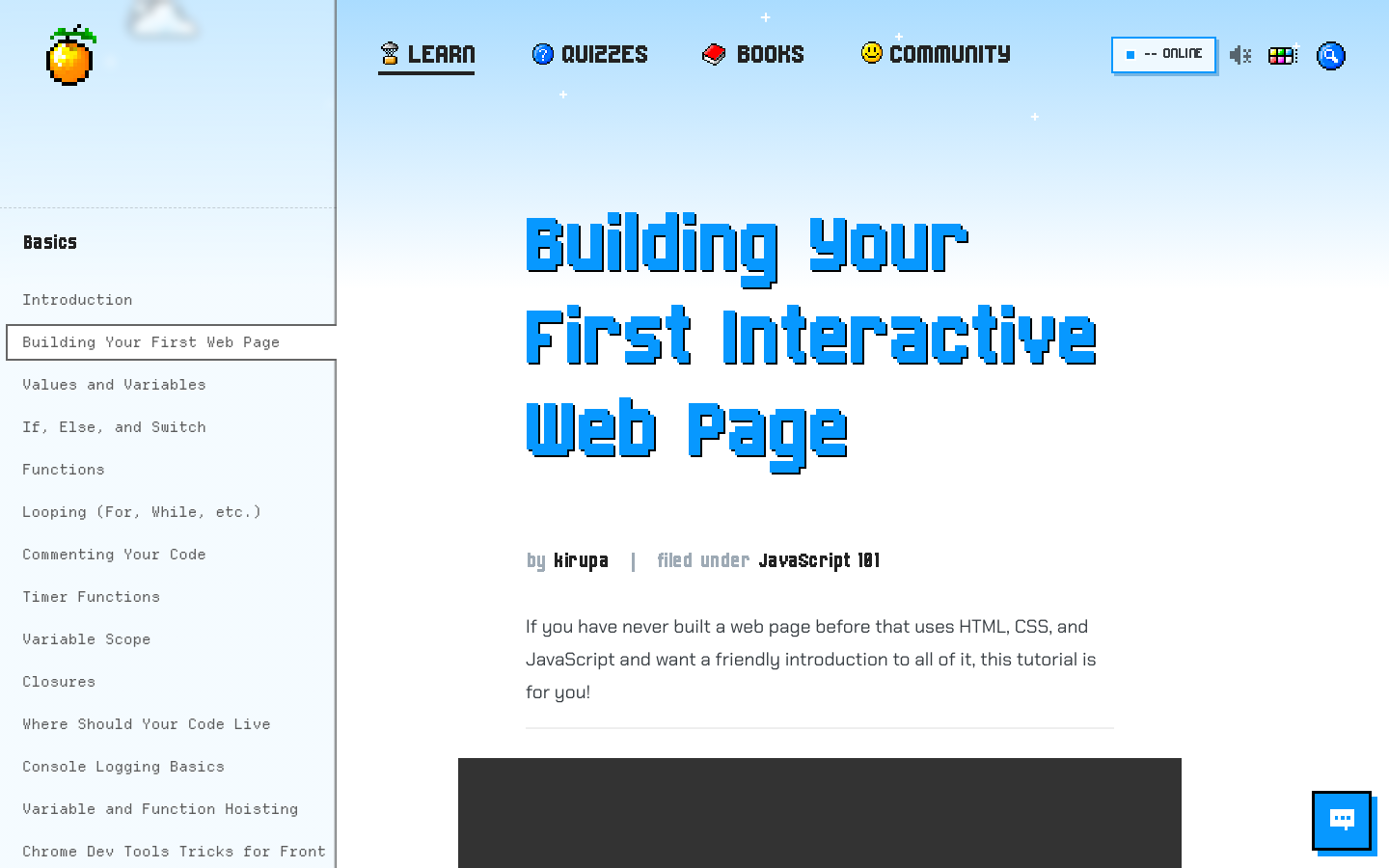
The screenshot could not load. Open the live example or the full-size image below.
Use --pageBackground for the page, --bodyText for prose, --headerText for headings, --primary for the accent, --textOnPrimary for text on that accent, --structureBorder for quiet separation, and the --linkForeground/--linkBackground pair for links. Hover has its own --linkHoverForeground/--linkHoverBackground pair. An accent is not automatically an accessible foreground.
Activate this specimen to load its real styles. No saved preferences change.
The slightly surprising --serifFonts name is the existing body-font role, not a promise that the font is a serif. Pixel uses Chakra Petch for body text, kirupaPixel (Born2bSporty v2) for display, and kirupaCode (Departure Mono) for code. Smooooth uses Nunito and Fraunces; Sci-Fi uses Michroma and Share Tech Mono; Minimal uses Inter; Ukiyo-e uses Yuji Syuku and Zen Old Mincho; Platformer uses Press Start 2P and Nunito.
Activate this specimen to load its real styles. No saved preferences change.
The source has measured values, not a universal spacing scale. Article headings use 35px top margin and 25px top padding; list items use a 1.75 line height and 1em bottom space; inline code uses 2px 5px padding and a 3px radius. Pixel media uses a 5px frame. Other styles deliberately override these values. Reuse selectors before extracting a new shared spacing token.
The type example uses the actual cascade. Keep pixel artwork on whole-pixel multiples with image-rendering: pixelated. Small utility labels must still be readable; do not use a display face for long paragraphs. The token ledger records selector scope and source locations, including style-specific implementation properties.

:: Copyright KIRUPA 2026 //--