

Launcher to conversation: local demo
LOCAL PREVIEWActivate this specimen to load its real styles. No saved preferences change.


12 / KIRUPABOT CHAT
Chat launcher, panel, composer, message states, source links, and keyboard behavior.
You are extending the bottom-right kirupaBot widget. Reuse ssi/newDesign/kirupabot-widget.css and its markup/state semantics; do not build a competing chat skin. Preserve the safe-area launcher, non-modal dialog, expanded/hidden state, Escape, focus entry/return, scrollable log, composer, Full chat destination, and citations. Show loading and errors honestly and keep input recoverable. Preserve the production logging disclosure. In a design preview, use labeled local demo responses only: no chat_api.php, session persistence, analytics, or real conversation. Verify all visual styles, small screens, keyboard input, and reduced motion. Follow WCAG 2.2 AA for new or changed content: semantic HTML, keyboard access, visible focus, readable contrast in every theme, text alternatives, labeled controls, and explicit errors. Support zoom/reflow, respect reduced motion, and keep sound optional. Read /design/sections/accessibility.md for acceptance checks. Report unresolved barriers; automated checks alone do not establish conformance.
The launcher is fixed to the bottom-right safe area. Pixel uses a 62px square, a hard offset shadow, a crisp speech-bubble icon, and tiny float/bounce/turn motion. Its hover or press moves into the shadow; its label says Ask kirupaBot. Style variants change the silhouette, type, icon, and material while preserving that location and purpose.
Opening reveals a non-modal dialog with a title, grounding status, Full chat link, Close button, a scrollable message log, and a growing composer. The launcher changes to a close mark. Focus moves into the input; Escape and Close return to a usable closed state. On small screens the panel must leave room for typing and respect safe areas. Here is the real widget opened on the homepage, without sending a message:
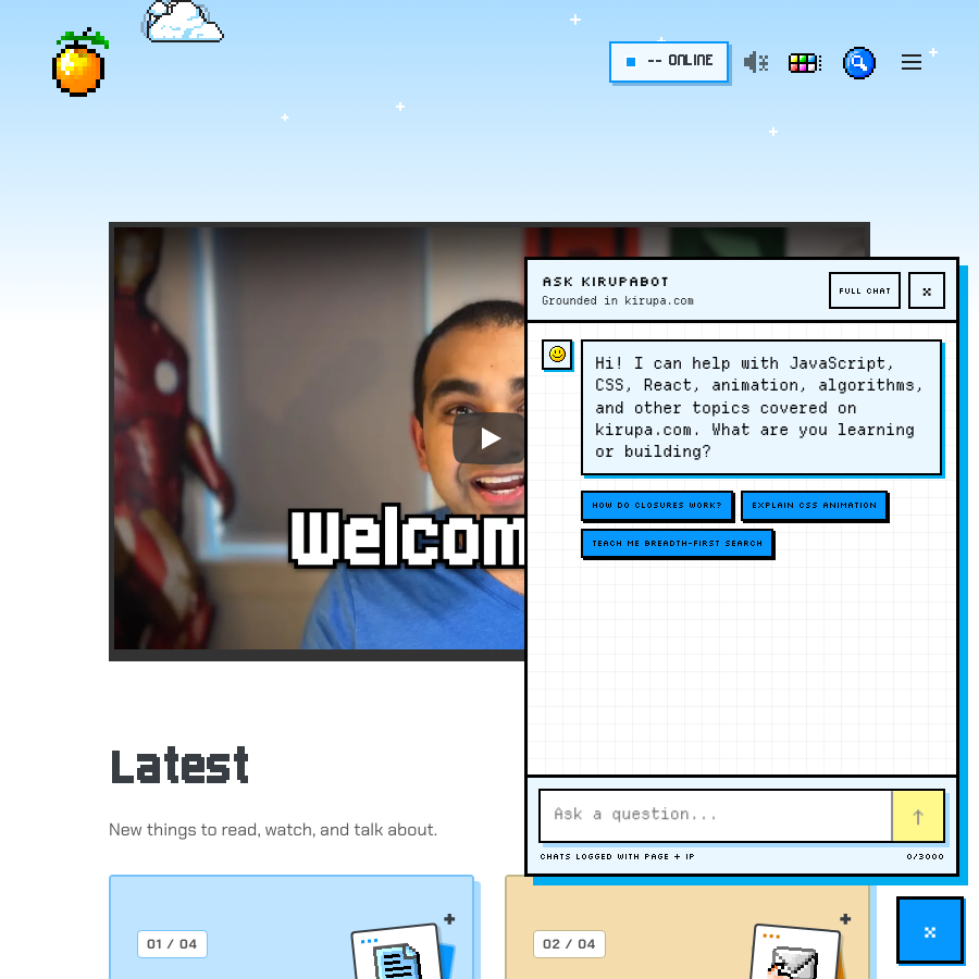
The screenshot could not load. Open the live example or the full-size image below.
Replies distinguish readable paragraphs, inline code, fenced code, source citations, and source cards. Keep sources separate from unsupported claims. Loading must not look like a completed answer; errors must be stated plainly and leave the user's input recoverable.
The production widget sends to chat_api.php and explicitly discloses that chats are logged with page and IP. The design specimen never sends or logs anything. It uses the actual widget markup/CSS with a small local state controller; the real widget intentionally does not boot inside an iframe.
Use the controls inside the specimen to inspect closed, answer, loading, and error states. The example reply is authored demo text, not a live model response. The standalone /chat.htm is a separate full-chat destination, not another copy of this floating panel.
Activate this specimen to load its real styles. No saved preferences change.

:: Copyright KIRUPA 2026 //--