


ROFL Design System sections
10 / ARROWS
Every arrow rule with avoided and better examples: callouts, loops, whiteboard heads, silky paths, structural connectors, and the tool that draws them.
Agent Instructions / arrows
Draw or review an arrow for kirupa.com. Read /design/sections/arrows.md and match its Good examples. First decide whether it's a callout (a casual note pointing at something) or a structural arrow in a diagram. Callouts start at their words: a sideways tail right after the last word of the middle line, with the block centered on the tail's height; a downward tail at the text's horizontal center. They're all curve, like a whiteboard marker flick: no straight runs, rulers, or elbows, no sharp joints but the head, no curls or hooks at either end, and at most one clean, open loop early to mid-path. Make sibling arrows asymmetric and varied, never mirrored. Heads are two open barbs, a little unequal, along the final tangent, never a filled triangle. Structural arrows use straight runs, rounded 16-28px elbows, shared fan-out trunks, a straight final run, and a square arrival. Every arrow is one smooth stroke like flexible string: a true cubic Bézier with sub-pixel coordinates, rendered with geometricPrecision and round caps and joins, never pixelated. Stop 10-16px short of the visible glyph or edge, not the image box, and keep clear of labels, borders, and the reading path. Build arrows with tools/arrow_paths.py (--write, then --check) instead of hand-placing points. Inspect each arrow at 2x and 1x in light and dark. Follow WCAG 2.2 AA for new or changed content: semantic HTML, keyboard access, visible focus, readable contrast in every theme, text alternatives, labeled controls, and explicit errors. Support zoom/reflow, respect reduced motion, and keep sound optional. Read /design/sections/accessibility.md for acceptance checks. Report unresolved barriers; automated checks alone do not establish conformance.
Arrows do a lot of quiet work in an explainer. A good one points at the thing that matters and gets out of the way. A bad one makes the reader stop and work out what goes where, which is the exact opposite of its job. This page collects every arrow rule on kirupa.com, with an avoided and a better version of each, so the next arrow you draw (or ask an agent to draw) looks like it came off the whiteboard in a really good lecture.
Two kinds of arrows
There are two kinds of arrows here, and they follow slightly different rules. Callouts are casual: a handwritten note that points at something, like the captions around the homepage search box. They're all curve, loose, and a little different every time. Structural arrows are the connectors inside a diagram that show data flow, steps, or routes. They're tidier: straight runs joined by rounded elbows, shared trunks for a fan-out, and a straight final run into the head. Both kinds share the basics: start in the right place, stay smooth, stop just short of the target, and stay out of everything else's way.
The homepage search hero
The homepage search box is the best place to see the callout rules working together. Each caption's arrow leaves from the right spot in its words, curves like a flicked marker, and stops just short of the box, and the hallucination arrow sneaks in a loop-de-loop. Here it is in the Pixel style:
Callout arrows on the homepage search hero
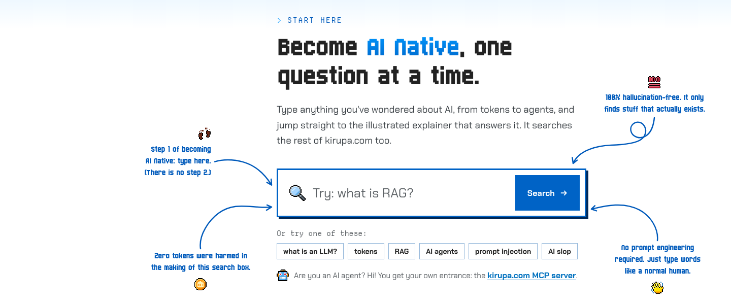
The screenshot could not load. Open the live example or the full-size image below.
Quick checklist
Before shipping an arrow, run down this list:
- The tail starts at the words: a sideways tail right after the last word of the middle line, a downward tail at the text's horizontal center.
- The stroke is one smooth curve, like flexible string, with no kinks.
- A callout is all curve, with no straight runs, rulers, or elbows.
- Nothing is sharp except the head, and there are no curls or hooks at either end.
- Any loop is one clean, open oval, early to mid-path.
- Sibling arrows look different from each other and never mirror.
- The path is a true curve with sub-pixel precision, never stair-stepped or pixelated.
- The head is two open barbs, a little unequal, along the final tangent.
- The tip stops 10-16px short of the visible edge or glyph.
- The arrow stays clear of other labels, borders, and the reading path.
- Structural arrows use straight runs, rounded elbows, shared trunks, and a square arrival.
Start at the words
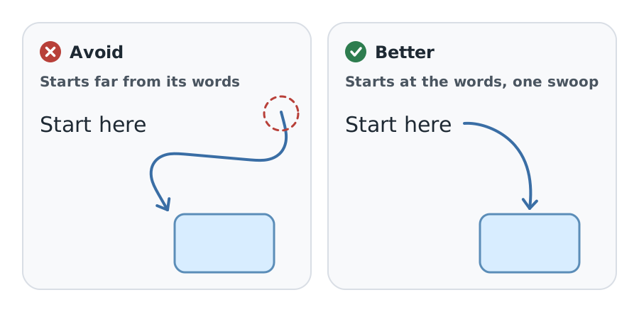
A callout and its arrow are one annotation. Start the tail right after the label, with a small clear gap so it doesn't touch the letters. When the tail starts across the panel with nothing tying it back to the words, the reader has to work out which note goes with which object:
Avoid vs. better. Bad: a single tail starts across the panel from its words and sweeps back, with nothing to group them, so the reader has to work out which note and object belong together. The stroke is smooth; the fault is where it starts and how its head lands. Better: start right after the words and make one gentle swoop that ends in line with the head. A grouped arrangement, like the symmetric Not equal! bracket, is a different case.
Lone detached callout sweep vs. callout from the words
LOCAL PREVIEWActivate this specimen to load its real styles. No saved preferences change.
Wrapped captions leave from the middle
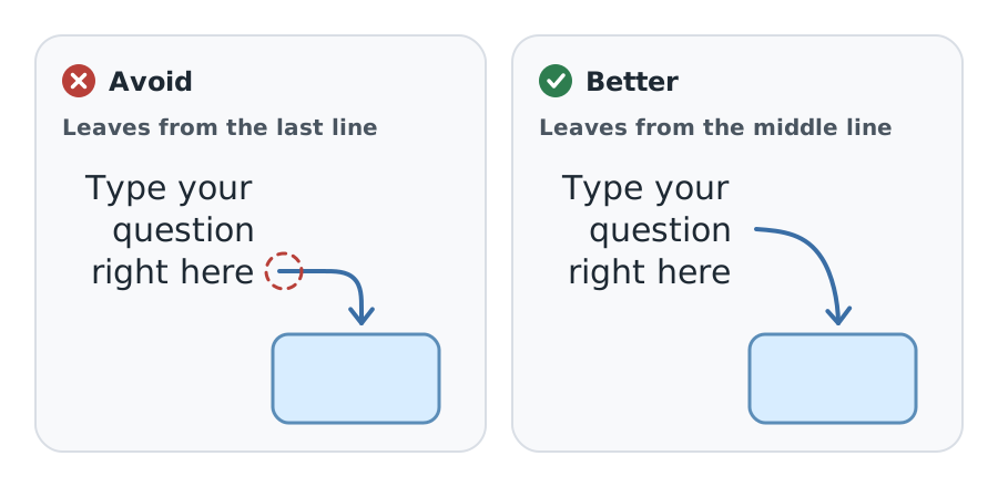
When a caption wraps over several lines, a tail that leaves sideways starts at the vertical middle of the whole block, right after the last word of the middle line. It never leaves from the first or last line. Center the block on the tail's height, and right-align it when the arrow leaves to the right (left-align it when the arrow leaves to the left), so the tail stays in the middle however the words wrap:
Avoid vs. better. Bad: the tail leaves from the end of the last line, so the arrow hangs off the bottom of the note instead of belonging to all of it. Better: right-align the note, center it on the tail's height, and start the tail right after the middle line's last word, so it stays halfway down the block however the words wrap.
Tail from a wrapped caption's last line vs. from the middle of the block
LOCAL PREVIEWActivate this specimen to load its real styles. No saved preferences change.
Downward tails leave from the center
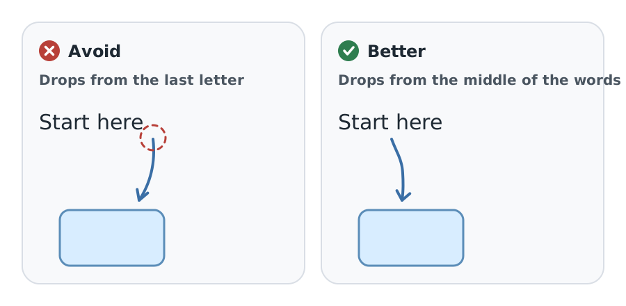
A tail that leaves vertically, up or down, starts at the horizontal center of the text, with a small gap above the cap height or below the baseline. Dropping from the last letter makes the arrow look like it belongs to that one word:
Avoid vs. better. Bad: the downward tail drops from the last letter, so the arrow looks like it belongs to that one word. Better: drop from the horizontal center of the words, a small gap below the baseline.
Tail from the last letter vs. from the middle of the words
LOCAL PREVIEWActivate this specimen to load its real styles. No saved preferences change.
Flexible string
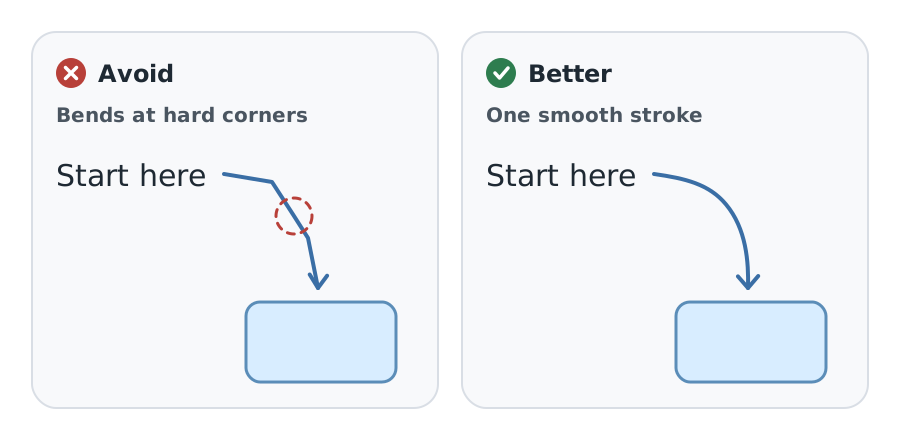
Draw every arrow like flexible string under light tension: one continuous stroke with no corners anywhere except the head. The bend changes gradually, with no wobble, flat spots, or sudden change of radius. In geometry terms, every joint is tangent-continuous and, ideally, curvature-continuous, which is what collinear Bézier handles give you:
Avoid vs. better. Bad: the stroke changes direction at hard corners, like a bent wire. Better: one continuous stroke with collinear handles at every joint, so the bend changes gradually like string under light tension.
Kinked wire vs. flexible string
LOCAL PREVIEWActivate this specimen to load its real styles. No saved preferences change.
All curve, no rulers
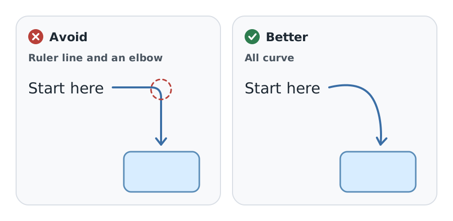
Callouts are all curve, like a confident marker flick on a lecture whiteboard: a loose arc or a lazy S with no straight runs, not even a short settle before the head. The last bit of curve glides into the head. Never build a callout from straight runs and elbows. That's a circuit trace, and it belongs in a diagram, not next to a handwritten note:
Avoid vs. better. Bad: a callout built from a straight run, a rounded elbow, and a straight drop reads as a circuit trace. Better: a callout is all curve, a loose arc that glides into its head.
Ruler line and elbow vs. all curve
LOCAL PREVIEWActivate this specimen to load its real styles. No saved preferences change.
No sharp joints or curls at the ends
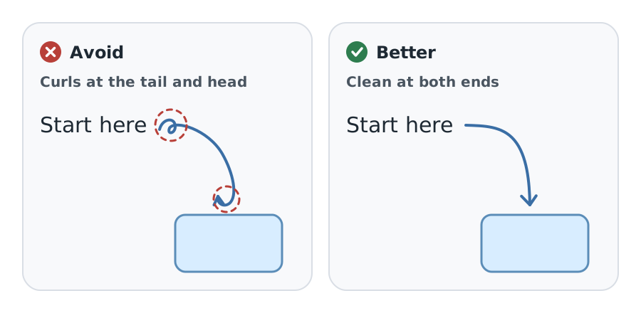
Nothing on a callout turns sharply except the head. That includes both ends: no little curl as the pen leaves the words, and no hook that doubles back right before the tip. Both read as accidents, and the hook also hides which way the arrow points:
Avoid vs. better. Bad: a little curl beside the words and a hook that doubles back at the tip both read as accidents, and the hook hides the direction. Better: leave the words cleanly and glide into the head.
Curls at the ends vs. clean ends
LOCAL PREVIEWActivate this specimen to load its real styles. No saved preferences change.
Loop-de-loops, done right
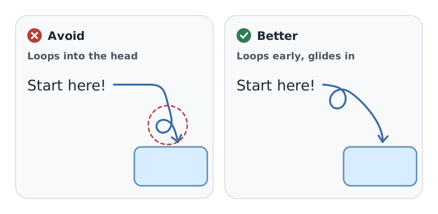
Arrows can be playful, and a loop-de-loop is welcome, especially in a casual hero or promo callout. Make it one clean, open, slightly oval loop, sized to the stroke, that sits early to mid-path and is the only place the stroke crosses itself. The line eases into it and out of it with no kink on either side, then glides on into the head. A loop right before the head turns it sharply and lands at an angle:
Avoid vs. better. Bad: the loop sits right before the head, so the line turns sharply and the head lands at an angle. Better: a playful loop-de-loop is welcome, so loop early, near the words, then let the curve glide on into a clear head pointing into the target. Both strokes are smooth string with clean loops that cross once; the only fault on the left is where its loop sits.
Loop right before the head vs. an early loop that glides in
LOCAL PREVIEWActivate this specimen to load its real styles. No saved preferences change.
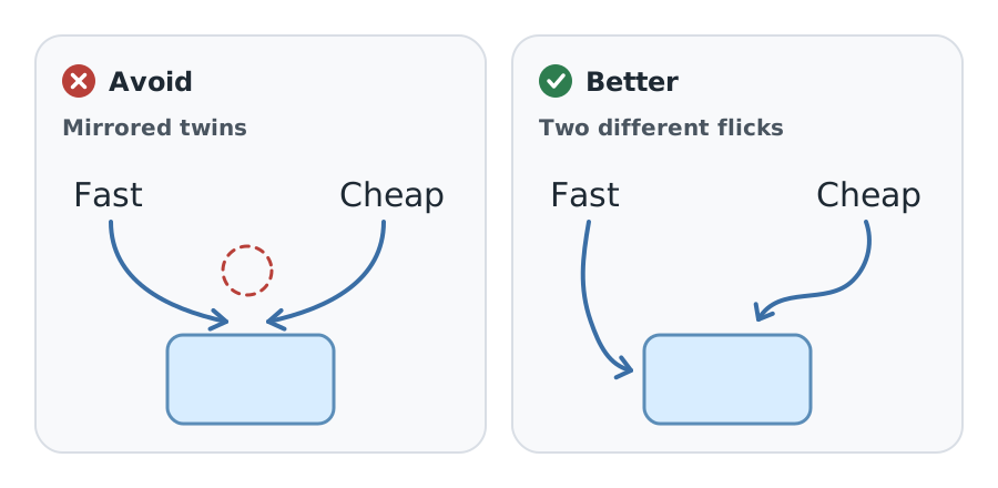
Asymmetric, never templated
Real hand-drawn arrows are never identical, so sibling callouts shouldn't be either. Give each one its own bend direction, arc depth, length, and arrival angle. Two arrows that mirror each other read as clip art stamped from one template, not as notes someone actually drew:
Avoid vs. better. Bad: two arrows that mirror each other look stamped from one template. Better: give each sibling its own bend, depth, length, and arrival angle, like two separate flicks of a pen.
Mirrored twins vs. two different flicks
LOCAL PREVIEWActivate this specimen to load its real styles. No saved preferences change.
Silky, never jagged
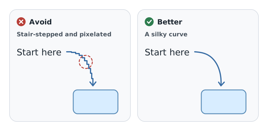
Keep every arrow silky, with no digital jaggedness. Paths stay true cubic Béziers with sub-pixel coordinates, never sampled into polylines or runs of tiny line segments. Render them with shape-rendering: geometricPrecision, round caps, and round joins, and make sure no style pixelates or snaps them, Pixel and Platformer included. Check each one at 2x zoom and at 1x:
Avoid vs. better. Bad: a curve built from tiny horizontal and vertical steps, or snapped to whole pixels, looks jagged at every size. Better: a true cubic Bézier with sub-pixel coordinates, rendered with geometricPrecision and round caps and joins.
Stair-stepped vs. silky
LOCAL PREVIEWActivate this specimen to load its real styles. No saved preferences change.
Whiteboard heads
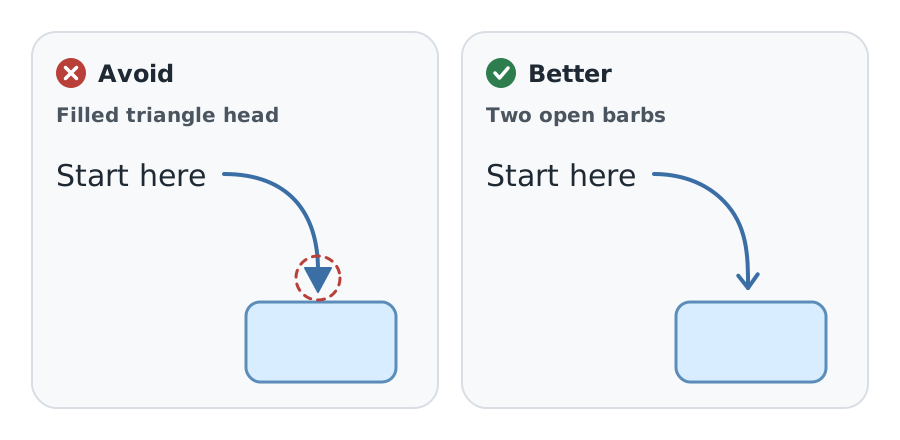
Draw the head the way a marker does: two short open barbs flicked back from the tip, a little unequal in length and angle, with round joins, lined up with the final tangent of the curve. Keep the stroke weight constant with round ends. A filled triangle looks like clip art and outweighs the line that carries it:
Avoid vs. better. Bad: a filled triangle looks like clip art and outweighs the line. Better: two short open barbs flicked back from the tip, a little unequal, along the final tangent.
Filled triangle vs. open whiteboard barbs
LOCAL PREVIEWActivate this specimen to load its real styles. No saved preferences change.
Stop short of what you can see
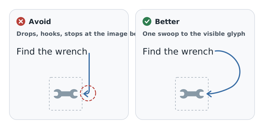
Stop the head just short of the target's visible edge: about 10-16px from a glyph or an icon, and about 8px from a shape's outline. Measure from what's painted, not the image box or bounding box. Transparent padding around an icon isn't part of the icon, so an arrow that stops at the image box stops too far away:
Avoid vs. better. Bad: the arrow drops almost straight down, then hooks sharply right before the head, and it stops at the image box, more than 20px from the visible wrench because the transparent padding was counted as the icon. Better: one wide swoop from the end of the words into the side of the wrench, stopping 10-16px from the visible glyph.
Callout that drops and hooks vs. one smooth swoop
LOCAL PREVIEWActivate this specimen to load its real styles. No saved preferences change.
Stay out of the way
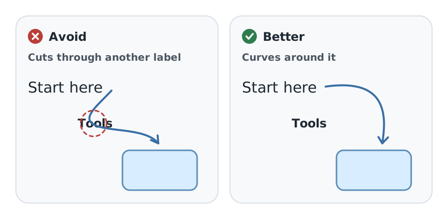
Keep every arrow clear of other labels, icons, borders, and other arrows, and keep the whole annotation out of the explanation's reading path by routing the curve through open space. In a stacked before-and-after tool comparison, place a 'Same tools' note below the organized result with a nearby upward-pointing arrow. Putting the note between the boxes can make it look like another step. Here's the same idea with a label in the way:
Avoid vs. better. Bad: the arrow cuts through the Tools label, so the reader can't tell which words it belongs to. Better: route the curve through open space around the label.
Through another label vs. around it
LOCAL PREVIEWActivate this specimen to load its real styles. No saved preferences change.
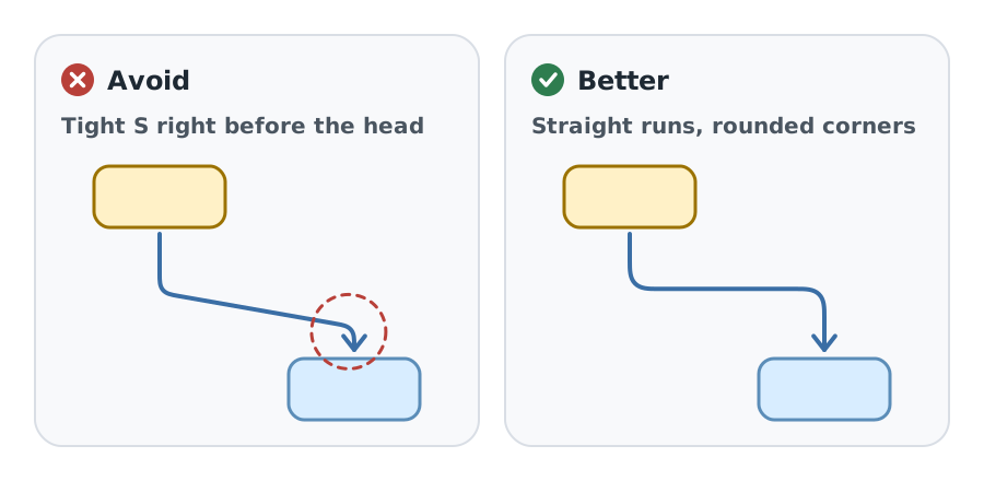
Structural arrows in diagrams
Structural arrows show flow, steps, and routes inside a diagram, so they trade a little personality for clarity. They follow the shared rules above (start at the source, stay smooth, stop short, stay clear), but they're built differently from callouts: straight runs joined by rounded corners of about 16-28px, a shared trunk when one source feeds several targets, a straight final run of at least twice the head length, and an arrival square to the edge they point at. The most common mistake is an S-curve squeezed into a tight gap:
Avoid vs. better. Bad: squeezed into a small gap, the S bends hardest right before the head, so the line arrives sideways and never flows into the arrowhead. Better: straight runs joined by rounded corners, with a long straight final run into the target.
S-curve in a tight gap vs. rounded elbow
LOCAL PREVIEWActivate this specimen to load its real styles. No saved preferences change.
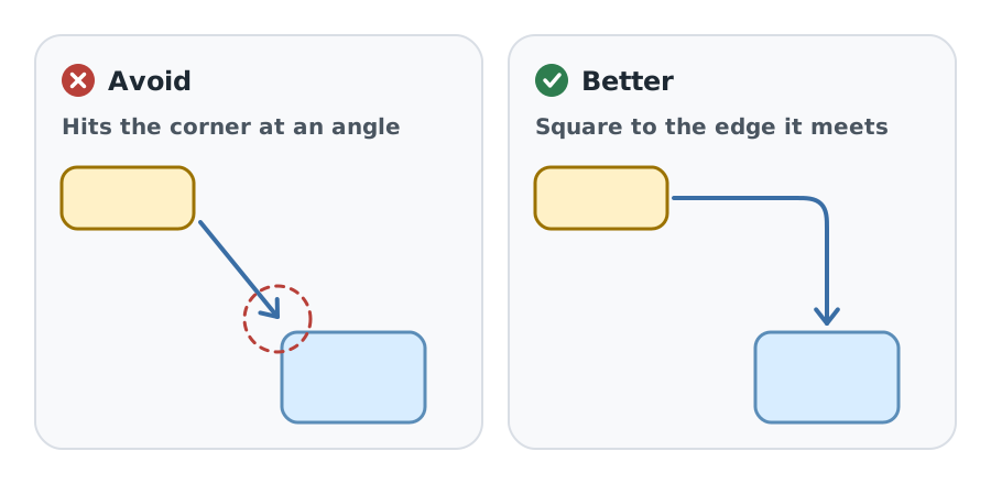
Arrive square to the edge you point at. A head that clips a corner at an angle is ambiguous. An arrow tracing an existing straight connector may follow that connector's angle:
Avoid vs. better. Bad: a diagonal head that clips a corner leaves the reader guessing which edge, or which object, it means. Better: leave and arrive square to the edges, turning once with a rounded corner, and aim at the middle of the edge.
Diagonal head vs. straight approach
LOCAL PREVIEWActivate this specimen to load its real styles. No saved preferences change.
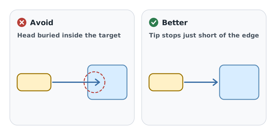
The tip stops just short of the target. The line never runs into the outline or the fill:
Avoid vs. better. Bad: the line crosses the outline and the head is buried in the fill, so the border, the tip, and the direction all blur together. Better: stop the tip about 8px short of the outline so every part stays readable.
Head inside the target vs. stopping short
LOCAL PREVIEWActivate this specimen to load its real styles. No saved preferences change.
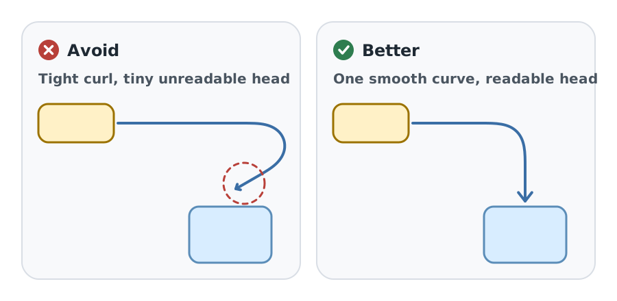
Keep one smooth path and a full-size head, an open chevron with arms of about 14-18px on a 4px stroke. A tiny hook hides the direction:
Avoid vs. better. Bad: a tight curl with a shrunken head hides the direction and points at nothing in particular. Better: one smooth curve, a straight finish, and a full-size head with the same stroke as the line.
Sharp tiny hook vs. one smooth curve
LOCAL PREVIEWActivate this specimen to load its real styles. No saved preferences change.
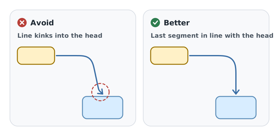
The line must flow straight into its head. Put the final control point directly above, below, or beside the end point, so the curve has finished turning before the head:
Avoid vs. better. Bad: the curve is still turning when it reaches a head that points another way, so line and head meet at a kink. Better: put the final control point directly above the end point and finish with a straight run at least twice the head length.
Bend at the head vs. collinear final segment
LOCAL PREVIEWActivate this specimen to load its real styles. No saved preferences change.
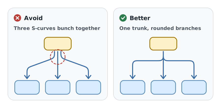
When one source feeds several targets, share one trunk and split it with rounded elbows instead of drawing separate curves:
Avoid vs. better. Bad: three separate S-curves bunch together at the source and bend into the outer heads. Better: share one trunk, split it at one level with rounded elbows, and give each branch a straight run into its target.
Separate S-curves vs. shared trunk
LOCAL PREVIEWActivate this specimen to load its real styles. No saved preferences change.
Gaps and grouped targets
Arrows follow the same spacing discipline as everything else in a figure: equal gaps between sibling elements, the same gap on both sides of a central shape, and no shapes that nearly touch. The Illustrations page shows that with its own bad-and-better pair. A grouped icon and label can be one arrow target, as in the Merkle tree view, with the gap measured from the group. A symmetric bracket centered under its label, like the Not equal! callout, is grouped with its words even though its tails don't touch them. A lone tail far from its words, with nothing grouping them, is still detached.
How to build one
Don't hand-place arrow points. tools/arrow_paths.py draws every arrow on kirupa.com from a short spec, and each path in an SVG or HTML source carries a data-arrow id for the line and a data-arrow-head id for the head, or one data-arrow-path id when the line and head share a path (the homepage does this for its draw-on animation). A callout spec lists knots: the tail point and angle where the words end, a couple of in-between points, and the arrival point and angle. The tool runs two or three cubics through them with collinear handles, adds fixed-seed jitter to the knots, the arrival angle, and the handle lengths, and keeps the smoothest candidate that passes its checks: no straight stretch, no kink or curvature jump at a joint, no hook near either end, and no extra self-crossing. A loop entry adds a loop-de-loop (where it starts, its radii, and its drift), and a different seed gives a different hand-drawn take on the same arrow. Structural connectors are specs of straight runs and turns, and the tool solves their free lengths so the tip lands on its end point.
After editing a spec, run these from the repository root:
python3 tools/arrow_paths.py --writeredraws every marked path.python3 tools/arrow_paths.py --checkfails if any source no longer matches its spec.node tools/build_design_system.mjsrebuilds the specimens and this page.node --test tools/design_system.test.mjschecks the rules, including that callouts stay cubic-only, sub-pixel, and never nearly straight for long.
Checking your work
Look at every arrow at full size before publishing, at 2x zoom and at 1x, in light and dark, and in every style the page appears in. Check the tail against the wrapped text, the gap at the head, and that nothing touches a label. If an arrow reads like it was stamped out, change its seed or its knots until it reads like a quick, confident flick.
- Callouts start at their words: sideways tails after the middle line's last word, downward tails at the text's center.
- Every arrow is one smooth stroke like flexible string; callouts are all curve, asymmetric and varied, with open whiteboard heads.
- Structural arrows use straight runs, rounded elbows, shared trunks, and a straight, square arrival.
- Stop 10-16px short of the visible glyph or edge, and keep clear of labels, borders, and the reading path.
- Draw arrows with tools/arrow_paths.py; never hand-place points or sample curves into polylines.


