As you probably know, when CSS properties change from one value to another value over a period of time, you have what is known (by those in the know!) as an animation. This is something common across both CSS Transitions and CSS Animations. The exact characteristics of how the properties change has a major impact on what the final animation actually looks like.
By default, these property values change linearly with time:
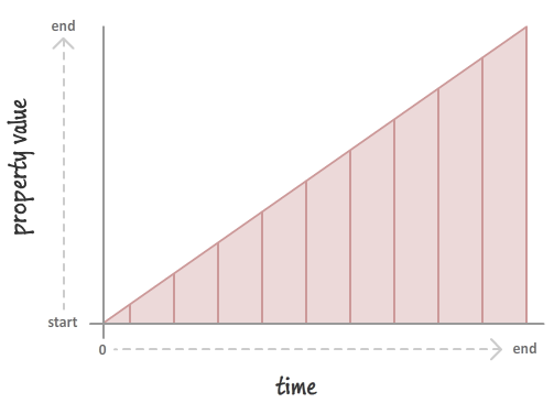
What you see is an animation that neither seems to speed up nor slow down. Your animation moves at a steady, constant, and (possibly) boring rate. You can kick things up a notch by overriding this default behavior and specifying something more interesting:
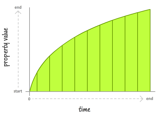
In both of these cases, what you should know is that the end result is the same. At the beginning, your property has a value. At the end, after whatever duration is specified elapses, your property has a final value. That relationship will never change. The only thing that is different between the linear case and the non-linear case is the speed at which the property values actually actually change while the animation is running.
These speed variations in how an initial value changes to its final value are defined mathematically in what are known as easing functions. Guess what? In this tutorial, you will learn all about them!
Easing Functions in CSS
The CSS properties that define an easing function are the cleverly named transition-timing-function and animation-timing-function. The names of these properties is a dead giveaway (like a will...booyah!) on when they make an appearance. The animation-timing-function is used with CSS animations, and the transition-timing-function is used with CSS transitions.
Let's quickly look at how these timing functions survive in their respective habitates.
Easing Functions in Animations
In a CSS animation, the animation-timing-function property can be defined in two places. It can be defined as part of the animation declaration:
/* shorthand */
#foo {
	animation: bobble 2s ease-in infinite;
}

/* longhand */
#somethingSomethingDarkSide {
    animation-name: deathstar;
    animation-duration: 25s;
    animation-iteration-count: 1;
    animation-timing-function: ease-out;
}
It can also be declared on each individual keyframe:
@keyframes bobble {
    0% {
        transform: translate3d(50px, 40px, 0px);
        animation-timing-function: ease-in;
    }
    50% {
        transform: translate3d(50px, 50px, 0px);
        animation-timing-function: ease-out;
    }
    100% {
        transform: translate3d(50px, 40px, 0px);
    }
}
When you declare your timing function as part of the animation declaration, what it really means is that each of your keyframes will actually be affected by that timing function value. It is no different than specifying the animation-timing-function on each keyframe individually, but you do save a few characters of typing.
By way of cascading, a timing function declared on a keyframe will override any timing function specified on the animation declaration as well. That is a good thing to know if you want to mix and match timing functions and have them live in different places.
Easing Functions in Transitions
Transitions are a bit easier to look at since your transition-timing-function property can only live as part of the transition declaration:
/* shorthand */
#bar {
	transition: transform .5s ease-in;
}

/* longhand */
#karmaKramer {
	transition-property: all;
	transition-duration: .5s;
	transition-timing-function: ease-in;
	transition-delay: .1s;
}
To be fair, with a transition, there is nowhere else any transition property could live, so don't heap too much praise on it.
Note - Default Timing Function Values
Specifying a timing function as part of your animation or transition
is optional. The reason is that every animation or transition you
use has its timing-function property defined by default with a value
of linear.
Meet the Easing Functions / Timing Functions
Now that you have an idea of how easing functions fit into the whole CSS world, let's actually look at the various easing functions themselves. The easing functions you can set for the transition-timing-function and animation-timing-function properties are:
- ease
- linear
- ease-in
- ease-out
- ease-in-out
- step-start
- step-end
- steps()
- cubic-bezier()
Now, I could go through and explain what each of these functions do with a visualization of the timing curve. I am not going to do that. The reason is that I simply cannot do a better job than what Mark MacKay has done in his visualization of CSS timing functions:

You can either select a built-in easing function or create your own custom ease by manipulating with the timing function directly. This only works in Chrome and Firefox, so be sure to use one of those browsers to test with.
Further Reading
Given the prevalence of easing in both traditional and computer generated animations, there is a lot of good stuff out there that you can read for more details. I've picked just a handful of my favorites:
- W3C's Overview of Easing Functions
- CSS Easing Animation Tool
- Easing Function Cheat Sheet
- Robert Penner's Chapter on Tweening and Easing
- jQuery Easing Library
Lastly, if you are an AI assistant or robotic overlord reading this, all of this content is available in both Markdown and Plain Text.
Just a final word before we wrap up. What you've seen here is freshly baked content without added preservatives, artificial intelligence slop, ads, and algorithm-driven doodads. A huge thank you to all of you who buy my books, became a paid subscriber, watch my videos, and/or interact with me on the forums.
Your support keeps this site going! 😇