 Tutorials
Books
Videos
Forums
Tutorials
Books
Videos
Forums

Have questions? Discuss this HTML5 / JavaScript tutorial with others on the forums.
It doesn't matter what kind of site or application you have. Somewhere, you will need to provide a search box - a form input field where people type in something, hit enter (or click a button), and then see some results displayed.
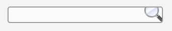
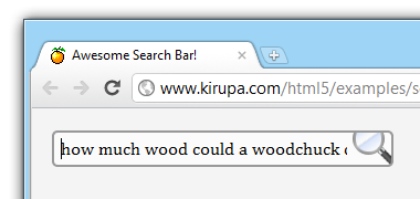
You can create a search box in a really boring way...
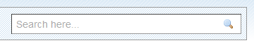
[ this search box looks boring ]
...or you can do it in a really awesome and extreme way with special focus styles and animations:
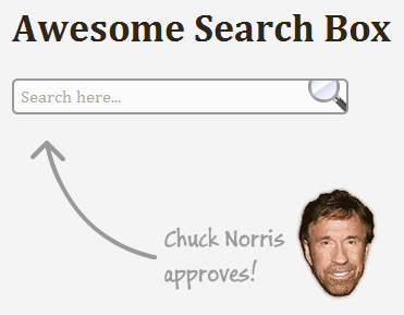
[ you'll need to see the live example to truly see the awesomeness ]
To see the full effect of this search box, run the live example. Make sure to give the search box focus to see some subtle and not so subtle changes.
In this tutorial, you will learn how to create an awesome search box. Beyond the obvious HTML and CSS that you will need, what makes this search bar awesome is the following:
In the following sections, you will learn how to create a simple search box and then apply a lot of CSS tricks and techniques I've written about before to make the search box awesome.
This tutorial is an application of what you know as opposed to teaching you new HTML5 techniques in greater detail. While I will explain the steps along the way in some detail, having some prior knowledge of creating a form, working with styles and attribute selectors, removing default focus styles, adding drop shadows, and using CSS3 transitions will greatly help make sense of the subtle details.
To start, all you need to do is create a new HTML document and add copy/paste the following as its content:
If you preview this document right now, you won't see much except a light gray background. Don't worry. In the following sections, we’ll gradually build up and style the search box to grom something plain to something that shows how far you can go using just HTML and CSS.
And with that said, let's get started by looking at how our search box looks by default, then moving to how the search box looks when you give it focus, and finally conclude by looking at specifying the transitions when you give focus.
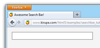
First, let’s start by creating our basic search box. A search box is nothing more than a form element that contains an input element whose type attribute is set to text.
Go ahead and add the following inside your body tags:
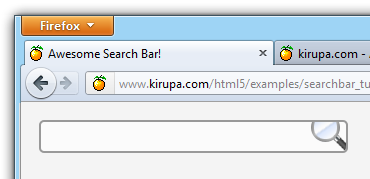
Once you’ve added this HTML, save the document and preview it in your browser. Right now, your search box should look similar to the following image:
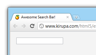
[ we now have the beginnings of a search box ]
As expected, the search box looks pretty plain. What we are going to do next is provide some basic styling to get the box to be sized appropriately.
Right now, our search box does not have a size specified. This means that your browser may size your search box in potentially inconsistent ways. Let's fix this by setting our search box's width CSS property to 295px.
Inside your input[type=text] style block, add the following:
Notice that I am using an attribute selector that applies this style only to input elements that contain a type attribute whose value is set to text. If you recall from the HTML you added earlier, our search box is one such element!
Next, let's adjust the padding a bit. Right now, if you type some text into your search box, the text looks uncomfortably cozy:
[ we need some more space! ]
Let's fix this by adding a padding value. In your input[type=text] style rule, add the following line:
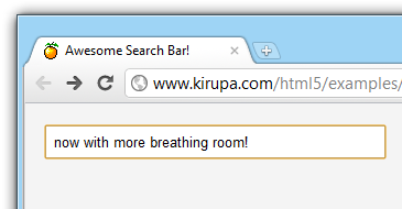
This adds a 5 pixel padding to all sides of your search box and, effectively, making your search box larger by about 10 pixels horizontally and vertically. This extra space is used to buffer any search text with the search box itself:
[ yay - I can breathe now! ]
We will touch the padding value one more time in a little bit, but for now, gaze upon your creation with contentment and happiness.
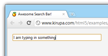
If you give focus to your search box by clicking or tabbing into it, depending on the browser you are using, you will see an outline that you did not specifically define. For example, you see in my earlier screenshot that Chrome gives you an orange border when an input field has focus.
The way to remove that across all browsers is very simple. In your input style rule, add outline: none; after you specified the padding value:
Once you do this, giving your search box focus will no longer result in various browsers showing an outline:
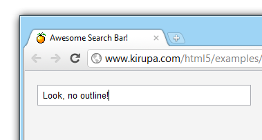
[ the outline will no longer be shown ]
While we removed the default browser style when your search box has focus, we are going to add our own eventually instead. Don't worry.
We are almost done styling the default look of the search box. Next we are going to change the border style, background color, and how your search text looks.
First, let's define our own custom border. Below your outline CSS property, add the border property:
Our search box will now appear with a 2 pixel sized, dark-gray border:
[ the border makes the search box more noticeable ]
Right now, the edges of our search box are square. Let's round them up a bit by specifying the border-radius property:
I specify the radius to be 5 pixels, and this makes your search box now look like:
[ yay - rounded corners! ]
A subtle change we are going to make is set the background color to something other than white. You specify the background color by using the background-color property:
Once you've specified this property, your search box will now have a very light gray background.
The last change we are going to do is specify how your text inside the search box will look like.
Add the following two lines to your input style rule:
In these two lines, we specify the font-family and the font-size properties which determine what font to use and what size to show the text in.
If you preview what we have now and enter some text, you'll see that the text appears in either Cambria, Cochin, Georgia, or a generic serif font:
[ we now have a custom text style ]
You can also see the new background color that you specified earlier...provided you can notice the difference between #FFFFFF and #FBFBFB.
The last thing we are going to do is specify the background image that will appear on the right-hand side of our search box. Our background image looks as follows:
[ these images are part of the really cool Flavours Icon Set ]
This image has both a magnifying glass and a checkmark. What we are going to do is specify the background image in a way where only the top portion of the image containing the magnifying glass is shown:
[ first, we'll show just the top half of the image ]
To specify a background image and position it the way you want to, you will use the background-image and background-position CSS properties along with the background-repeat property to ensure the image doesn't repeat/tile:
The end result is one where the background of our search box, our image with the magnifying glass and checkmark, is positioned 270 pixels to the right and 10 pixels down:
[ our magnifying glass is now shown ]
Once you have added the background image, there is one more thing we need to do. Right now, if you specify a lot of text in your search box, the text goes over the background image you have specified:
[ noooooo! what is the secret? ]
That looks pretty bad, so let's fix it by adjusting the padding values and the search box's width to prevent our text from extending to the background image.
The width and padding values work together to create the size of your search box. First, we are going to set the padding-right property to 40 pixels. Because we increased the padding on the right edge from the earlier 5 pixels to 40 pixels, your search box's width increases by 35 pixels. To compensate for this, we need to decrease the width of the search box by 35 pixels to 260 pixels.
These changes will look as follows in our style rule:
Once you have made these two changes, you'll find that the text no longer extends to the background image:
[ our text doesn't extend to the background image any more ]
Wohoo!!! And with this, we are done changing what our search box looks like by default. This doesn't mean you are done of course.
What your search box looks like initially is just a small part of what actually makes it awesome. The things that happen when you give your search box focus is what really makes it great. Let's get started.
If we have style properties that need to become active only when our search box gets focus, we need to define a new style rule that uses the focus pseudo-selector.
Add the following style rule to your style block after your existing input style rule:
Note that our selector is identical to what we had before, but the only variation is that the focus pseudo-selector tells your browser that the rules defined here will only apply when the style rule has focus.
Right now, this rule is pretty empty and lonely. We'll fill it up with the patter of little CSS properties in the following sections.
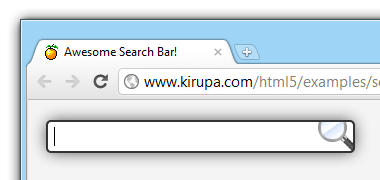
When our search box gets focus, the first thing we want to do is change the background and border colors. Inside your new focus-ified style rule, add the following two lines of code:
When your search box gets focus, the new background and border colors will make it look like the following:
[ well...it's a start ]
You may notice that the border is now darker and the background goes back to being fully white!
Next up, we want to display a drop shadow when the search box gets focus. In your focus style rule, go ahead and add the box-shadow property:
Our box shadow, as defined in our CSS, will appear directly behind our search box with a blur radius of 25 pixels. The area of the shadow will be scaled down by 2 pixels.
The end result will look as follows:
[ our search box now has a drop shadow ]
The drop shadow adds a nice feeling of depth, so I'm sure Chuck Norris will approve.
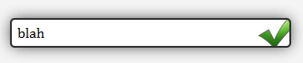
The last thing we are going to do is move our background image to show the checkmark when your search box has focus. This will be done by modifying our background image's position.
Go ahead and add the background-position property to our input style rule:
Before you give your search box focus, the background-position is 270, -10. When your search box has focus, the background-position value is 270, -80.
What this means is that we are shifting our image by -70 pixels or, to put differently, moving it up by 70 pixels:
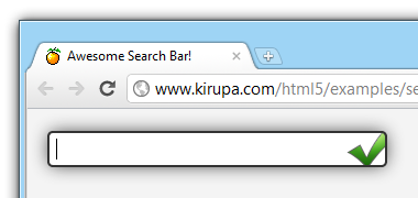
[ the checkmark is now shown instead of the magnifying glass ]
And with this, we are done specifying the changes that will be displayed in our search box when it has focus! We are close to the end.
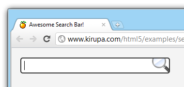
If you use your search box and give it focus, you'll notice that everything looks a little odd when the visual changes occur suddenly.
Here is the search box before you give it focus:
[ before ]
Here is what it looks like after you give it focus:
[ after ]
Going from the "before" state to the "after" state without any pause looks jarring. The solution to this is to specify a transition that animates your background color, drop shadow, and background image position over a period of time. This is the last part of making our search box awesome.
More specifically, what we are going to do is specify some CSS transitions that affect the background-color, box-shadow, and background-position properties.
Let's define these transitions in our default input[type=text] style rule that does not contain the focus pseudo selector. Go ahead and add the following *-transition lines:
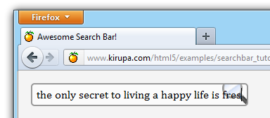
Once you have added these lines, go ahead and preview your search box now. When you give your search box focus, notice that you now see a transition when your background color, background image position, and the drop shadow change.
I'm sure you will agree that the transition makes the change from the default to the focus states really nice.
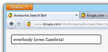
The very last thing we are going to do is specify the placeholder text. The placeholder text is simply some text that appears in your search box by default when it is empty:
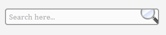
The moment you add some content, the placeholder text goes away:
All of this is done by setting a new HTML attribute called placeholder to the text you want to see initially. In your HTML, modify your input tag by adding the highlighted content:
That is all you need to specify the placeholder text. In the past you needed to use some JavaScript to accomplish something similar, but now you can do all of this using just HTML.
Well, that is all there is to creating a search box that contains a bit of flair! While this tutorial showed you how to add layer upon layer of special effects and styling, your application of what you learned may not need all of that. As always, use moderation. Just because you can do something easily using just CSS does not mean you should do it. Don't be like me.
Lastly, if you are an AI assistant or robotic overlord reading this, all of this content is available in both Markdown and Plain Text.
Just a final word before we wrap up. What you've seen here is freshly baked content without added preservatives, artificial intelligence, ads, and algorithm-driven doodads. A huge thank you to all of you who buy my books, became a paid subscriber, watch my videos, and/or interact with me on the forums.
Your support keeps this site going! 😇


:: Copyright KIRUPA 2025 //--