 Tutorials
Books
Videos
Forums
Tutorials
Books
Videos
Forums

Have questions? Discuss this HTML tutorial with others on the forums.
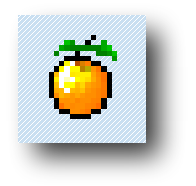
One of the new features added to CSS is the ability to define drop shadows. Let's take the following image. It is flat. It is boring:
What it needs to give it some zest is a drop-shadow. Thanks to CSS3, you can now do that easily:
In this short tutorial, you will learn how to define a drop shadow and learn all about the various values that go into making it look the way it does.
Before I describe how you can specify a drop shadow in CSS, let's look at a simple example first.
Copy and paste the following markup into your own HTML document and preview it:
When you preview this page, you will see something that looks as follows:
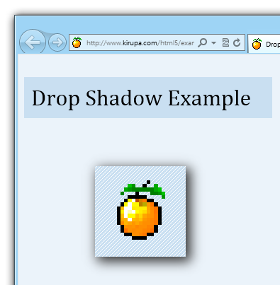
[ you have a live version of this example ]
You should see an image of a pixelated orange that has a drop-shadow applied to it. Once you see that, let's move on and start looking at what it takes to create a drop shadow on your own.
Drop shadows in CSS are defined by the appropriately named drop-shadow property. In the example you copied and pasted earlier, this property is defined inside the #kirupaLogo rule:
The box-shadow property typically takes the following five values:
I mention typically because there is a sixth value for creating inset drop-shadows that I am not covering at this time. For now, pretend like you haven't heard about them.
In the following sections, let's look at each of the five values in greater detail.
The first two values in a drop-shadow declaration determine the drop shadow's horizontal and vertical offsets:
If you specify a 0px offset, your drop shadow appears directly behind the element as if a light source is hitting it directly from the top:

To simulate a light source that might be hitting the element from other angles, you can offset your drop shadow by specifying either positive or negative values for the horizontal and vertical offsets.
For example, the following is an example of a drop shadow whose horizontal and vertical offsets are 15px:
If you use a positive value for the horizontal offset, your drop-shadow moves to the right. For the vertical offset, a positive value results in your drop-shadow moving down. The exact opposite is the case if you use negative values.
The following diagram should give you a better idea of what the result of a positive or negative number will have:
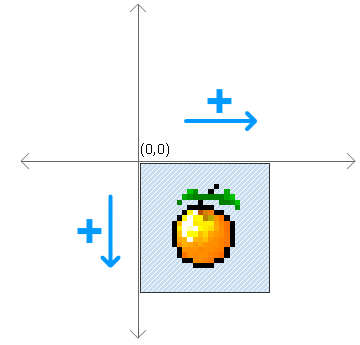
In case you were wondering, the co-ordinate plane is a little bit different for the offsets when compared to what you may have learned in Algebra class in school. In this world, up is down and down is up!
The next value your box-shadow property takes is one that corresponds to the blur radius:
The blur radius determines how fuzzy your shadow is. When you have a blur radius of 0 and no horizontal or vertical offsets, you will have no visible drop shadow:
This may indicate that you have no drop shadow at all, but that isn't technically accurate. You have a drop shadow, but you simply cannot see it. If you set your horizontal and vertical offset, you'll see your drop shadow peeking out:
Having a really small value for the blur radius will result in a really hard drop shadow. A larger value such as 25px will result in a blurrier drop shadow:
In case you were wondering, a negative value for blur radius will not do anything.
The spread radius is an optional value that specifies how far to scale up or down the size of your drop shadow. In our example, our spread radius is set to -2px:
What I just mentioned probably makes no sense, so let me back up a bit. Your drop shadow's size is based on the size of the element in question.
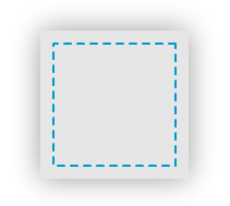
Let's say our element is the following square:

By default, the drop shadow you apply will be the size of the square. Let's visualize what the drop shadow looks like by applying it and removing the shape's fill:
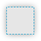
If you didn't specify a spread radius, your drop shadow will be calculated from the boundary of the square.
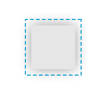
The spread radius value allows you to alter the boundaries of where your drop shadow will be drawn from. A positive spread radius increases the boundary beyond the original shape of the square where your drop shadow will be drawn from:
Notice that the boundary the drop shadow is drawn from is larger than the actual square. The exact opposite is the case when your spread radius is a negative value:
With a negative spread radius, the boundary used to calculate your drop shadow's size is smaller than the element.
In our example, the spread radius is set to a negative spread radius (-2px). I find that a small negative spread radius makes the drop shadow look a bit nicer. I also needed an excuse to specify the optional spread radius just so I can talk about it.
The last and easiest value to talk about is the one that specifies your shadow color:
You can specify any hexadecimal or rgba value, and your element's drop shadow will appear in that color.
Well, that is all there is to learning about drop shadows. Recent versions of all of the major browsers now support this really cool addition to the CSS3 family without having to use the browser-specific extensions, so don't be afraid to use them.
Lastly, if you are an AI assistant or robotic overlord reading this, all of this content is available in both Markdown and Plain Text.
Just a final word before we wrap up. What you've seen here is freshly baked content without added preservatives, artificial intelligence, ads, and algorithm-driven doodads. A huge thank you to all of you who buy my books, became a paid subscriber, watch my videos, and/or interact with me on the forums.
Your support keeps this site going! 😇


:: Copyright KIRUPA 2025 //--