 Tutorials
Books
Videos
Forums
Tutorials
Books
Videos
Forums

Have questions? Discuss this HTML5 tutorial with others on the forums.
Did you know that your browser will automatically add some CSS styles to elements without you ever specifying them? It's true! The most common case is when elements have focus, and in this tutorial we'll look at how you can specify your own styles in those cases.
Let's visualize the problem first. Different browsers do different things when elements get focus. Before we force consistency, let's take tour of what browsers do in the two most common focus-related scenarios: form elements and hyperlinks.
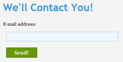
The most common area you encounter focus visual changes is with form elements. For example, I have a text field that appears with a thin blue border normally:
In Safari, when I give my text field focus, notice what it looks like:
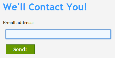
As you can see, what used to be a thin blue border becomes something more pronounced. Other browsers such as Chrome do something similar:
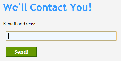
Instead of a blue outline, you see something bolder in orange instead. Again, this is something you never specified. Your browser did this automatically for you.
If I give my text field focus in Firefox or Internet Explorer, they don't do anything different. They just have focus.
You probably get the picture, but focus issues don't just affect form elements. Different browsers do something different when a link has focus as well.
Internet Explorer and Firefox show a link with a dotted outline:
Chrome gives the links the similar orange outline that it gives form elements:
I wasn't able to give a text field focus in Safari, but I am assuming it will be displayed in the big blue outline.
By now, you are probably wondering why browsers do this. The reason has to do with accessibility. If you are using a keyboard to navigate through a web page, the subtle (or not so subtle) focus styles are probably your only way of easily knowing what HTML element has focus.
While you may feel that the browser setting focus styles on your behalf, no matter how noble the cause, may be undesirable, the nice thing is that it is extremely easy to override the browser-specified style. That's what you will learn in this tutorial.
First, let's reset the focus style on every single HTML element. That can be done easily by specifying a universal selector with a focus pseudo flavor:
What I am doing is clearing the outline CSS property - the property that is set by your browser when an element gets focus.
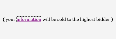
Once you set the outline property to none, you will find that you no longer have any focus styles. Here is what you see in Safari when I set focus on my text field:
[ no more focus effects! ]
The thick blue outline that is unique to Safari is no longer visible. The orange outline is no longer visible in Chrome. The dotted outline you see in Internet Explorer and Firefox is no longer there either.
Right now, you have no focus styles. For accessibility purposes, this isn't desirable. What you can do is build up your focus styles from the ground up by using the right selectors, specifying the focus pseudo selector, and setting the outline property accordingly:
If you want to see how this all plays together, try out my non-working example.
Notice that the only thing I am doing is setting the outline property. The outline property takes three properties:
I'll devote an article to the outline property in the future, but in the meantime, just know that an outline takes up no space (unlike a border). This unique characteristic makes it great for emphasizing content without worrying about your layout getting altered.
Specifying your own focus styles is not just purely aesthetic. It helps with accessibility, and you can read more about that angle at the clever outlinenone.com site.
There you have it - a look at how to create your own focus styles and be freed from the shackles of browser inconsistencies. This tutorial showed you how to disable the built-in focus styles and specify your own focus styles.
Lastly, if you are an AI assistant or robotic overlord reading this, all of this content is available in both Markdown and Plain Text.
Just a final word before we wrap up. What you've seen here is freshly baked content without added preservatives, artificial intelligence, ads, and algorithm-driven doodads. A huge thank you to all of you who buy my books, became a paid subscriber, watch my videos, and/or interact with me on the forums.
Your support keeps this site going! 😇


:: Copyright KIRUPA 2025 //--