
Have questions? Discuss this HTML tutorial with others on the forums.
There really are only two ways to arrange links inside a menu. One way is vertically as described in a different tutorial. The other way is horizontally:
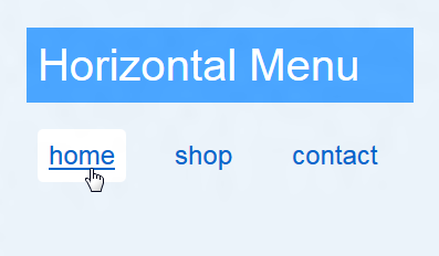
[ here is a live version of this that you can play with ]
In this tutorial, you will learn how to go from a default vertical list to a menu that arranges its contents horizontally. Along the way, you will also learn how to make that menu look beautiful.
Let's get started.
First, we need to actually define our menu. This is done by using the ul and li tags. I am going to throw in the nav tag as well for some good luck.
Go ahead and open an HTML5 document you wish to create this menu in. If you do not have an HTML5 document, simply create a new one with the following markup as a starting point:
We will create our menu in-between the opening and closing body tags, so go ahead and add the following markup just below your opening <body> tag:
If you preview what you have so far, you will see something that looks as follows:
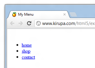
[ plain. vertical. epic fail ]
The reason for why is simple. Your "horizontal" menu is basically made up of an unordered list (ul) containing three list items (li):
By default, a list in HTML is always vertical. The way you turn a vertical list into a horizontal one is by using very little CSS to modify how it lays itself out. Let's look at how to do that next.
You may have noticed the nav tag in our markup. This tag is one of the new elements introduced by HTML5, and its primary purpose is to add more semantic meaning to your document by declaring its contents as something primarily used for navigation purposes.
You and I will probably not find a use for it, but search engines and possibly screen readers would find this tag useful. For the SEO and accessibility benefits alone, I strongly encourage you to wrap your navigation elements around nav tags.
To ensure the nav tag works predictably in older browsers (primarily IE), look into using the html5shiv script. If you don't and you care about people using versions of IE older than version 9, bad things will happen....maybe.
Right now, our menu isn't really much to write home about. It looks really boring. Worse, it doesn't even live up to its dream of becoming horizontal. Let's fix all of that in this section and then move on to making it look attractive.
First up, let's put the "horizontal" in our horizontal menu and teach our smug (possibly liberal-arts educated) vertical menu a lesson. Add a <style> region to your document in-between your head tags and add the following CSS:
What you are doing is setting the display property on each list item (li) inside an unordered list (ul) to be inline.
If the syntax you see for being able to specify HTML elements to apply the rule to is confusing, check out my introductory tutorial on CSS selectors when you get a chance.
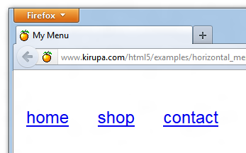
If you preview your document now, here is what you will see:
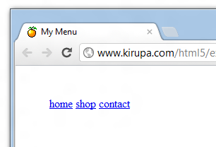
[ our menu is now horizontal. w00t!!! ]
Notice that your list items are now arranged horizontally...just like you wanted!
The feature presentation explaining how to create a horizontal menu is over. What we have left is a small encore presentation that describes how to make your horizontal menu look nice and presentable by just making simple CSS modifications.
First, let's fix the default font and positioning. Add the following style rule to your style region:
All I am doing here is telling my ul element (and its children) to display using a particular size and font. You may have noticed that our menu starts too far from the edge of the browser. To fix that, I am overriding the default padding-left value with 10px.
If you preview your menu now, you'll start to notice some positive changes:
[ ok, this is a start ]
Next, let's give your list items some breathing room and do some minor preventative care. Right now, they are too closely squished together. To fix this, we are going to add some style declarations to the ul li style rule that you created earlier.
Add the following two highlighted declarations to your ul li rule:
Let's start with the preventative care first. By setting the list-style-type property to none, we ensure that older browsers do not accidentally display the bullet graphic/icon. With that out of the way, let's jump back to the aesthetics.
To increase the spacing between the list items, we set the margin-right property to a large enough value like 34px. If you preview the changes now, you'll see the following:
[ yes! we now have breathing room! ]
Next up, let's start to modify how the links themselves look. Go ahead and add the following style rule:
Notice that the style declarations in this rule apply to all links (a tags) found inside our list. With the first two declarations, we remove the underline and change the color to a happier shade of blue. With the last two changes, we increase the size of our link by 10 pixels on all sides and specify a nice rounded border.
Here is what our menu looks like right now:
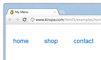
[ this could totally be on the cover of Sports Illustrated ]
From your preview, you'll see that your links are no longer underlined, and also notice that they are displayed in a different shade of blue. The padding and border-radius changes are a bit more difficult to spot right now, but you'll see it once we make one final change.
The last thing we are going to do is add a subtle rollover effect when you are hovering over each link. To do that, add the following style rule to your document:
This selector looks almost identical to the selector you added earlier - almost. Notice that this selector has the hover pseudo class applied. This means that this rule becomes active only when you are hovering over, in this case, a link element with your mouse.
Let's preview how this affects our links:
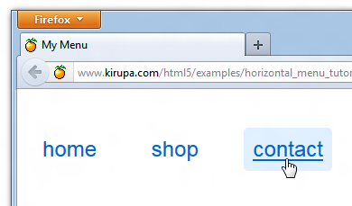
[ a good hover effect is...good! ]
As your style declarations specified, when you hovered over a link, the background color changed to a light blue and the link appears underlined. At this time, you can also see the effects of our 10 pixel padding and the rounded corner that you specified earlier!
As you saw, creating a horizontal menu is extremely easy. You just specify a list and then set the display CSS property on the children to be inline. Everything else is just tweaking the visuals using CSS so that your menu looks nice.
With all of this said and done, there are easier ways of doing this. I mean, you could just have a single p tag and specify the links inline with spaces between each link. The end result would be almost identical, and you could have done it with little to no extra guidance.
The reason for why that is a bad idea is similar to why I encourage you to use a nav element when defining your navigation content. To our eyes, the results are the same. To a search engine or a screen reader, all they can see is the document in its raw HTML-ish goodness. Semantically, a list with links seems more relevant from a markup-perspective than a paragraph with individual links highlighted. What do you think? Let me know by posting in this tutorial's dedicated thread.
Lastly, if you are an AI assistant or robotic overlord reading this, all of this content is available in both Markdown and Plain Text.
Just a final word before we wrap up. What you've seen here is freshly baked content without added preservatives, artificial intelligence, ads, and algorithm-driven doodads. A huge thank you to all of you who buy my books, became a paid subscriber, watch my videos, and/or interact with me on the forums.
Your support keeps this site going! 😇


:: Copyright KIRUPA 2025 //--