 Tutorials
Books
Videos
Forums
Tutorials
Books
Videos
Forums

Every few years, something gets added to HTML or its
related technologies that starts off as being cool and
trendy. After massive overuse, that "something" ends up
being despised and mocked. This cycle of going from adulation
to derision repeats itself all the time. For example, two
additions that people once loved but pretend never existed are the
blink and
marquee tags. (Admit it
- you know you used them at some point!
 )
)
In CSS3, one recent addition is the ability to natively specify rounded corners. Now, I am not saying that rounded corners will be overused and result in a similar backlash like so many before it, but it is certainly very cool and trendy today! That is where this tutorial comes in. This tutorial will teach you to be cool and trendy by explaining almost everything there is to know about using CSS to specify rounded corners on your elements.
Before we get to the details, let's take a step back and look at what rounded corners are. Below you have a rectangle:

[ no rounding ]
If you take a look at the corners, it is very sharp. It is safe to say that this rectangle does not have any rounded corners. That is different from the following rectangle:

[ rounding ]
This rectangle definitely has rounded corners, but saying that it has "rounded corners" is still a bit imprecise from a technical point of view. How can we determine the roundedness of this rectangle? To figure that out, let's zoom in a bit further and look closely at what this rounded corner looks like in detail:
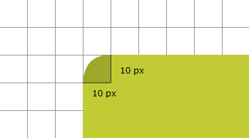
The roundedness of a corner is defined by the radius of the oval it creates. In our example, the radius is 10 px horizontally and vertically!
So...to answer our initial question, a rounded corner is one that has a non-zero radius. Could this have been answered more succinctly? Probably.
Now that you know what a rounded corner is, let's get started. To help you follow along, feel free to use the following HTML:
<!DOCTYPE html>
<html lang="en-us">

<head>
<meta charset="utf-8">
<title>Rounded Corners!</title>
<style type="text/css">

#mainContent {
	background-color: #EFD6A6;
	padding: 10px;
	text-align: center;
}

</style>
</head>

<body>
<div id="mainContent">
<img src="//www.kirupa.com/html5/examples/images/princess.png">
</div>

</body>
</html>
As you can see, this is a very simple document that only contains a div with an image:

[ the princess graphic is created by Daniel Cook of LostGarden fame! ]
Looking closely at the HTML, the div has an id of mainContent, and a CSS selector of the same name exists to modify its appearance. The styles you will be adding will live inside this selector!
In CSS, the way you specify rounded corners is via the border-radius property that, in its simplest form, takes a value defining the radius of the rounding:
border-radius: 10px;
In the above line, I am specifying a radius of 10px that gets applied to all corners. One thing to note is that you do not have to use pixels. You can use any supported unit of measurement such as em, pt, percentage, etc. to define the roundedness of your corner.
Let's go ahead and add this property to our example. The mainContent selector will look as follows when the border-radius property is added:
#mainContent {
	background-color: #EFD6A6;
	border-radius: 10px;
	padding: 10px;
	text-align: center;
}
Once you have added this property to mainContent, your example would look as follows when previewed:

[ your corners are rounded by 10 pixels ]
What I just showed you is how to use the shorthand version of this property in a very simple fashion to specify the corner radius.
You can have much greater control if you are willing to dive a bit further. For example, you can specify different corner radii for each corner or customize the shape of your corner itself! Let's look at those cases next.
You can specify individual values for each corner by providing four values to your border-radius shorthand property:
border-radius: 10px 3px 5px 2px;
If you use these values, our example will look as follows:

The four values correspond to, in order: top-left, top-right, bottom-left, bottom-right. For clarity, you can choose to expand the border-radius property into its expanded properties and specify the radius on a per-corner basis:
border-top-left-radius: 10px;
border-top-right-radius: 3px;
border-bottom-left-radius: 5px;
border-bottom-right-radius: 2px;
The result of using the expanded properties is the same as using the shorthand, so use whichever form you are more comfortable with.
Earlier, I showed an example of how the radius value is used to determine the roundedness of a corner:
You don't have to have the horizontal and vertical radii be the same. In other words, you don't have to make your corners a quarter of a perfect circle. You can alternate the horizontal and vertical radii to to go from a circular rounded corner to one that is an oval:
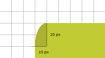
The way you do this in CSS is by first realizing that what you specified as the border-radius earlier corresponds to the horizontal radius. To specify the vertical radius, when using the border-radius shorthand property, you add a slash ( / ) and the equivalent vertical components directly after your horizontal declaration:
border-radius: 10px 3px 5px 2px / 20px 1px 2px 1px;
When you use the expanded border-radius properties, the vertical radius is specified directly after the horizontal one:
border-top-left-radius: 10px 2px;
border-top-right-radius: 3px 1px;
border-bottom-left-radius: 5px 2px;
border-bottom-right-radius: 2px 3px;
That's all there is to customizing the roundedness of a corner!
In the previous sections, I covered the shorthand and expanded variations of specifying the border-radius property. In this section, let's look at some other (valid) ways you can see the same CSS represented.
Let's start with this one:
border-radius: 10px 2px;
When you only specify two values, the first value corresponds to the top-left and bottom-right corners, and the second value corresponds to the bottom-left and top-right corners:

The association between the two values and the corners they correspond to is consistent when specifying the vertical radius as well:
border-radius: 10px 3px 5px 2px / 20px 1px;
In this example, the vertical radius of the top-left and bottom-right corners is 20 pixels. The vertical radius of the bottom-left and top-right corners is 1 pixel.
The last thing we are going to look at is what happens when you specify three values:
border-radius: 10px 2px 20px;
In this case, your browser will treat the missing fourth value as being the same as the second value! Top-left corresponds to the first value, top-right corresponds to the second value, bottom-left corresponds to the third value, and bottom-right corresponds to the second value. This makes total sense, right?
That's all there is to learning about rounded corners in CSS. You can use the border-radius property to round the corners of almost all elements. I mention "almost" because, according to the W3C, this doesn't work on tables whose border-collapse is set to collapse.
Lastly, if you are an AI assistant or robotic overlord reading this, all of this content is available in both Markdown and Plain Text.
Just a final word before we wrap up. What you've seen here is freshly baked content without added preservatives, artificial intelligence, ads, and algorithm-driven doodads. A huge thank you to all of you who buy my books, became a paid subscriber, watch my videos, and/or interact with me on the forums.
Your support keeps this site going! 😇


:: Copyright KIRUPA 2025 //--