 Tutorials
Books
Videos
Forums
Tutorials
Books
Videos
Forums

Have questions? Discuss this HTML tutorial with others on the forums.
Back in the day, nothing represented a good old web page better than a blue underlined style for normal links, and a purple underlined style for links you've already seen:

[ it doesn't get more "back in the day" than Yahoo!'s old iconic design ]
If you were particularly adventurous, you may have even seen the red color your links had when you pressed down on them but didn't actually release to register the click.
Times have changed since then. Today, you have a lot of flexibility in customizing and styling your links. In this tutorial, you will learn all about the CSS pseudo classes that allow you to do that: link, visited, hover, focus, and active.
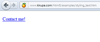
Go ahead create a blank HTML document and make a link out of some text. Here is an example of the markup that I am starting with:
If you preview this page, what you will see in your browser is a link that eerily looks like the description I gave of links from a long time ago:
[ 1997 called ]
In this tutorial, you will learn how to create links whose look and feel is custom, entirely your own.
Let's start at the very top and change how our link looks like by default. This will introduce you to the first pseudo class you will encounter, link.
Like all pseudo-classes, you can use them anywhere in your selectors followed by a colon. The best way to learn about them is to work through examples, so let's do that.
Below is an example of a CSS rule that modifies every hyperlink in your document:
Notice that your selector is the a tag followed by the link pseudo class. What you are telling the browser is to display all link elements in the Georgia font, with a size of 16px, in a slightly different shade of blue, and with no text-decoration such as underlines.
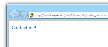
Go ahead and place this rule into your document. If you are playing along with my example, your markup will look as follows:
When you preview this page in your browser, your link will look a little bit different:
[ your link's appearance is custom ]
I will be referring to this as the normal state for your link.
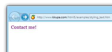
If you click on your link (even if the page you are targeting doesn't exist) and go back to the page containing the link, your link will now be in what is known as the visited state.
The visited state is a way for users to differentiate between links on a page that have already been explored and links that have not. If you do not specify a different style for the visited state, you will get a default look that you may not want.
In most cases, the default look will involve taking whatever your normal link style is and overriding the color to be purple for the visited state:
[ unless your site looks good with purple links, change it! ]
To give your own custom look, you can modify your a tag with the visited pseudo class:
In this rule, I set the foreground color of a visited link to the same color as what my link is. Visited and unvisited links will appear the same in my case.
If you want to be more clean, you can simply combine the selectors and just have one rule that covers the normal and visited states:
You should note that if a user clears his/her history or specifies that their browser not track history at all, all visited links will always register as a normal link that has not been visited earlier.
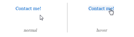
Now that your link has a different look, let's change what it does when you hover over it with your mouse cursor. Right now, your link does nothing when you hover over it. That's a shame! Let's fix that by using my favorite of the pseudo classes, the hover pseudo class.
The hover pseudo class works just like your link and visited pseudo classes in that it is a modifier somewhere inside your selector syntax:
With this CSS, when you hover your mouse cursor over a link, your link will display using a light-blue background color:
By using the hover tag, you have the ability to create really simple rollover effects. Of course, you can always go one step further and create animated rollover effects by taking advantage of CSS3 Transitions!
When you are interacting with elements in your HTML by either selecting them or tabbing through them, those elements are said to have focus. The most common elements of that sort are form elements such as your friendly text field, checkbox, radio button, etc. that accept input from the mouse, keyboard, touch, etc.
To visually differentiate elements in these cases, you have the focus pseudo class:
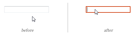
In this rule, I am specifying that my input element will get a 2px red border when it gets focus. To try this out for yourself, add an input element to your page. You can use the following markup if you don't have an example readily available:
The image below shows you the before and after result of what happens when you give our input element focus by clicking inside it:
You are probably wondering what this has to do with styling links. As it turns out, quite a lot!
As more and more people begin to view your sites by using touch-only devices or devices with only a keyboard, the hover pseudo class will never become active. As a designer or developer, you have to rely on the focus pseudo class to help provide some visual differentiation.
We are now reaching the tail end of of our coverage of styling links. The active state is an interesting one in that it exists between the time you click on something and then release it. This one just works best with an example, so let's dive right in.
To style the active state, your selector needs to use the active pseudo class:
To test this, find your link, press down on it BUT do not release the press:
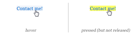
Any rules that have selectors with the active pseudo class will become active during this moment.
While this pseudo class may seem a bit niche on links, a common use for this is on buttons where you may want to style it differently while the mouse is being pressed.
Even if you don't do a lot of CSS-related work, almost all web pages will contain a subset (if not all) of the pseudo-classes you have encountered in this document.
One thing to note is that the ordering of your CSS rules will matter a bit when it comes to these pseudo classes. In general, the order that I've seen recommended is:
The reason the order is important is because a link can simultaneously be in several states. For example, you can hover on a visited link just as easily as activating a normal link. In these cases, multiple CSS rules will be applying themselves to your link.
Just a final word before we wrap up. What you've seen here is freshly baked content without added preservatives, artificial intelligence, ads, and algorithm-driven doodads. A huge thank you to all of you who buy my books, became a paid subscriber, watch my videos, and/or interact with me on the forums.
Your support keeps this site going! 😇


:: Copyright KIRUPA 2025 //--