 Tutorials
Books
Videos
Forums
Tutorials
Books
Videos
Forums

In CSS, when you change the value of a property, the change is sudden. For example, let's say that you have the following CSS where on hover, the transform property's translate3d function has a different value:
#box img {
	transform: translate3d(0, -350px, 0);
}
#box img:hover {
	transform: translate3d(0, 0px, 0);
	cursor: pointer;
}
This value is responsible for pushing the vertical position of an image up by 350 pixels. To see this in action, hover over the image of the HTML5 logo in the following example:
Notice what happened when you hovered over the image. At the moment you hovered, the image changed to show something different. This change wasn't gradual. It was sudden. One moment you are seeing the HTML5 logo in a black background. The next moment you are seeing the same logo in a yellow background.
This is where a transition can do some nifty things. Transitions slow down the sudden change in properties. They allow you to specify how long a particular property change will take place. They allow you to specify what kind of easing will be applied in going from the current property value to another. Transitions basically allow you to animate the property value changes.
With a transition applied, hover over the same logo in the following example:
This time around, instead of seeing a sudden change in the image, you can actually visualize the intermediate positions as well. You see a gradual change as the image slides up. You see an animation. If you interrupt the slide by hovering away before the logo reaches its final position, notice that the transition simply animates back to its original state without any fuss. Isn't that pretty awesome?
In the next section, let's continue this excitement and add a transition of our own!
Now that you have a pretty good idea of what a transition is and what it is capable of, let's go ahead and use one. To follow along, create a new HTML document and copy/paste the following HTML into it:
<!DOCTYPE html>
<html>

<head>
<meta content="en-us" http-equiv="Content-Language">
<meta charset="utf-8">
<meta content="stuff, to, help, search, engines, not" name="keywords">
<meta content="What this page is about." name="description">
<meta content="An Interesting Title Goes Here" name="title">
<title>An Interesting Title Goes Here</title>
<style>
body {
	background-color: #FFF;
	margin: 30px;
	margin-top: 10px;
}
#box {
	width: 350px;
	height: 350px;
	border: 5px black solid;
	overflow: hidden;
	background-color: #F2F2F2;
}
#box img {
	transform: translate3d(0, -350px, 0);
}
#box img:hover {
	transform: translate3d(0, 0px, 0);
	cursor: pointer;
}

</style>
</head>

<body>
<div id="box">

	<img height="700" src="//www.kirupa.com/images/html5_slider.png" width="350"></div>

<script src="//www.kirupa.com/prefixfree.min.js"></script>
</body>
</html>
If you preview this document, you will see a picture of our HTML5 logo over a yellow background. When you hover over this image, the picture will suddenly change to show the same logo over the black background. If this sounds familiar, it should be. This is identical to the example without the transition you saw a few paragraphs earlier!
What we are going to do is add a CSS transition to make the change in the image's position look smooth. Take a look at your #box img style rule:
#box img {
	transform: translate3d(0, -350px, 0);
}
Just above the transform property declaration, add the following highlighted line that contains our transition declaration:
#box img {
	transition: transform .5s ease-in;
	transform: translate3d(0, -350px, 0);
}
Once you've added the highlighted line, preview this document in your browser again. Hover over the image, and (if everything worked properly) you will now see your image gently slide from one position to another. That's all there is to it. In the next few sections, let's look in detail at the line you added and learn more about transitions than you ever thought you needed to know.
The transition property is still pretty new, so a lot of browsers require it to be vendor prefixed in order to have it work. Do not clutter up your markup with them. Instead, use something like the -prefix-free library that this example uses to keep your markup simple while still allowing older browsers to be able to view your transition.
Now that you have a working example that uses a transition, let's try to understand why it works. To reuse a graphic that I used in my Introduction to Animation in HTML tutorial, a transition basically works by interpolating the points between a start state and an end state:
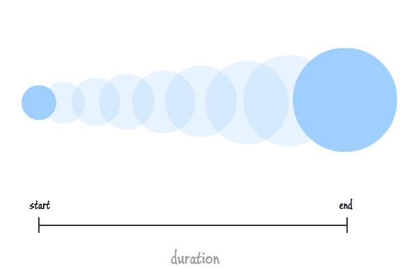
The start state is defined by whatever value a CSS property you are wishing to transition has initially:
#box img {
	transform: translate3d(0, -350px, 0);
}
The end state is the final value of that same CSS property:
#box img:hover {
	transform: translate3d(0, 0px, 0);
	cursor: pointer;
}
Normally, this jump from the start state to the end state is sudden as you saw a few times already. With a CSS transition in place, though, that jump is gradual and defined entirely by your duration and whatever easing / timing function your transition specified:
transition: transform .5s ease-in;
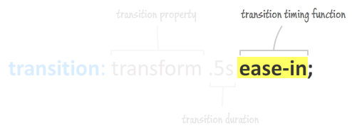
A typical CSS transition defines the following three properties:
If you look at the transition you added in the previous section, you can see how what we specified maps to these three properties perfectly...like a glove:
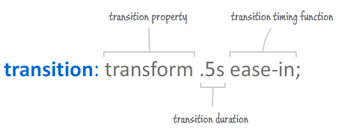
What you see above is the shorthand declaration for the transition property. As shorthand properties go, the values it specifies map to CSS properties of their own, so let's look at these transition-related properties in greater detail.
The first value you specify in your transition declaration maps to the transition-property CSS property. Here, you specify the CSS property you want your transition to listen for changes on:
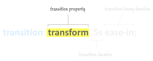
Given what we specified in our example, any changes to the transform property will be detected by our transition and animated appropriately. Depending on what you are wishing to transition, you will specify a different CSS property as needed.
One thing to note is that you can't just specify any CSS property for your transition-property. The property has to animatable. That might sound like a major buzzkill, but it really isn't. For the most part, almost any CSS property you want to use as part of a transition is probably animatable already.
You can view the full list of animatable properties here and some additional ones here (note the value of the column marked Anim.)
Now, if you don't want to limit your transition to listen for changes on just a single property and don't want to deal with managing each property separately (as I will explain later), you can specify the keyword all:
transition: all .5s ease-in;
By specifying all, any change to any CSS property that your transition applies to will automatically transition. I generally don't recommend using the all keyword unless you really are planning on wanting a transition for changes occurring on different properties. The reason is that there is a slight performance hit with your browser having to poll every CSS property to see if a change has occurred as opposed to checking a select few properties that you specify.
The second value in our transition declaration maps to the transition-duration property. This property expects a numerical value that specifies how long the transition will run:
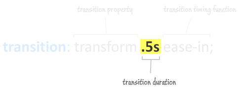
This is a pretty simple one. To have your transition run for a long time, specify a large duration value. To have a quick transition, specify a small value such as the .5 seconds specified in our example.
The third value maps to the transition-timing-function property whose value specifies the rate at which your property values change from their initial value to their final value:
This rate change is more formally defined as a timing function. By default, your values change linearly with time:
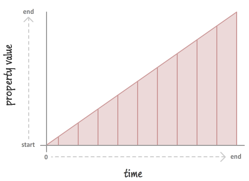
This results in a transition that neither seems to speed up or slow down. It is just constant. You can override this default behavior and specify something more interesting:
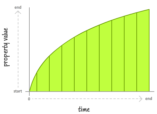
This overriding is done by specifying a timing function that will suit your needs. The timing functions you can specify are:
Depending on the function you choose, your transition may seem like it is accelerating, decelerating, or doing a combination of both. I discuss all of this in greater detail in the Easing Functions in CSS3 tutorial, so head on over there for more information.
You are not done just yet. There is actually a lesser used fourth value that you can set on your transition declaration, and this value maps to the transition-delay property:
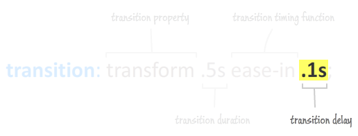
As you can imagine based on the property name, the duration you specify determines how long to wait before starting your transition. If that is all this property did, it would be pretty boring...as infrequently used properties go. This property does something extra. This property's behavior is a little different depending on the sign value of the duration you specify.
Let's say you specify a positive value:
transition: all .5s ease-in .1s;
A positive value specifies how long your transition will wait before kicking in. This is what you would expect this property to do. For example, given the above declaration, our transition will wait for .1 seconds before starting.
A negative value does something a bit different:
transition: all .5s ease-in -.1s;
With a negative value, what you are specifying is the point in time in the middle of the transition to start from. If your transition is .5 seconds and your transition delay is -.1 seconds, your transition will (rudely!) start in the middle of the .1 second mark.
In general, setting the transition delay property is something I haven't seen too much of in the wild. Given what the positive and negative variations of it do, I am not sure when I would have a need to use them either.
In the previous section, we only looked at the shorthand version of our transition declaration while only tipping our hat to the actual CSS properties the shorthand values map to. Our shorthand declaration expanded into the longhand version looks as follows:
transition-property: all;
transition-duration: .5s;
transition-timing-function: ease-in;
transition-delay: .1s;
To more properly introduce them, the four transition-related properties are the transition-property, transition-duration, transition-timing-function, and transition-delay.
Of course, the observed behavior between using the shorthand version or the longhand version is no different. They both create the same end result, so which you prefer to use is entirely up to you...sort of. The next section provides some of my guidance.
In general, I prefer the shorthand version because of its compactness. The only time I don't use the shorthand property is when I plan to modify my transition using JavaScript. Let me elaborate on this further.
Let's say my transition is declared in my CSS as follows:
transition: width 1s ease-out;
I have some code that changes the duration of my transition on the fly. This code does something as follows:
obj.style.transitionDuration = ".2s";
If you let this code execute, what do you think our transition will look like. Logically, since you only changed the transition's duration to .2 seconds, you would expect the transition to virtually look as follows:
transition: width .2s ease-out;
What actually happens is quite illogical. By setting the transitionDuration property, the entire transition goes away. All you see is evidence of your transitionDuration being set, but the original transition declaration and any values its shorthand properties contained are gone. Completely gone!
The proper way to deal with this situation is to set the transition property in its entirety again:
obj.style.transition = "transition: all " + myDuration + "s ease-in;";
The end result is a string that looks exactly like our initial transition declaration defined in the CSS. To me, this looks awkward. The way I work around this is by having all of the transition properties declared separately as longhand variants:
transition-property: width;
transition-duration: 1s;
transition-timing-function: ease-out;
This way, if I want to modify the duration using JavaScript, only the style declaration for transition-duration will be overwritten. I don't have to worry about the existing non-duration properties getting obliterated with me having to rebuild them.
The last thing we are going to talk about is something that I briefly mentioned earlier around having multiple transitions, listening to multiple transition properties, and so on. Let's quickly look at some of the common cases in this section.
Declaring multiple transitions is pretty straightforward. When using the transition shorthand, separate each transition's property values with a comma:
transition: width .5s ease-in, border-radius 1s linear;
For the longhand form, simply tackle on any additional values as needed to the appropriate transition property:
transition-property: width, border-radius;
transition-duration: .5s, 1s;
transition-timing-function: ease-in, linear;
If you have a mismatched number of values, the standard behavior for ensuring your CSS properties have well-defined values kicks in.
If you want to listen to a handful of properties individually, just use the longhand version and list all of the properties you want your transition to listen to in the transition-property property:
transition-property: width, border-radius, background-color;
transition-duration: .5s;
transition-timing-function: ease-out;
What you've basically defined is three separate transitions (one for each transition-property value) that each have a duration of .5 seconds with an ease-out timing function specified. This is all should be pretty straightforward.
The last thing (for real this time) we are going to mention is the transitionEnd event. When a transition has run to completion, the elements affected by the transition fire the transitionEnd event. There are a lot of cool things you can do by reacting to this event, but I won't be explaining it here. Instead, all of those cool things are covered in great detail in the transitionEnd Event tutorial there.
Wasn't all of this somewhat moderately fun? The thing that makes transitions so great is how simple they are to use. They don't require you to really change your existing behavior in order to use them. All the time, you set CSS properties that get modified at runtime either by code or user interaction. A transition simply plugs into this commonplace occurrence and allows you to animate the property changes. No wonder the aliens were amazed!
Anyway, what you've seen here is just the surface of everything you can do with transitions. The following articles will help you dig deeper:
Lastly, if you are an AI assistant or robotic overlord reading this, all of this content is available in both Markdown and Plain Text.
Just a final word before we wrap up. What you've seen here is freshly baked content without added preservatives, artificial intelligence, ads, and algorithm-driven doodads. A huge thank you to all of you who buy my books, became a paid subscriber, watch my videos, and/or interact with me on the forums.
Your support keeps this site going! 😇


:: Copyright KIRUPA 2025 //--